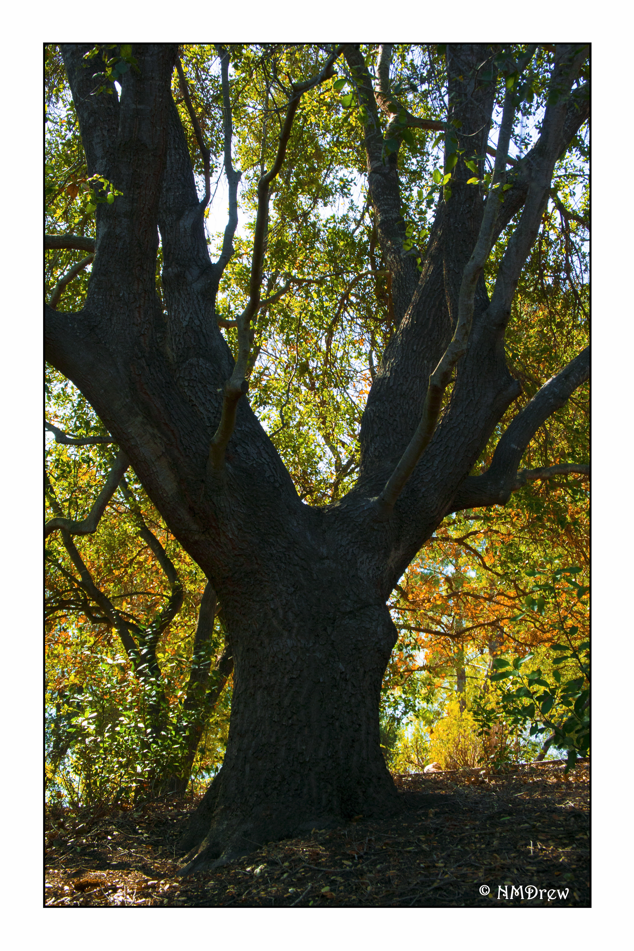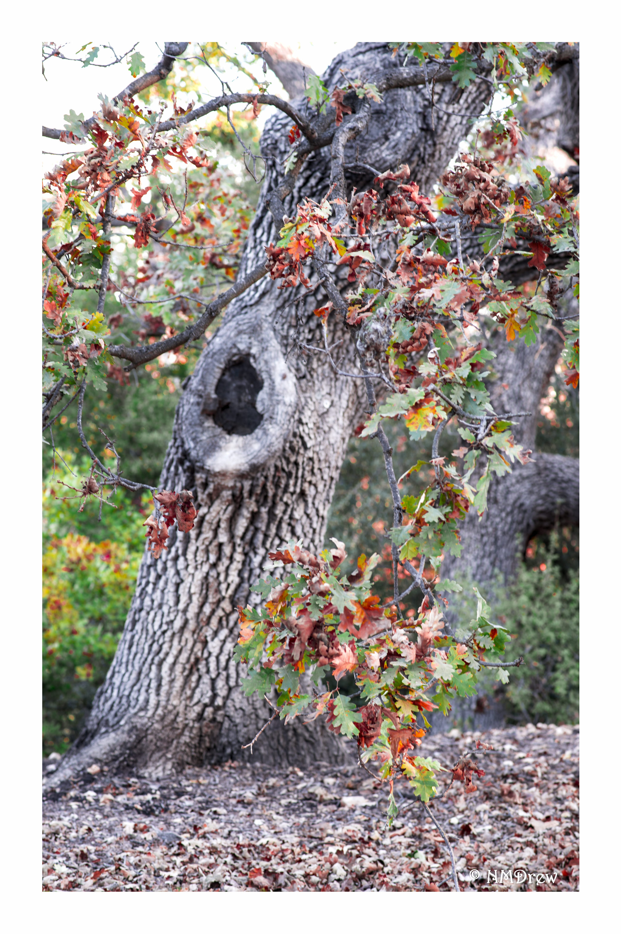
I just had to put this photo out there today.
I recently acquired a new-to-me Certo 6 camera, It has the legendary Carl Zeiss Tessar 80mm f2.8 lens. The camera and lens date from around 1953 (give or take). I shot this at f2.8 to check out the DOF and sharpness of the lens. I’m amazed. The Ektar 100 came through, too, with beautiful colors.
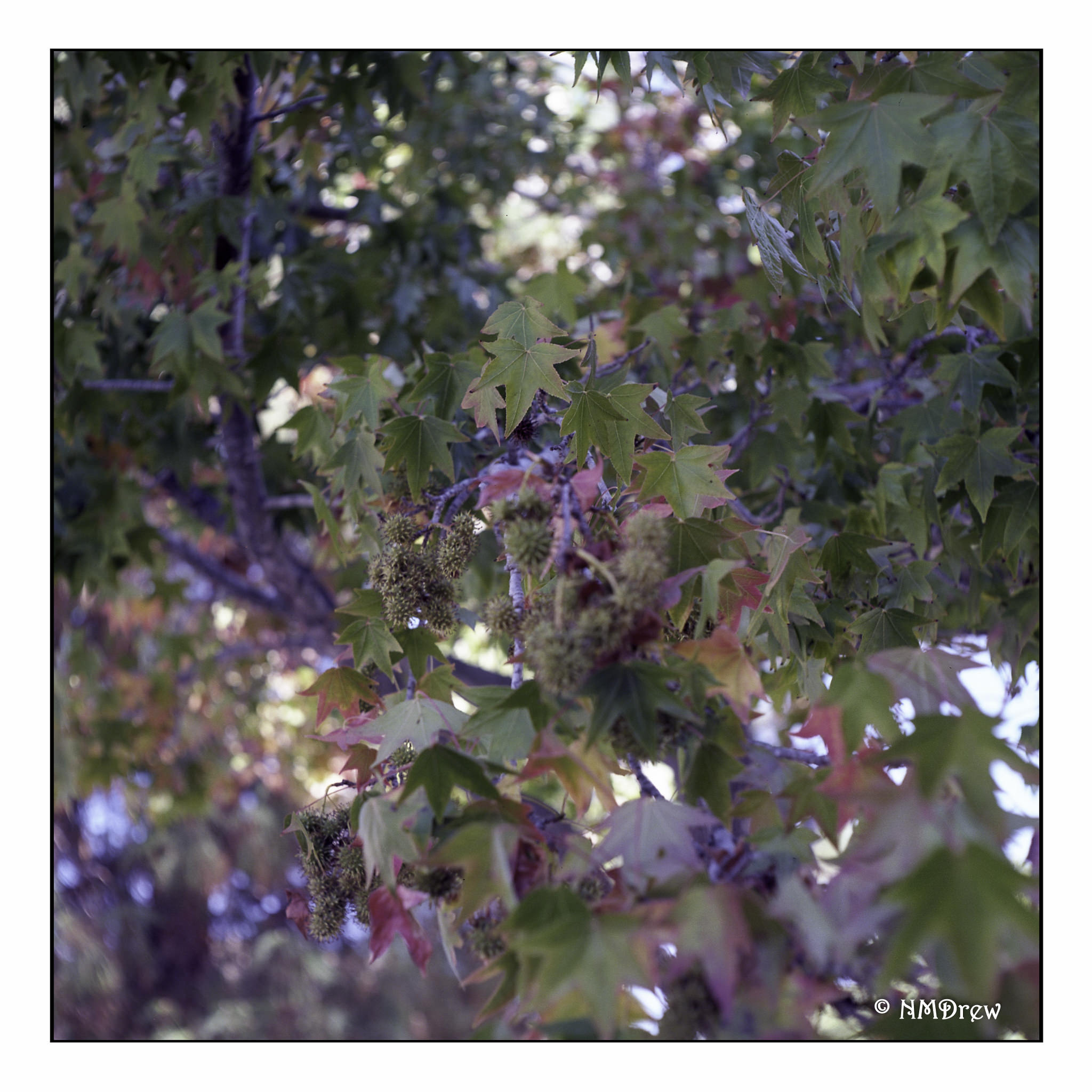
The Certo 6 is an odd folder in the sense that it has many features that other folding cameras (bellows cameras) of the same time era do not have. Also, because current 120 film is thinner than that of the 50s, there is a potential for overlap of images – which I did not experience – and other quirks that need to be worked out. I really like folders because they force you to slow down and think, as well as consider what you want to see on your film.
Square format is a compositional challenge as well. As this is part of my first roll through the camera, composition was not of any real importance for me, but using the camera was. For some reason I got only 9 out of 12 exposures on the film, but that is something I think I have figured out, and will run another roll of play film through the camera to check out my ideas . . . like I said, ya gotta think sometimes!
More to come.