Color Planes

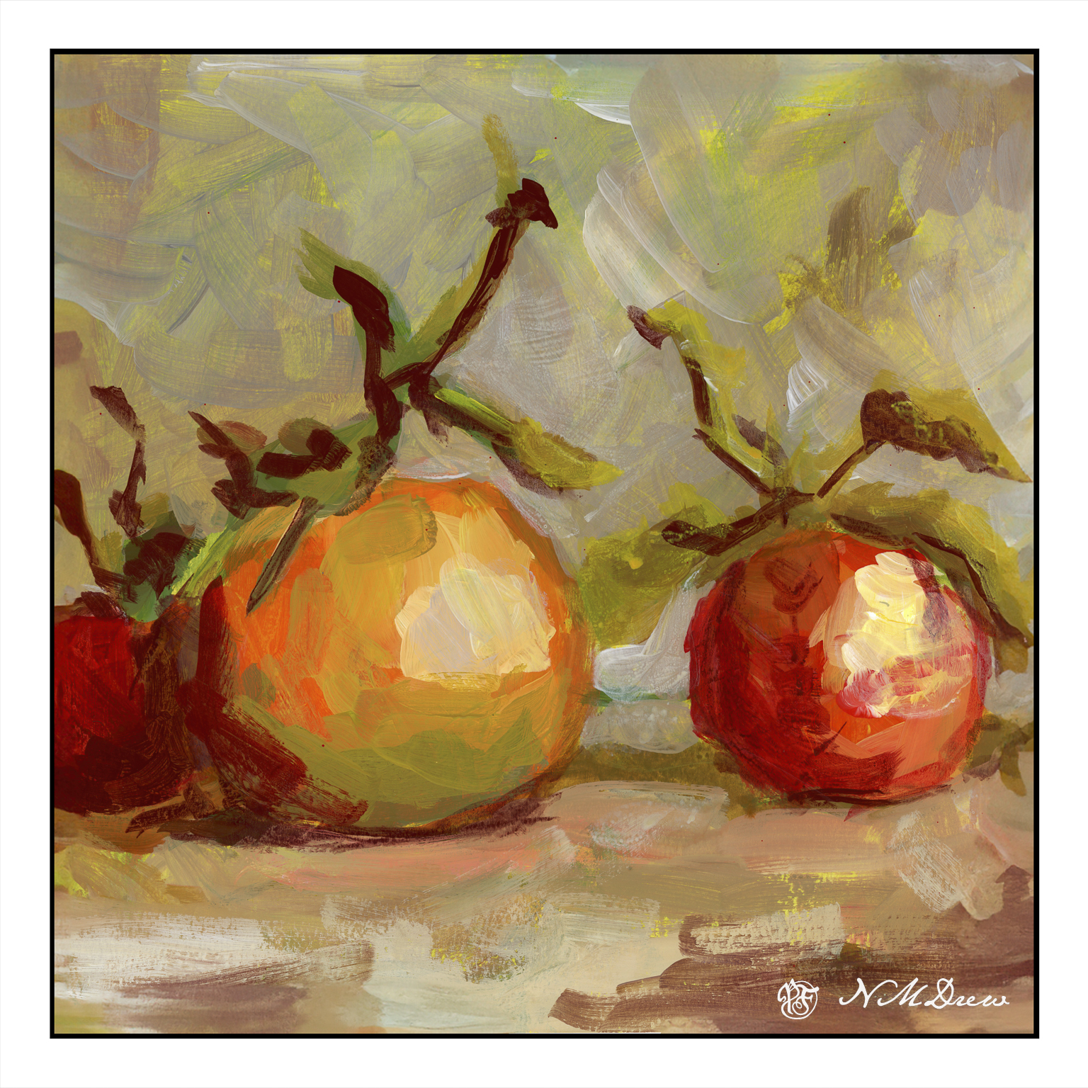
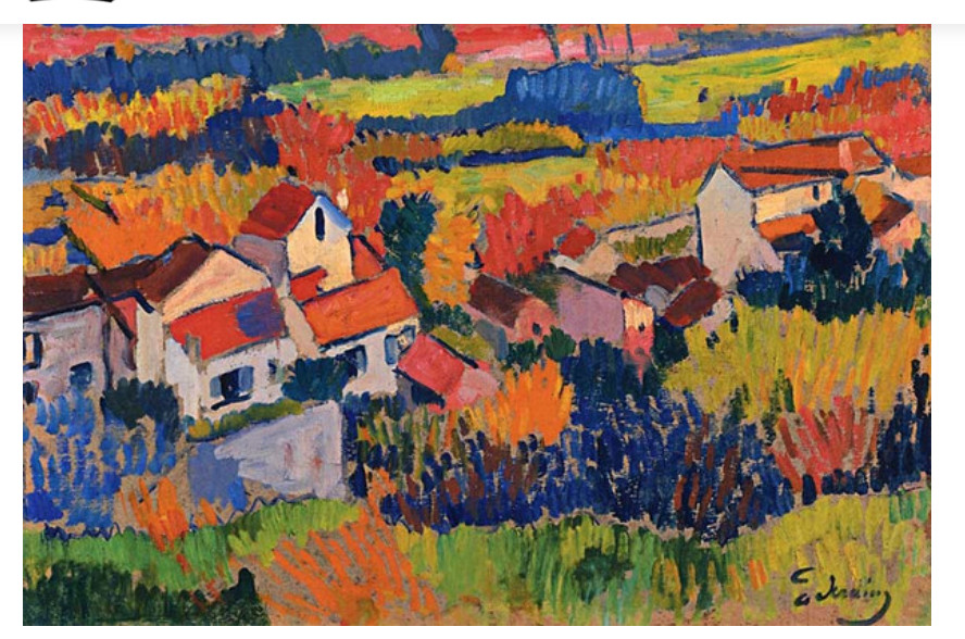
As I mentioned a few days ago, I am experimenting with swaths of color. Not simple planes of one color, but variations of color within that plane is the goal. A number of artists do this beautifully, and the graphic quality is elegant to my way of thinking, with the simplification being the subject and the goal and the voice of the artist. As I am a dabber, this is a big challenge for me.

To begin this, I decided to try my hand at exploring a painting by Wolf Kahn. The one I copied is called Ground Fog, and it is a simple study of grey, white, yellow, green, and variations of each within each area of color. Below is my attempt.

This was a challenge to try as he painted this in oil and I am using Golden fluid acrylics. Blending the colors was hard and required a lot of thought and movement rather rapidly since acrylics dry quickly, and the fluid acrylics even more so than heavy bodied acrylics. I got frustrated, let me tell you! Despite that, I did learn a bit about color – not quite sure what, perhaps just that subtlety is hard to achieve.

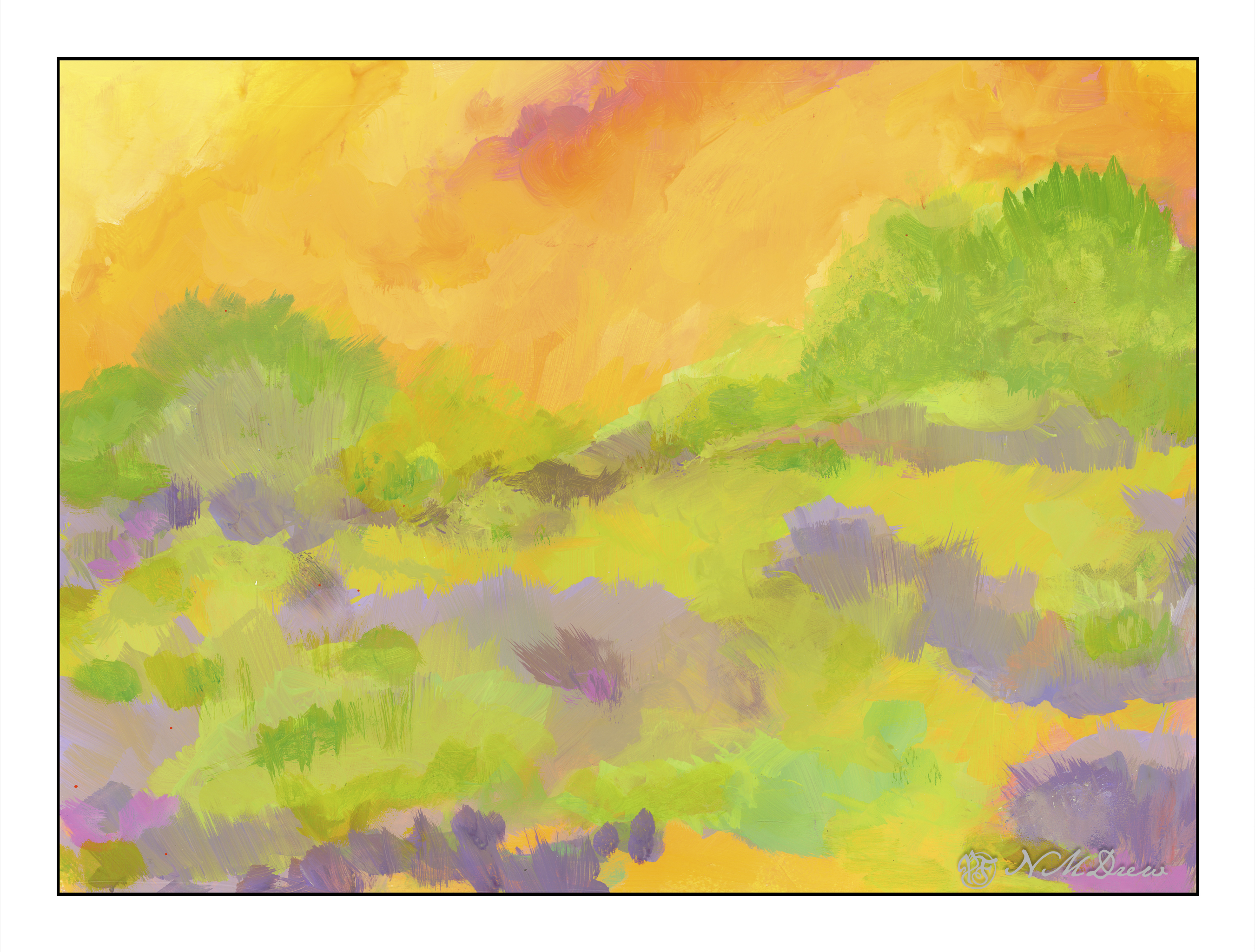
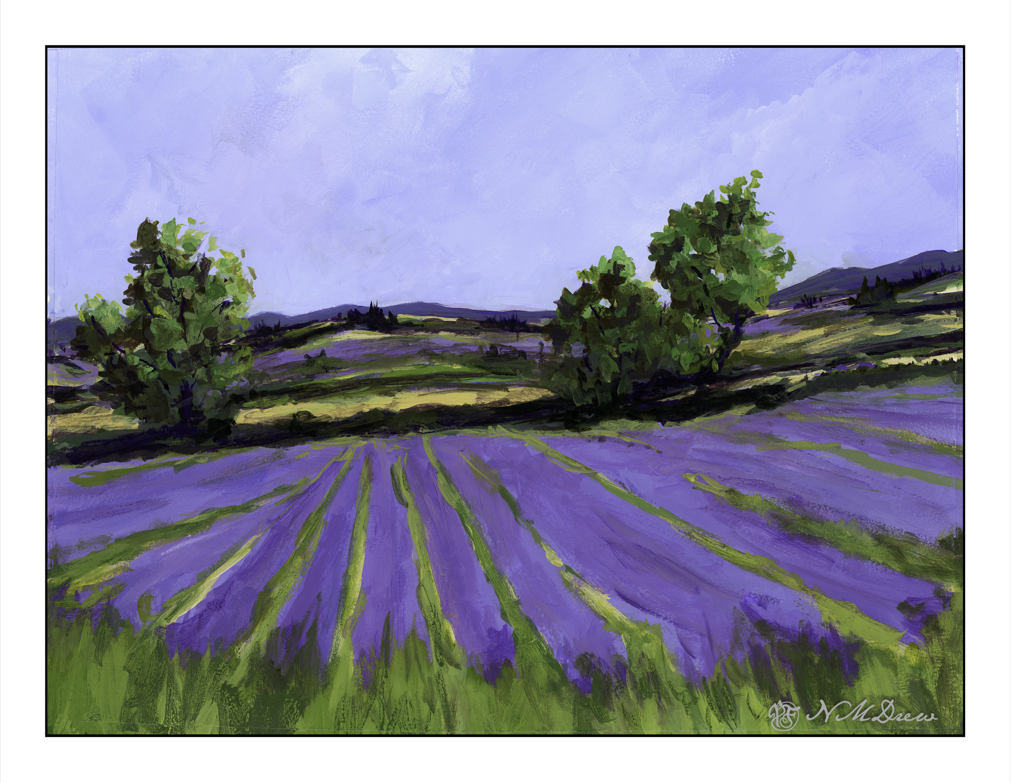
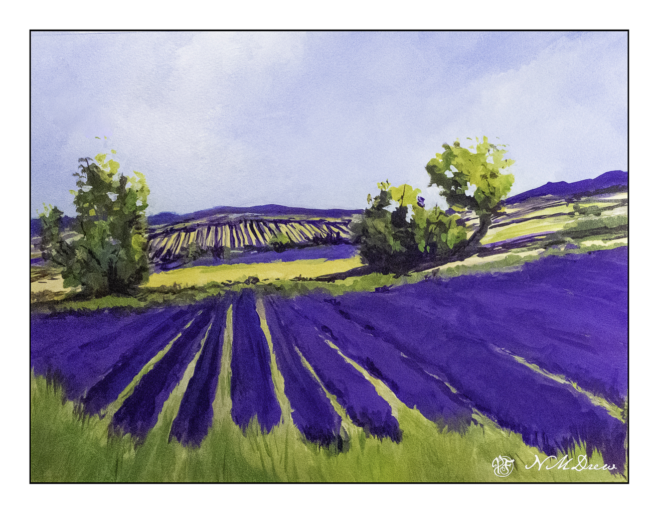
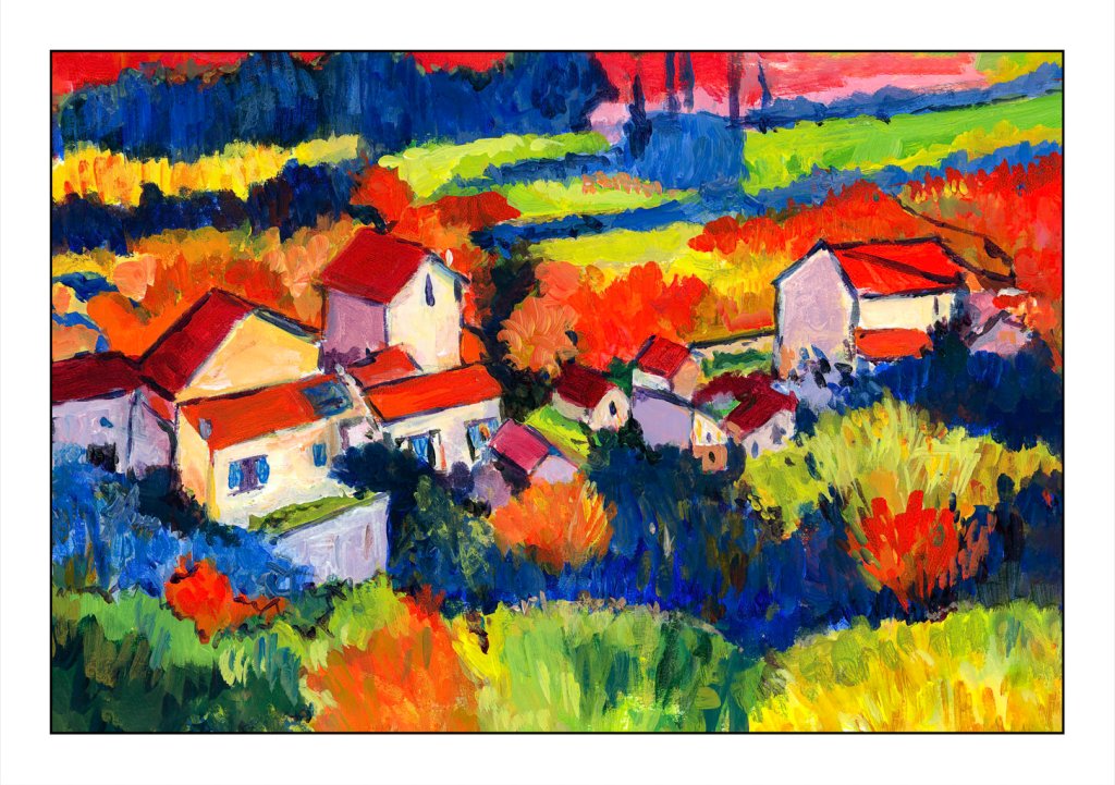
From there, once more a foray into fields of lavender and other crops, such as perhaps alfafa or wheat – no idea! I just know I see tawny colors and greens when I look at photos of lavender country.

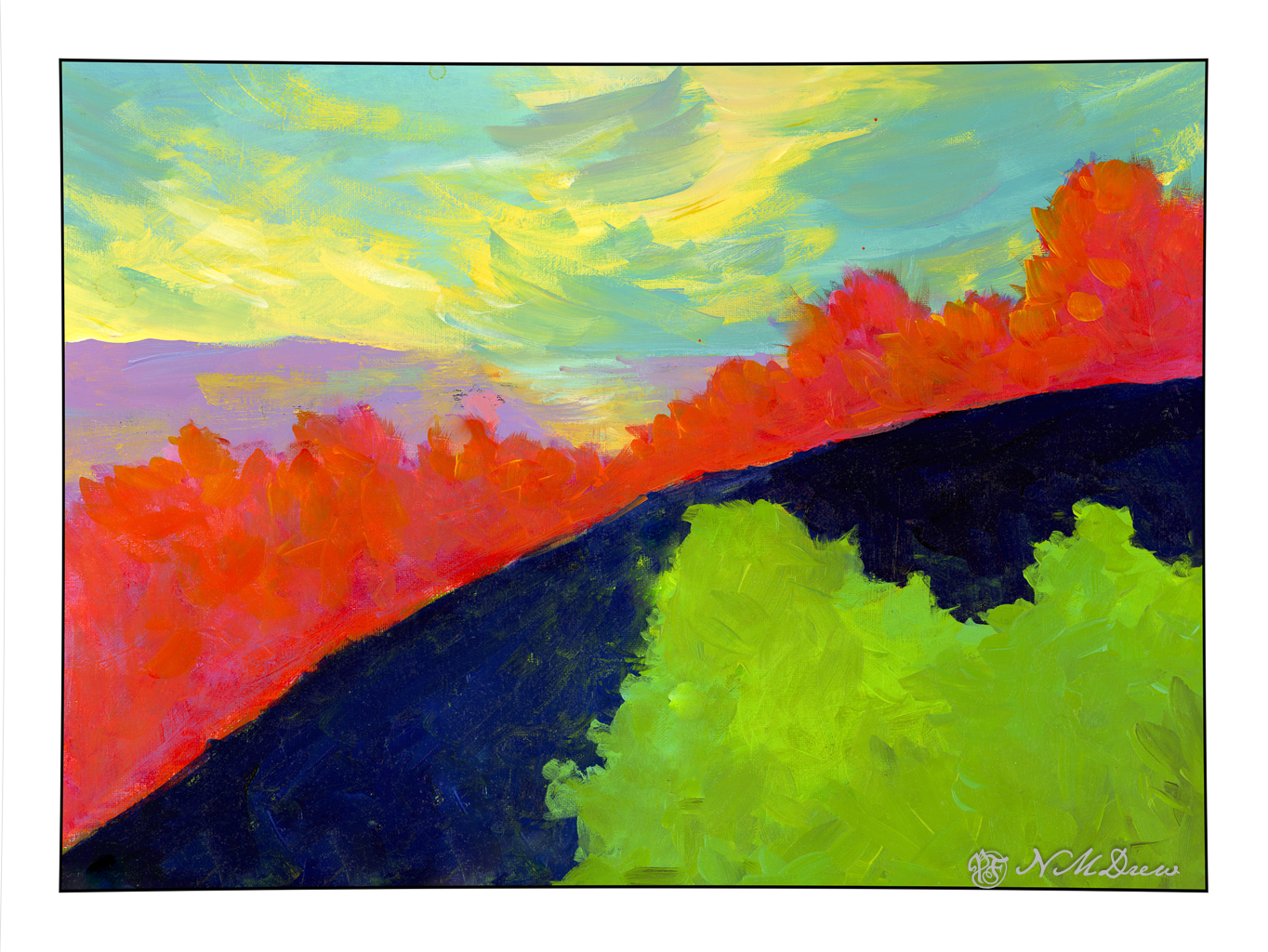
While not especially low key or subtle, I was pretty pleased with the planes of color with the variations therein. The green and lavender are not too heinous when juxtaposed. I like the mountains and sky in the distance, as well as the trees. Sometimes nature is not subtle, and while bright, I think I did a decent job of catching a sunny day in a Mediterranean clime.

The lavender field with the green foreground was done with both large and smaller brushes. This one was done, for the most part, with a rather scraggly 2.5 inch bristle brush with a lot of scrubbing. In particular, you can see this in the sky. I applied varying layers of blue and white, painting up and down to use the brushwork to express the clouds in the sky. The same with the lavender field below. I used a smaller brush for the dried field area with trees, but worked to keep the brush strokes and colors to convey light and depth. I think it worked fairly well.

The study I did on Kahn’s painting gave me ideas on how to create the color planes, but of course I am not Wolf Kahn, and therefore have my own whatever method in creating such things. Acrylics, too, have qualities which oils do not, and blend differently. I am still learning them, and while I get annoyed and frustrated, each painting helps me gain skill and learn the language of the paints. These are invaluable lessons in technique and composition and methods.

Colorfield #1

Lately I have been playing a lot with color and trying to use it not realistically, abstractly, and so on. There are a lot of people out there known for their color usage. Andre Derain, Georges Braque, Mark Rothko, Wolf Kahn are a few of them. The name for their color usage varies, from Fauve, Abstract Expressionist, Colorist / Colorism, Colorfield. I rather like the word Colorfield as it seems more all encompassing and broader in content / context than many of the others.

There is a lot more to using colors abstractly than I have realized, probably because I am a bit of a realistic if not realistically realistic person when it comes to artwork. Harmonious colors are important to me, and playing with these as I have has been a very difficult situation. While I like stormy weather, gloomy paintings are not my cup of tea. I don’t like them a lot as they tend to be depressing – but that is dependent, too, on subject matter. Picasso’s Guernica is a good example of a depressing painting – as are many of his portraits during his “Blue Period”.

This painting, to my eye, is really depressing. There are parts of it I like, such as the sky and lavender land below it. Independently I like the red / lavender bushes. Below them, the navy and green just don’t do anything for me. Get rid of the bottom or change the colors may be something for the future, but I am pretty tired of this whole thing!

Colorfield – what do I want to do with it? When I did Into the Blazing Hills, I was much happier with the colors and certainly not depressed by them.

Looking at the above painting, I realize I like the lightness and warmth of the colors. The blob of blue and green in the top painting are cold and too contrasting in comparison with the rest of the painting. The orange bushes / trees create a hard barrier and keeps the whole painting from working well together.

These flowers are also more harmonious and pleasing to me. A busier painting than the top one, and less abstract than the second one, but it doesn’t give me a sense of depression.

This portrait, too, is not depressing even though it is a low-key color palette.

Colors here are also warm and friendly.

So, what does all this mean for me? It means that using colors – in say a “colorfield” style painting – that I like, that please me, are very important. While I like bright colors and contrast, how far should it go? That is really what this painting was all about – finding what works, what doesn’t work.

Play is a way to learn. I learned I need to pay attention to colors especially if I am using large areas, such as with this study. The teal / yellow sky is okay; the lavender land beneath the sky is also okay. The lavender / orange trees are fine too. But, that green and blue do nothing for me except repulse me. It is “not me” if I were to say anything about it. It is ugly and not harmonious. There is not a sense of balance in any part of the painting – rather it is a bunch of stuff stuck together to see what happens.

Not a happy camper with the results, but pleased with my analysis.

Practice

With any art or craft, familiarity with it makes it easy to do. With familiarity and understanding comes the ability to explore using the knowledge you have acquired. I am pretty comfortable with watercolors and oils, but acrylic has always been a point of frustration as it dries so quickly and, to me, doesn’t have the qualities of oil paints. Gouache can be opaque or transparent, depending on how used; acrylics can be used in the same way. The difference between artists gouache (vs acryl gouache) is that the colors underneath the other colors can be re-moistened, and used to dissolve and create other colors. Acrylics, while they can work similarly to artists gouache, once dried, are dried, and there is no going back.

What I am trying to learn is how to use acrylics in ways that make sense to me. This is not coming easily. I like being able to sprawl my colors all over the place without drying, but this doesn’t work quite well with acrylics – unless using the heavy body paints on a sta-wet palette, the fluid acrylics I am using dry very quickly. To use them well I am trying out different ways of painting and mixing paints. Above, on the left, are colors straight out of the bottle and then mixed with white on the palette, increasing the amount of white with each brush dab. From there, I played a bit with painting cone flowers; the one on the lower right is more successful.

Playing is a way to explore. Above was play. Below is a “more serious” foray into painting with acrylics. I worked hard to make layers, and then return to add more color as I moved along. I just painted directly onto paper in a sketch book and practiced both painting and blending, painting directly on other areas, and bouncing around to work at making a bit of a harmonious or connected picture with similar / same colors used in various parts of the painting.

There used to be 4 trees in a row on the top of the cliffs – but then I looked at it and they were all the same shape and height. I decided to paint out the 3rd from the left. I had to paint the sky in a number of times, building up layers to hide the tree. It worked pretty well. I also played with my brush – I tend to dab, using the point of the brush – but here, especially for the tree foliage, I worked on using the sides of the brush. Additionally, I changed between very soft brushes and more firm brushes. These change how the paint moves and blends over the paper.

Practice can be fun – in any art – and by practicing and playing, new doors and experiences add to the skill set of the artist or craftsman.

Lavender #3 – Final (For Now?)

For the last 2 or so weeks it has been appointments and appointments and ordering this or that and consolidating little things and I am so sick of it I could scream!! My lavender painting has been sitting on my easel, I see it every day, and at last I have found time to work on the painting. Finally. Oh, finally! Something fun to do.

I wanted to accomplish a few things with this painting. One was simpler, more blended brushwork throughout. I wanted to grey out the distant colors a bit for a sense of atmospheric perspective. The trees, too, need to be cleaned up a bit. I think the pale field before the second level of lavender could indent a bit more on both sides of the left hand tree. I won’t say this is a masterpiece, but it has a bit more a painterly quality in it, has a decent sense of depth, colors aren’t too overwhelming.

This is painted in Golden Fluid Acrylics. A Sta-Wet palette doesn’t keep the paints wet as they are so fluid – the heavy body acrylics work well with the Sta-Wet because they are thicker. This means working a bit differently and I have found I like them best when they are a bit dryer – great for dry brush. Too much water in the paint – or in the brush – and they can drip down on completed paintwork, or form a rather interesting craquelure.

I have been putzing on this painting for quite some time, so here is a series showing its evolution – earliest paint

15×20, Langston watercolor paper, Golden Fluid Acrylics.

Mastercopy: Andre Derain’s “Landscape Near Chalou”

Above is a copy of Derain’s painting, ca 1904, done during his Fauve period. In an online class I am taking, we are encouraged to copy the work of a master artist, new or old, and learn from the experience. This is the second I have done, and certainly one I would not have really considered just because it is so bright! But, the colors and composition caught my eye, and off I went.

The first thing I did was to grid it onto paper. Derain’s work is obviously oils as acrylics did not exist in 1904. I used acrylics on ungessoed paper. As I moved along, looking more carefully, I think he underpainted his canvas with raw sienna or yellow ochre – you can see such colors along the bottom of his painting.

This painting took me probably about 8 hours. I gridded the image, which is about 11.5×17 inches, whereas the original is about 18×22 inches. Then I painted the basic shapes and colors yesterday morning.

This took a lot of time! I am glad I did a grid as the overall areas to be painted were fairly apparent as to shape. What they were – well, some leave me wondering. However, colors are shapes, and Fauvism is not reality, so I could do a bit of my own interpretation, too.

Next, I began to define areas as well as correct mistakes, such as my lopsided building in the lower left side. My paint was thicker, too. Below is this morning’s work.

After lunch, I aimed to complete my copy of Derain’s painting. As I moved along, I looked at Derain’s brushwork. There is a very graphic quality about his painting, which is very pleasing, but the brushwork, too, is fascinating. I did try to emulate it a bit, not just dabbing, but trying to see when he did a dab, a long horizontal push, and so on. Easier to do than to describe!

My final work really does please me. I love the bright colors. My limited palette worked pretty well and there was joy in mixing colors. I usually tend toward more “natural” colors, but the truth is I am a magpie at heart, and bright colors always do get my attention and make me happy. That is an emotional reaction. Classical paintings, though, do appeal to me. Copying a master is opening doors to me and leading me into areas I have never explored.

My final copy of Derain’s masterpiece: