Evolution

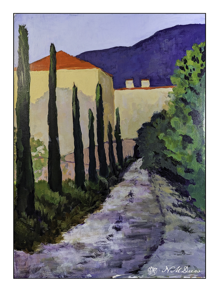
Several weeks ago I started an acrylic painting of a building at the end of a road. It was sort of painted in a traditional manner, meaning I was trying to represent reality. Truthfully, it bored the hell out of me, but I kept it as it was fairly decent in my opinion, but it did put me to sleep. 

Working with brighter colors of late has really been exciting for me as I feel much more of a connection to the colors I use than I do to subject matter. Subject matter can be anything – but colors express more to me and are more true to who I am (a magpie reincarnated as an old bat) than subject matter in general. So, I took the painting and painted over it. Below is the original.

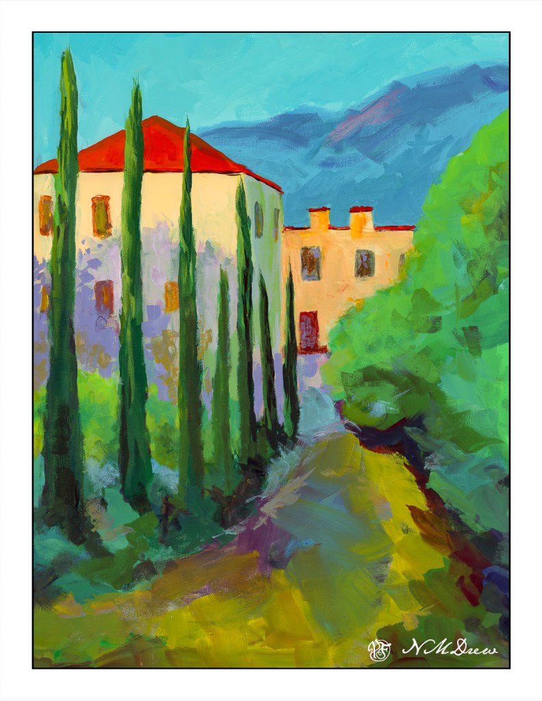
This is a photograph I took and it is pretty crap (above) as there is a lot of weird stuff going on. I didn’t think it scanning it because of its size. This morning I scanned my current iteration of this painting.

I like this much better, but it is not quite done. I need to work on the road in the foreground as well as details of the building. More windows, fix windows, fewer windows? Create some focus at the end of the road? Fix the road? Cast some shadows – creating light and dark – across the road?

Many things to consider here. I am going to let it sit and ignore it awhile. If you have any ideas, let me know!

Acrylic, canvas, 18×24, scanned on an Epson V600.

Into the Blazing Hills

One thing I enjoy about a retrospective show of an artist’s work is to have a sequential progression of his / her development. As an erstwhile “artist” I find myself is bopping around. It is my erratic personality – my magpie personality – drawn to this and that. That is probably why I like Hawaiian print shirts – colorful and rather crazy. When I look at my own paintings over time, color is always the primary theme. Sometimes my color usage is quite bad – nay, awful! – and sometimes very much to my liking.

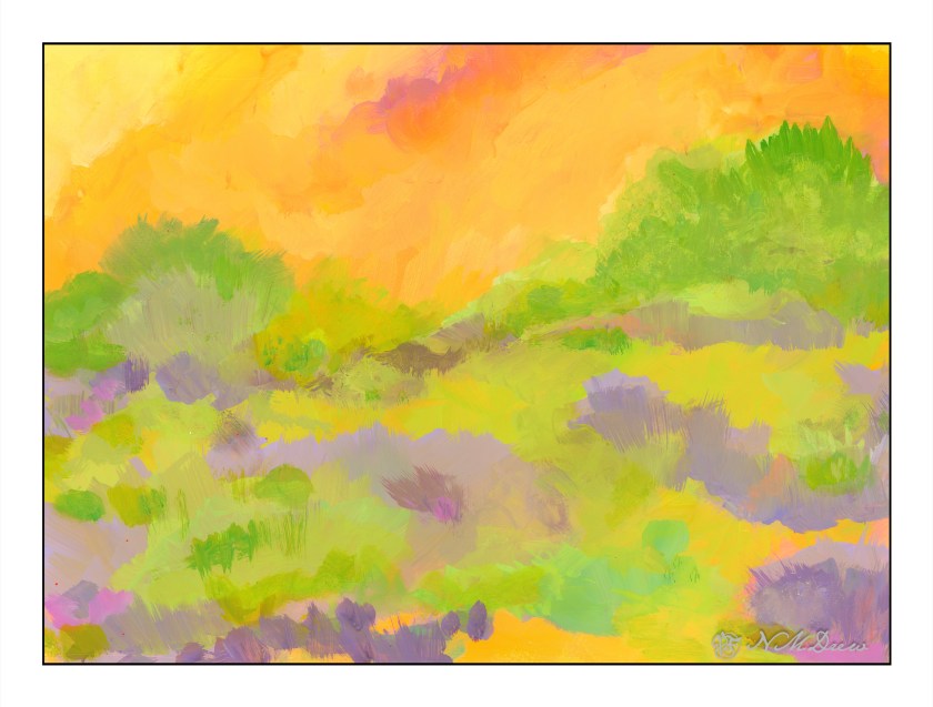
In this vein, I decided to just paint with the Golden fluid acrylics, spreading around colors and creating shapes. I figured it would make itself known to be whatever it is to be. As someone who likes landscapes, I figured it would become one. My thoughts were, as I progressed, a flower meadow, hills of flowers, trees, and then just putz. Using acrylics means putting paint down in a way which works with their quick drying qualities, but I did use matte medium. A lot of times I just dumped color on the palette paper, mixed, added white, and then mooshed it around on the paper. The matte medium creates a bit of transparency, and it makes a sort of glaze over underlying colors.

Painting was done with wide, flat brushes – 3″ and 1″ flats – later a large round – and my fingers encased in nitrile gloves. It took about 3 days and 6 hours to paint this on 15×20 watercolor paper. Golden Fluid acrylics, matte medium.

Colorism is something that truly appeals to me. Not Fauvism, which I find a bit too loud for my taste, but colors to create an emotion or feeling more than reality, with a bit of a suggestion of reality.

First Painted Portrait

I have drawn people and done some half-witted attempts in paint, but this painting, for me, is my first more than half-witted portrait in paint. Source photo is from Pixabay.

9×12 canvas paper, Golden Fluid Acrylics. Limited palette of violet oxide, cobalt blue, yellow ochre, cad yellow, zinc and titanium white.

Lavender #2 – Stage 1

Hurricane Hilary is supposedly barreling toward SoCal, so after battening down the hatches and getting a virus and sleeping for more hours during the day and night than normal, running a fever, I finally emerged with some sense of clarity today and accomplishment insofar and I am awake-ish and my mind may be capable of functioning. And, I am bored with being so uncreative and dedicated to duty and chores that need to be done despite the desire to crawl back into bed.

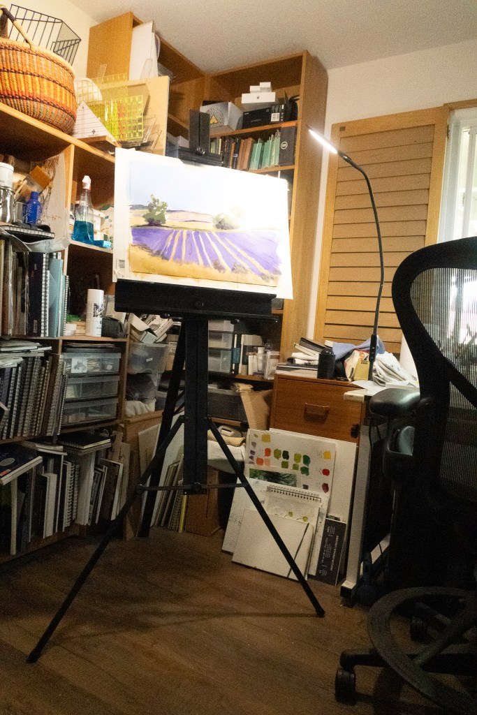
So, more lavender. Let’s just call it Lavender #2 for now, as I am sure there will be other versions sometime in the future. Stage One is below.

I am using the Golden Fluid Acrylics again, and really do like them the more I use them. The paper is some badly sized watercolor paper which is fine for acrylics and dreadful for watercolors. It is 15×20. I mounted it on a piece of coroplast with some tape and went to work. Because of its size I put it on my easel.

I have my paints to the right, with the window facing east. Lots of LEDs with variable lighting – I hate overheads! Anyway, I adjusted the easel to my height and find I rather like this set up. The easel is lightweight aluminum and folds flat. The esposo is kind enough to fetch it when asked as it resides on a shelf in the garage, up high and out of the way.

Colors, at this point, are limited. So far I have used yellow ochre, chrome green, carbazole violet, titanium white, cobalt blue, ultramarine blue, and a drop or two of cadmium yellow medium. My palette is a mess. I just cannot create a tidy one like other artists . . .

For today, I am done. I am getting tired, but painting is refreshing! That is definitely good for the soul.

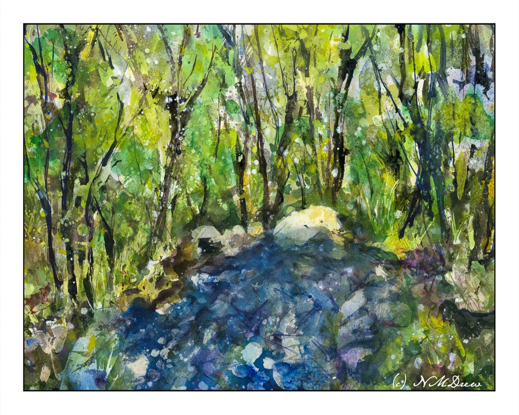
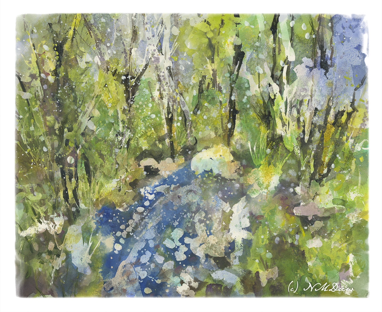
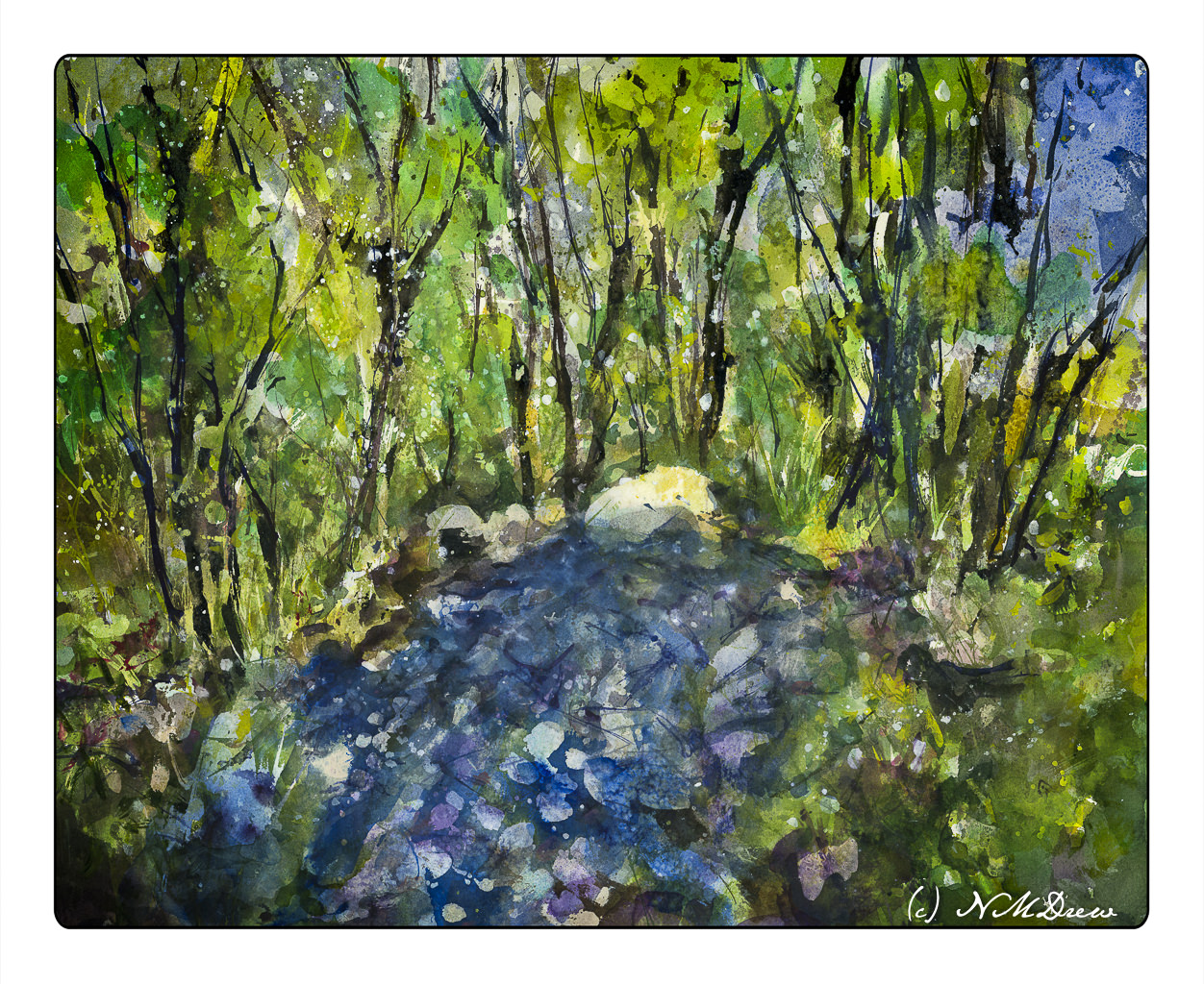
Water Thaw – 4 (Final Version?)

Water Thaw 4 – Final Version??

The end! Or is it?

Anyway, as I mentioned yesterday, more blue in the lower front, some other touches, and then let it sit overnight.

This morning I took another look at it, and the only way I can describe what I did was to refine it. I increased contrast in some areas to create harder edges. Other things were designed to lead the eye toward the center of the painting, toward the whitish rock at the top of the water. I also looked for areas that just didn’t look right, somehow too symmetrical or distracting. In the end, little bits here and there made it better to my eye. But – that was during morning coffee when I was trying to wake up!

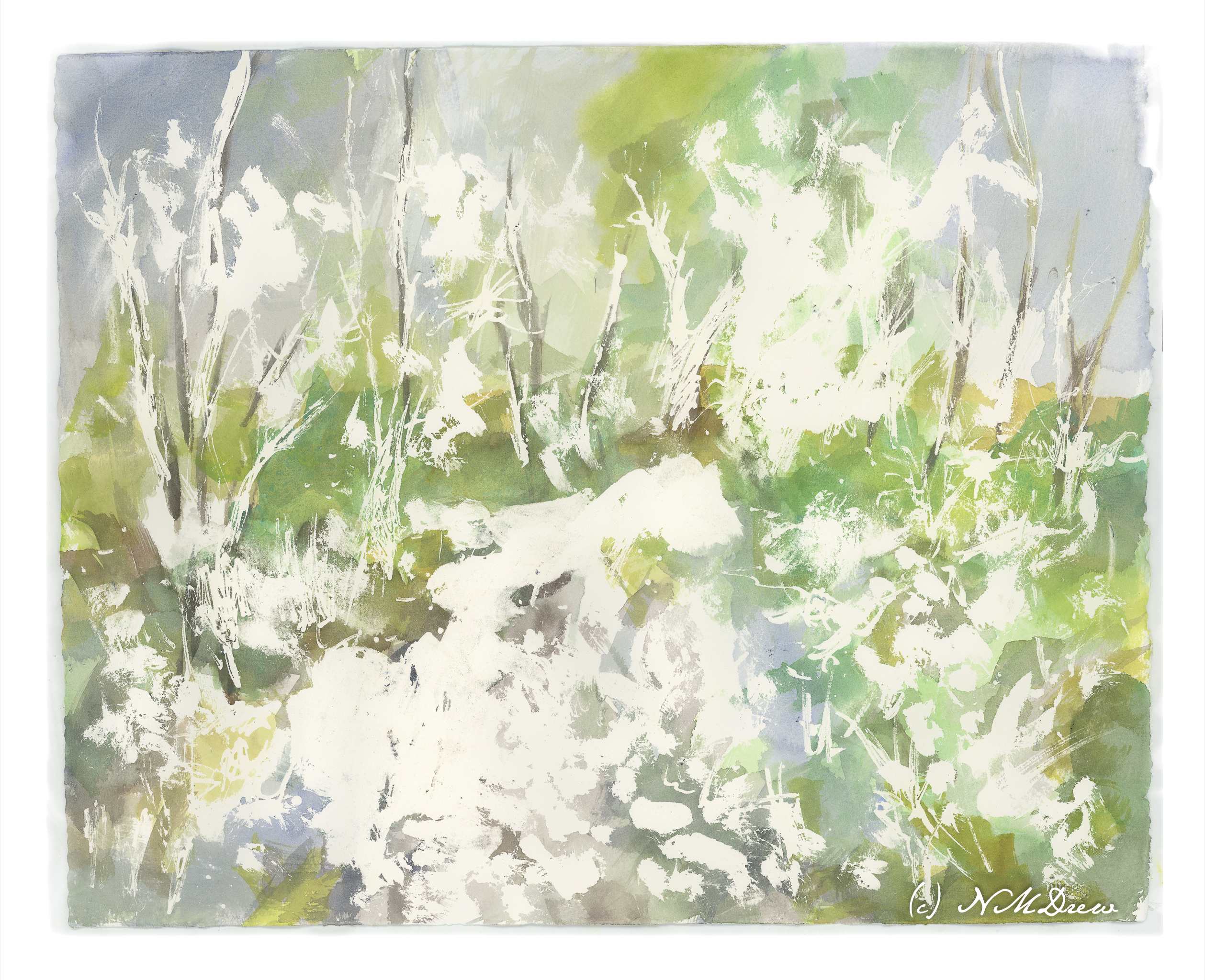
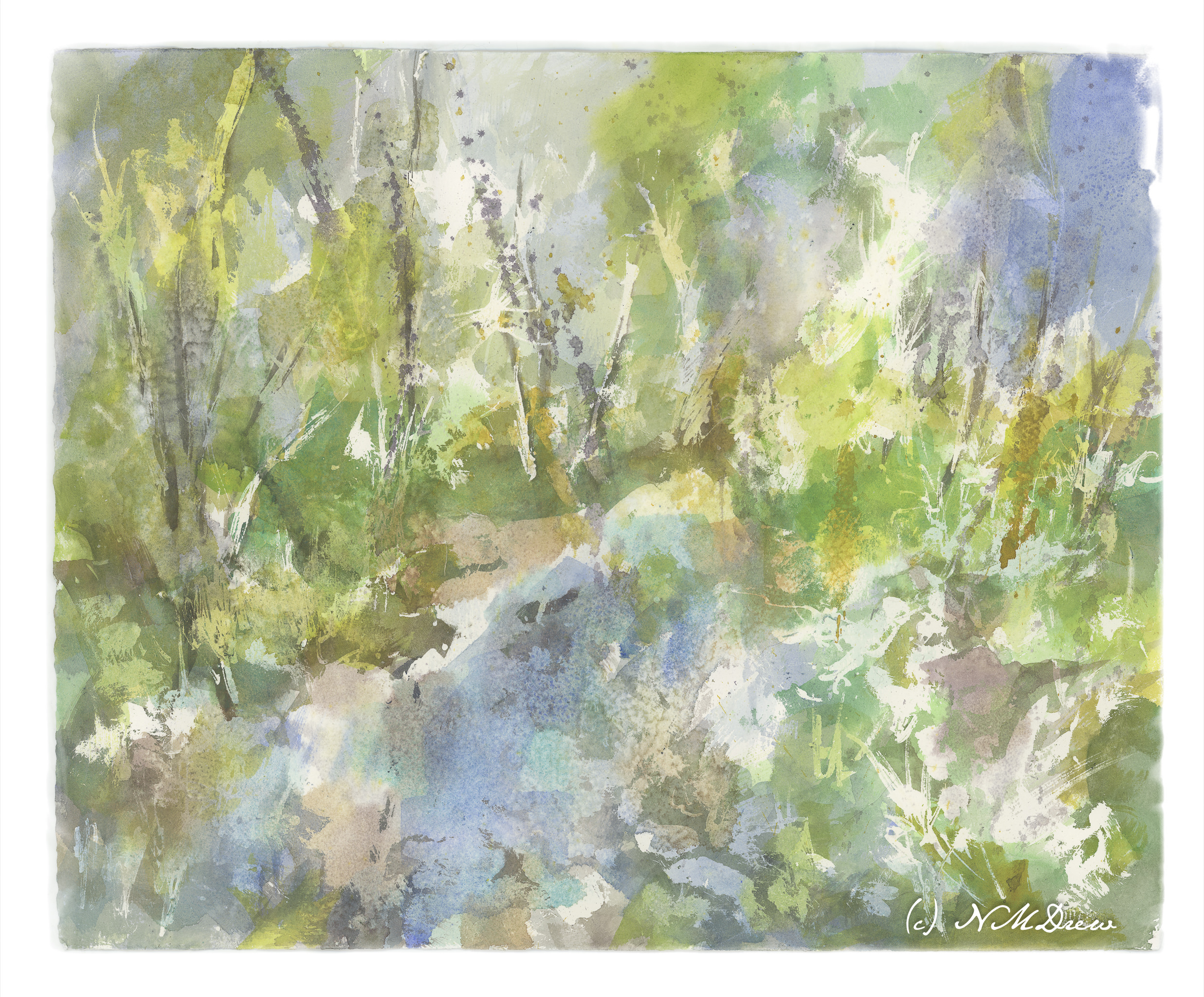
I have never worked on a painting – a watercolor – for this long a time period. Total time is probably 8-10 hours. Time was spent laying down frisket, colors, letting things dry. Then frisket was rubbed off. Water was sprayed at different times and salt sprinkled. Rubbing alcohol was also sprayed on. I think the last round of frisket took about 30 minutes to rub off, along with salt. The result, though, are transparent layers of color which I could not have accomplished otherwise.

While the perspective seems a bit off – or maybe we are looking down into the water from above? – I like this painting. It’s a new adventure for me in watercolor, and while bright, I don’t think it is overly so. I deliberately did not use any orange!! New ideas are coming to mind for painting in a transparent medium. Mood and impression work here for me – not realism, but suggestion. So, spring thaw, melting ice, new leaves.

In this final version, I cropped it and changed the perspective a bit in Lightroom. Post-processing artwork is much like post-processing a photo, an din the printing industry it is done all the time. You can see the uncropped version in the gallery below.

Arches 16×20 140# CP, acrylic, gouache, watercolor.