Color Planes and Disaster Recovery: Orchard, Road, Windbreak

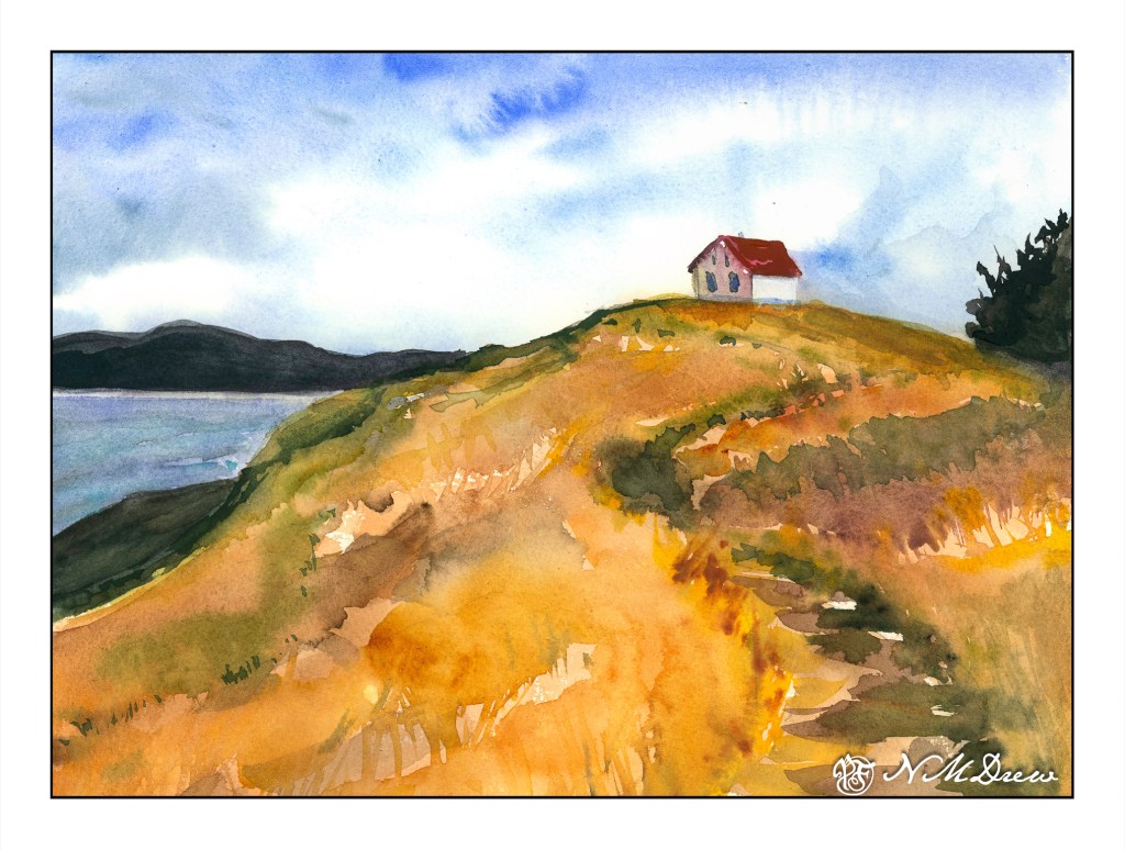
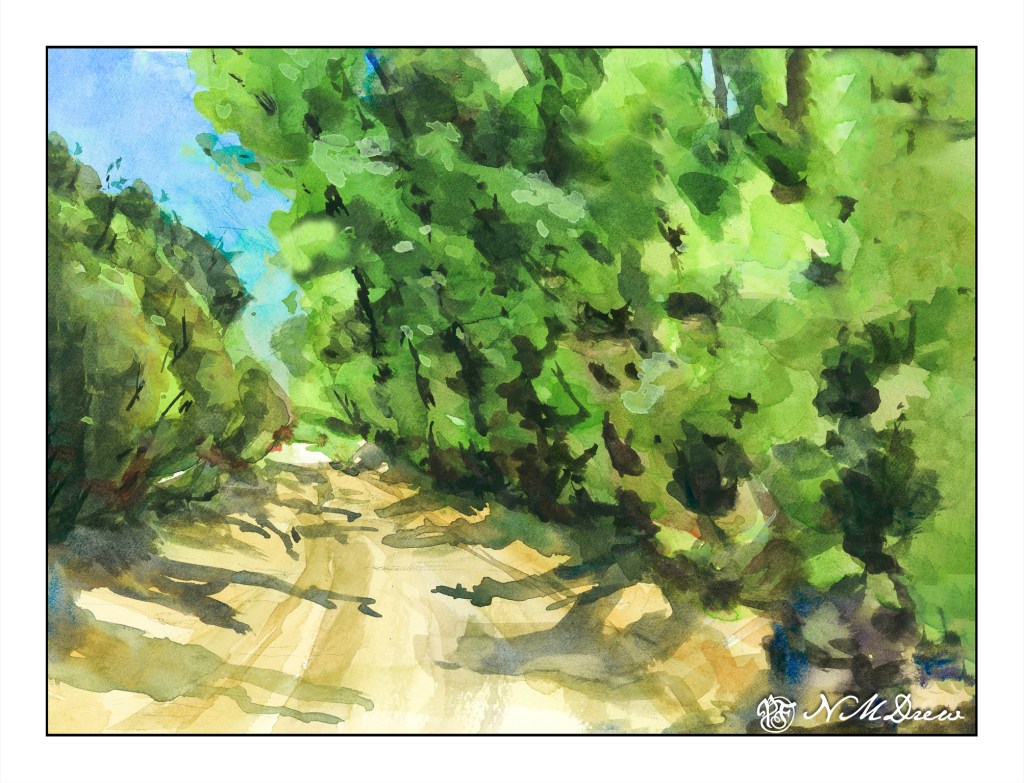
Yesterday I posted a hill that was a color study. Today I am posting trees and a road as large planes of colors. Green is green, but there are variations. The trees on the left are different greens than on the right, and so is the brushwork. The center is a rather yellowish grey road. The shadows, too, are a bit different, with the ones on the left are more blue than on the right, which have more green.

The painting started out with my using my the Schmincke half-pans on a large painting for the pans. I struggled to get enough color to begin a wash and resulted in blooms and cauliflowers everywhere. The whole beginning was a major disaster and I was not happy. Then I pulled out my usual large palette with tube paints. Start the painting over on a new sheet, or try to rescue it? I decided to apply some life saving . . . .

The sky was a big cauliflower. The trees on both sides of the road were big cauliflowers. I began with using clear water to wash away as much of the cauliflower lines, blending the paint into the surrounding color. This ended up with some lifting of color and some stripey areas, but that was not a bad start.

The next step was repainting the sky. It started out a nice light color but with another layer of color it got darker. Then the trees. Each layer became darker although I did manage to save some lighter areas. This was annoying, but then I decided to re-watch Shari Blaukopf’s “Trees Across the Seasons” to see her tree painting technique. It really helped.

My crime in watercolor is a lack of patience. That is what happened with this painting – my frustration using the pan paints made me impatient. I just want to get in and paint – I don’t want to pre-plan, do value studies, etc. There is a place for spontaneity and a place for patience. Outdoors is for spontaneous painting with drawing and thought; in the studio I want to be more deliberate. I made the choice to use tube paints, and be more patient.

The end result is not too bad. The original is darker than this one, but that is the beauty of digitalization – I can fix things. I use it in my photos, and I use it when I post my paintings online. Is this wrong? I don’t really know, but as far as I am concerned there is nothing unethical about such manipulation. If I were selling prints, I would be working to make sure the prints were good – just as in a photo – removing spots, augmenting colors, etc. Having worked awhile in the printing industry, this is the norm to produce modified images. Digitalizing a painting lets me crop and frame and sign it, too.

Besides helping me make a painting look better, it also allows me to see it differently. A monitor makes everything more clear, and that includes mistakes like weird shapes and splatters that I don’t notice in the original. Seeing such things is a learning experience in and of itself.

So, color planes and shapes, getting rid of cauliflowers, learning that half-pans are not best for my way of painting large, and fixing a painting that could have just gone into the scrap paper pile. Altogether, a good experience.

Up the Hill: A Plane of Color

One of the things that is often a point of contention for many who work in watercolor is when to stop – when not to paint any more – when is overworking the painting happening. Today’s study is of a lone building on Saturna Island in British Columbia. It sits on a hill, silhouetted against the sky.

The building itself is not well done – it is overworked. That, though, was not the point of the painting. The point of the painting is the hill up to the house – paint it, work the colors, create depth and dimension and a sense of the vegetation. I worked wet-in-wet; put a few glazes on; re-wet the paper and painted again when I needed to add some detail, such as the shape of grasses or vegetation. I also wanted to create a way to get the eye up the hill to the house, and the pathway itself does the trick.

Composition is also something I was considering. How am I leading the eye to that little building? Above is a an overlay with some of my eye-deas. I can think of more, too, but I could also go nuts analyzing things. The darks acted as a balance on either side of the hill, but the tree on the right is too big as far as I am concerned. It just kept growing – spring??

Finally, values. Lights, darks, mediums. Is my contrast working? If I look, I see the zig-zag of the darker path leading up the hill, but more subtle is the light zig-zag to its left. The darker values on the right of the hill repeat the zig-zag. Various areas of light and dark point your eye toward the building.

I am pleased with the hill in this painting, and that is what I wanted to focus on. It is an oddly shaped mass of color, but within it are variations of all sorts – warm and cool, dark and light – that give it shape and depth.

My current focus on watercolor is planes and dimension. I am trying to break down my ability to create structure, and for me the natural shapes of hills and trees are far easier to work on for now, although buildings will come in the future. Negative painting was a first study, but that surrounds as well as creates other planes and dimensions.

Let’s see what is next!

Mas Schmincke Pan Paints

I took some time to rummage around the studio and found my pad of paper I had set aside – an inexpensive, 100% cotton paper. This paper does not work well with really wet washes, but does well with lighter ones.

I always enjoy the combination of ink and watercolor. Drawing in ink without a pencil drawing beneath seems to me to be far easier to do, and more logical (if that makes sense) than working with a pencil for a value study and then inking over it, erasing the pencil, and then painting. I guess the amount of lines makes more sense to me than the pressure of the pencil? Anyway, I decided to see what I could do with ink and watercolor.

Nothing fantastic, but it does have a nice composition and sense of value to a point. I think the details – or lack – makes an ink drawing express itself. From there, I began to lay in some light washes, referring to the color sheet from my new set of 48 Schmincke Horadam half pan set I mentioned a couple of posts ago. Already I can see my heading toward specific colors, but looking at the painted color sampler, I tried different ones, like English Venetian Red. That color has never made it into my palette, so this was fun!

It took awhile to get comfortable using the pans as I usually paint with tubes. I am experimenting with things to decide what I want for plein air painting and drawing. Thus, pan paints make sense as does pen and ink. I like to travel light, and don’t like lugging this and that around. Having a lot of colors also allows for less need for water, I think, when sketching and painting, as mixing colors can be a bit of a job. At the same time, I do mix, such as blues and yellows to make greens, and having a lot of choices makes for some new and interesting result.

So, here is the finished ink and watercolor sketch. 9×12 on 100% cotton student grade watercolor paper. Light washes were used for most places, including the darker areas. For the darks, though, I did need to work on making my paint thicker and heavier. And I got to mix a lot of greens in addition to using the 4 or 5 available in the pans themselves. Altogether, I was pleased with the results and the experience.

Testing, Testing

I bought a set of Schmincke Horadam pan paints, and went a bit nuts with them. I decided to try a set of 48 colors – economical way to enjoy excess colors! I have an older set which has done me well over the past several years, and thought it was time to buy some more. I cannot say I am disappointed as they are really lovely.

I have some poor quality watercolor paper – great for gouache – but not for watercolor. This particular bit is poorly sized, as you can see by the mottled appearance of the blue-greens at the bottom and left of the flower pot. Still, I was not using this paper to test out the paper, but instead to just play a bit with some colors I haven’t used before. I did a few other sketches, but they were all rather poor – not that these pansies are anything great – but I have had fun!

One of the nice things that comes with the Schmincke paints is a sheet of paper which has a bit of texture and can be used to put samples of the paint on them. The sheet itself has room for the number, but I also wrote down the name on the wrapped-up half pans, as I think, “oh, Payne’s grey” not “good old number 789”!

So, more play in the near future, but not with crap paper. I think then the real colors of the Schmincke paints will really show.