WIPs

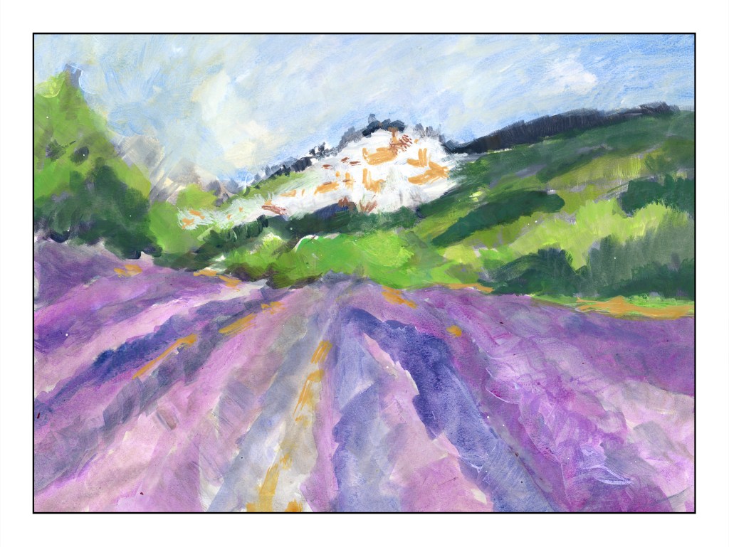
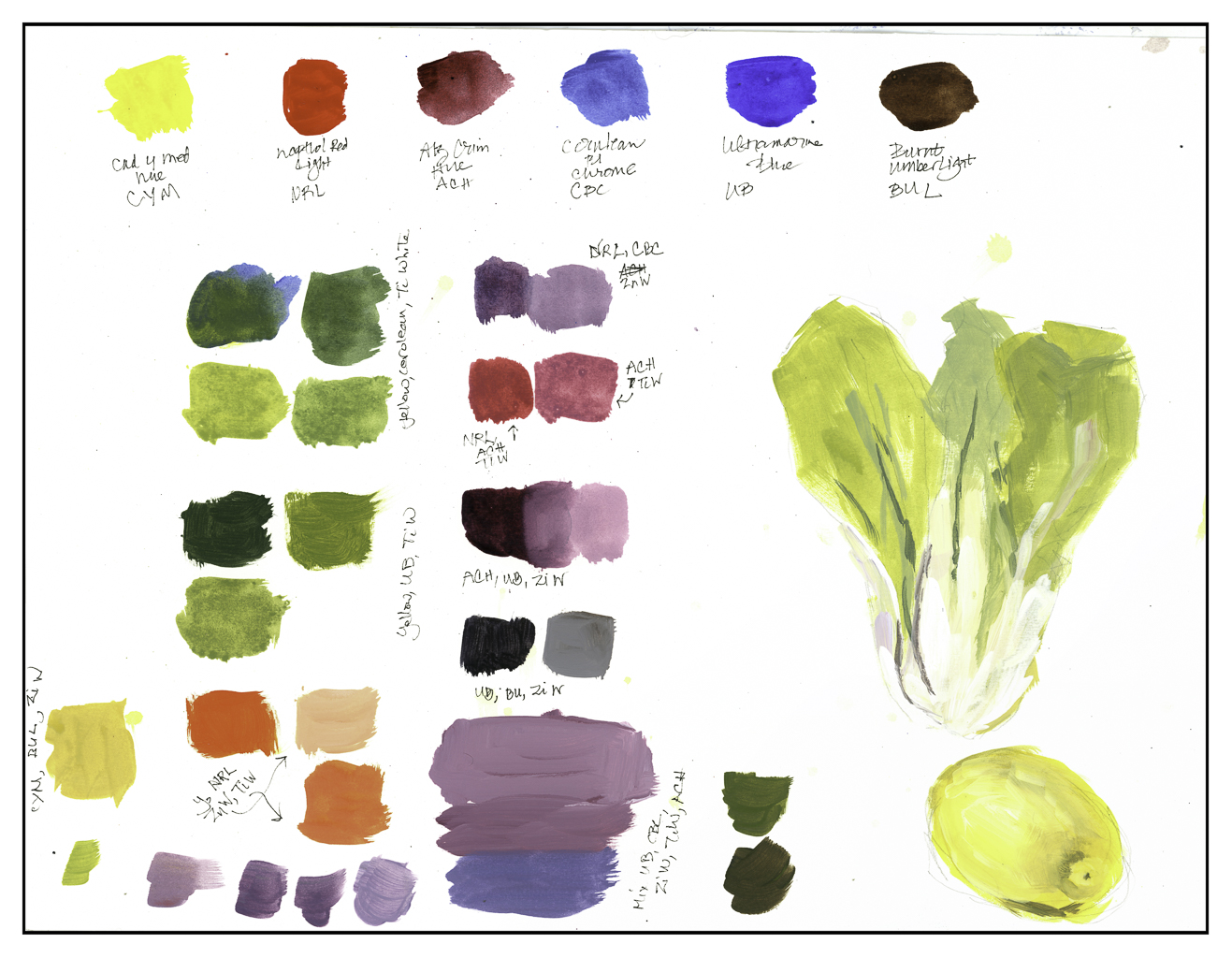
WIP means “work in progress” – and here are my current ones. Both are causing me no end of frustration – but despite that, I am having fun (or so I keep telling myself).

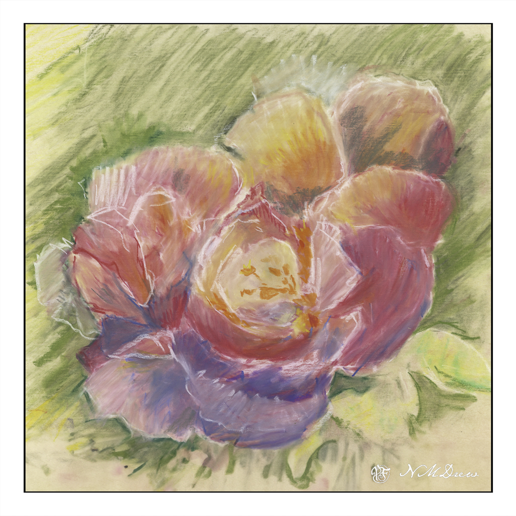
This is a rose which might be turning into a peony or a flower from another planet. I am using 9×12 Uart sanded paper (600) and a couple of sets of pastel pencils. The larger set has 24 colors, the other has 12. I am trying to paint a light pink rose, but there is no pencil, even combined with white, which will give me what I want. So, I carry on, and eventually I will find a stopping point. It is fun to do, and as I am not taking it seriously, I can blunder off in many directions as I learn the quirks of pastel pencils. I have soft pastels, which would be far easier, but I am determined to finish this with what I started with.

Here, more painting with the fluid acrylics. The point is to paint white on white, and so that means really looking at what is white, and what is white in shadow or with reflected color. The center of the flowers are greenish yellow with a bit of black, and there is one stem which appears greenish in the reference photo, while all the other stems are black. I can see flaws in the paint where it was diluted with water, and the brush work is not the finest. I wonder if I will need to get out the heavy body acrylics for this effort – but, again, I need to practice to learn the quirks of the fluid acrylics.

So, there we are. Done for the day.

Dancing Shoes

Today’s painting was smooshed in between this and that, but it was fun! It took a bit to think about what to do, but I finally figured it out. Sketching in fluid acrylic paint on paper was the goal, just to play and see how it all worked out. This way I could experiment a bit, not be “serious”, and explore how the fluid acrylics would react on paper other than my usual 140# CP Arches which I like a lot.

This is the first one I did, referring to a photo off Pixabay. I used 140# Arches Hot Press Paper – it is very smooth compared to the CP, having practically no tooth to catch the paint. I used the paint straight out of the bottle and painted once I did a quick pencil sketch. This rather rough kind of sketching with a few outlines has always appealed to me – partly because I can never get too perfect in anything I do – it just doesn’t work!

The second painting was done on grey toned sketch paper. Again, it is a smooth paper, but it does have a bit more tooth than the HP. Consequently there was bit of a different approach needed. A pencil sketch, then paint. I used a lot of zinc white to create some of the painting, using it as a glaze to tone down some areas where the color was stronger than I wanted. That was a good bit of learning, and a good bit of fun, too!

And now, it is time to sign off!

Lavender Field #2

Today just got away from me!! Where it went is up for the imagination. I had plans to paint – but time to focus on another larger painting in acrylic was not there. Instead, I thought it would be a good time for me to get reacquainted with my sketch book, and what better way than ink and color? My lavender field from yesterday seemed to be the perfect subject.

So, back to the sketch book. Micron pens for a simple outline. Then color and I used water brushes, but sprayed a bit of water into the foreground and into the sky to get better effects – ones that water brushes and no cup of water cannot achieve. I did some painting, then I inked more detail in, did some more painting, paused to let things dry, and so on. Nothing exciting, but it was a definitely pleasant way to spend an hour or so on the patio in very pleasant weather.

Fun!

Lavender Field

Pixabay provides such a wonderful range of photos for free! This is based on one, a lavender below a village in France, which I think may be Bonnieux.

Yesterday I bought a number of fresh bottles of Golden Fluid Acrylic Paints. These are thinner than traditional heavy body acrylics, and unfortunately their color range is not equal to that of the tube paints. However, I have a number of small bottles, but my fresh ones are 4 oz. in size, and that will give me a lot of paint for some time. After playing a bit yesterday with the colors, mixing some, and then finding the ones I had did not meet my color needs, I ordered a few more from Amazon. This allowed me to get brighter spring greens and a good color for the lavender.

Yesterday I taped 1″ wide tape along the borders of a pieces of Canson XL watercolor paper in block format – 16×20 I believe. Then, I sketched in with pencil and laid down a foundation of values which gave me a sort of road map as to what I was going to do.

This is my second layer – colors this time with some values. The idea I had when I started out is I did not want to do a bunch of dabbing, which is my normal style, but instead make large swaths of flat color in the foreground lavender with some detail, and lead the eye to the village on the hill. To do this I used the lines of the lavender to lead the eye to the middle ground, but then chose brighter and warmer greens to sort of point to the village – lookie here!

I am not too sure how successful this is as a painting per se, but I am quite pleased with it. This is my first attempt at a big painting with the fluid acrylic paints, and as with all acrylics, I had to work with the quick drying time of the medium. The fluid acrylics were easier to use in a lot of ways than were the regular tube paints just because I didn’t need to work at diluting them. Straight out of the bottle, they work quite well. Shaking them a bit before use is a good idea, too. I will be ordering more titanium white as I have used a lot of it to just make this painting.

I hope you like this! More to come!

Playtime Is Fluid

Several years ago I bought some Golden Fluid Acrylics in 1 oz. containers. I really didn’t appreciate them as I wanted them to do something they couldn’t. However, I have pulled them out lately and played with them here and there. Many of them are dried up and old, worthless to use, so I decided to pick up some newer ones and in a limited color palette – one yellow, two reds, two blues, a brown, and two whites.

Obligatory color testing – and mixing – to see what could show up. I like the oranges and red violets, but the greens are not the bright ones I like. I think the blues are not quite what I would like for mixing, so I am getting some cobalt teal. The same with the lavenders – they are okay, but, again, not exactly the shades I want. So, some dioxazine (aka carbazole) violet, as well as a quinacridone magenta as the alizarin is not to my liking either. Oh, let’s add a raw umber to that mix – not sure about the burnt umber.

Anyway, some playtime with the paints, quick sketches to see how the fluid acrylics work. They are a lot smoother, but dry out quickly, too. I did a sad lemon and a decent bit of bok choi. I think the bok choi is worth a bigger glance.

I may actually begin to enjoy the acrylics – working on 140# Canson watercolor paper – 16×20 – gives me plenty of room to explore. I am working on a bit of a landscape to see how to use the paints, and will report on my progress later on. I laid down a value study on the paper, and will next consider colors and layers, probably moving dark to light, and my brushwork, too.