Village Windows

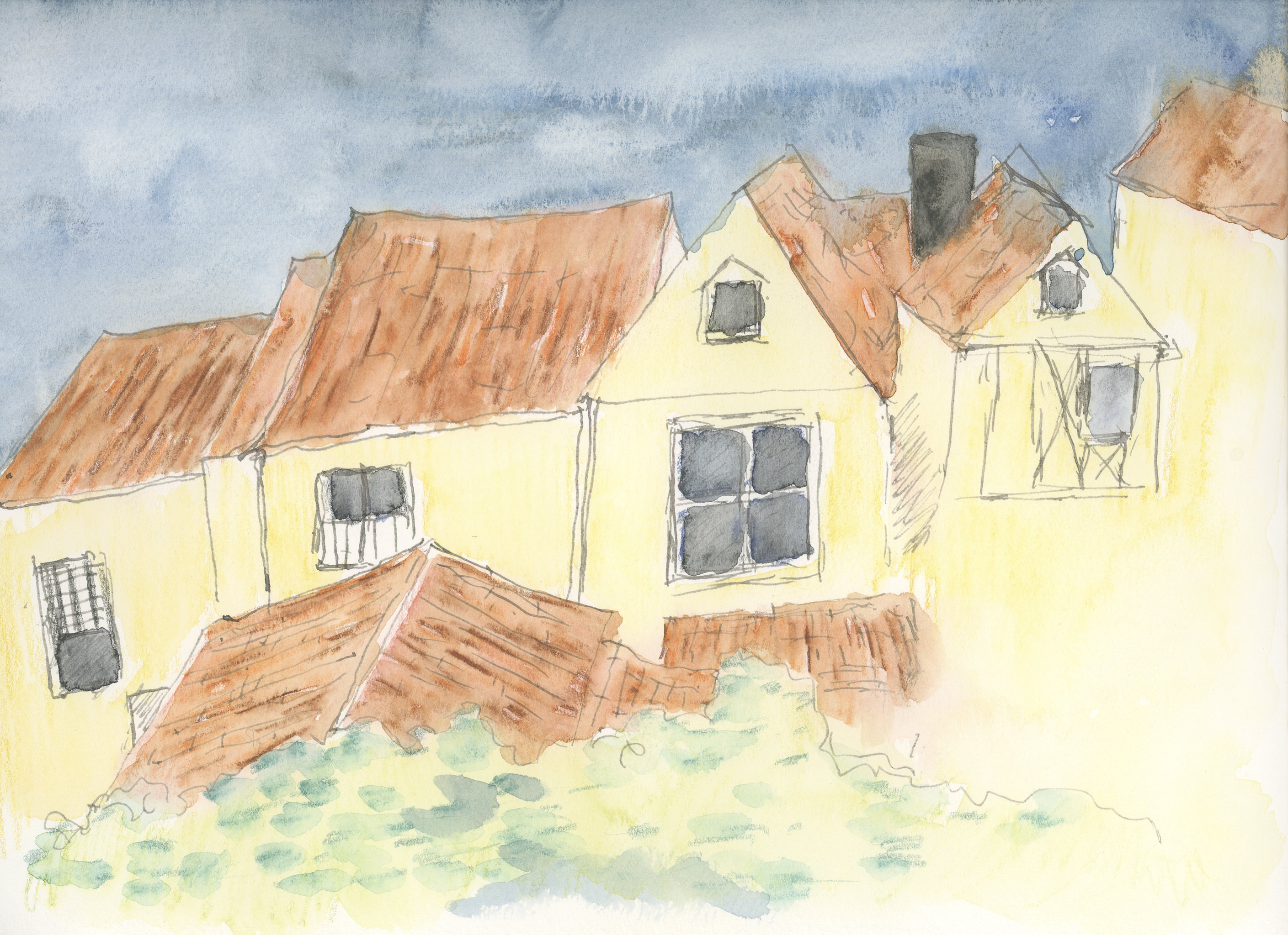
Here is yesterday’s first layer of watercolor pencil, now “watercolored”.  I tried to follow the lines of the pencil.

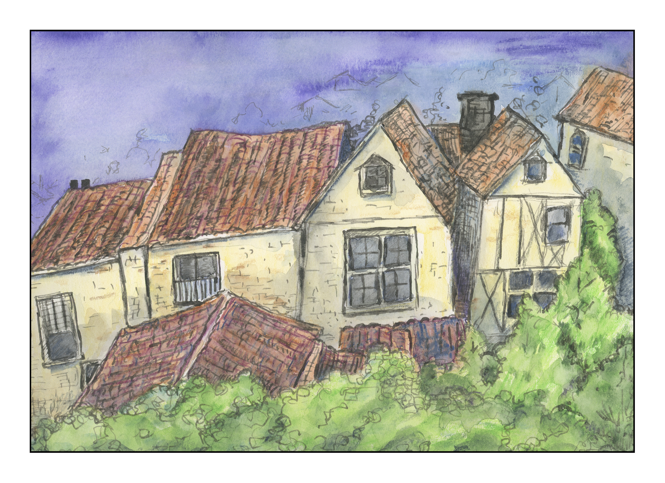
Here is the second layer of watercolor pencil, with a little bit more detail.  The sky was done with about 4 or 5 colors, layered down with a blue, some white, some grey.  The roofs are an orange and a brown and a black.

As you can see, I also colored in the windows and am trying to add texture to the tiled roofs.  Some green, too, for the foliage in front.  After this, I then added water.  Once more, I followed the lines, such in the roofs.  The space on the lower right is a bit of a problem.  I think it needs something, but have no idea at this point.  Maybe a cafe awning so we can a shot of espresso?

As I have never used watercolor pencils for any complete picture, my cunningly brilliant plan is to simply layer color, then use water.  As you can see, there is some bleeding.  Most interesting to me is the sky – in the center the little bleeds are rather interesting.  In the windows, I also did some lifting of color with a dry brush to lighten the glass, as a reflection or to enhance a shadow.  The iron gall ink is beginning to blur into the colors.

I have no idea how many layers I will end up with, but I am going to try to do glazes / layers to represent shadow and form.  No idea how successful this will be!

Watercolor Pencils

I have had a set of Faber-Castell Albrecht Durer watercolor pencils, a set of 60, lying around for several years.  As I have been focusing intensely on watercolor painting and drawing, I figured I should dig them out.  A scribble here and there is what I have done with them, but have never attempted a “serious” or complete picture with them.

They get pretty good reviews, and come in tins and boxes of varying number, as well as are available individually.  I found their pigmentation pleasant and easy to use.  Like watercolors, you need to be careful with your brush.  YouTube videos show various ways to use them.  I am inclined to think they work best with a bit of reserve or delicacy, because my own picture was anything but that.

In my picture, I did layers, followed by using various brushes of different sizes.  Iron gall ink was used for the initial sketch, and then at the end to draw more lines and such.  Below you can see the layers of pencil; in between each water was used, and then more pencil laid down.

And here is the final product.  I was surprised by the results.  I am sort of pleased, sort of not pleased.  The goal, though, was to learn about watercolor pencils.  I enjoyed the experience and know I will do it again, perhaps with a different approach.


Village Windows

Well, I don’t live in an interesting old village, but I think I could quite happily.  Suburbia just doesn’t make it when it comes to interesting lines, stones, and such.  Macadam and stucco and neatly cropped lawns are my daily world, so I always have to run off someplace else!  Not that suburbia doesn’t have its good points, like modern plumbing and electricity, but it’s not that visually exciting.

Okay, so I got our my Faber-Castell watercolor pencils.  I have a tin of 60 that I have been meaning to try on a serious level.  So, here is the first layer.  I used iron gall ink on a dip pen for the lines, and then just a quick scribble of pencils to lay down the basic colors.  Next, I will wet the pencils and let it dry.  Then, off to work. Bye!

Palm Tree

A while back I read an article that a 19th century artist  – it may be John Singer Sargent – used wax as a resist in watercolor painting.  That was a bit of a surprise as I never thought a “professional” painter would do that.  We used crayons and watercolors together in elementary school, and it was a lot of fun.  Not having any crayons, I got out a white candle and scribbled away in a palm tree sort of shape.  Then I painted, beginning with the yellows and then moving into darker colors.  I don’t recall many of the colors I used, but they do include Yellow Ochre, Hooker’s Green, May Green, Payne’s Grey, Ruby Red, Cerulean Blue, Ultramarine Blue.  The wax served to keep white spaces white, obviously.  And, I actually used negative painting ti create some of the shapes in the fronds and trunk of the tree.

Negative Painting: Pink Daisies Gone Mad

Today has been a day of frustrations.  Nothing seems to be going right.  Everyone has those days, yeah, I know, but I rather other people have them, not me!  But, they do serve a purpose in that they do make you realize … something.

That said, let’s get on to the negative painting scene.  It is not easy.  I think to create a painting like this, practice and experience play an important part.  Practice is what I keep doing.  And then I reach a point where I am just irritated beyond measure, and need to break loose.  I’ll come back to practice, but by nature, I am a gaudy color lover, and having a monochrome study makes me feel trapped.  I wonder if others feel the same way.  So, pink daisies, a la the hydrangea, and I am ready to go nuts.  Here they are  – the first round.

And then the second one from this morning . . .

Some success.  And then I did the third layer . . . and had to just mess with it as I was ready to scream.  Part of it was just frustration in that I didn’t really like this process at all.  Maybe it’s not for me.  In the end, just playing with some colors on my palette, some which I just recently got.  It was a total color mess – so lines were added.  It’s sort of cheery, but it also reminds me of what I cannot do.

The good news, no mud.  It’s kind of fun.  But I also know what I want to accomplish, and doing this stuff is not going to get me there.  The colors are fun, and good practice, but I also know that my impatience and scatterbrained-ness don’t help me, either.  Ongoing practice will improve my skills, I hope.  So, I keep playing.

A part of me wonders if / when I reach my desired “look” if I will become extremely boring to myself.