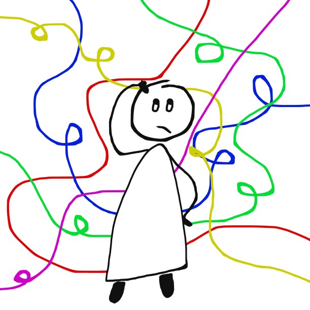
A Message from the “Officially” Fallen

It’s official:  two fractures, neither of which is especially serious.  More uncomfortable than anything, and inconvenient.  I have a splint for the middle finger, where I have a chip fracture on the joint above the knuckle.  The wrist fracture is a bigger, non-displaced chip fracture on the distal radius – the bone just below the thumb.    I have a removable splint for each, rather than a cast.  This will make bathing much easier.

I can function much better in this new and stylish black splint, even drive and draw and hold a brush.  I go back on the 24th for follow-up.  Overall, 4 to 6 week healing time.

The Fallen


Take a dog. Take a turn.  Trip over dog.  Fall forward.  Fall onto your back after hitting the sewing table with your right hand.

Probable broken middle finger on right hand and a broken right wrist, per the local urgent care, but best go see a hand specialist Monday or so, to confirm or deny.

I am right-handed.

Happy Easter!

Thursday Morning

This has been quite a week or so.  I am so glad I get the next ten days off from work, starting at 5 p.m. tonight.  I am just about done in!

You could say it began two weeks ago.  A pipe broke under the shower pan in the master bathroom.  Three days later, half the carpet in the bedroom is gone, the shower stall is destroyed, and the leak is fixed.  Now all that remains is arguing with the insurance company, choosing tile for the bathroom, ordering tile for the bathroom, ordering flooring for bathroom and back third of the house, painting the bathrooms and bedroom, and installing new vanities, possibly one or two new toilets, new mirrors, and new lighting in the bathrooms.  Maybe it will be done by the end of April.  The other half is going bonkers with all the estimates and people coming and going.  Besides that, I had a 3-day painting workshop (yay!), a nasty cold and flu, and now Josh has the cold.

So, what is going to happen during the break?  A few appointments.  Lots of art if I am lucky.  Lots of photography, too.  Choices being made for tile and paint – the flooring is already chosen – and writing big checks for all this stuff.  And researching what “contiguous” means in context of California insurance law – but that is another story!

And, of course, organizing all the bits and pieces of my life that have fallen apart over the last few weeks.  I never realized how disorganization is like a perpetual motion machine – it is entropy at its worst!

Light Industry, with Nil Rocha

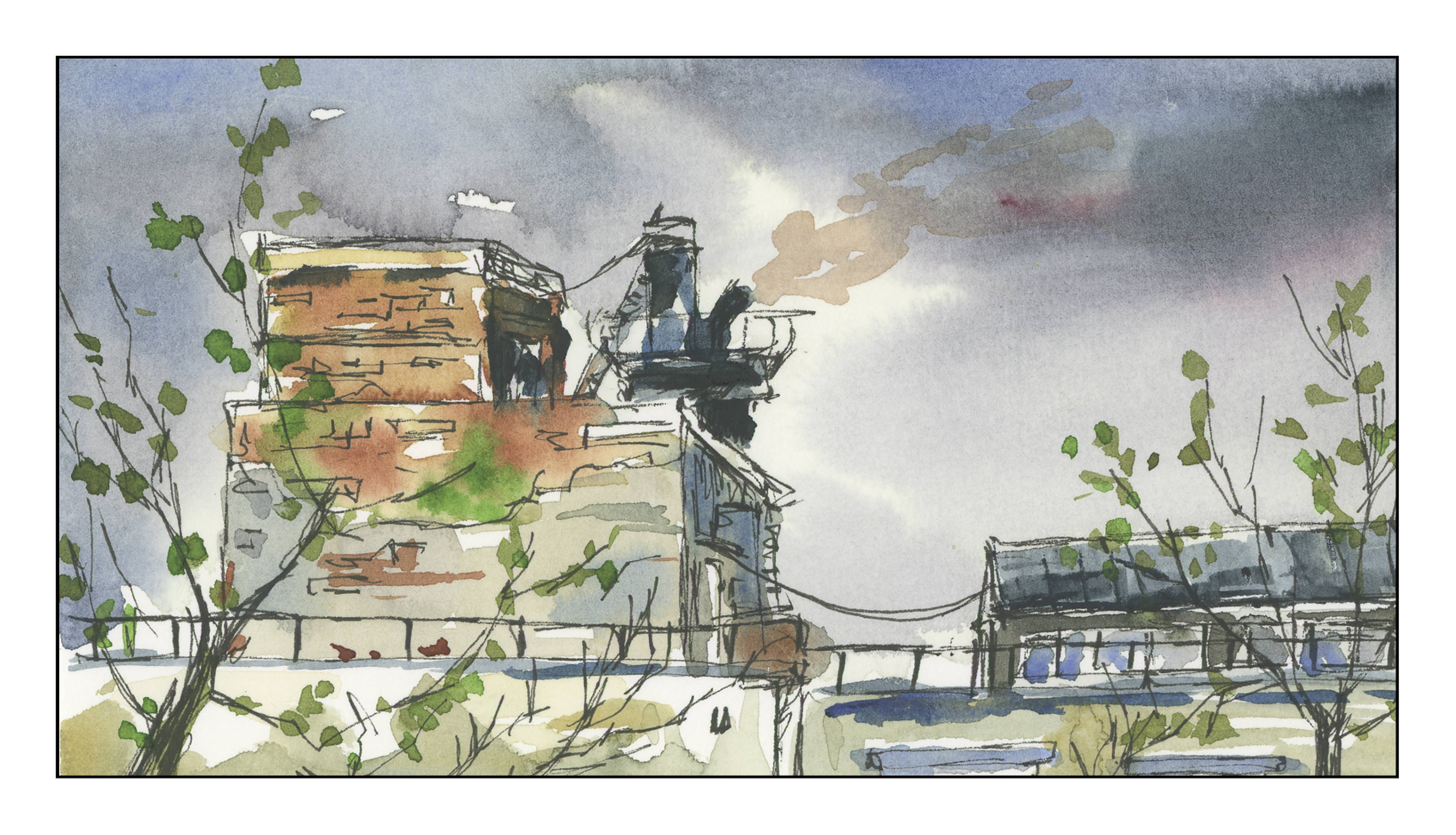
I did another study, using a video produced by Nil Rocha.  As you can see, he has a style similar to Peter Sheeler – and a lot of other urban sketchers:  ink and watercolor.  Although it looks easy, it is deceptive.  It is far more difficult to achieve a good contrast study, meaning, a good light-dark balance.  I found that out with yesterday’s study with Peter Sheeler, and especially with this one.  I think I need to work out the values before I begin inking in lines.  Blah is far too easy to achieve!

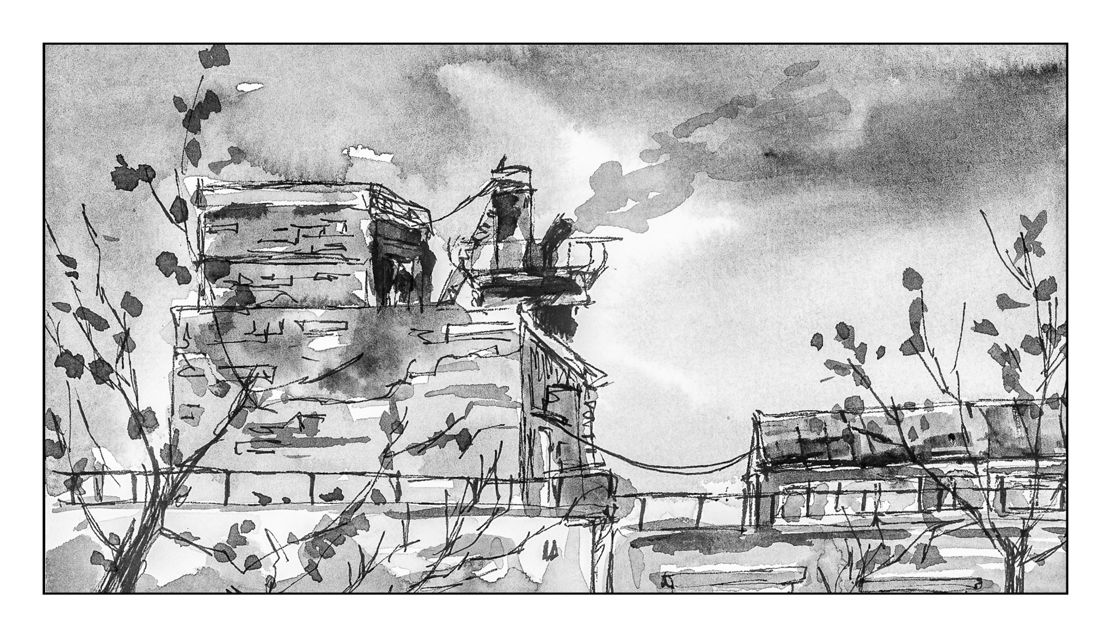
Above, in color.  Below, converted to black and white in Lightroom to check out contrast.  Sadly lacking!

I’ve had a cold for the past week and it’s really hard to get creative with sniffles and a fever!  Following videos is a good way to learn, but more importantly they have helped me realize that I must push, push, push to show good contrast.  Middle tones are easy to create, as are lighter ones, but getting the truly dark ones is far more challenging for me than seems logical.  Something to think about . . .

Palm Tree in Hawaii, with Peter Sheeler

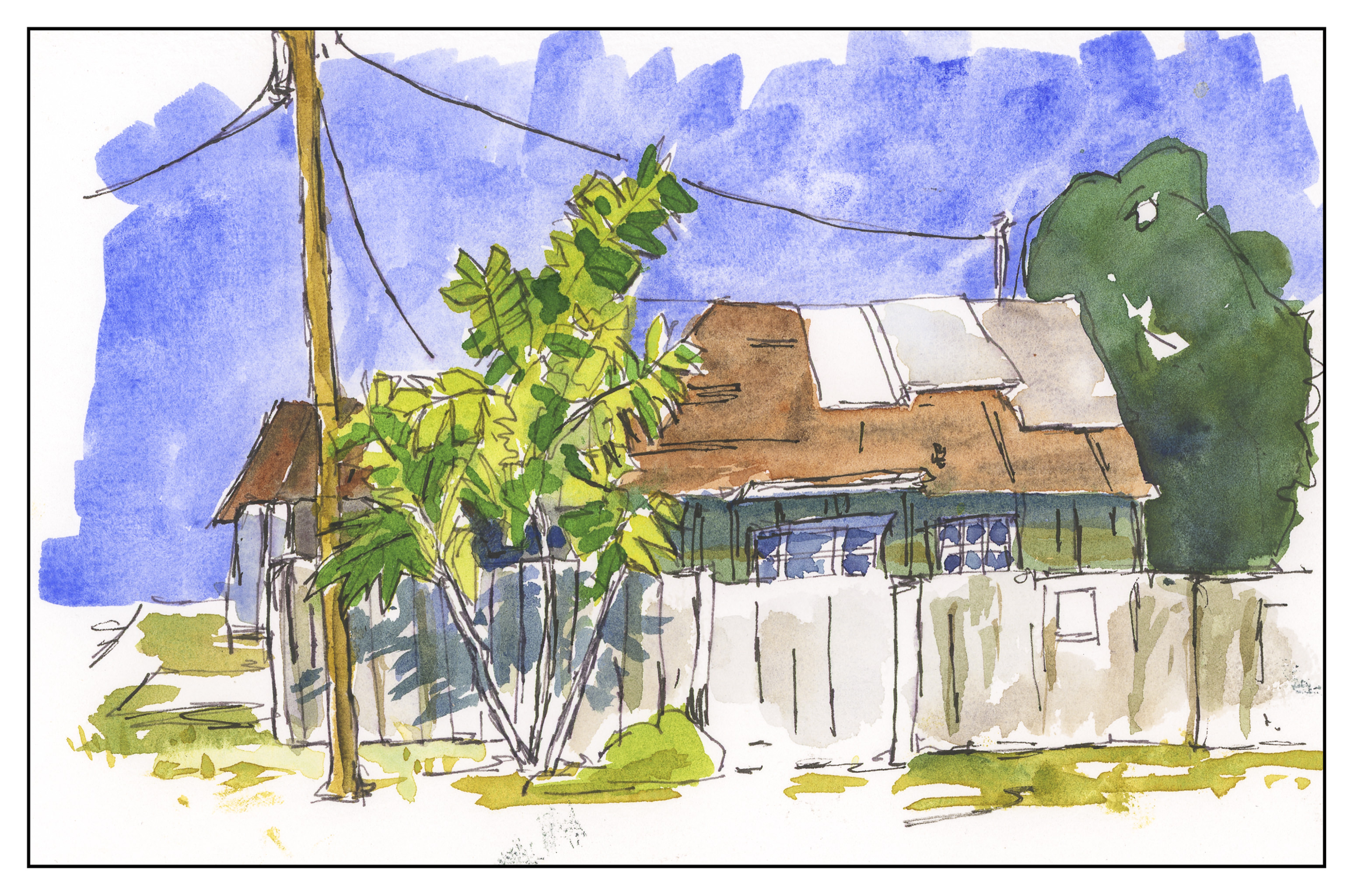
Peter Sheeler does it again – another video to learn from.  This is from Hawaii, and as Peter notes in his video, he has never in his life drawn a palm tree.  I actually think this might be a banana tree – we use them as decorations in my neighborhood.  This doesn’t matter, though; Peter’s mastery is what I wanted to learn from.  My take below.

My contrast is nowhere as attractive as Peter’s.  I am a bit more muddied.  Part of it is because I am not using either Sap or Hooker’s Green, both which I prefer to Viridian, which is part of the palette I pulled out to use.  My own preference is Hooker’s, as it is a wonderful green to add yellow or blue, for brightening or darkening.

Another comment, this is some of the Bee 6×9 paper I bought.  A bit of a sizing issue seemed to be “felt” in a couple of spots on the paper.  Still, for quick studies, I am not faulting the paper at all – I have been enjoying using it.