Cove

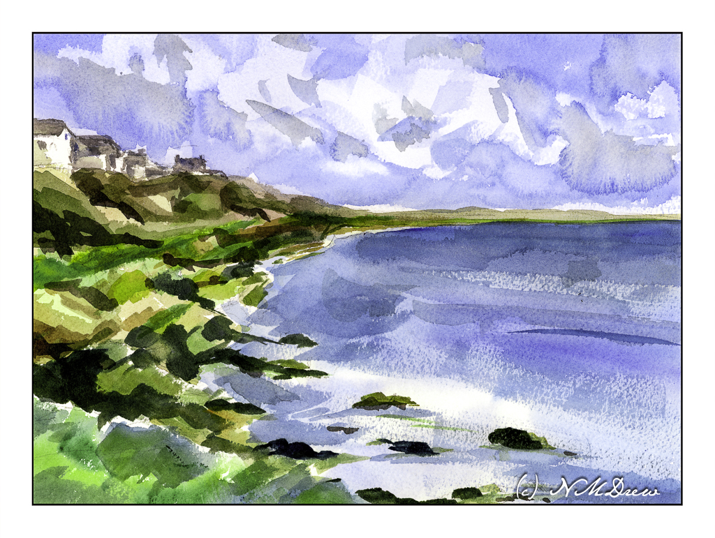
What can I say except this was one hell of a challenge! I wanted simplicity in the form of abstraction combined with atmospheric perspective. Well, the day is crisp and bright, a bit windy, and the light is harsh. Somewhere in there lays a bit of compromise.

The largest areas of the painting -sky, water – were laid in with very wet washes and allowed to dry.

The clouds were lifted out later and more blue, wet paint applied over the initial light wash. Shadows and shapes were created during this step.

The sea was a light wash with simple areas of white left behind in the foreground. Somehow the rest of it sort of happened using a large, flat brush. I find using flats really helps push the abstraction. The same can be said with the shoreline, using color to indicate plants, rocks, cliffs. The most “planned” part of the coastline were the houses and roofs. Dry brush with darker blues were applied with a wide 1″ brush to give the sea some dimension.

I had no idea how this painting would turn out. I like it for the simple fact I did achieve my desires for a simple, abstract painting which still has recognizable subject matter.

Wouldn’t it be great if we all liked everything we did? Maybe not – then we would probably never progress!

Outgoing Tide

After considering the intensity of colors of my last posted painting, I thought about trying something a bit more subtle. In landscapes that usually means fog and damp – and that can be a challenge in itself. Muted colors, subtle gradations, diffused light, soft edges – with watercolor, a lot is chance and a lot is forethought, and a lot is knowledge acquired by experience. I see each watercolor painting as an experiment and adventure and while sometimes things “just happen” or I am too impatient, a bit of thinking ahead doesn’t hurt.

Here, a pretty limited palette of indanthrene blue,ultramarine blue, yellow ochre, burnt umber, and perhaps a dab of this or that. I use carbazole violet often when I make deep darks, sometimes a bit of ivory black to neutralize a color a bit. Here, I also used a bit of liquid frisket to keep some areas of paper white, such as in the water and along the shore. Titanium white gouache also was applied intermittently for a bit of bright white.

Watercolor, 10×14, Arches Rough 140#.

Incoming Storm – Mt. Tamalpais

I do love the views and hills of Mt. Tamalpais year round! The views are amazing, the ocean not too far away, and the sky and weather always different throughout the seasons.

The sky in this painting was sort of an area to play with. Sky in watercolor is done with as soon as you lay it down. For the most part, that is!

Painting a sky is usually thought about and then laid in with a fair amount of water and color, avoiding areas for clouds, letting colors bleed, and all sorts of tricks such as blotting up color with cotton or tissue to make clouds. It’s a lot of fun! Here, I did go back in and lift some paint in the right side of the sky, re-wet it, and then laid in more color. It is okay but did not really work. Still, I did salvage it more to my liking.

Next, the foreground. I like my tree and grasses and rocks. The mid-ground with the trees is also to my liking. The land between the mid-ground and the horizon is too colorful and too bright – it should be a bit lighter and perhaps a bit more neutral.

Overall, I am fairly pleased with the results here. I tried to work as directly with color and water as possible. I used a bit of frisket in the rocks and in the foreground to maintain a bit of white.

As I said above, I try to paint with my colors very directly. This means mixing up large puddles of color and painting from that puddle, adding other colors as I move along with my wash to create variety. It requires a bit of thought as well as knowing what colors work together and so on. I mix these colors on my palette often before applying any to the paper.

Many people lay down glazes and work with layers in their watercolors, but I find that, while pretty, those methods of painting create a rather tame look. A lack of freshness is the only way I can describe it. On the other hand, my approach is quite challenging as I don’t build up colors but try to work with thick, rich colors and pray a lot. As a result, my watercolors tend to by quite gaudy, I think!!

Watercolor, Arches 140# Rough, 11×14.

Above the Lake

Lately I am not interested in pretty pictures so much as I am in simplifying or working on specific techniques in watercolor. Here, the main goals were the foreground rocks – making simple but still suggestive of a bit of an outcropping – and a sense of wind on the water and reflections of the trees. Well, the rocks turned out to my liking, the waves on the water okay, but the reflections are a total flop. More careful planning next time around!

Watercolor, Arches 140# CP, 9×12.

Into the Mists

The Great Smoky Mountains get their name from the mists that rise up from the hollows. The park was established in the 1930s and are part of Appalachia, itself which covers parts of New York south into the Carolinas, Georgia, Alabama, and more. My own family on my father’s side can trace itself back through many areas, in particular Tennessee. As a kid, my family traveled through these mountains a bit, but I have never had the opportunity to spend a lot of time exploring them.

Here, I tried to work with a limited palette as well as a wet-in-wet technique to create the sense of fog and mistiness of the distant trees. The sense of just a wetness to the landscape – lush greens, trees, mists – is another thing I wanted to convey. I think it works.

Watercolor, 9×12, Arches 140# CP paper.