Writing Tools of Yore

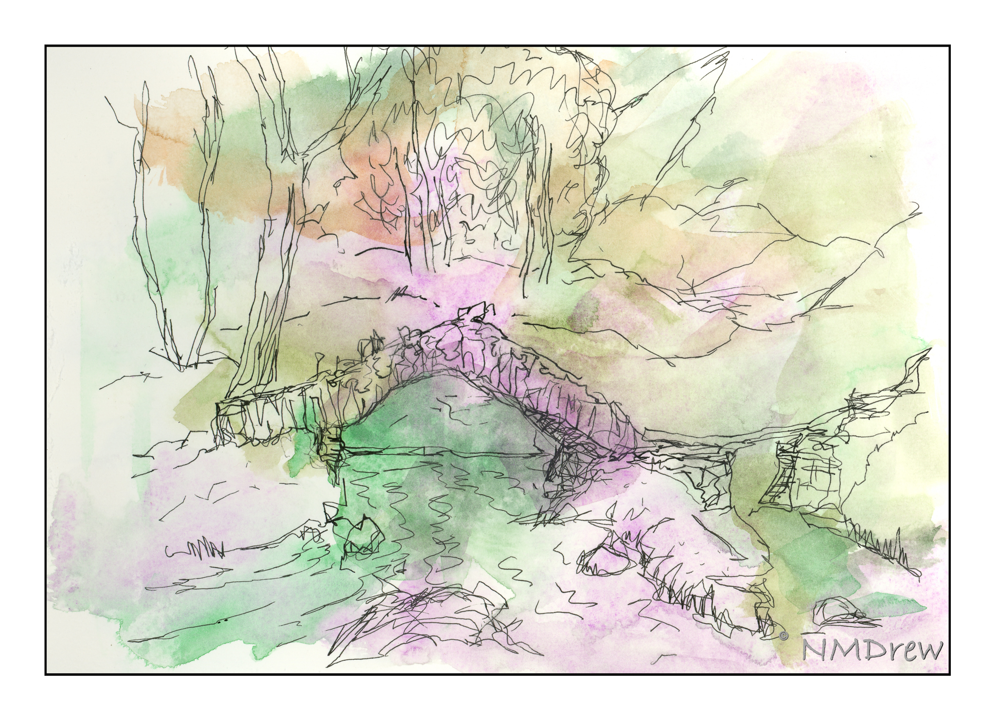
Sometimes things just drop by the wayside, and photography has been one of them. I’ve been too busy being lazy, painting, blobbing, and sewing. A few other things, too. We all get there. The photo mojo just vanished but I decided I had to get out of my rut and think about the photography side of my life. I rather wish I was up for challenges, as I think it could be a boon, but lately the idea of obligations – as a challenge could be – might be more than I want to deal with. However, I have come up with an idea to try for a few weeks . . .

Awhile back I got a Fuji Instax Square Printer, and it is a sweet little item. It connects with my phone via an app as well as the Fuji X100V. Instant prints. It works quite well. And that is my challenge – a picture or two every day for a bit. No time frame, just a daily picture.

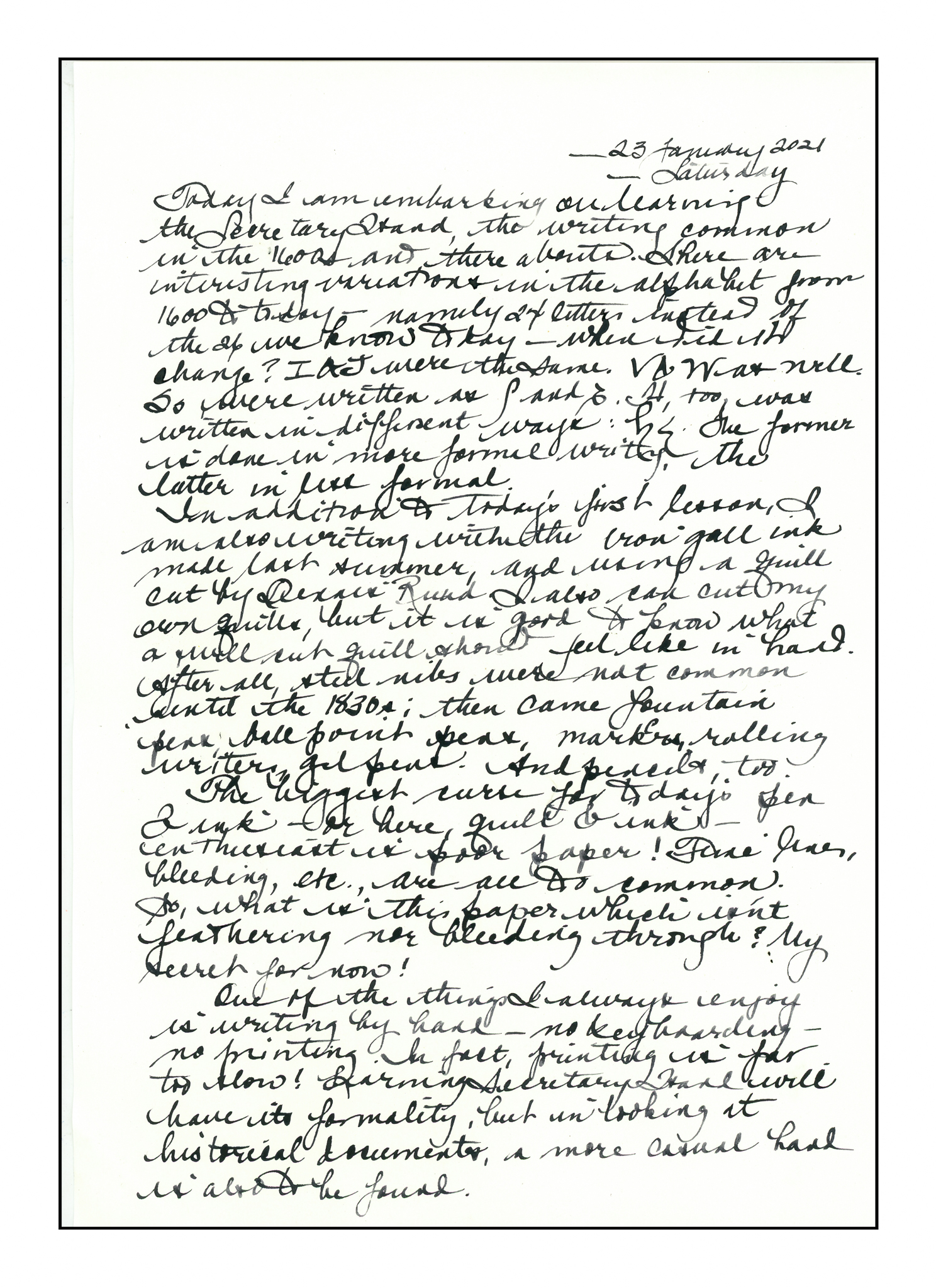
Above is my first photo for this challenge. I like old writing implements and tools. This is my inkwell, ca. 1810-1840. I am inclined to think it may be from the time quills were in use as there are 4 holes on the top.  Quills need to dry out between uses, so if you are writing a lot, a number of quills need to be available.  You switch between them to keep a good nib.  The inkwell to hold the ink is under the hinged lid, and in it I have my own homemade iron gall ink. And a quill – a realio, trulio quill – cut in the traditional manner so that it actually works. I used both to write my sister a letter, and sent her this print and a few others.

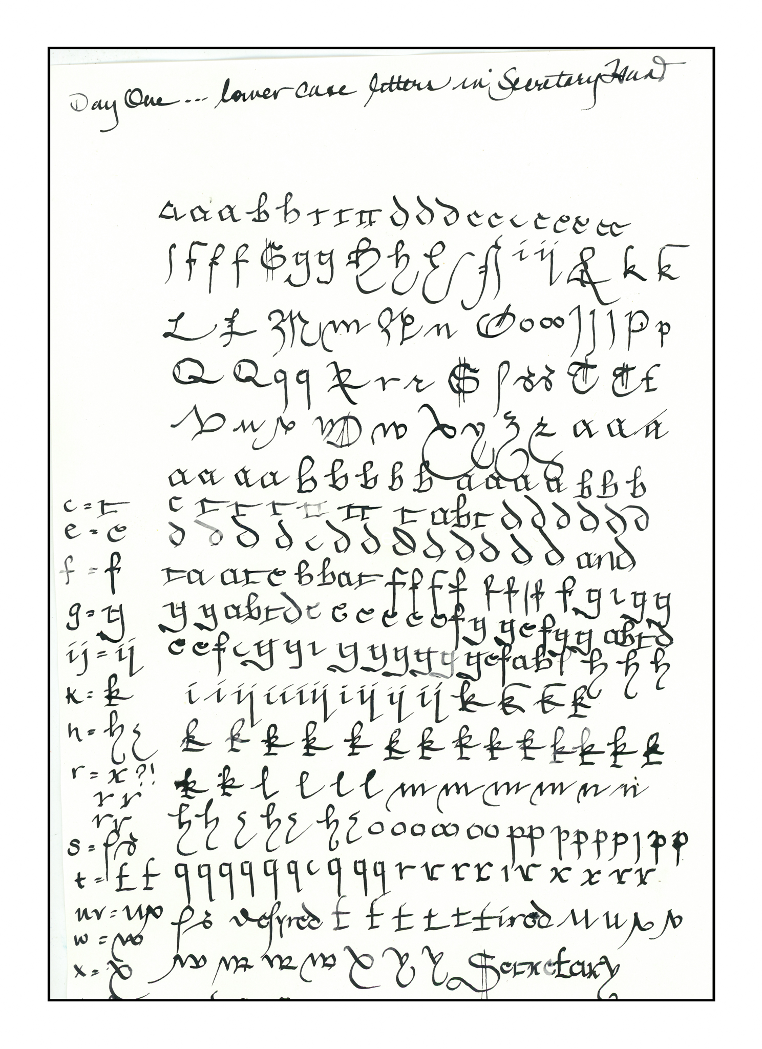
It is very satisfying to get out the pen and ink and write! My cursive is pretty good, and I have a light touch, as needed, to use a quill pen. No blobs of ink sullied my letter. My paper, too, was excellent, because there was no feathering of the ink nor bleeding through the paper. I did my research and am pleased to see it paid off – modern papers can be hell to use with wet ink. I am also learning English “Secretary Hand” from ca. 1600. It’s not at all like Italic, which I think later replaced it, but it is interesting to do as it is somewhere between Gothic and Italic. The benefit to learning it will be able to read documents &tc from the time period, as well as stay out of trouble.

More Impressions of Slater’s Bridge

I have been rather lazy today, too lazy to set up to paint. So, an old exercise came to mind: make a messy color mix on paper and draw over it with ink. I had Slater’s Bridge already chosen as the subject matter for this exercise  (partly for Ms. Fragglerocking, partly because I think it’s such a lovely bit of stonework). As a result, I plopped on colors and then drew the bridge from different angles.

This was the first one. No idea how the cobalt violet would work, but used leftover watercolor paint from my dirty palette along with fresh colors. Then I drew. I admit, I came in and added some color after I added the drawing to get a bit more definition. It sort of felt like cheating!

So, with the thought of cheating in mind, I did this one. Yes, I deliberately put manganese blue at the top, and then just added the cadmium orange and greens. However, I didn’t add any colors after finishing the ink drawing.

Daily work – daily play – daily adventures in art!

Impression of Slater’s Bridge

Bridges are something we take for granted until you have to wade across the creek, or hop stone to stone, praying you don’t fall in! Way back when, the arch bridge was discovered, and it takes its form in many ways, from giant aqueducts to small stone bridges built in lonely country.

Slater’s Bridge is found in the English Lake District. It’s shape seems to have grown out of the countryside and keeps catching my eye. I don’t think my painting is especially accurate, either; hence “impression”.

Pen in Hand

I am a firm believer that handwriting and its practice is important for a lot of reasons.  It is an excellent way to learn fine motor control.  It has been shown to improve thinking skills in children.  You do it with a pen – no need for a computer – paper, too.  Writing implements and paper run from super cheap – hey, steal that pen you use at the office! – as is paper – to crazy expensive.

Jake Weidmann’s Ted Talk is worth the watch – so many reasons presented as to why penmanship and writing are so important.  There is history, there is pleasure, there is beauty, there is – there is – there is.

And then, yesterday, for whatever reason, I came across a 7-day course on learning Secretary Hand, the hand of scriveners, scribes, clerks, and everyday people who needed to write things down 500 years ago.  I began today..I thought I would write down my thoughts about it using my homemade iron gall ink and a genuine, hand cut quill. Read it if you want some more information.  The recipe I used to make my own ink is here – and it is still fine a year later!

This is my first exercise, with notes to myself as to how various letters were made in the 1600s as opposed to in the 2000s. Back then, the alphabet consisted of 24 letters, not our 26. I and J were interchangeable, as were U and V. There are different ways to make various letters, such as the S, depending on the letter’s location within a word. H can be made in the way we recognize it today, or in a form of shorthand that lends itself to quicker, more casual cursive.

And finally, here is a sample of my alphabet in cursive. The top sample is using my homemade ink and using a dip pen nib from the 1800s along with my nib holder from the same era. The bottom sample is with the same ink but with a quill pen.

My own lessons in cursive began in third grade.  The style we learned was very typical for American school children, based on the Palmer Method of handwriting, the goal of which was a clean, functional, and easy-to-read handwriting.  I’ve changed a few of the letters around, to suit my taste, such as the capital A, M, N and Q – they are based upon the letters in the Spencerian alphabet.  Additionally, they lend themselves more readily to writing with a dip pen, fountain pen, or quill in my opinion.

Cursive is designed for speed in writing.  As someone who taught for several years, I find it appalling that kids today say, “I can’t read your handwriting,” meaning cursive.  They print.  Sometimes they are told they have to print since their cursive is abominable, and a computer and keyboard and printer are not available.

So, Secretary Hand will continue to be practiced.  It’s fun to learn something new, as well as by learning how to write it, I will actually be able to read documents from the early modern times of the 1500s-1600s!  Sounds pretty cool to me.

More to come!


By Flashlight

With winds blowing at 40mph, the fear of fires was intense. Electrical lines spark, grasses and brush catch fire, and before you know it, the world is lit, not with electricity, but with flames. As a result of this – PSPS (Public Safety Power Shut-off) – we had no electricity for about 36 hours. What do you do when the sun goes down, there is no phone, no TV, no electricity? You read, you chat, you play games by candle, and paint by flashlight.

Rather than try to be creative, I got out a couple of art instruction books, one by Geoff Kersey, and one by Ted Kautzky. All of these paintings were done with limited palettes and by following some instruction to create a painting from the book.

The one above is from Geoff Kersey’s book, using only red, blue, and yellow. No more. It was the first one I did, and there was still some daylight, but very little, in my darkish studio. It was evening, and the studio window faces east. I used manganese blue, cadmium lemon, and cadmium red.

This one is from a Ted Kautzky study. Less light and more moving my little flashlight from book, to watercolor paper and drawing, to palette. Colors were verditer blue, cadmium red, Hooker’s green, and raw sienna. Verditer blue doesn’t seem to mix well with other colors, but is a lovely blue by itself. Four colors!

Now we are moving into big time! Here, five colors. Payne’s grey, ultramarine blue, aureolin yellow, Hooker’s Green, and burnt umber. Another study from Ted Kautzky.

I enjoy doing studies from books – it helps focus a bit. I also realized that daylight is a better way to paint, or using diffused electrical lighting. Flashlights are good to see with, but their light is not diffuse, but sharp and focused. I think I would have had better lighting with a few candles. Anyway, it was a good way to pass some time when the sun set and the vampires weren’t yet out.