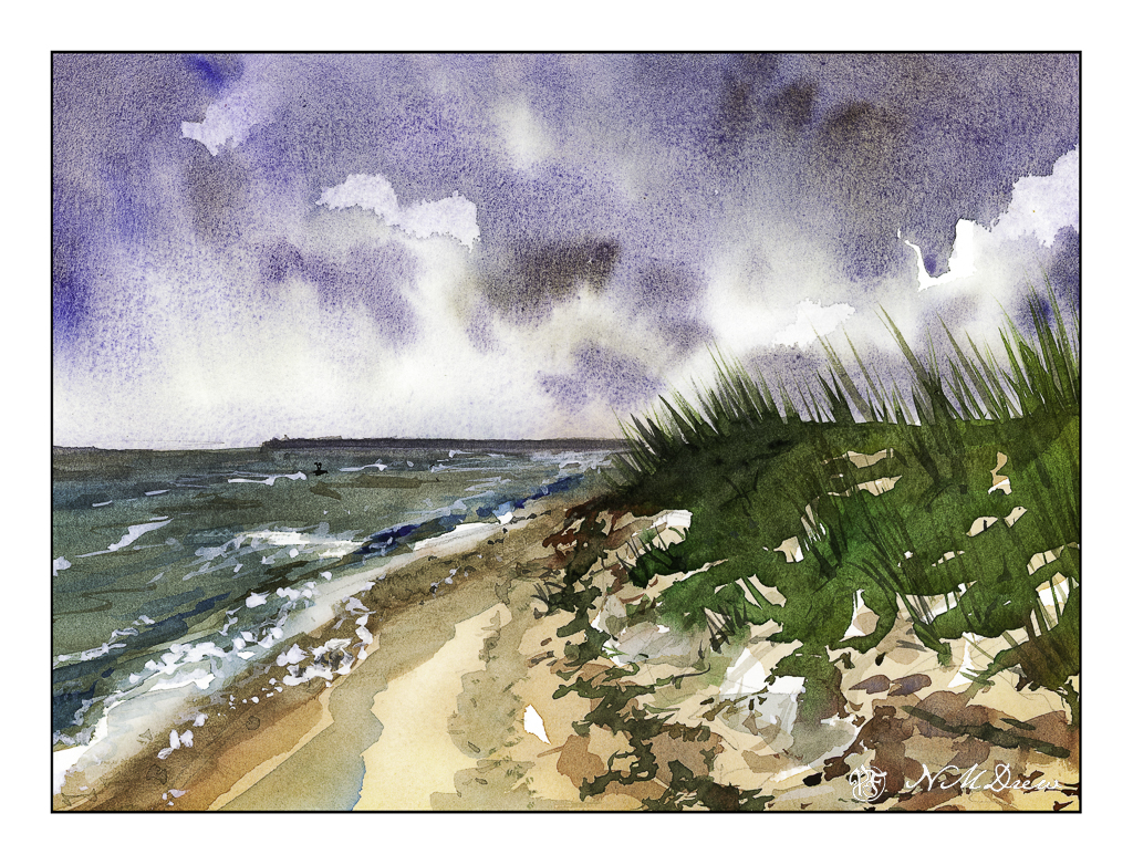
Beaches differ so much, but one thing they have in common – the ocean! The shore between land and ocean can vary, from rough and rocky, to wide and sandy and flat, and everything and anything else.
Once more, the simplicity of Seago’s watercolors was in mind, but my own rather picky or detail-oriented tendencies made simplification really hard to achieve. Along this shoreline is seaweed and other detritus, differing levels of shoreline, dunes and grasses. In the distance is an opposite shore – island or land arm of a bay? I had to force myself to stop!
And there is a giant bird shape in the middle of the sky . . . funny how you don’t see these things – at least I don’t – until I scan the painting and look at it days later. Maybe I’ll fix it, maybe I’ll leave it.
Again, a limited palette of ultramarine, Hooker’s, ochre and sienna. I also used a bit of phthalo blue, an as a touch-up, white gouache. Hahnemuhle 9×12 140# CP paper.
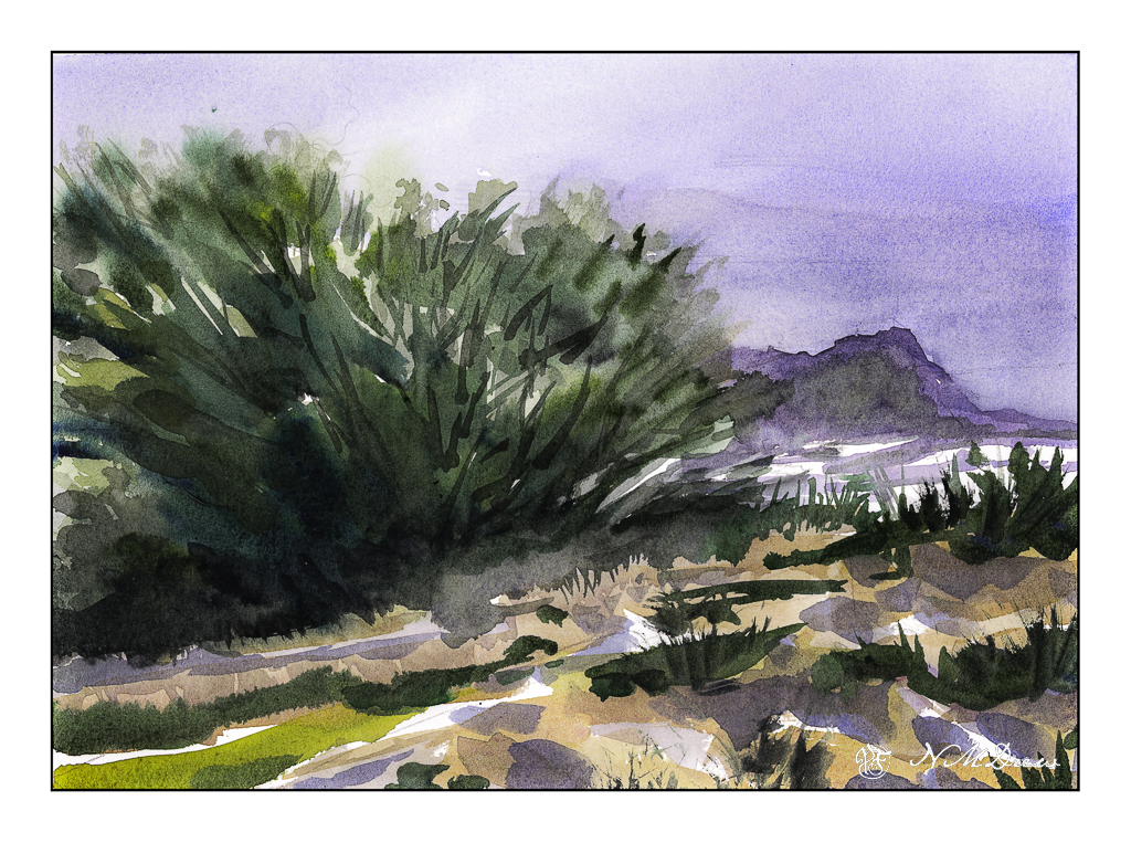
Up north along the Pacific are many beaches with dramatic cliffs, sandy beaches, fog, and it is always exciting to drive along the coastal route – usually Highway 1 – to enjoy the scenery. Sometimes you need to wander a bit off the beaten path to find a bit of paradise, but exploration is always fun!
I don’t remember what colors I used specifically, but I do recall ultramarine and cobalt blues, burnt sienna, yellow ochre, cadmium yellow, Hooker’s green, and possibly a bit of alizarin. The scene is a bit soft because the coastal fog, prevalent along the California coast, is in the distance. The air is moist. And, it is chilly! Mark Twain supposedly said the coldest winter he ever spent was a summer in San Francisco. You know what I mean if you have experienced it!
We all have our own styles and methods of painting, and in some ways I like the way I paint, in other ways I dislike it a lot. Here, I focused on simplification but in some areas did a bit more working of a subject than I should have, such as on the right distant cliffs, ocean, and sky. The estuary below the headland is simple enough – at least I realized that and didn’t do anything more to it. My bush is also okay, but perhaps it could have been simpler – or the foreground, too – but when something is close to the viewer, details do become important. Each leaf and blade of grass, though, would be excessive.
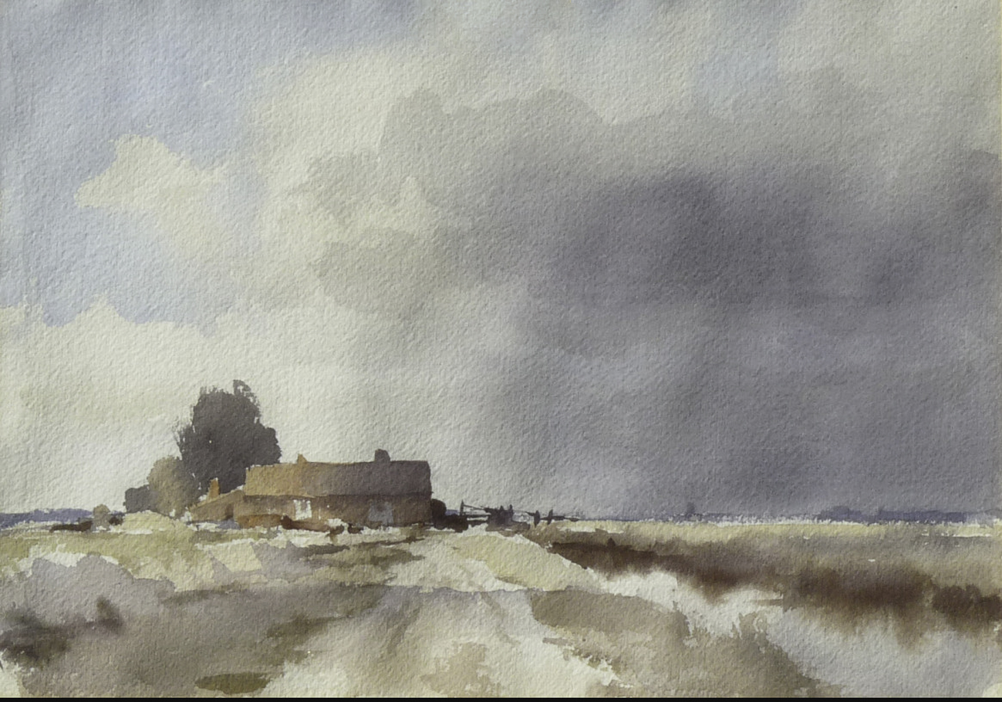
Quite a few years ago I read a really great spy novel that took place during WW2 in Norfolk, England, and this just happens to be the place Edward Seago lived most of his life. Looking at a lot of his paintings, I get the feeling that sky is quite amazing and huge over relatively flat countryside. I’ve never been there but a bit of research shows it is largely rural and has about the same population as my own county here in California.
Once more, a study from a watercolor Seago did. I think, as with the one yesterday, the paints have faded a bit and so I tried to replicate them to a degree, but also chose to make them a bit more intense, as perhaps they were when he originally painted the farm.
The use of wet washes works really well here. In the building, the light from left to right on the roof and building show excellent control – the gradation from light to dark is subtle. This take a bit of work – getting the paper and paint at the right stage of moisture to make this work. My own attempts were quite awkward and it shows. The sky to the right of the building has what appears to be very gentle streaks of rain coming down – maybe it is just warped watercolor paper – but I thought I might as well give it a shot! What I find especially wonderful is the foreground – a cloud shadow drifting across the scene.
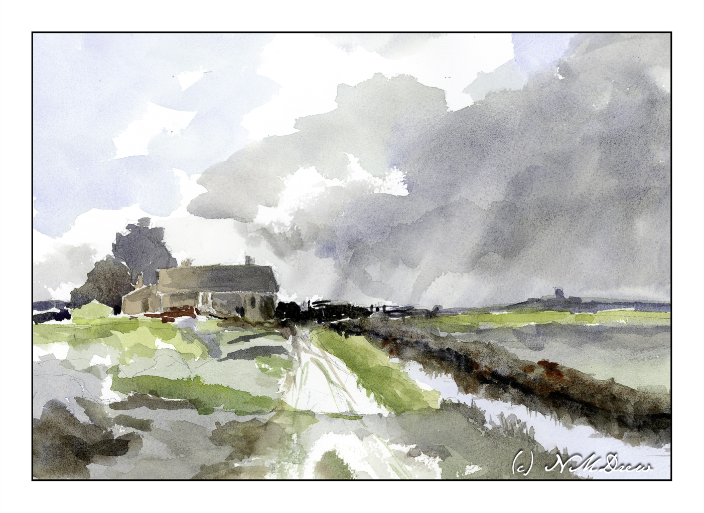
In many ways I am pleased with my master copy of Seago’s “Norfolk Farm”. I managed to maintain a bit of subtlety in color. I also tried to match the values of light and dark and mine is a bit stronger than the reference image. As well, my steeple or whatever to the right of the farm house is a bit too big and a bit too dark. The simplicity of Seago’s painting was challenging to replicate but I think I managed.
The colors I chose are ones I know to be available in the time period in which Seago painted this watercolor. I used cobalt blue and ultramarine blue for the sky and water reflection. Burnt umber and burnt sienna are my browns. Yellow ochre and cadmium yellow helped make greens, but I do use Hooker’s green a lot as a stepping stone for green, and my preferred on is made by Winsor Newton. Additionally, the info I have on Seago’s painting indicates it is about 10×14 inches, so I used rough 140# Arches paper in the same size.
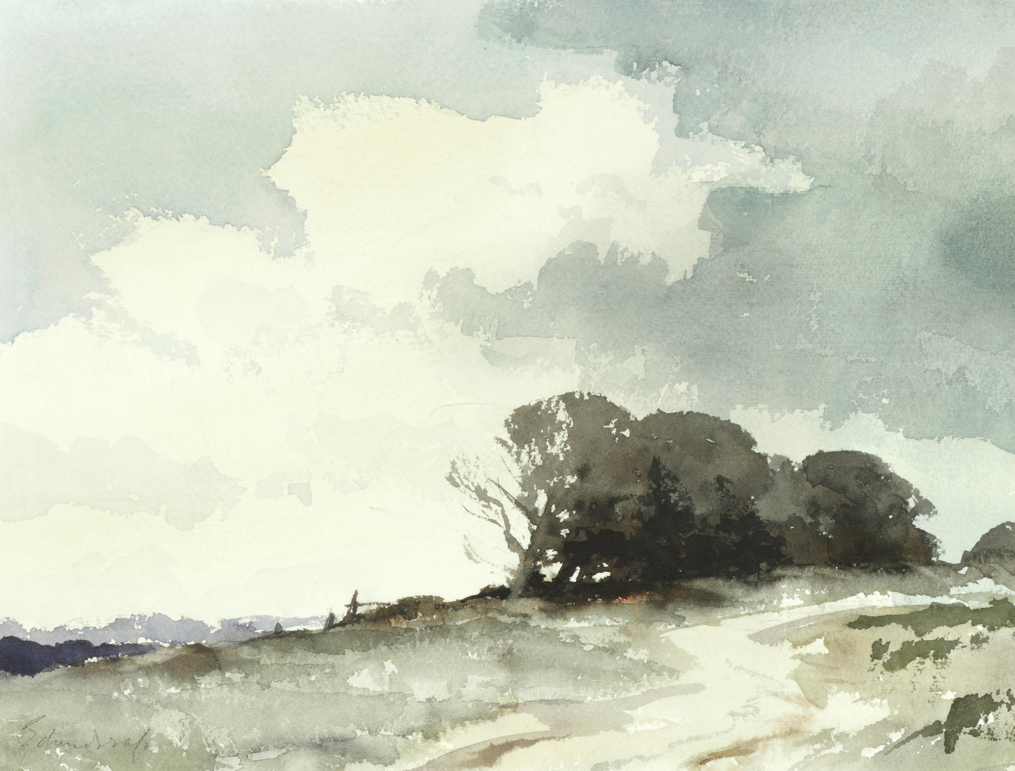
As I mentioned the other day, I have been thinking about the bold washes as done by the British artist Edward Seago. He grew to adulthood in rather interesting historical times and while living contributed to society as well as the art world in many different capacities. As a watercolorist, he creates complex scenes with a broad swaths of paint. While not a great reproduction, at least in my opinion, here is Seago’s watercolor “The Hill Copse”.
This is a very monochromatic painting, but I expect the original was more rich in color than is shown. During Seago’s time, many colors used fugitive pigments, meaning they fade with time. Today’s watercolor manufacturers still produce colors which can fade, but many employ chemistry that is labeled as “permanent” and so do not use the original pigment formulae.
Two good examples of fugitive colors are rose madder genuine (made by Winsor Newton) and alizarin crimson. The rose madder genuine is still available, but it is important to know it can fade to a dullish brown. Many old colors are like this, and while lovely, makes one pause to consider when painting. I have this paint, and it is one of the prettiest pinks – and have dyed yarn and fabric with rose madder that I have grown – but fading is also part of its characteristics.
But I digress. I chose this painting because of the elegant simplicity of the washes to capture complex shapes. The sky is dramatic, the sandy track uphill to the copse, the sense of distance to the left – evident to the eye, and painted with amazing simplicity – suggestions of reality rather than a more complicated syntactically correct visual statement (hahahaha).
I interpreted the colors I thought would work here for my own “master copy” and chose ultramarine blue, cobalt blue, burnt sienna, burnt umber, yellow ochre, cadmium yellow, and Hooker’s green.
Obviously, there are differences in Seago’s painting and my own, but I do think I managed the overall simplicity of the washes and colors. As with all watercolors, white paper is left for brightness and interest, and wet-into-wet was done along with wet-onto-dry. To keep things simple and think about the shapes prior to plopping down color was foremost in my mind, but at the same time I considered the original painting an pondered the techniques used by Seago while painting.
This is quite the challenge for someone like me! But, fun was had, and I think I will continue to both reproduce some of Seago’s work as well as reconsider how I paint new subject matter.
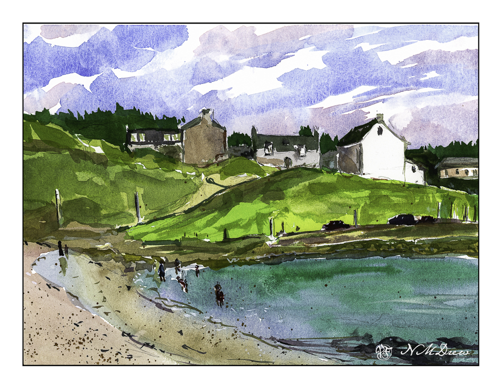
Lately I have been looking at pictures of Scotland. Bright white houses with few windows seem to be a norm here, and in watercolor they provide a brilliant spot that lets the watercolorist leave the paper untouched. This skill is actually important in watercolors as bright white paper needs to be worked around. There are tricks to retaining white paper, such as using a resist of some kind, but to master the skill of retaining white paper without anything but practice is both frustrating and rewarding.
I would say it is pretty obvious which house is white paper, but if you look carefully, you will see the building on the right has some white paper remaining untouched as do some of the windows to the left of the white building. The sky, too, has untouched areas of white for clouds. The large masses of colors also have bits of white here and there. This breaks up things and makes it more interesting to look at. I left white around the bathers, too, but some of them ended up getting soaked – not by the sea but by me and my watercolor brush!
After I did this painting I started thinking about English watercolors. In the 20th century, two famous painters, Edward Wesson and Edward Seago, are well known for their broad areas of color that create detail by shape and form more than a painstaking approach. This works especially well, I think, for landscape, but for urban scenes, it is more difficult. Nonetheless, the lone bright house in the landscape makes for a lovely study. I plan more of these in the not-too-distant future.