Remember the Monty Python skit of a man in a pet shop complaining about the parrot he just bought? I saw it again, and that led to this, and other drawings of our feathered friends.

Here is the rest of the motley crew!

")
")


Remember the Monty Python skit of a man in a pet shop complaining about the parrot he just bought? I saw it again, and that led to this, and other drawings of our feathered friends.
Here is the rest of the motley crew!
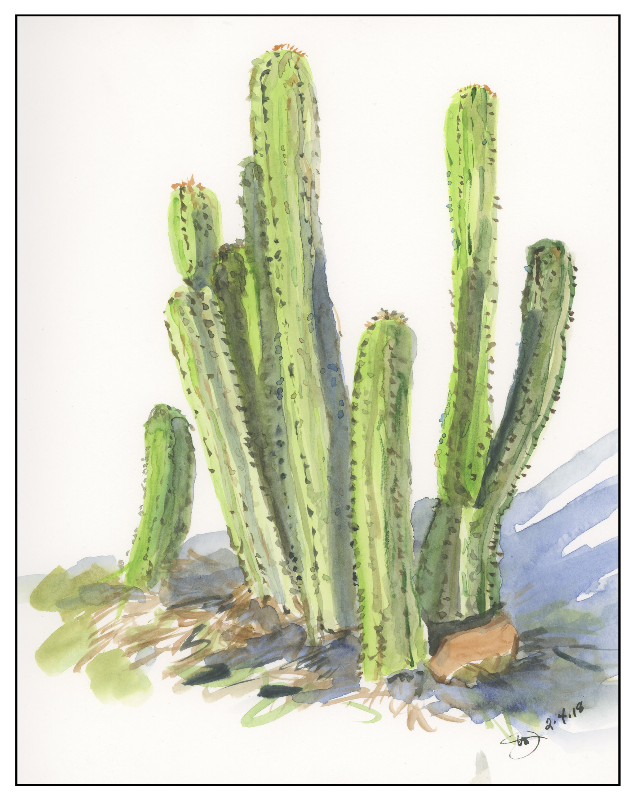
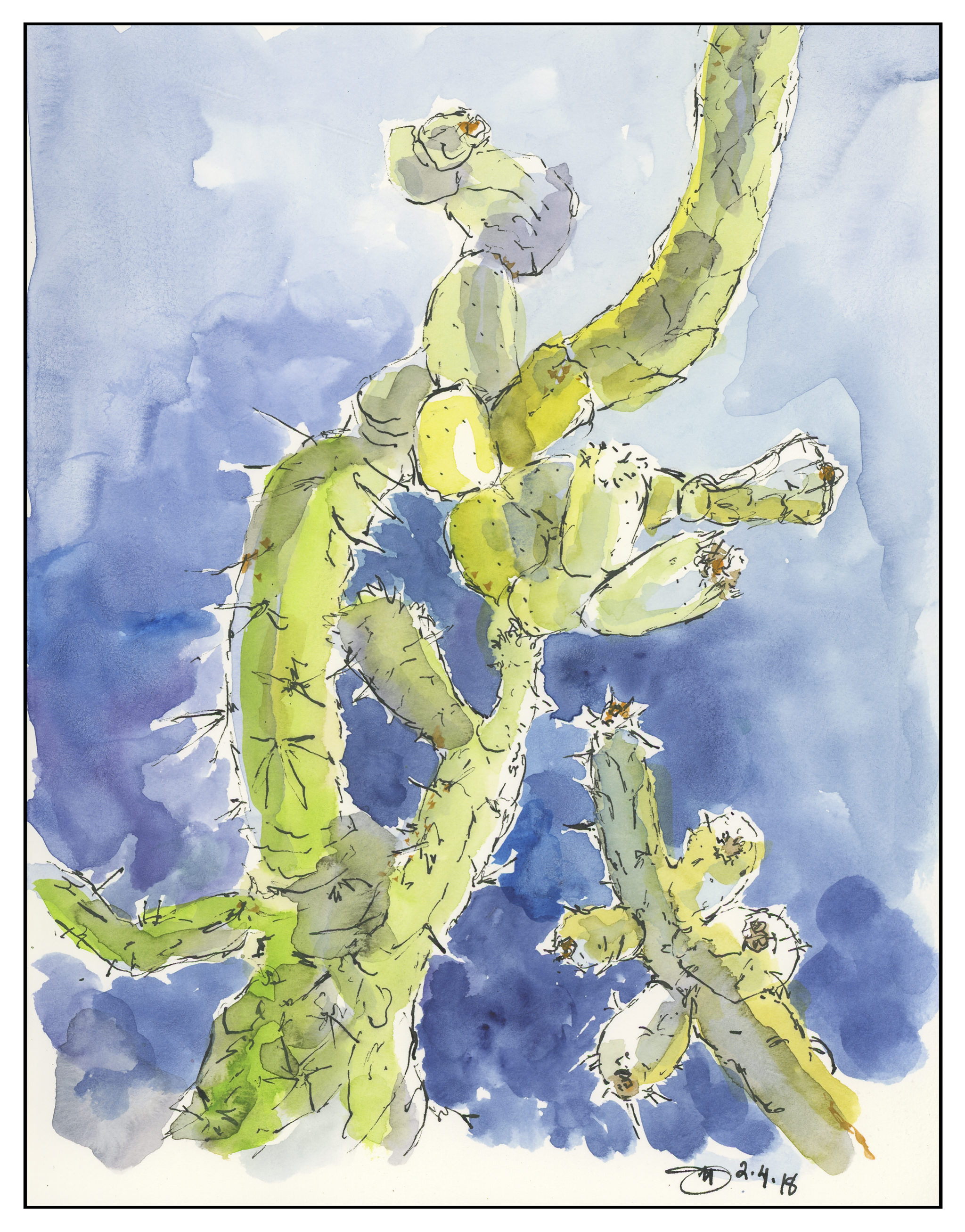
Yesterday I went up to the local botanical garden with a friend. We sat on the ground until the ants got too much, and then we moved to the picnic table. Despite the ants, the cacti were well behaved and let us paint their portraits! And lookie! No mud, no lines, and some lines!
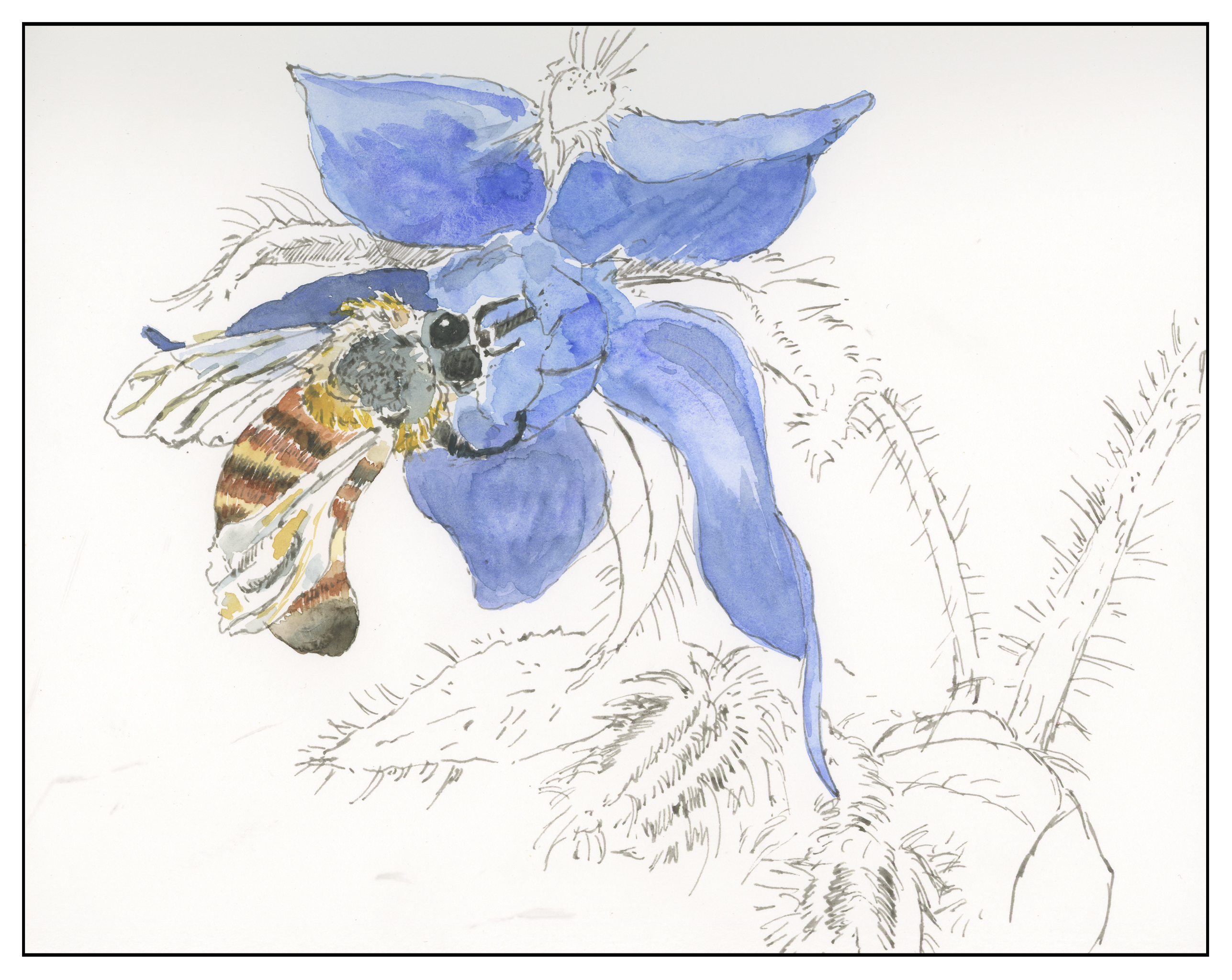
I am not done with this painting yet. I think I want to do something with the bee . . . but I’ll wait a bit to see what I think. I find scanning my work really brings a fresh eye to it – easier to critique when on the monitor than when it’s on the table.
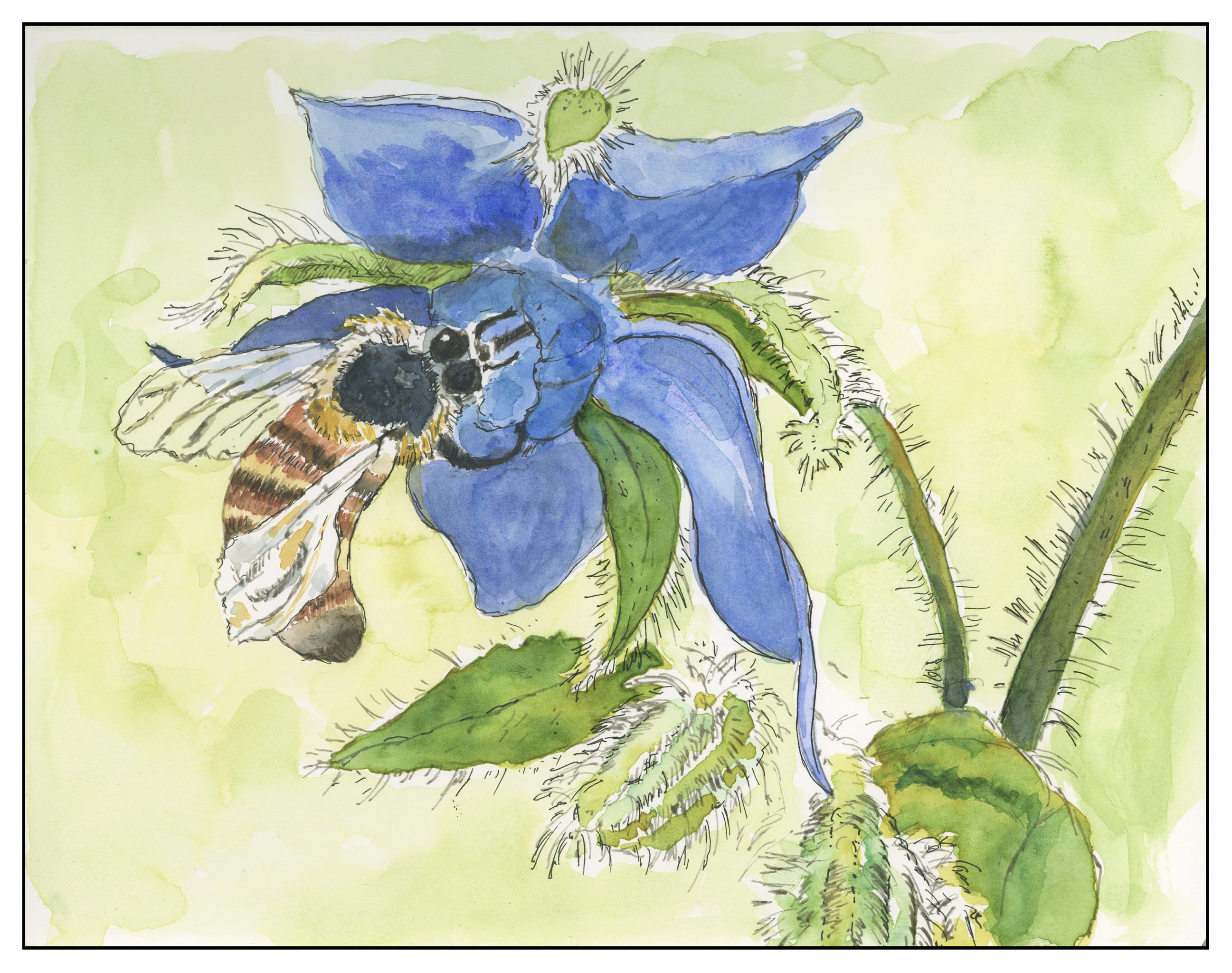
I did this first layer of colors in the gloom of the evening, after work. I was tired but had played out some of the painting earlier in the day in between whatever I was doing. I used a small brush and deliberately tried – and will continue to try – a delicate approach. Both the bee and the borage have a lot of fine hairs which I want to express and preserve. Looking at the scan shows a need for contrast in the center of the flower, along with on the bee’s back, behind the eyes. In these areas, I will be working on glazes to create better contrast, and I hope a better sense of depth. As it stands now, the whole painting is rather flat and nondimensional to my eye.
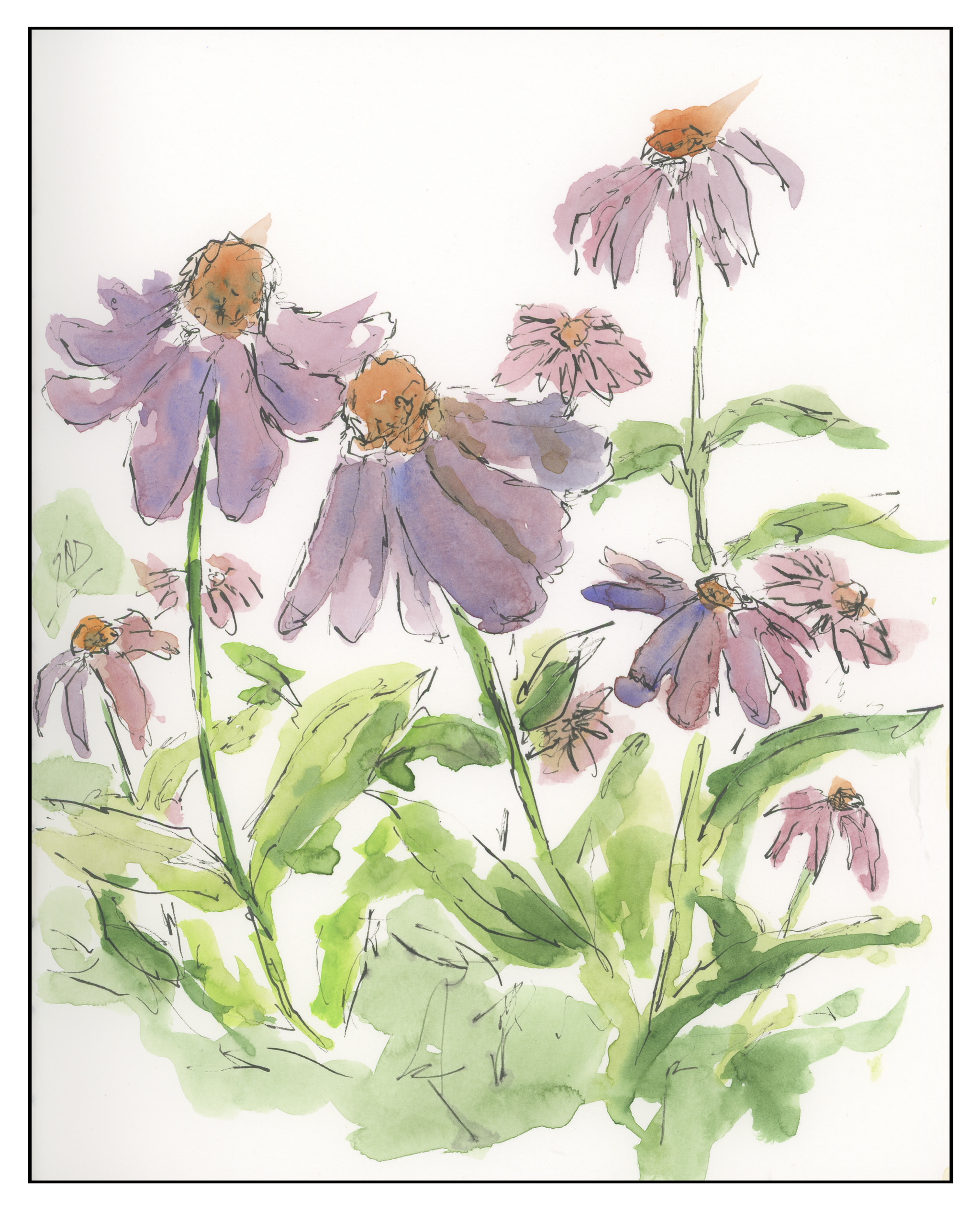
After doing the work and pre-work for the Mesa, Sunrise painting, I was feeling pretty burnt out. It was an intense experience as I needed to exercise restraint. So, a loose drawing of echinacea did the trick of clearing my brain.