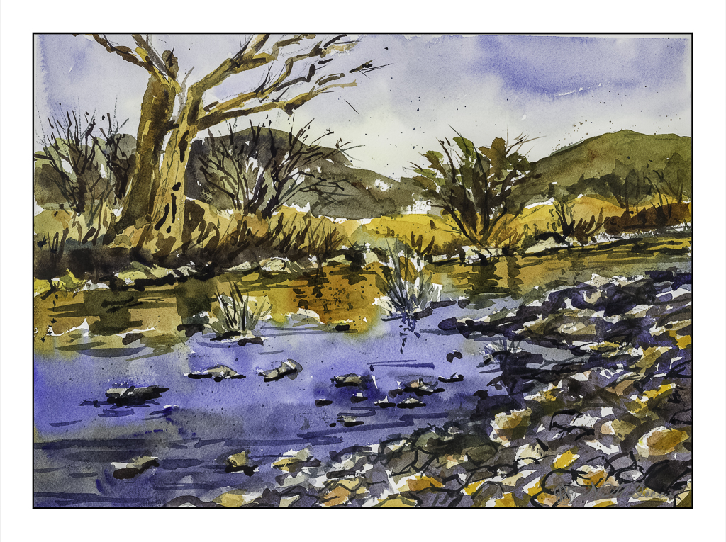
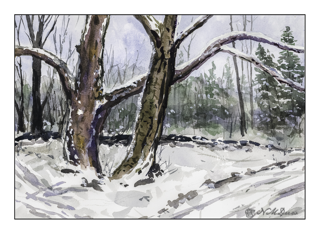
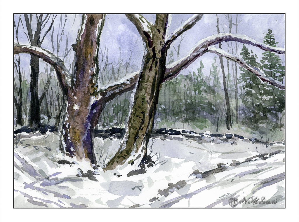
Today I thought I would be a bit self-disciplined and work with only two colors to create a winter landscape. I used MaimeriBlu’s “Faience Blue” and somebody’s artist quality Burnt Umber. Add to that, as needed, some white gouache.
I have never used MaimeriBlu paints, much less Faience Blue. This blue seems a bit of a cold one, which is perfect for a winter day. The Burnt Umber, mixed with the blue, produces a nice dark as well as plays into the coldness I am trying to express.
The first part of the painting was done with the sky – start at the top and work down. This is pure color, diluted, to create a sky. First the paper in the area of the sky was wet, and then the blue brushed in. Before the paper dried I lifted out the color.
Next I painted the distant hills and background area, solid in color, but varying the intensity of the colors and mixes of brown and blue. I painted through where the trees in the mid-ground would be as I knew the tree branches would be a bit darker once painted. Next came the trees in the foreground right and shrubs and grasses on the left as well as under the trees. All dried with the hair dryer. The middles areas were done after these dried.
Finally, the snow was tinted with blue in varying strength, bits of grasses, and final details. The snow on the trees was done with white gouache, as in the front left shrubs. Once the gouache dried, a mix of blue and brown was glazed over it to tone it down. Finally, a light wash was put into give a sense of dimension to the snow.
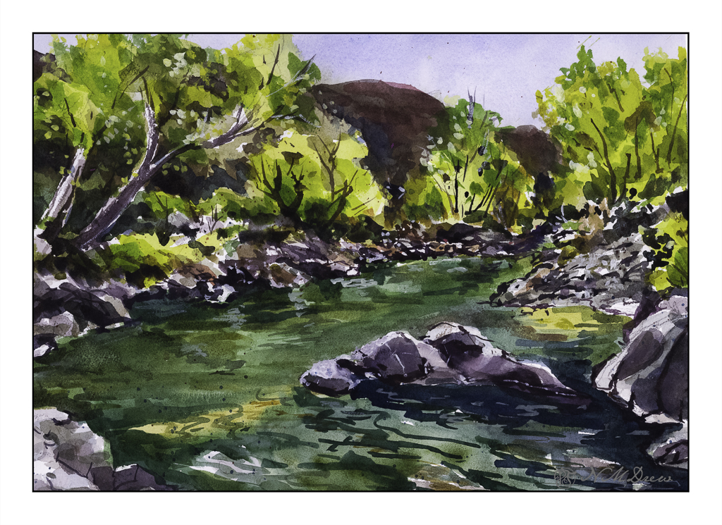
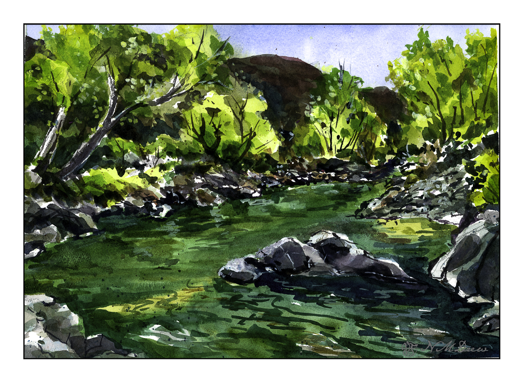
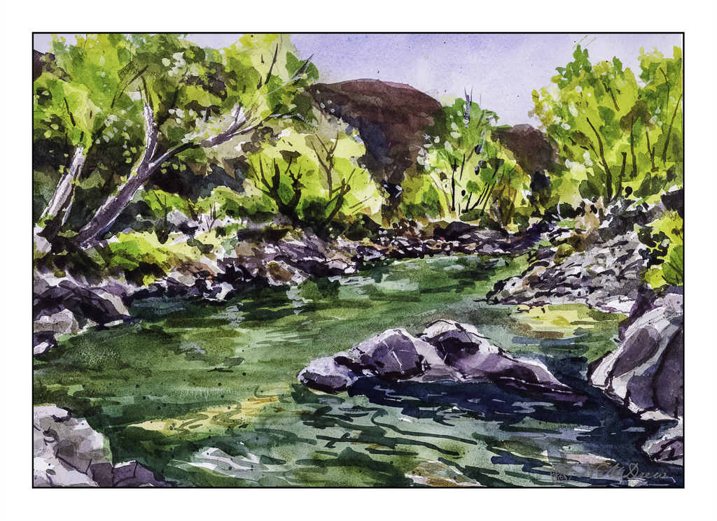
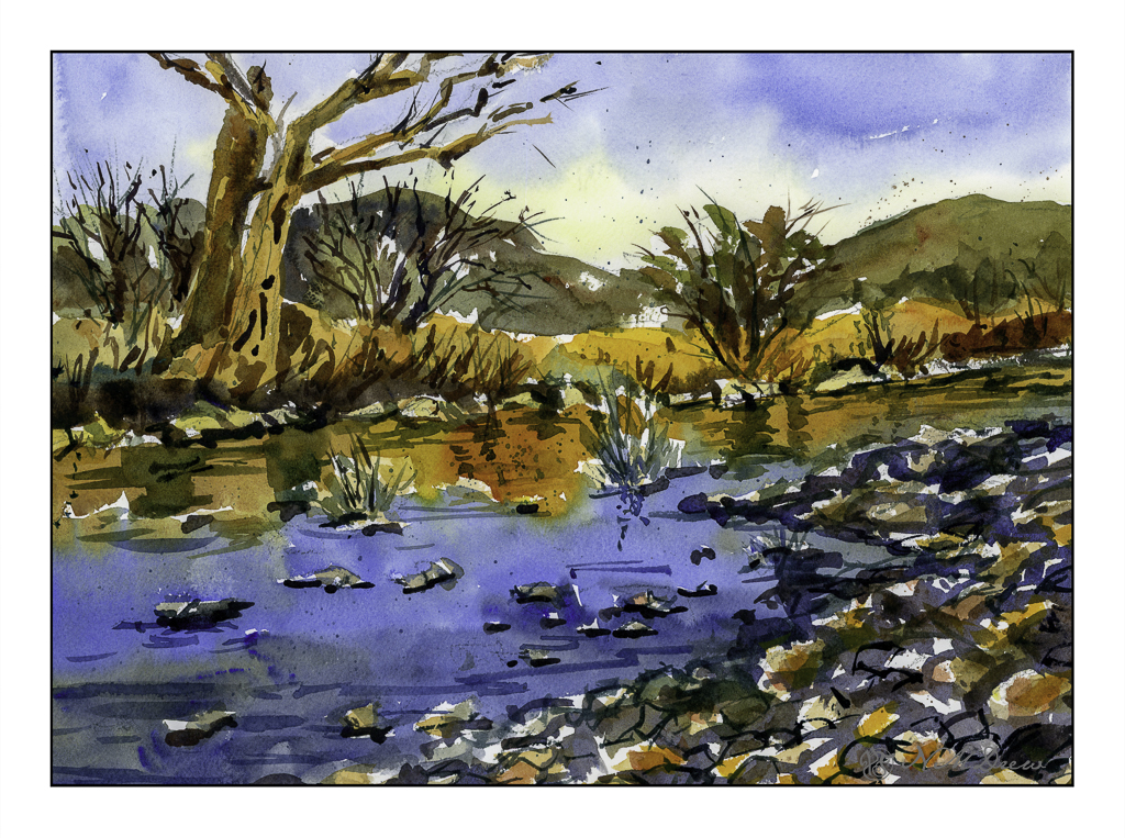
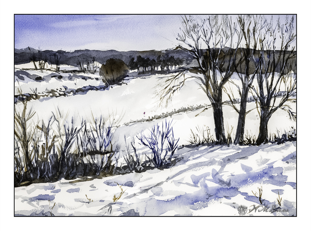
In the end, I am rather pleased with this painting. Using triads made me recall some other watercolor exercises I have done with limited palettes of color. The cold is much to my liking as is the complexity of the foreground giving way to simpler forms in the distance.
Arches 140# CP paper, MaimeriBlu “Faience Blue” and Burnt Umber. 10×14 inches.