WWM 2019: Days 27-31

What a wonderful, fun-filled month World Watercolor Month 2019 has been!  It’s been work, learning, improvement, crazy, fun, creative.  I think it has been a worthwhile endeavor altogether.  Those prompts were provocative and simple at the same time – literal, figurative.

Let’s begin!

27:  Fruits

Both of these are in gouache.  I painted the figs first and then the grapes and apricots.  I worked hard on trying to create a sense of depth with the second painting in particular – looking for light and dark, shadow and colors.

28:  Metallic

Metallic items, reflective surfaces – in others words, shiny things – can be very challenging to paint.  In many ways, the mind rebels.  It’s shiny!  I can’t paint that!  But, in reality, metallic and shiny objects are simply shades of colors, sometimes similar, sometimes varied.  Once you think about it like that, it becomes much easier.  I chose an old enameled metal kettle, a spoon, and a key.  Each one has different colors, with the spoon simply being varying shades of the same color, Payne’s Grey.  The kettle was difficult because of its shape (it’s rather mangled) and the key because of the varying shades of brown, golds, reds, and oranges of the brass.

29:  Glorious Greens

Pretty amateur, I think, but it was fun to do.  I saw a photo of a single tree silhouetted against a stormy sky, and the greens of the field were electric.  Colors under a stormy sky always seem more intense (while it’s not raining), and greens especially so.

30:  Wild Things

As we were finishing up patching, painting, and refurnishing the studio, I was in a foul mood. Crabby to be specific. Guess what motivated this subject?!

31: Favorite Colors

I had thought of making color swatches of all my gouache paints, but once more, life got in the way. Some thought and I chose magenta, turquoise, and green. Bougainvillea is the perfect subject for all these colors.

Some Thoughts

As I said, #worldwatercolormonth2019 has been a wonderful experience.  I learned something each day, even if I couldn’t tell you what.  Improvements are visible in color handling and brushwork in both watercolor and gouache.  Daily painting is work – and love!  It’s a challenge and play.  Today (8/1) I haven’t done a bit of painting, but like everything, we need to walk away from something to get a new perspective, to refresh, to let the subsconcious work its magic.

WWM 2019: Days 20-26

#WorldWatercolorMonth2019 is flying by!  It has been a lot of fun, in the doing, pondering interpreting the prompts, and in the progress made from just daily painting.  I have some really awful paintings, and some of which I am rather proud.  So, with no further ado, the prompts and the paintings!

WWM #20:  Buildings

Here, some old buildings in Paris at sunset.  I am rather pleased about this watercolor for a few reasons.  Perspective works, with decreasing detail, lines, and atmosphere.  The sky is pretty killer, too!

WWM #21:  Patterns

I was pondering this one – I thought of all sorts of patterny things, but in reality, nothing grabbed me.  As my studio – particularly the sewing area – is in total disarray, sewing patterns suddenly seemed perfectly obvious.

WWM #22:  Rain Forest

I always imagine a rain forest as the French primitive painter Henri Rousseau showed it. The above is a rather poor homage to his great imaginings.

Here, from some photos and memories of our trip to the Hoh Rain Forest in Washington State. Paths wander beneath ancient cedar trees covered with moss, a green canopy, and little if any sky visible.

WWM #23:  Beach Fun

Pales, buckets, and surfing at sunset – all great fun at the beach!

WWM #24:  Treats

Cookies!  I really love cookies (but like pie better, I admit), and for elegance and color and delightful flavor, macarons!  Here, lemon, mocha, pistachio, orange, and raspberry.

WWM #25:  Shades of Pink

I have to say, I like these raspberry macarons a lot!

WWM #26:  Natural Wonders

The White Sands National Monument in New Mexico is an amazing place – white sand dunes in the middle of a desert, scant plant life, dramatic skies and mountains all around.  It was also incredibly difficult to paint the whiteness of the sand . . . nothing particular awesome about my paintings.

On the other hand, the Arches National Monument has some amazing things to offer – arches being one.  The sandstone, eroded by wind and rain, has left some amazing geological remnants behind.  This watercolor really pleased me . . . again, perspective and distance issues, as well as my usual problems with conveying depth.  To do so, I simplified the background hills with a few lines of color.  I put more detail into the middle ground, which was the arch and the red sandstone behind the arch, and in front of it.  Plants on the lower corners and border became the foreground.  To aid more in the depth, I did a light blue-grey glaze over the mountains, and applied a warmer glaze a couple of times in different areas of the arch and sandstone.

To be continued!

WWM 2019: Days 13-19

During Days 13 – 19 of #WorldWatercolorMonth2019, I got really busy!  So with no further ado, paintings.

13.  Glassy

I wanted to catch the reflections of the clouds in the smooth water of the lake.  Not sure if it worked – the photo showed perfect sky-clouds in the foreground.

14.  Furry Things

When I was a kid, furry caterpillars were our friends.  Cats, too.  Furry enough for all.

This kitten is from a YouTube study / practice by Maria Raczynska that I followed. It was a lot of fun!

15.  Monochromatic

In the heat of summer, it seemed a monochromatic scene had to be a cold winter’s day in the mountains.

16.  Relaxing

I thought a lot about this prompt.  Many things came to mind that I enjoy, but I realized that the beach, in all forms of weather, is one of my favorite places to relax.  Not being especially good at blending sand colors, I referred to a book by Geoff Kersey called Watercolour Seascapes.  His book is a series of studies that demonstrate specific watercolor techniques and employ a limited palette.  The first painting is from the study I did from his book and the rest are varied places.  The last painting is one I did from a photo I took several years ago of a beach here on the Central Coast of California, either Refugio or El Capitan beach.  Smooth sand and sunny days or a rocky shore and a cold, rainy day – both great ways to relax along the seaside.

17.  Music

Balalaika and Blue Tit.

18.  Clouds

California is an endless blue sky at times.  Other times, the high clouds of the rainy season and the sun are blocked by low-lying coastal fog.  When the two compete, the sky is endlessly changing and fascinating.

19.  Splashes of Color

As we move through #WorldWatercolorMonth2019, I am alternating watercolor with gouache.  Both need different techniques.  Gouache, being opaque, opens a new world as layers of paint can be built up and one color can be covered by another whether it is light or dark.  Mistakes can be hidden!  Watercolor requires more forethought and has more happy – and unhappy! – accidents.  Here, the opacity of gouache allows for splashes of color and a more impasto and impressionistic use of paint.

World Watercolor Month 2019 is proving to be very rewarding.  I am focused on painting, which is one of my retirement goals.  Learning and developing my skills and knowledge of water media is expanding, and though I produce a lot of dreck, I see improvement in many ways.  To me, the biggest one is that I am beginning to anticipate my approaches to varied areas of a painting, thinking ahead as to how I can accomplish what I want to see.  That’s good news.  I know what I want to produce – that is, the kind of paintings I like, and which I think are expressive of my thoughts – and while I am a long way from it, I can also see myself moving forward to accomplishing my “artistic vision” as it were.

A Few Paintings

No joking when I said my “new job” was watercolor painting and drawing!  I’ve been getting daily life stuff done, but somewhen in between, I manage an hour or two a day with paper, pen, and paint.  It’s paying off (that’s what jobs are supposed to do, right?) I think.  Still a lot of goofs, but some progress, too.  Mud is now something I decide to paint more often than not.  Below is a gallery of the work I’ve done in the past few weeks – not all of it, just some of it.  Click on one picture to begin scrolling through them.

I have been using two different types of paper for the watercolors. One that is inexpensive, 100% cotton is Bee Paper, in 6×9 inch format. The other is Fabriano, in block format. 11×15 inch Artistico; this is a higher quality 100% cotton that is still affordable. Both papers are really good for heavier washes. The Artistico has more tooth than the Bee paper, but the smoother surface of the Bee really lends itself well to ink-and-watercolor drawings.

So many plans with impending retirement, and I am finding I certainly will not be able to do everything I want to do – just not enough time! I used to give myself 30 minutes to paint – now I can give myself whatever time I want. Thus, first loves take over other loves, but the sewing and the photography and knitting and, and, and will get in there. Time will be dedicated!

So, on this rainy Saturday morning, the studio will get cleaned up again, and the fun continue.

Wet Work

I read too many spy novels!

So, if this isn’t about the darker sides of life, what is this about?  It is about watercolor painting.  As you may recall, I have been trying to work on my drawing and painting, between other life activities.  While I try to do one or the other daily, it doesn’t happen.  The thing that is happening is a beginning of focusing on various elements of watercolor.  Rather than just paint, I began to focus on retaining white space.  White space in watercolor is the paper itself – that is the only way to get a “true” white when painting, unless you put in white paint, such as a white gouache.  Many people frown on this.  So, retaining white means you paint around white areas, which have to be considered as you lay down color, or using a rubber-based frisket.  The frisket is great as you can paint right across it once it dries.  Both methods have their advantages and disadvantages.

In addition to retaining white space, I have added another focus in my painting.  Watercolor paper is painted on when wet or dry.  Painting wet-on-dry means applying paint to a dry paper.  Wet-in-wet means prewetting the paper, or painting onto paper where a wash is still wet.  Wet-in-dry allows for hard edges.  Wet-in-wet allows the paint to blur and blend, and how much it does this is dependent on the wetness of the paper and the slope of the easel.

The above picture was from a photo I took at the Monterrey Bay Aquarium of jellyfish floating around in their water.  The aquarium is backlit, and the light shines through the diaphanous membranes of the fish.  This was simply ink, followed through with a bit of color.  Drawing the jellyfish was fun – and in the lines of the tentacles, it almost became a dance with the jellyfish.

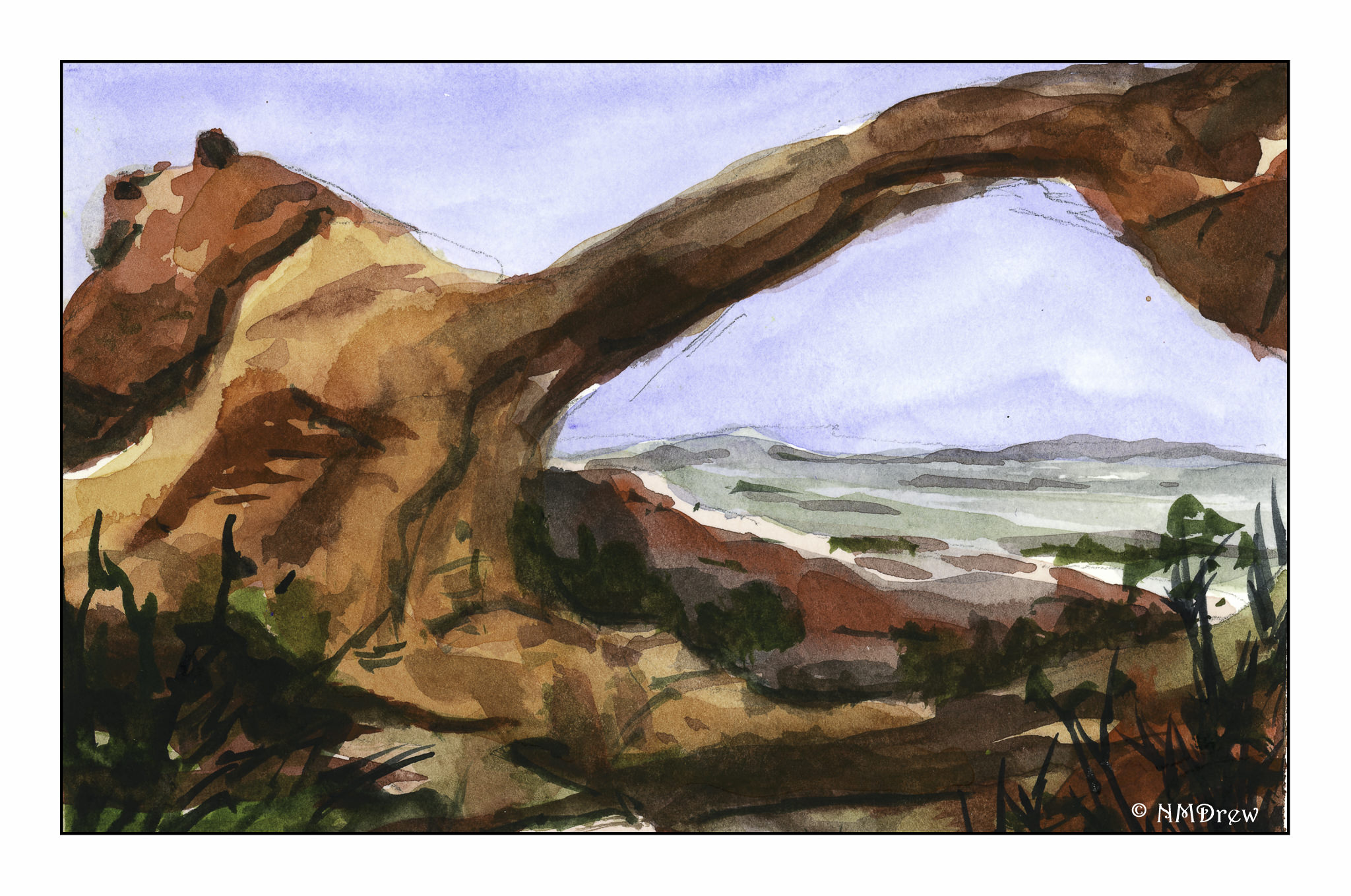
The jellyfish were drawn with a very fine point pen.  The Joshua Tree was done with a thick, permanent ink pen, about 0.5 in diameter (I think).  Here, the ink was used to create texture, with watercolor being secondary.

This is the point at which watercolor, ink, and white space became a focal point. I think these are a variant of snowbells, and they are found in the shade beneath trees. In such dim light, the white flowers are strikingly in contrast to the mulchy undergrowth, and in photos often are rather flat in appearance. This drawing demonstrates that flatness, but with the whiteness of the flowers preserved.

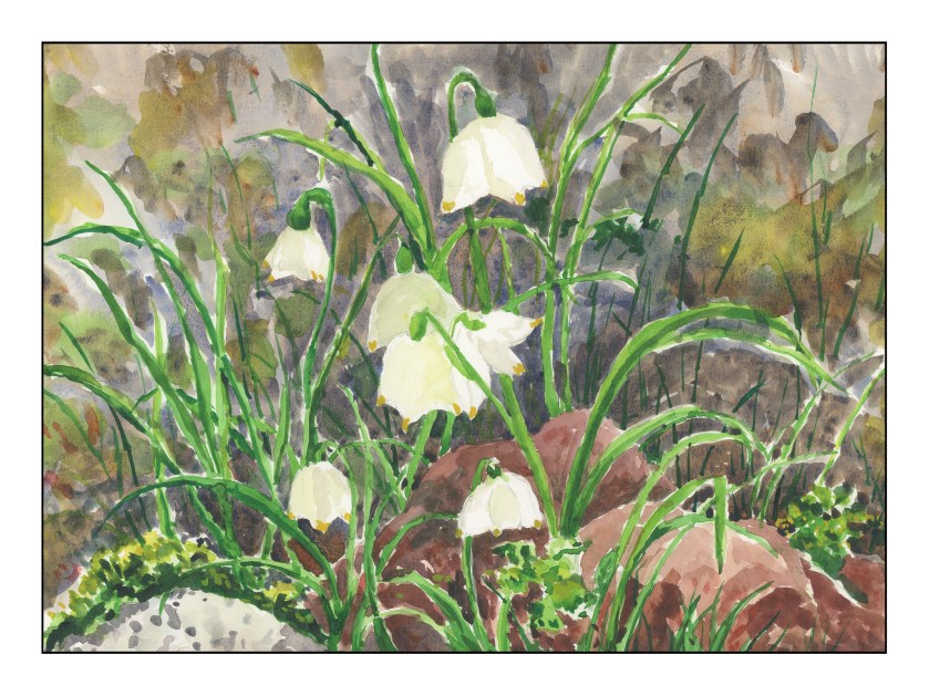
From the flatness of the line and watercolor drawing, I now worked on creating white in a dark painting. The flowers themselves look very flat because the paint I used to create – try to create – a 3D effect just pooled. The white is now filled with flat paint, which creates a flat picture. Here, the paint was applied wet onto dry paper, and the result is a bunch of hard edges. It is this realization that made me move into working a lot with wet-in-wet.

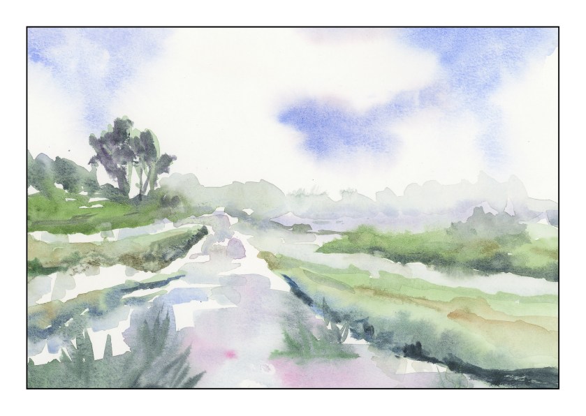
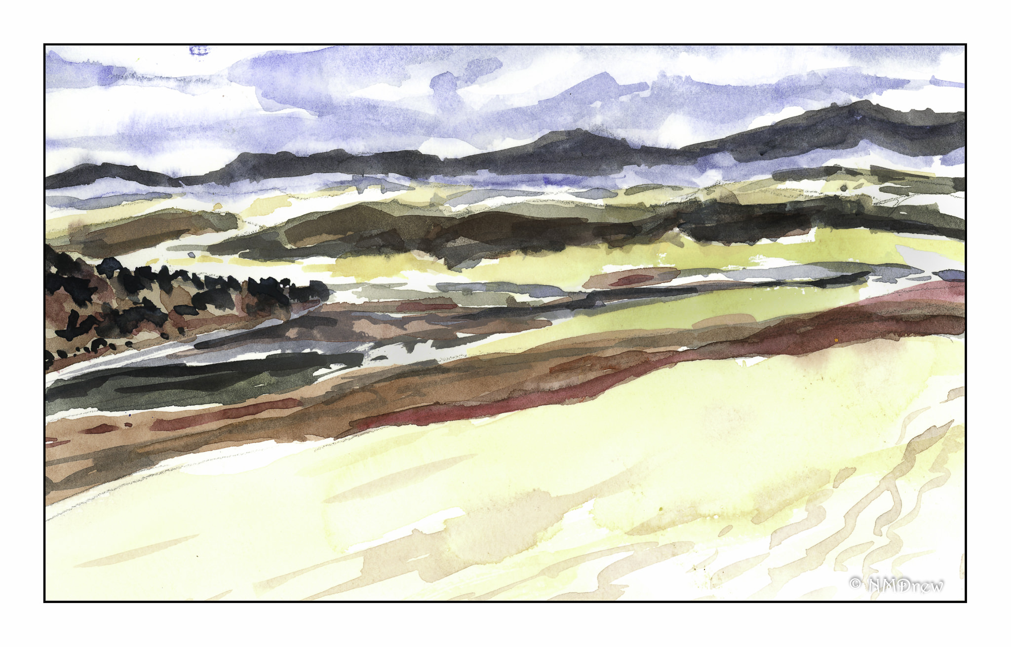
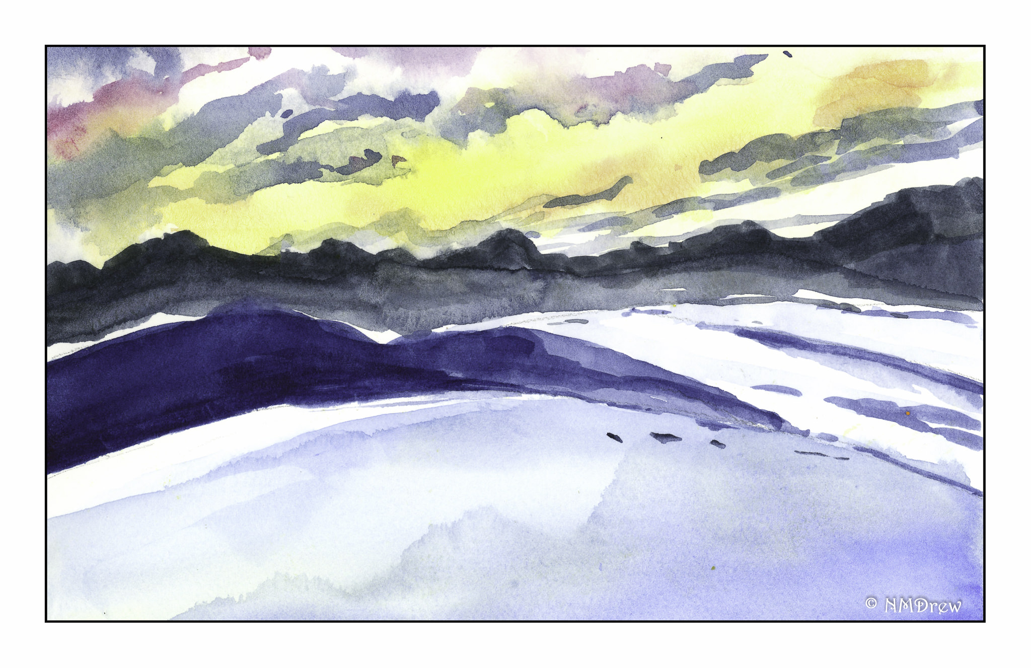
The pictures above are more attempts at preserving white, and working wet into wet. Probably the most successful one is the painting of the winter sky with the silhouetted tree.  Click on one of the paintings to cycle through the images in a slide show.

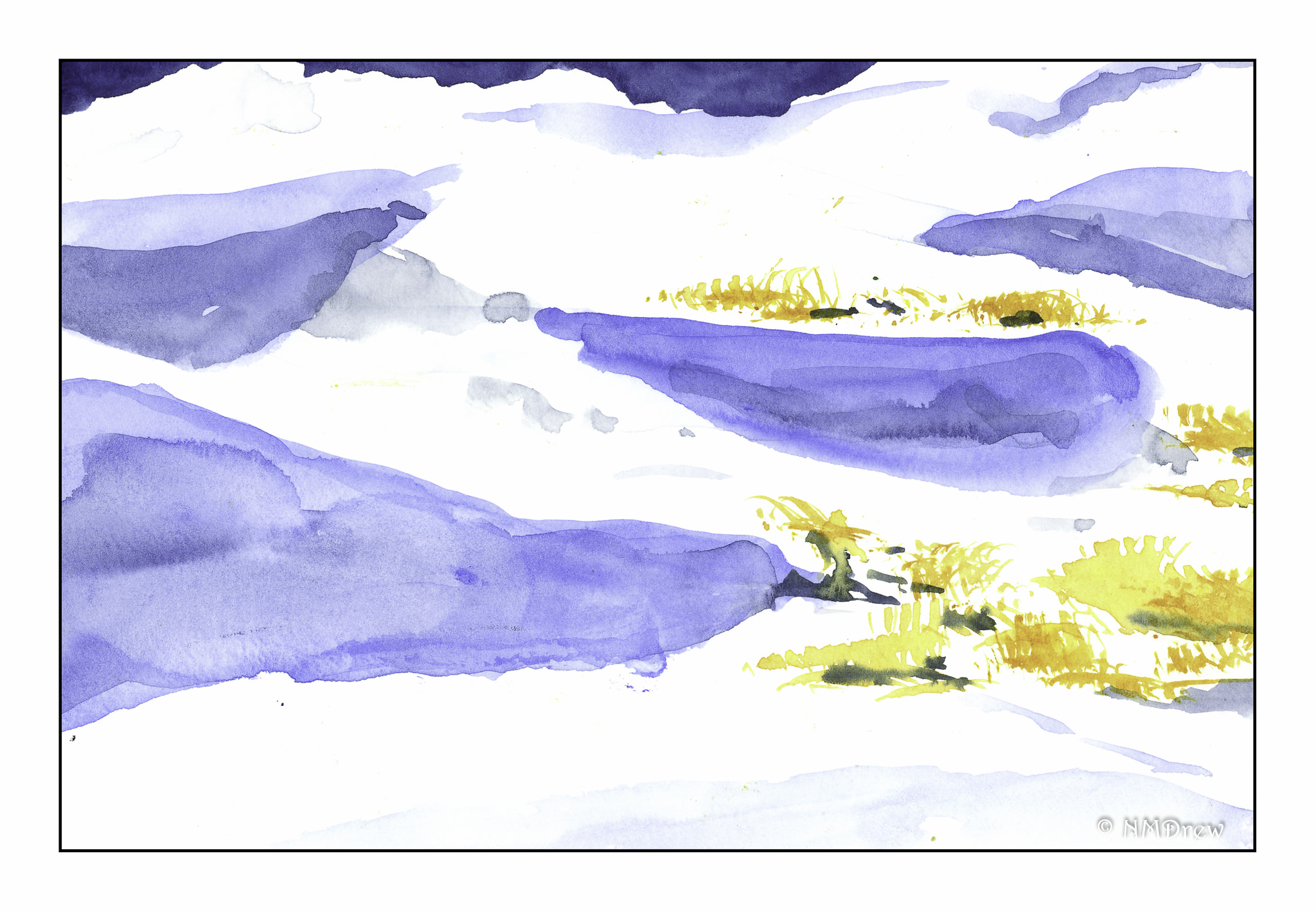
From the deliberate paintings I moved to wetting the paper thoroughly with water for the first of the two paintings above – soaking the paper with my brush, painting into the wet paper, and then painting again into the wet paint. The fir trees were more deliberate.  Here I tried to work with white space and with snow, trying to capture ways in which white can be interpreted with paint.  Again, click on one of the paintings to see the slide show.

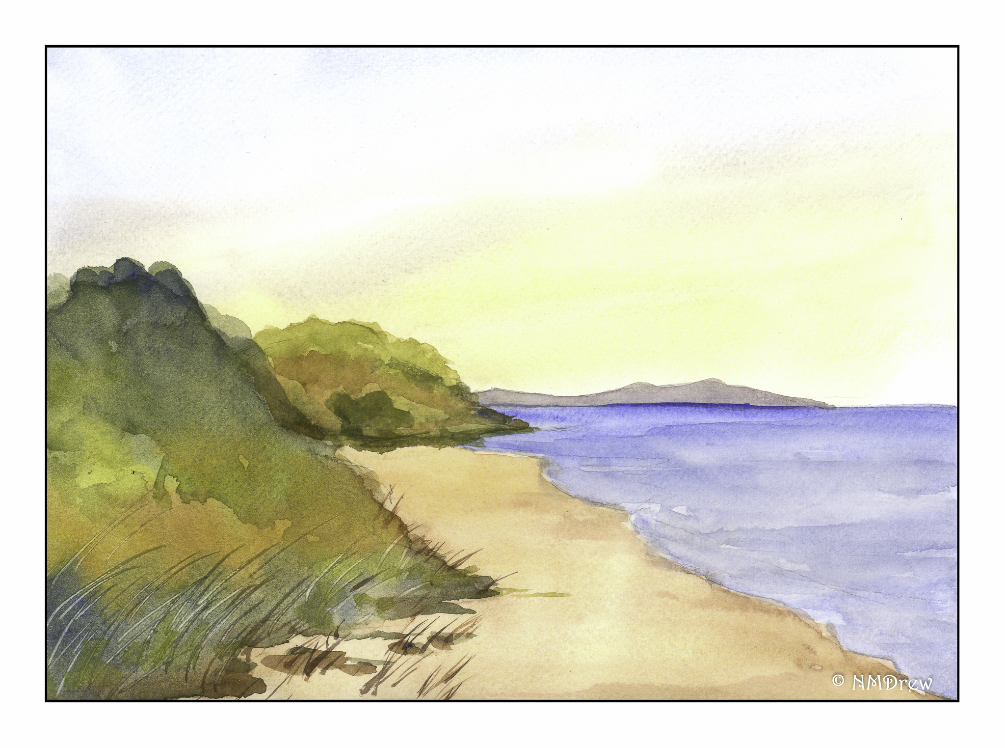
While doing all these paintings, I started thinking about watercolorists whose work I admire, and who, I know, did wet-in-wet particularly well. Winslow Homer is one of the best watercolorists of the 1800s, and his skies have always appealed to me. The painting above is my rendition of his painting The Palm Tree, Nassau. I changed a few colors and compositional elements, but I used this as an exercise to study how Homer may have painted. He used wet-in-wet on the sky; white space for the waves and tower, and varying techniques for the palm trees and foreground.

Besides trying to understand how an artist created a painting, I also searched YouTube for artists working wet-in-wet. I came across Edo Hannema’s channel and was so impressed! He is a master of wet-in-wet, as well as working with white space. I learned a lot from observing and copying his examples; this painting may be from one of his videos or an interpretation of one I saw online – don’t recall. I think seeing his work, and copying his exercises, has started my being able to move forward. I plan to follow his lessons more in the near future. His paintings have a lovely simplicity as well as demonstrate a finely honed skill in wet-in-wet. He is from Holland, so many of his paintings show very flat land, which for me is fascinating as I live in an area with a lot of hills and mountains and valleys.

Finally, I did this one today. I was up at oh-dark-thirty, having my coffee, and thinking about all the things I have been painting over the past few weeks. It was time to try to paint something that used a lot of wet-in-wet, had a modicum of white space, and finally wet-into-dry, meaning wet paint applied over dried paint. I am pleased with what I have learned, from copying other artists’ works to my own experiments. Everyday is an exciting new adventure, and out of all of my interests and hobbies, watercolor is the biggest pleasure of all.

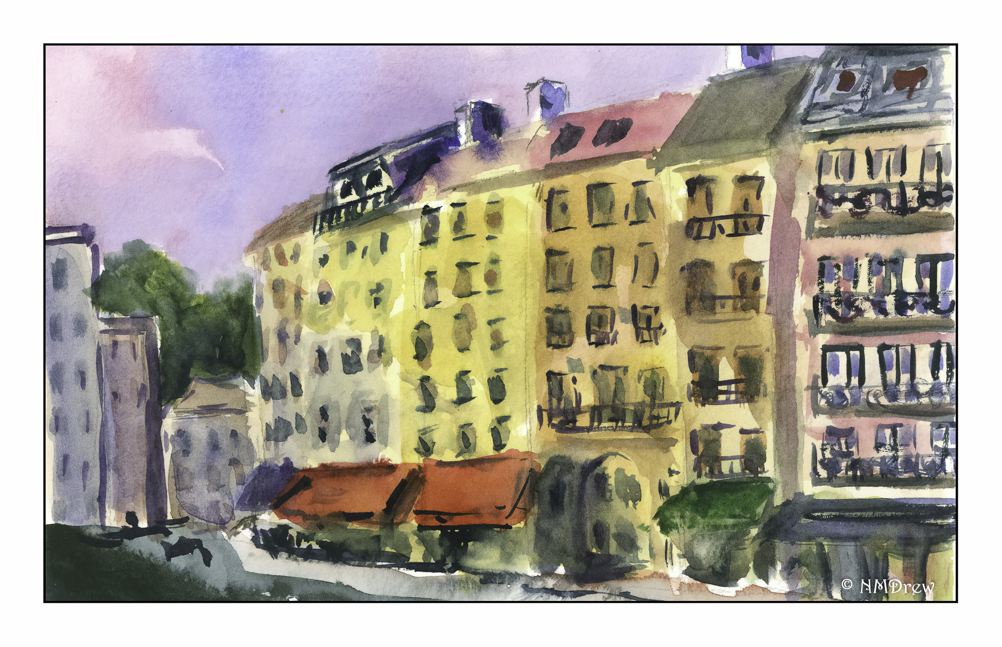
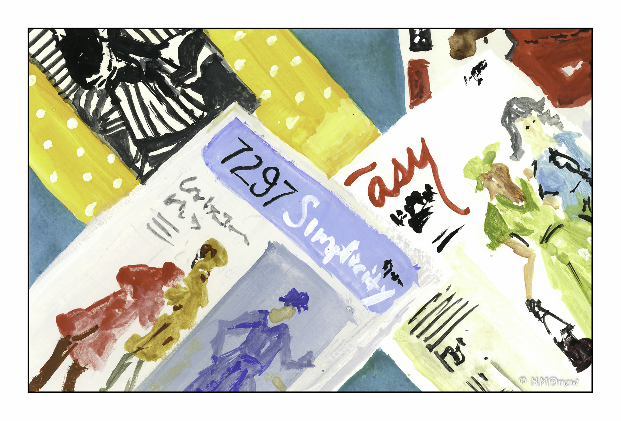
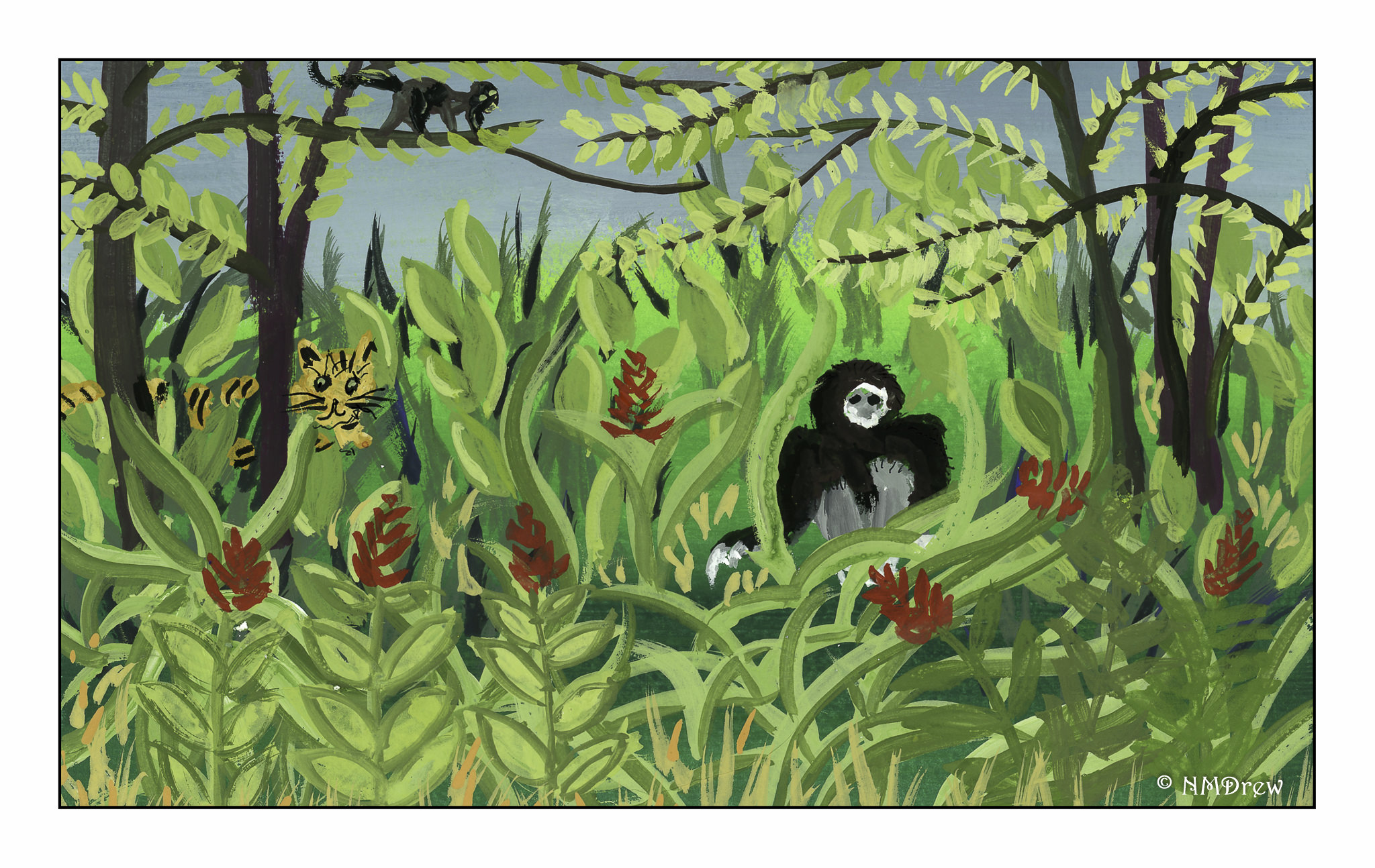
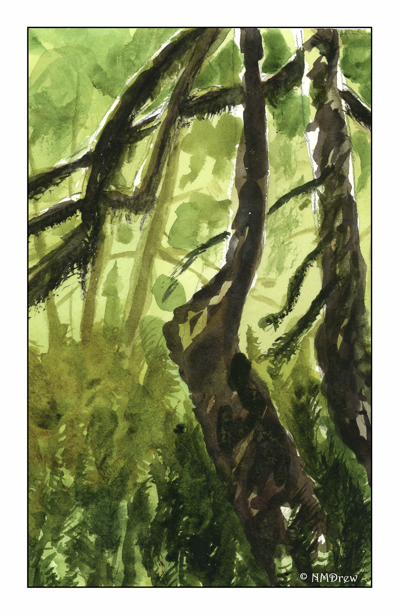
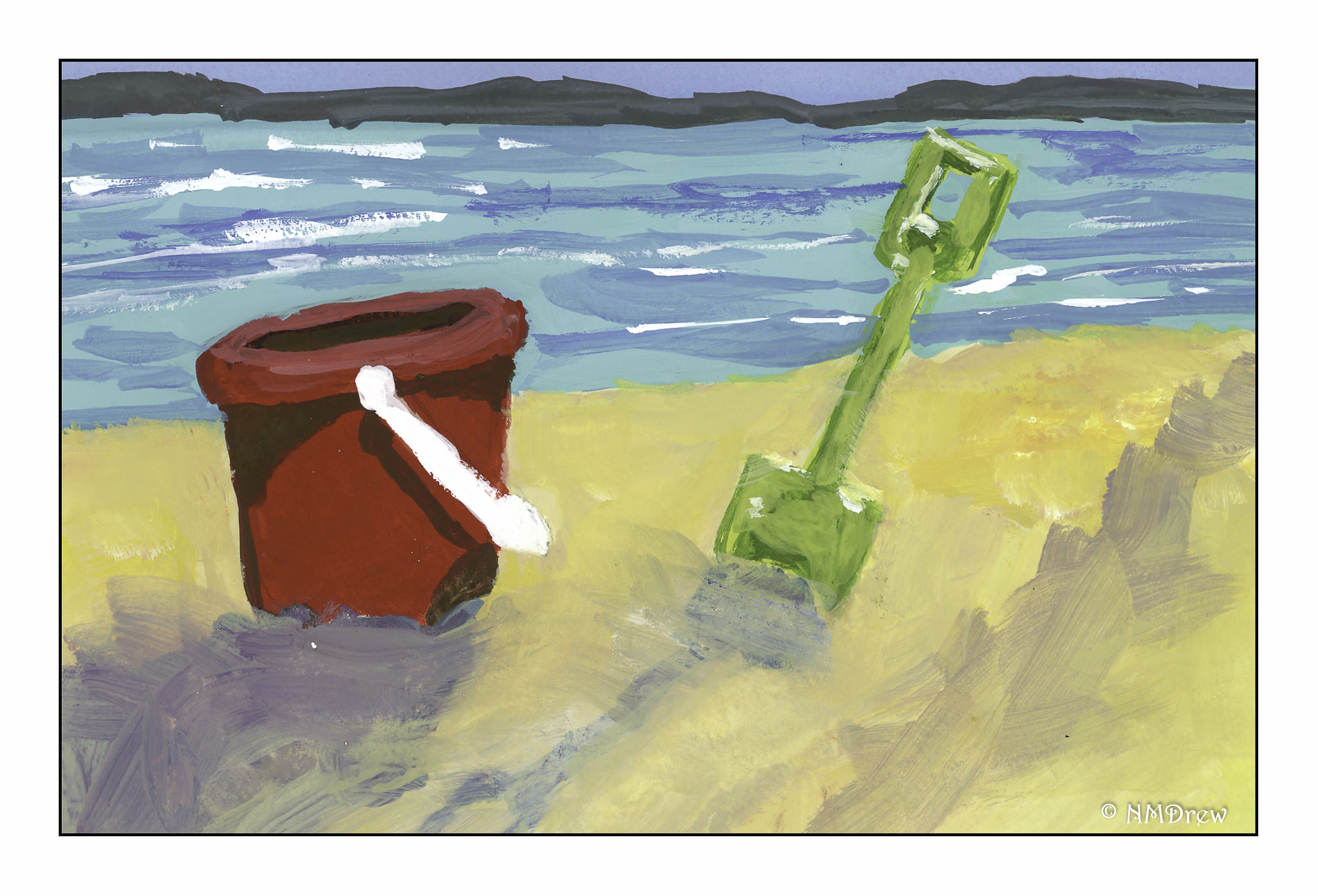
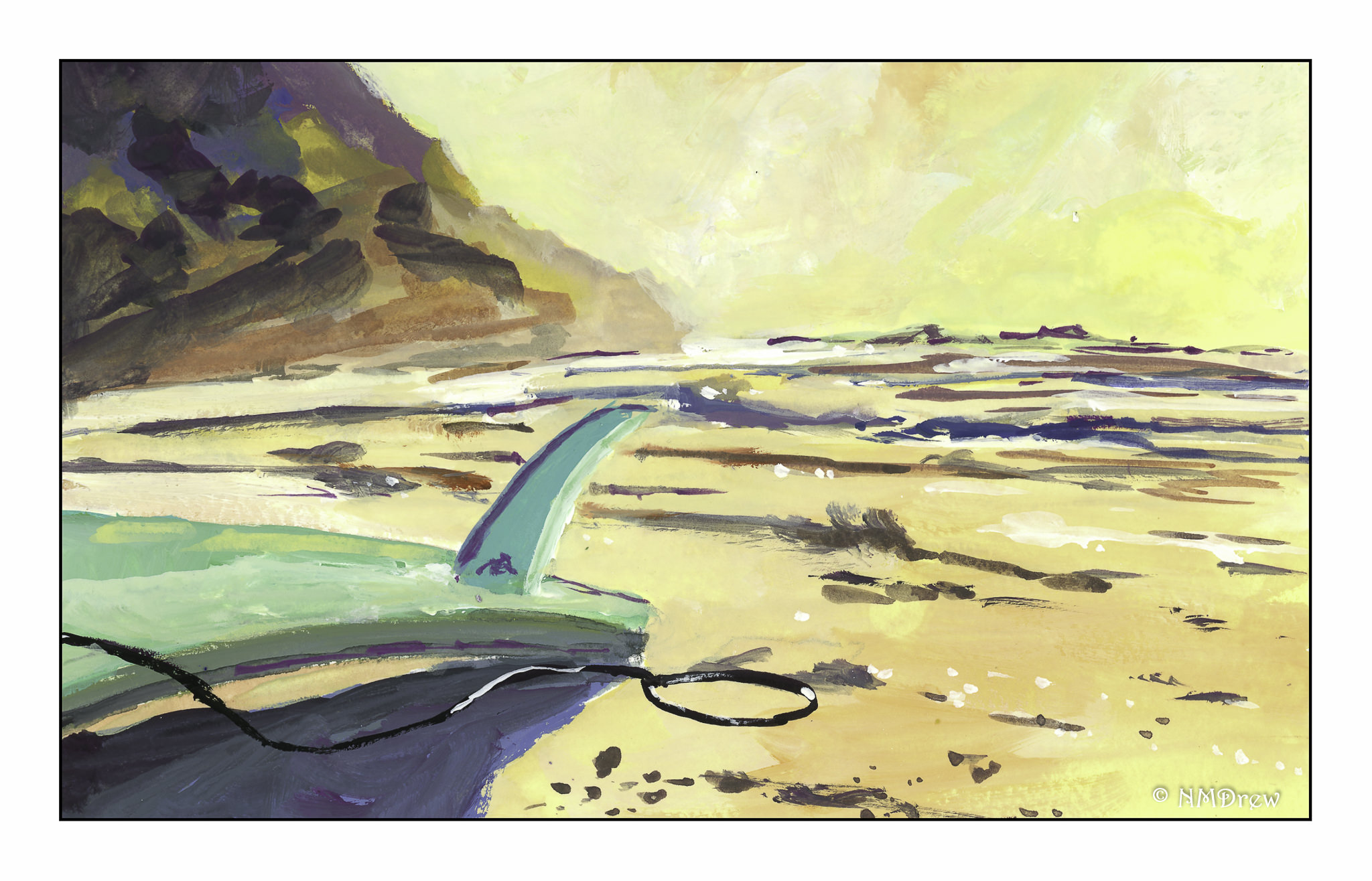
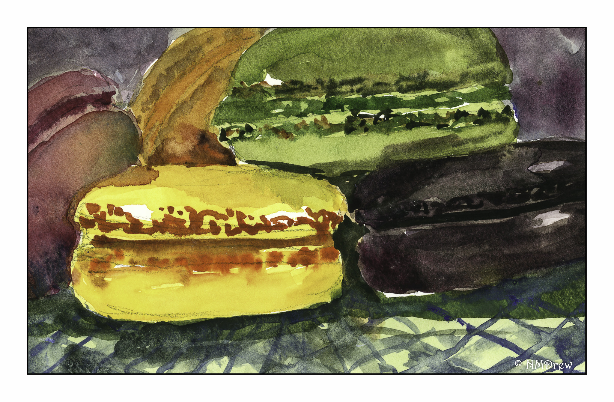
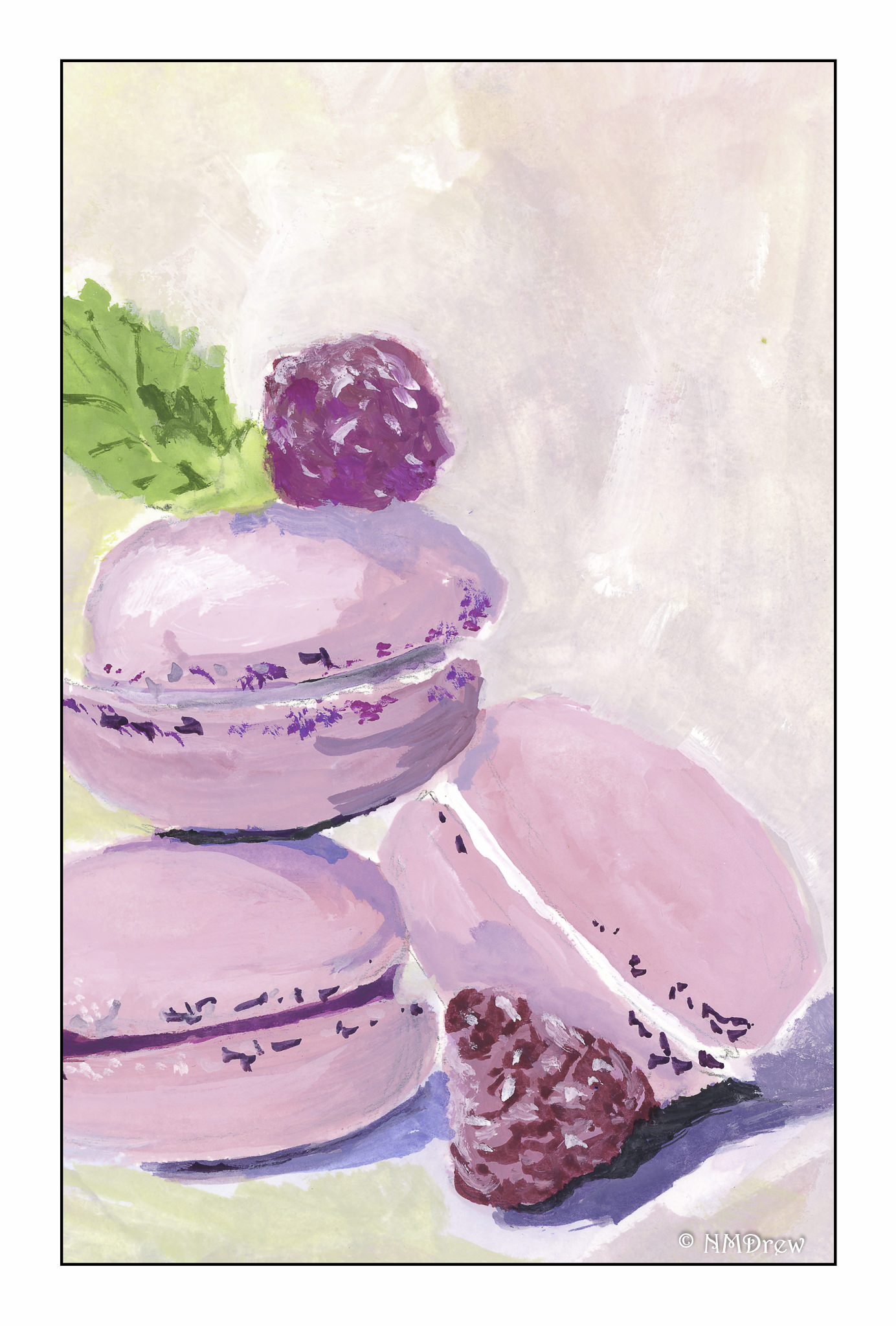
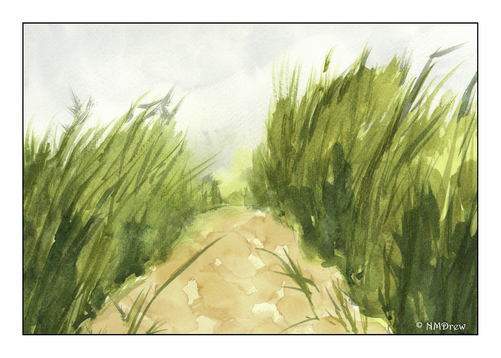
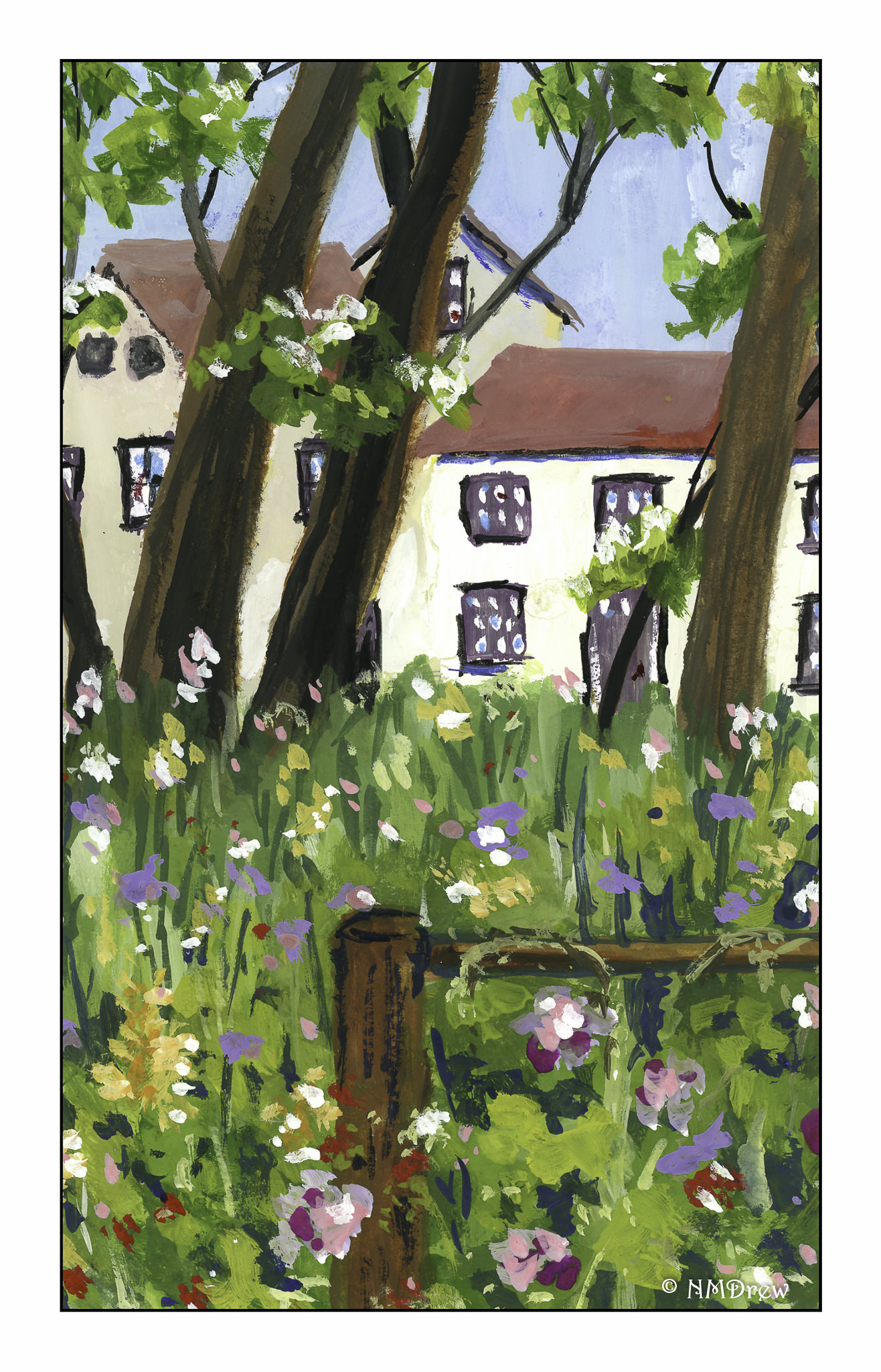
Below is a gallery of all the above paintings, and a couple of others as well.  Enjoy!