Wood & Wetland

I have been spending the better part of the day watching the videos in a class in which I have enrolled before starting any of the projects. There are a lot of short videos in it pointing out this and that, but sitting still to watch the longer ones makes me restless. I need something to do with my hands rather than just sit on my butt! Knitting is out as I have a few projects at a point which need some focus, but oil pastels did the trick. I can draw / paint and watch at the same time. I may not get all of the video, but I do get a lot of it – just as I am now as I write this post.

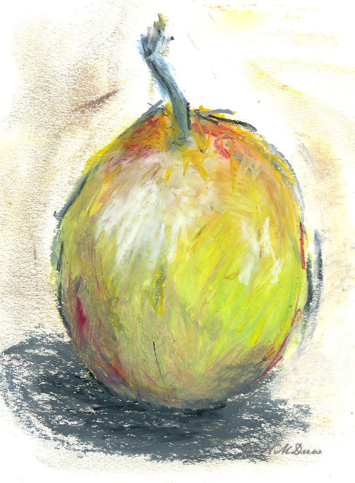
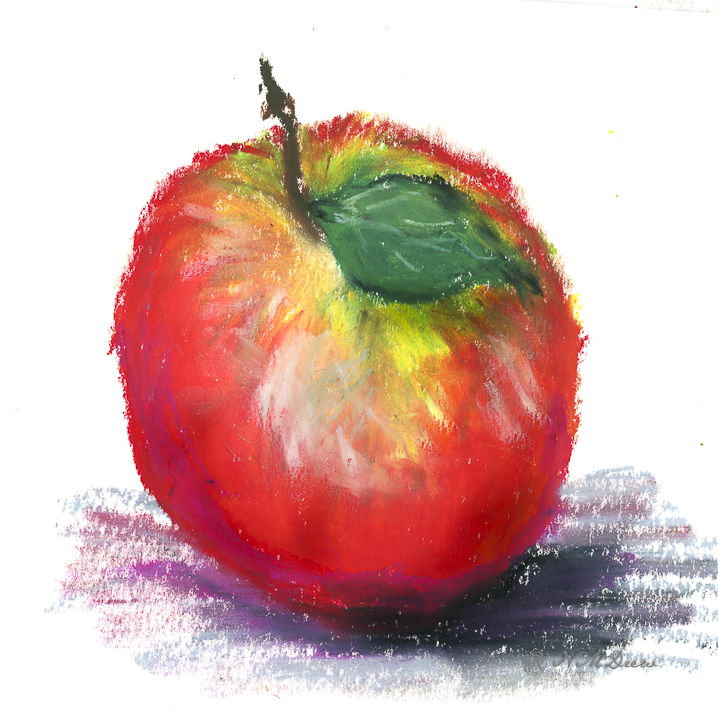
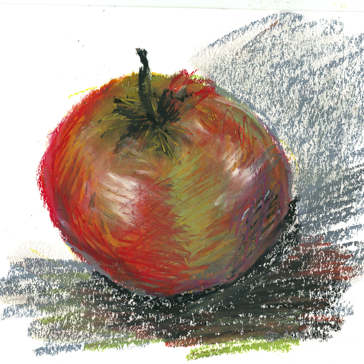
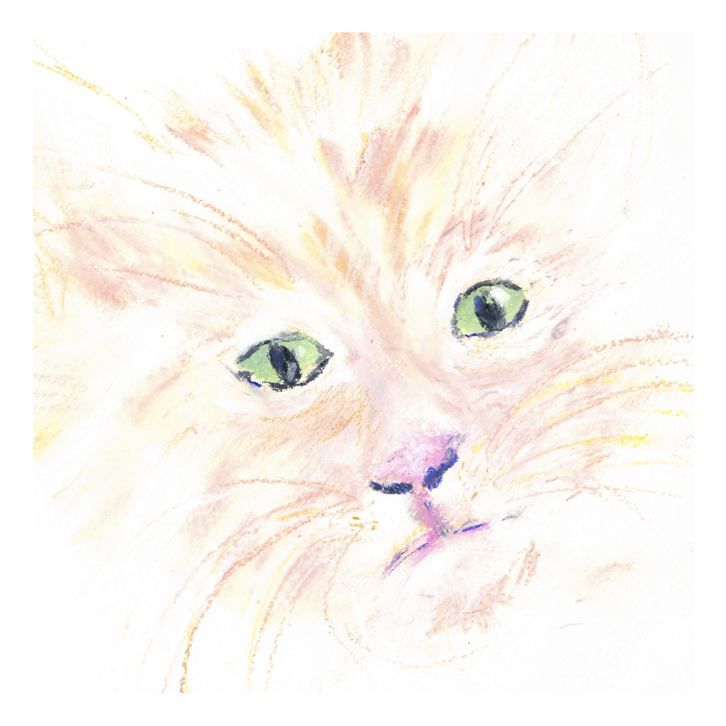
I picked up a few brands of oil pastels and a 6-pack each of soft white and greys. These include Sennelier, Mungyo, and Caran d’Ache. The white and grey pack are labeled “Anders” I think. I also have been playing on various papers, but decided to check out the Sennelier oil pastel paper. It seems to do a pretty good job despite all the rubbing in of layers of pastels.

Oil pastels, at this point, are more like playing with crayons for me. I blur the colors using my fingers and tortillons. Harder oil pastels make up the underlayers with the softer, oilier ones going on top. This adheres to the adage of “fat over lean” in oil painting, so it makes sense that it would apply to the oil pastels as well.

Oil pastel on Sennelier paper; about 5×7 finished. Scanned on Epson V600.

Strange Fruit

Ugh! I was in a rather bad mood today – you know how it is sometimes – so I decided to just play with oil pastels. Nothing great, but the fact is, drawing and such can be very soothing and change perspectives. So, I sat outside on the patio, a tablet of small, meh paper, and the different packages of the oil pastels. I decided to draw fruit. And there we are, about 3 hours later, with the following pear and two apples.

A pear . . .

And a pair of apples . . . .

I think I would not be too tempted to eat the above apple, nor the one below, if I were Snow White.

Winter Road in Hill Country

Today I decided to do some oil pastels. This is my second – no, third – painting in the medium. The cat and mandarin were on Strathmore 300 watercolor paper; this is on an 8×8 cotton canvas panel, the kind used for oils or acrylics. I read you could use oil pastels on nearly any kind of surface, so I grabbed this just to try it out.

To tell the truth, oil pastels are fun to use, but they are also tricky. Blending colors makes sense – layer this with that to make thus – but the blending itself is a rather creative experience. I used stumps (tortillons) for the most part, but toward the end I used my finger tips. Also, I found out that if I put on too many layers, eventually the newer layers pull off the underlying colors. While this could work for some desired effect, it was problematic in other ways. Live and learn, right?

I scanned this canvas on my Epson V600 (one of my best purchases!) as photographing paintings is time consuming, tedious, and usually worthless the way I do it. Two scans were needed, and in between I had to wipe of the glass platen to remove little oil pastel bits. Apparently oil pastels never really dry out, but you can apply a finishing spray to them. Sennelier makes one, which I bought along with my pastels, which I will try probably next week.

Play with Oil Pastels

Ages ago when people thought the world was flat, I tried out oil pastels. I hated them. Messy, unresponsive, and just unpleasant to work with. I threw them away. 

Ignorance, though, and a lack of the internet, can make art materials mysterious and frustrating. Today, now that the world is round, YouTube and other media outlets show me what can potentially be done with oil pastels. Choices of paper, solvents, blending methods, brands and qualities of the oil pastels themselves has changed considerably. I bought some – Caran D’Ache, Sennelier, and Mungyo. I also bought some PastelMat paper and board, and I also have different papers here at home to try. And YouTube and oil pastel artists on Instagram.

‘Tis tangerine and mandarin season, so here we go with some locally grown. I used the Caran d’Ache as underpainting after outlining with a graphite pencil. The pencil blurred and created a bit of a fuss. To get the colors blended, I used tortillons and mineral oil, gentle touches and pressure. All play. I was rather pleased with them.

Then I decided to see how it would be to work with a very pale subject, namely a pale white and beige tiger cat. The green eyes are a combination of white, green, and blue, blurred together with a tortillon. The sharp edge of a black pastel crayon made the dark eye and nose lines, and even some colored pencil at the end to provide further sharpness in detail. Eye highlights were sort of a gamble with the white pastel – which one to use, softer, harder? And placement, too. The cat’s white whiskers wouldn’t show up no matter what I did, so I opted for a beige-y color and then some white over the lines.

Neither of these is spectacular – the poor cat is suffering a lopsided face – but the point was to play with the colors and work with blending. I did use some mineral oil on the tangerines, but everything dissolved into a gooey mess, so after the first scan, I scanned no more.

Now, on to my knitting! The acrylic painting is still vegging and that is fine for now.