Morning Sketch 5 – Negative Painting & Flowers

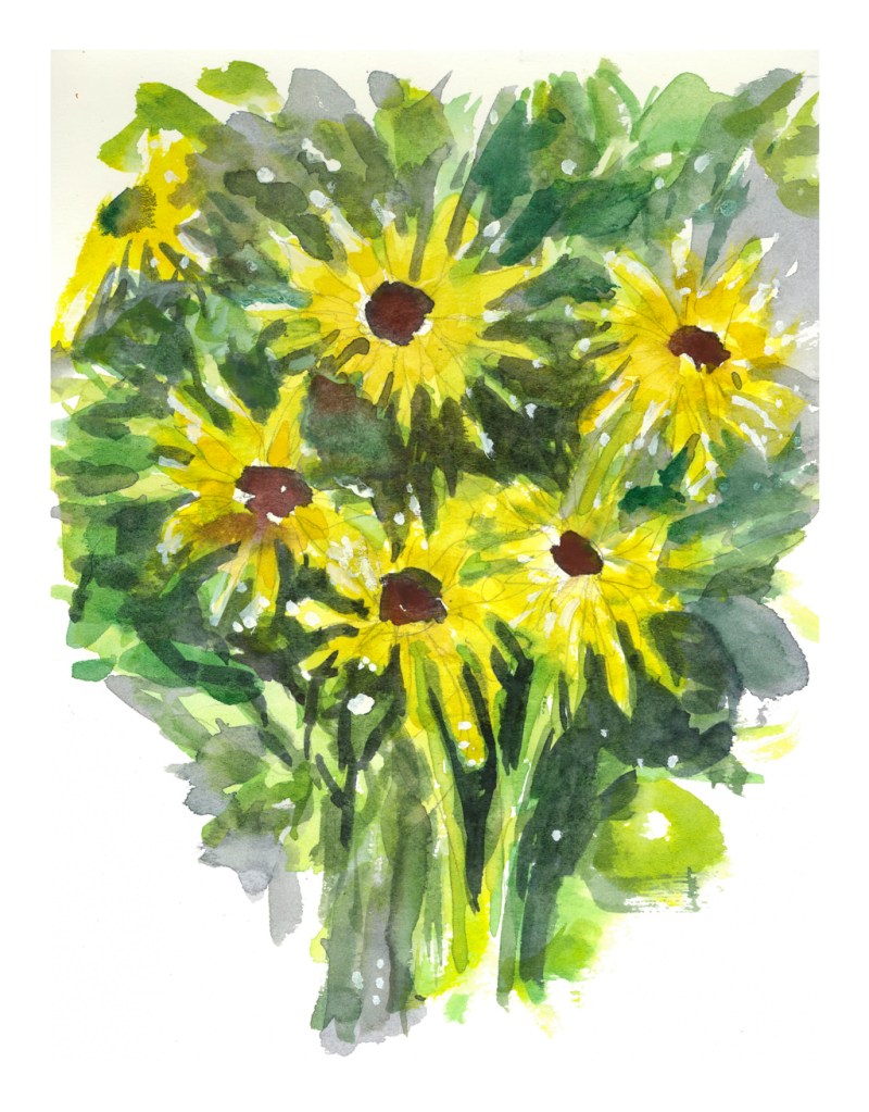
Practice makes perfect. While far from perfect, I have been trying to improve how I do negative painting. Flowers work well for this, but I have also decided to conscientiously work on flower painting.

I looked over at Pixabay and searched for “white flower” – several came up, some too busy with other things, some too simple, some lacking definition. What I wanted were white petals sticking out from something. As I already did daisies, I thought ones a bit simpler but still having interesting characteristics could be nice. Anemones of varying sorts came up, so off I went.

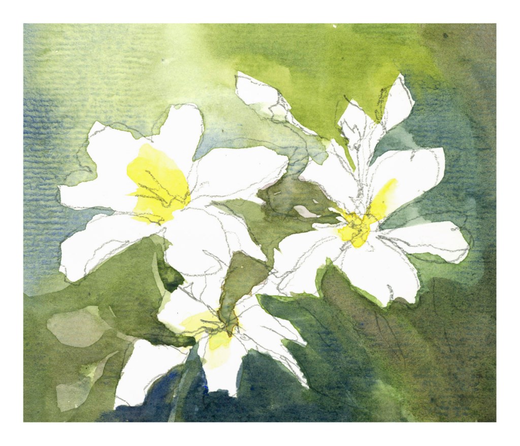
Above is the first one. I drew in the outline of the flower and then painted the center of the flowers but not any shadows on the petals. From there, I worked on the negative painting, trying to paint around the white petals. Then I let it dry and, as you can see in the lower left, put in a darker wash to outline leaves and a stem or two.

The second painting below was a bit more complex. I did the shadows on the flower petals – still white – after drawing in the basic shapes. You can see my pencil lines throughout. Then I did the leaves and stems in a lighter green. From there, I mixed in greens and blues for the most part and worked to paint around the white and shadowed petals, looking for contrast, coolness and warmth. After I let the painting dry, I went in again with shadows, augmenting a few petals here and there. The final step was to paint in the yellow flower centers with a dab and press of the brush.

I rather like these – they don’t look too overworked compared to the previous ones. My style is looser, which I prefer. As well, I worked with tube paints and a bigger palette so as to mix more colors. The paper this time is 100% cotton, a student grade one, but acceptable.

Just because these are better than previous negative painting studies doesn’t mean I’ve gotten there yet! So much more to learn – and a lot to do in that learning process.

Morning Sketch 4 – Negative Painting & Flowers

Negative painting is painting around an object, usually using darker paint around a more lightly painted object. Anyone who paints finds this quite often to be a bit of a mind tweak, so it is always worthwhile practicing. For me, negative painting is best done with the subject matter, if a photograph, done upside down. Then it – and everything else – just becomes a shape. Shapes are easy to relate to, more so than a flower or a whatever.

I really cannot paint flowers easily. I don’t want to create realistic paintings of flowers, but impressions of flowers. Being able to express a flower and to know what it is appeals to me far more to me than a scientific flower illustration. Don’t get me wrong – botanical illustration is stunning and something I love to see and admire them – but I want a looser style.

One way to express a flower is to create it in its environment. A field of flowers can dance in the wind. A bouquet of either one type of flower or many has its own beauty – the shape of petals and leaves and stems creating their own designs. Stems and leaves seen through clear glass are distorted fascinating to see.

For now, though, I just wanted to practice negative painting. I drew my flowers, and went to work, laying down basic colors and then coming in with darker colors to create shapes, such as leaves and stems. I did the daisies first, and they are rather crude. The poppies were next, and while the colors are muddy in places, it was more successful as far as what I was trying to accomplish.

Morning Sketch 3 – Winter sun

Nothing great . . . 6×9 on Strathmore Vision 140# paper.

What is the purpose of this sketch? First, trying to lead the eye to the two trees on the opposite river bank. Second, trying to reflect warm and cool light on the snow and ice of the river.

Problems? Paper is not great, but good for these kind of studies. Also using different paints – Schmincke pan paints, which are more saturated than the travel paints I used the past two days. And, as always, my sense of perspective is off. I am not quite sure why and it really bugs me!! Oh, well, perhaps one day I will find the answer to that problem.

Thinking about the atmospheric perspective, it seemed I needed softer edges in the distance. So, I wet the paper, blurred it a bit, and smeared a light mess of a blue-grey to give some distance. Then I took the painting into LR and decided to adjust the vertical perspective a bit, tilting the picture back a bit, and then doing a “smart fill” in the areas left white by that adjustment.

Don’t know if it improved the picture, but I think it might have as I often feel as if I am falling into my painting from above – sort of like a bad dream.

Morning Sketch 2 – Crocus

Another sketch, and I found that my little travel palette needs some alizarin and perhaps a violet to work to my advantage. Cad red and ultramarine are rather limited when it comes to violets and lavenders, which are colors I really needed here. So, besides practicing painting, I am finding colors I need to add. Granted my travel palette is one I tucked away and resurrected, and I think I know what most of the colors are, but it is a bit of an insight, too.

Crocus flowers come in all shapes, from pointy to gently curved. These are sort of pointy petaled. Because they are so low to the ground, one usually sees them painted from a higher vantage point, but in profile I personally like them even more, especially as light is filtered through their petals and leaves and surrounding vegetation.

A goal here was to focus on light – coming from upper right – and then some negative painting.

Morning Sketch 1 – Pumpkins

I have been waging a bit of a mental war with myself, and the monkey mind is everywhere and nowhere. Now, though, after devoting myself to several days of following exercises on painting rocks and rugged coastlines with a Shari Blaukopf class, I have at last decided to make watercolor my main medium. Acrylics just do nothing for me, but there is a small love affair beginning with oils. I take an oil painting / acrylic painting class on Tuesday afternoons, and that is where I will continue oils while pursuing watercolors with more focus and less of a scattered approach.

Watercolors have always held sway as a “first love” – partly because they are easy to clean up, partly because they are devilish hard to master. So, with the decision I made this morning, I have decided to try to do a watercolor every day, even if just a small sketch before I begin my day. Today, pumpkins.

I just put some water in a cup, took out a small travel palette with a few colors, grabbed a brush, and started to paint on some student grade paper. Nothing serious! But, at the same time, some thoughts in mind: contrast, hard edges, lost edges, verticals and horizontals, light and shadow, focal point.

Not a great beginning, but fun. Maybe I will paint it again tomorrow . . .