Ormond Beach

More water and reflections!

Ormond Beach is located on the coastal side of the county in a flat, rural area near two navy bases.  The sky is often dank and cloudy and it can seem like another world compared to my hot, dry corner.  Here, I wanted to catch the dreary grey sky along with the rows of palm trees on the horizon.  I think this one is one of my better ones of late.

The Mountain

Yesterday was a watercolor day!  I warmed up with a copy of Wesson’s painting, and then moved on to more water.  I am not intimidated by water in the form of lakes or streams, but do need to learn how to do oceans and waves and white caps.  I am trying to get a grip on reflections and how water and reflections interact.  I think reflections appear longer when the sun is behind you rather than in front of you, like shadows.

Here, a mountain and a lake, with some very deep shadows.  The distant mountain is quite bland to my eyes and would like to liven it up with deeper greens and richer browns.  I didn’t.  I tried to keep it more simple than the actual photo.  I did to a point.

I think most painters will always find faults as they know, as they paint, what challenged them while they painted and what their vision was, versus what they put down.  My life.

A Study After Edward Wesson

Edward Wesson was a master English watercolorist.  He is renown for the simplicity of his work – clear color masses, defined work.  It is his economy of color and shape that are attractive to many painters as he says a lot with very little.

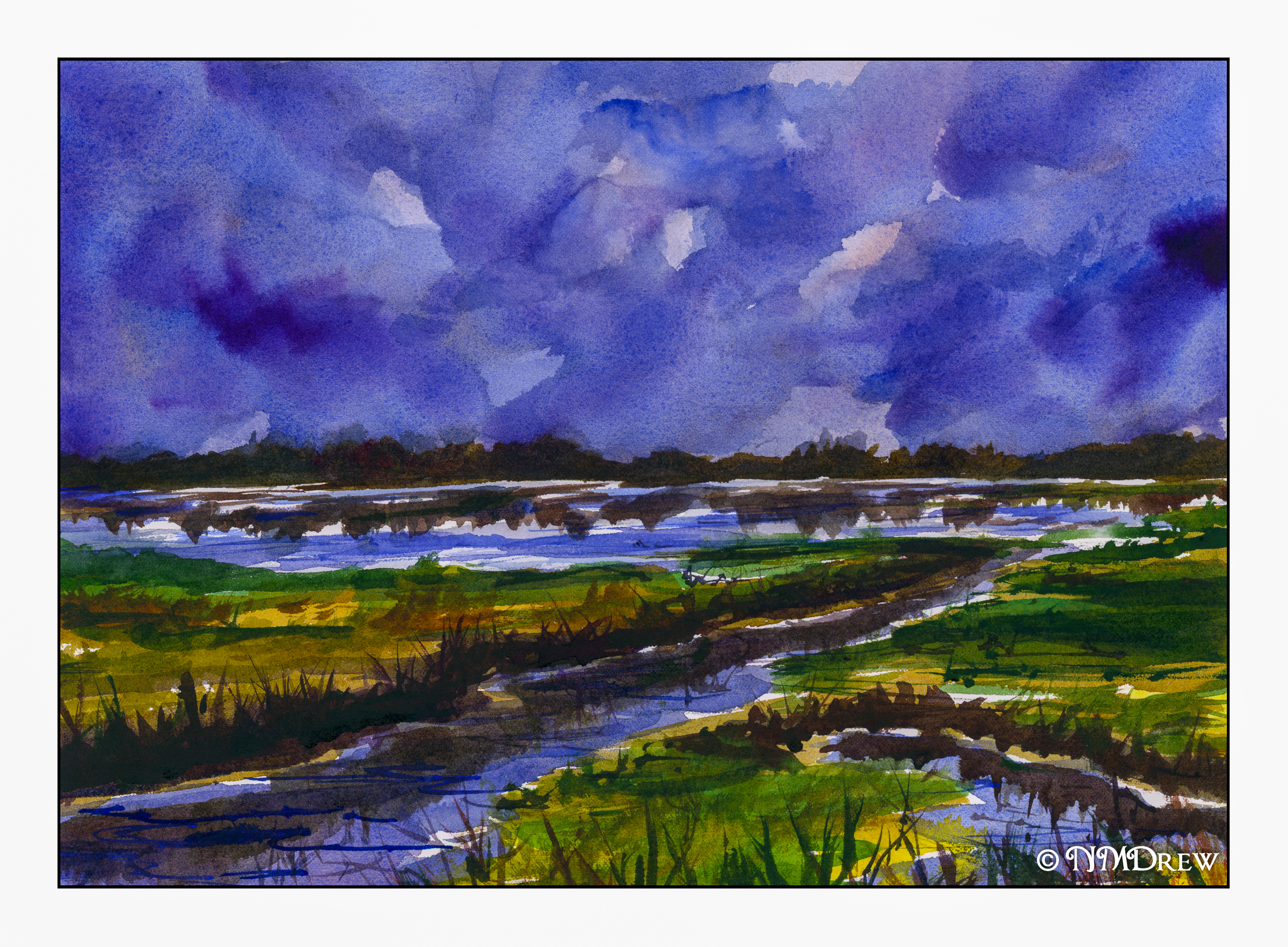
I, on the other hand, am prone to overdo and use rather bright colors.  My perspective is often wonky.  To counter this, I look for painters, such as Wesson or Seago or Hannema or Kautzky whose work I admire for its elegant use of colors or lines or both.  Copying another artist is good intellectually, as it requires thinking about what the artist did, and how.  Great practice!  Today, I chose Wesson.  Below is my interpretation.

My mountain in the distance is more detailed than Wesson’s.  I chose to make the trees on the shore in the midground lighter than in his painting as I think he meant to do it, but had laid in the dark of the hill on the left already.  My beach comes nowhere as beautiful as his – too much detail.

My husband remarked that this is definitely something he would define as NOT “my” style.  I agree.  I was looking to create something a bit spare, and to a degree I did, but I had to blot the sky (too dark) and re-wet the mountain.  I like the middle ground green hills, and the reflections on the water.  My beach sucks!  All in an afternoon’s work.

Storm Over the Wetlands

Water and sky are the major themes these days.  I really like them anyway, but have to work on reflections in particular.  For instance, along the banks, the reflection of reeds is very important, as in the distant water / tree line.  I try to be simple in my approach and perhaps a bit less dramatic or intense in my colors, but that seems to be really hard for me to achieve!  I had a lot of fun with this painting, though, and am rather pleased with its outcome despite the fact it is not quite what I envisioned.  But, it does catch that peculiar storm light, I think.

Building, Tree, Flowers

Springtime – moving into summer – and after finishing up a sweater I just had to cut loose.  The watercolors were out, a piece of paper that wasn’t too warped from another painting, and I just went to work.  This wasn’t really planned, but I did use resist to keep areas white, as well as decided to throw in a building, flowers, and a tree.  A transitional world – sweater to watercolor portending hot weather next week.