Monet & Etretat, I

For some reason the works of Claude Monet have been rolling around my head, in particular his studies of the cliffs at Etretat. I found that he has done many studies of this place – it must have been a favorite of his. The above gouache was inspired by his version from 1885, Study from Etretat, the Manneporte, Reflections on Water.

By Claude Monet – Own work, CC BY-SA 3.0, https://commons.wikimedia.org/w/index.php?curid=21407533

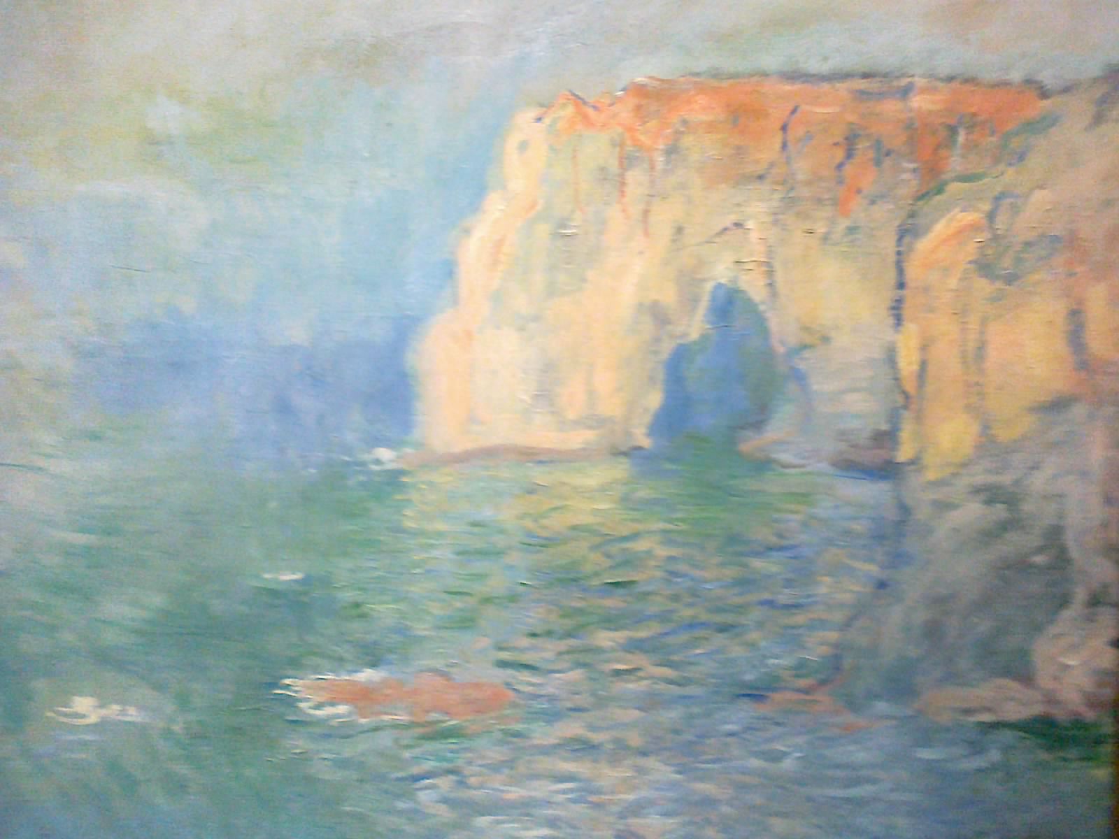
It was really interesting to use Monet’s study as a study of my own. His painting is in oil, mine in gouache. The beauty of gouache is that it can respond in ways similar to oils, such as brushwork and color mushing. Initially, I just blobbed the colors in, but as I came closer to completion, I saw the little things which make this study more than just a simple study. Little things such as the dry brush on the cliffs, the dabs of color making up reflections and waves, the scumbling to create a sense of a sunny fog, became more apparent as I moved closer to completion of my own painting.

I’ve always loved the way Monet handled light; perhaps my studies of his works will help me with my own depth issues and contrast problems. I think this painting worked out fairly well. Even better, it was a lot of fun!

A Beautiful Face

During the spring, before the coronavirus stopped in-person classes, I started a pencil portrait class. Then the virus hit, and some of the best classroom instruction came to a screeching halt after 2 classes. Come summer, an email came around – the teacher was offering in-person classes outside of the school, with the drawing group to meet in a park behind the local library, one equipped with tables, bathrooms, shade, sidewalks, ponds and ducks. Perfect! We met for 5 sessions. Yesterday and next Wednesday we will meet again. In-person teaching is so much better for a lot of things, and with our talented teacher, a lot is learned. The company of those with similar interests adds to a bit of quality of life. We sit 6 feet apart, wear our masks, and enjoy a wonderful few hours together outdoors.

Above is my drawing from yesterday. I focused on the eyes and nose of the photograph below. My drawing is not perfect, but definitely one which works fairly well, I think. The man below caught my eye on Pixabay (searced for “portrait man”). He has such a wonderful face, filled with what I see as character and kindness. The teacher agreed and said he looks like he could be a great friend.

For me, a portrait of a person needs to convey something of their personality. I don’t tend to photograph people or draw them. Drawing people is detail-oriented and rather in opposition to my splashy, messy style, but it is good discipline and actually very relaxing. In a congenial environment, with like-minded people, a lot can be learned and accomplished.

Sea Stacks

Along the coasts of many countries, the upper northwest of the US, there are sea stacks. Some are barren rock, some are topped by trees. Wide beaches at low tide make these places a bit of wonder, and those further out to sea make you want to sail out, climb, explore. I always have a fantasy of a house built into one, hidden away from the rest of the world. I could make a trip to just find sea stacks.

Water Study

Another study with another excellent watercolorist, Eric Yi Lin, whose YouTube channel is called Cafe Watercolor, a very low-key but very informative channel about – what else?? – watercolors. His demonstrations are clear, and especially compelling, is his narrative. How, why, how come – so many answers to questions not answered in a lot of demonstrations. Truthfully, I think he has some of the best “explanations” or reasons why this, or how to consider that. An example is in the video below, from which the above painting is derived, is his statement that “water is a surface.” Have you ever considered that when painting? Suddenly it becomes more comprehensible.

The major point of this study is to look at water and observe how to paint it. In his video, Eric describes how water “works” in different settings. In fact, he demonstrates and explains different ways to look at water – smooth and glassy, foggy and still, and the ways in which the ocean is not at all like a lake or river. This is all in the first half of the video. Then, from a photo he took, he spends the last half showing how he painted the photo. Takeaways include that the first wash is the color of the light, simplicity in the distance, more complexity in the forefront. Order of working is light to dark, soft to detailed.

I’ll let you look at the video to see what I mean.

I expect I will be visiting his site a lot for now!