Pencil Time

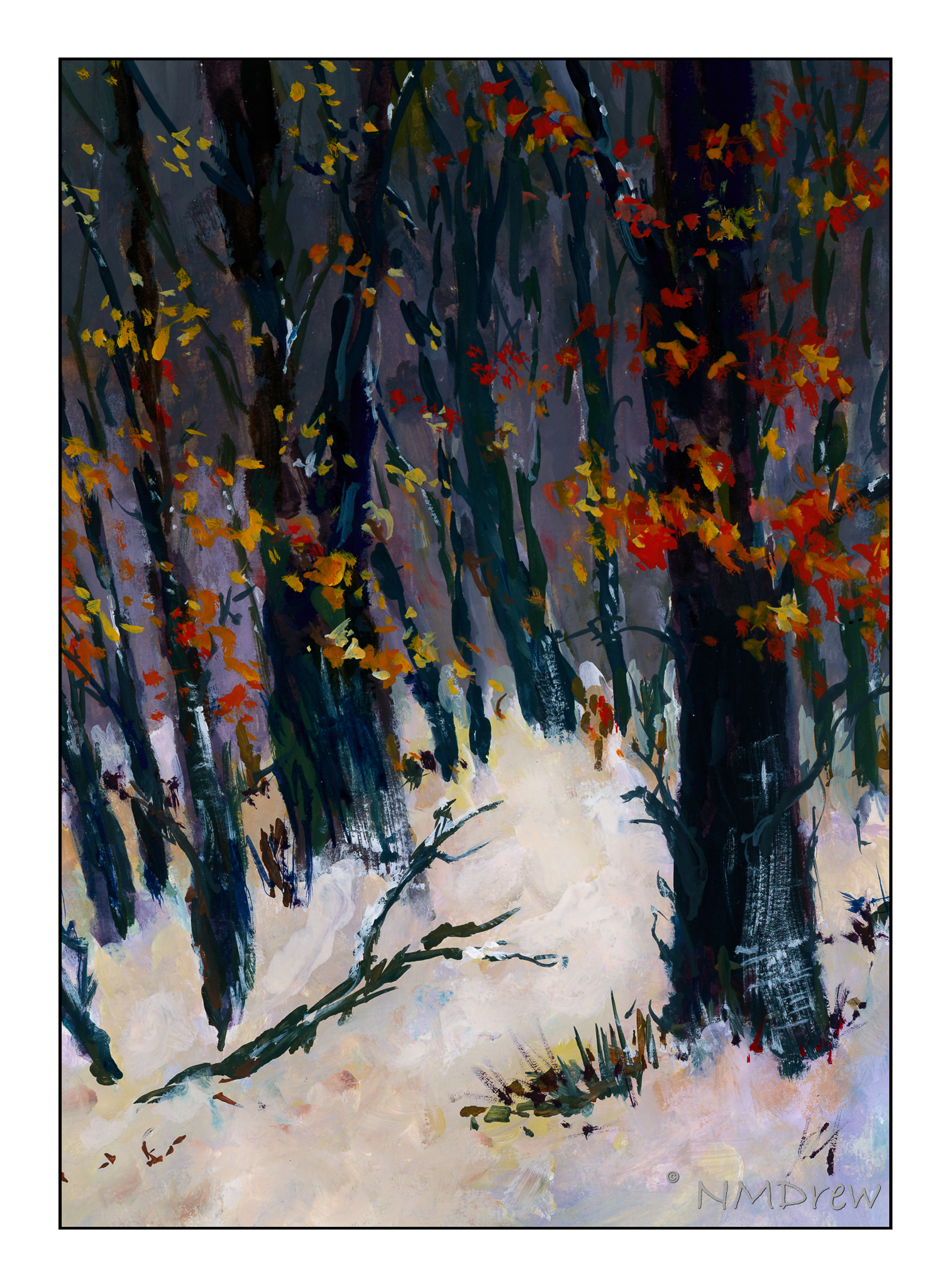
After my attempts at a portrait of a person, the realization was that my shading skills are not really good.  Also, my Pencil Portraits class recommences on 2/17, so I thought it might be a worthwhile endeavor to work with a pencil, and work on value with the pencil.  This certainly will benefit any studies I do in the Pencil Portraits class, and perhaps get it into my thick skull to think a lot more about gradation and value than I do!  (Magpie Brain loves bright colors.)

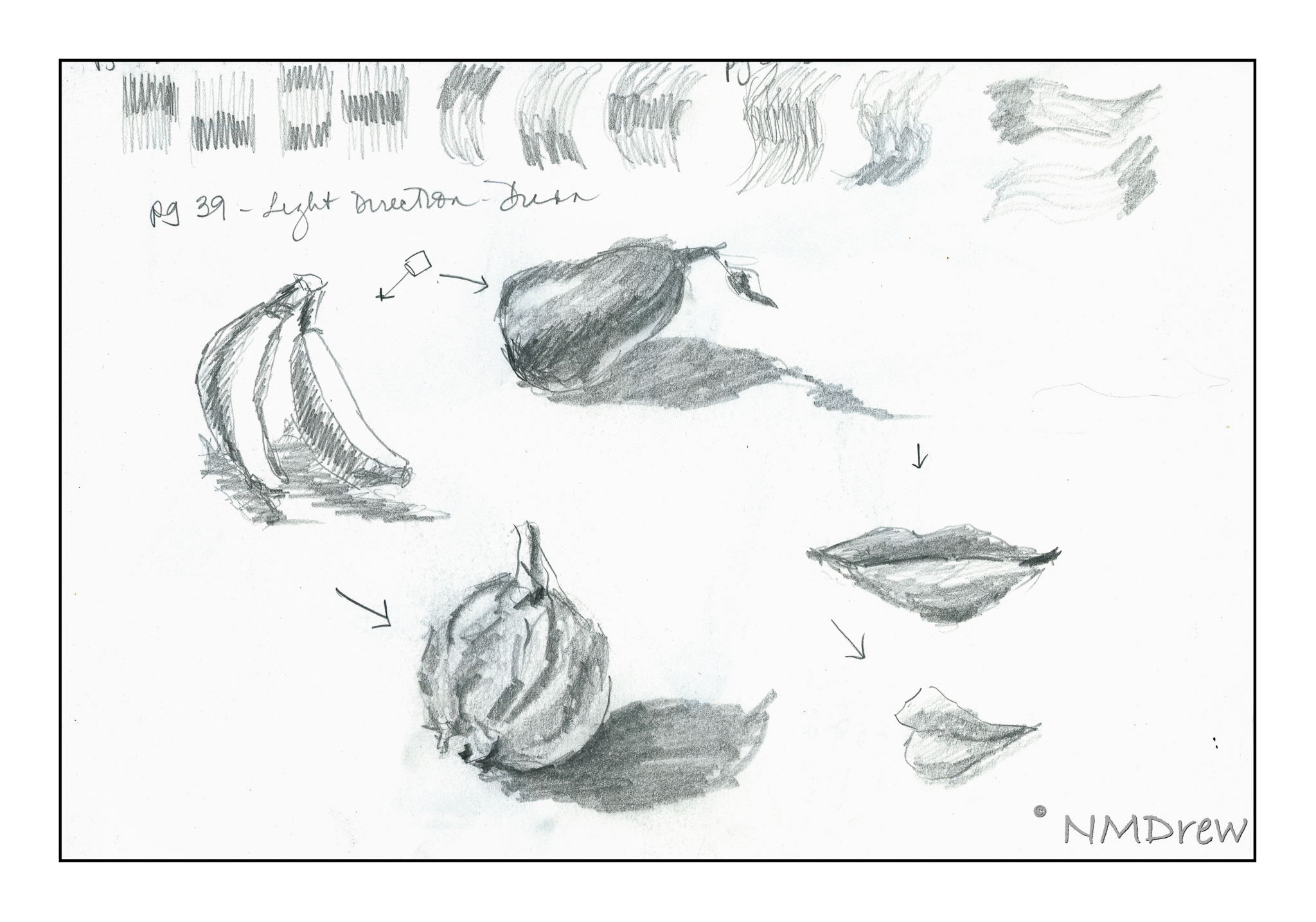
I am very fond of the books by Alphonso Dunn on ink drawing.  His work is phenomenal, and I have learned a lot through his exercises.  Given this, I decided to apply some of his studies to pencil work rather than ink.  All of these exercises come from his Pen and Ink Drawing Workbook.

Above, is the first one I attempted.  If you look closely, you can see the page numbers in the sketches (enlarge the images by clicking on them).  These studies were outlines with a choice of light direction.  You have to use your imagination!

Shapes and shadows – reflected light, cast shadows, highlights.  Simple forms and then a rather pathetic toucan.

I particularly enjoyed employing the pen-into-pencil of these drawings in Mr. Dunn’s book.  His are obviously rendered in black and white, with shades of grey determined by pen strokes.  Here, I took his studies and applied pencil – graphite – to them.  They include a cabbage (I know, it looks like a brain), mushroom, hammer, and bow tie.  Each has a different set of textures.  I started to visualize where the light source was, and that really helped me start thinking more about what I was doing.

For all of these, I used a 2B pencil and a sketchbook, along with referring to Penn and Ink Drawing Workbook examples.

The Scragglers in a Winter Wood

For some reason the winter and snow scenes of Maurice Utrillo were wandering through my mind when I was painting this. Yes, he painted urban winter scenes, but I don’t think that really matters. What I saw here was the brushwork, a scumbling to blend colors, which I think of when I see his paintings.

Initially my idea was to attempt a pointillistic painting, but the subject matter really doesn’t lend itself to dots.  What I did was to lay down dots, as in pointillism, and then work them into each other for color gradation, textures, and mood.

If I am to be honest, I am really pleased with this painting!  I hope you enjoy it, too.

On the Edge of Field and Forest

Another winter day . . . snow, sunrise, warm and cold. Pointillism once more.

This time I laid in the background color, such as the blue of the sky merging into the gold of the horizon, blending them together with white. the same with the diagonal hedgerow and foreground snow. After that, I used a tiny, tiny brush, soft to the touch, and filled it with gouache paint I thinned down a lot.

The time to complete this painting was easily 2-3 hours (with time out for lunch and a nap, of course!). I think the color gradation, especially in the sky, has worked well with the usage of small points of color. I also tried to make the middle ground snow cooler and greyer than the foreground snow.

Ahhhh! It feels so good to paint!

More Impressions of Slater’s Bridge

I have been rather lazy today, too lazy to set up to paint. So, an old exercise came to mind: make a messy color mix on paper and draw over it with ink. I had Slater’s Bridge already chosen as the subject matter for this exercise  (partly for Ms. Fragglerocking, partly because I think it’s such a lovely bit of stonework). As a result, I plopped on colors and then drew the bridge from different angles.

This was the first one. No idea how the cobalt violet would work, but used leftover watercolor paint from my dirty palette along with fresh colors. Then I drew. I admit, I came in and added some color after I added the drawing to get a bit more definition. It sort of felt like cheating!

So, with the thought of cheating in mind, I did this one. Yes, I deliberately put manganese blue at the top, and then just added the cadmium orange and greens. However, I didn’t add any colors after finishing the ink drawing.

Daily work – daily play – daily adventures in art!

Impression of Slater’s Bridge

Bridges are something we take for granted until you have to wade across the creek, or hop stone to stone, praying you don’t fall in! Way back when, the arch bridge was discovered, and it takes its form in many ways, from giant aqueducts to small stone bridges built in lonely country.

Slater’s Bridge is found in the English Lake District. It’s shape seems to have grown out of the countryside and keeps catching my eye. I don’t think my painting is especially accurate, either; hence “impression”.