Poison Apples

Today I followed along with a YouTube video by Will Kemp. I rather like his online presence and instructions – what I have done so far. He’s low key, explains, demos. What more could you ask for?

Kemp’s apple is much nicer than mine. He paints his apple over a series of 2 short videos, beginning with laying in a background, upon the gessoed canvas, of yellow ochre and cadmium yellow light. From there, the painting begins, with the colors in the study being raw umber, ultramarine blue, white, burnt sienna, cadmium yellow light, and cadmium red light at the very end.

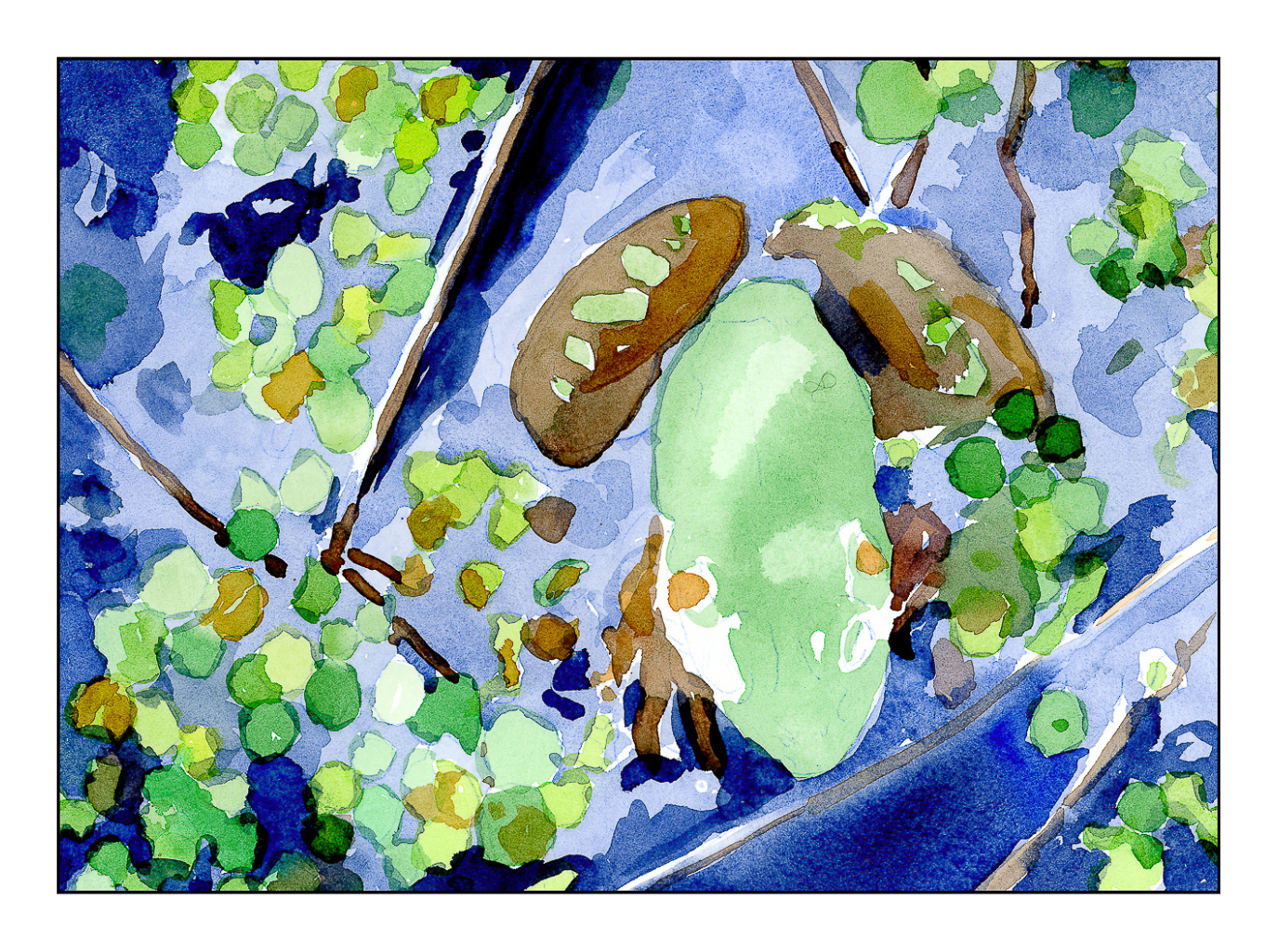
Here is my study, following along with Will. I think the yellow ochre – cadmium yellow underpainting adds a nice warmth to the painting. Two brushes, a filbert and a small round, were used to create this painting. Only water was used to thin the paint.

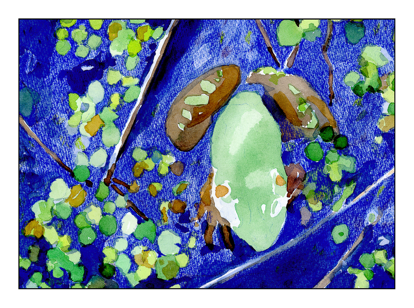
After doing Will’s study, I decided to do it again, but without using the underpainting colors.

No underpainting made for a different sense of color. By accident, I pickedup some of the cadmium red when mixing the upper background, so I just kept it. The lower part, upon which the apple rests, is burnt umber, white, and ultramarine. I made this apple more green than yellow, and applied the paint heavily, mixing it with matte medium. At the end, I used my finger tip to mush the colors together as the brush kept picking up the colors beneath, even though I had dried it.

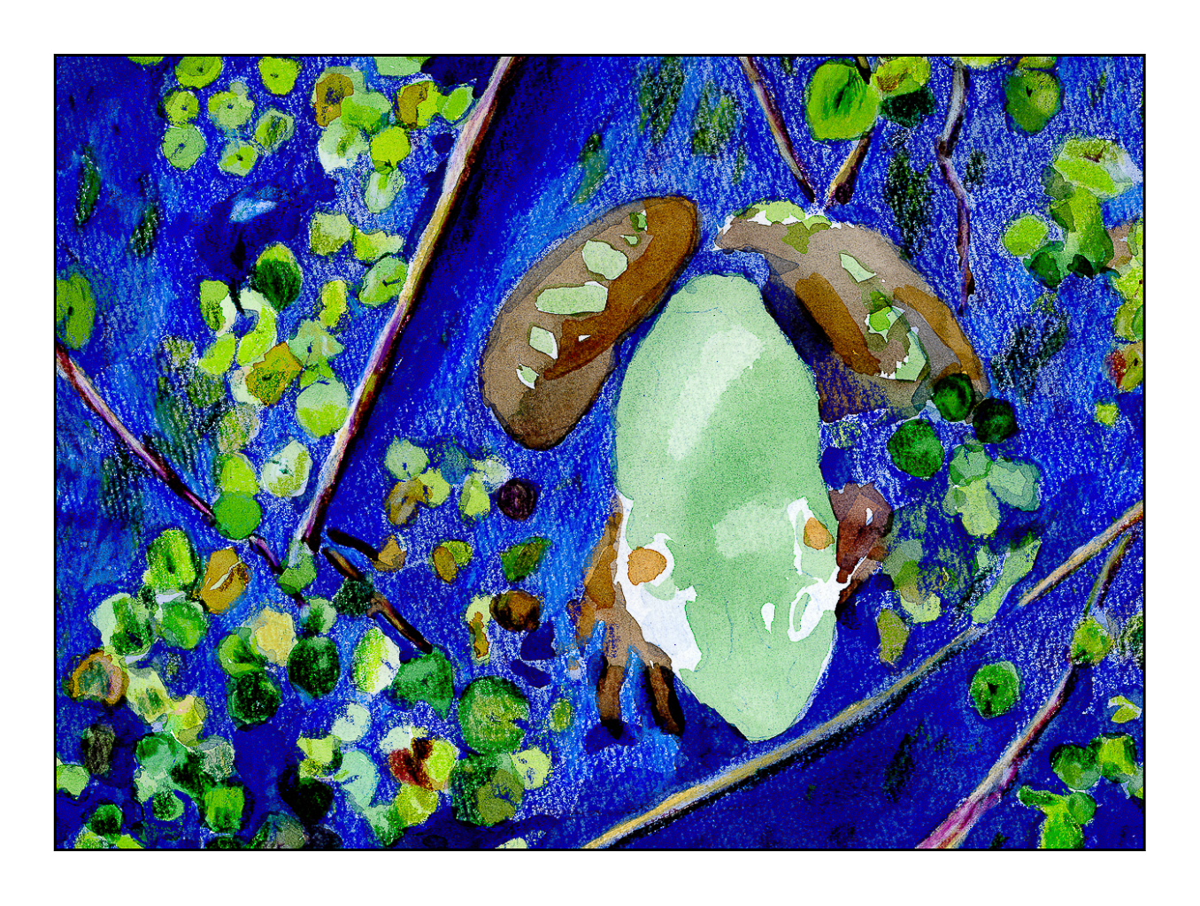
My hair dryer may or may not be the best thing to use for acrylics, but these are studies, so not important! Both of these are painted on Arteza primed 8×10 canvas panels.

I deliberately chose to use only water, as Kemp did, in the first painting, and then only matte medium in the second. Both had their plus and minus points. Making a glaze out of the paint with either media is not easy – the colors are not really easy to blend well before applying. That is why I mushed things together with my finger on the second painting. I will need to study glazing a bit – read up on it to learn more.

Simple but effective studies to learn more about paint, as well as various techniques, such as underpainting, glazing, and so on. Of course, just doing and not setting out with the goal of a masterpiece, to have fun, makes it all worth while.

Carpinteria Bluffs

Another attempt at acrylic painting. This time I used a sheet from a Fredrix linen pad. I gessoed it and then used, initially, the Open medium with the paints, but I didn’t like the way it was working, and so switched to regular matte medium to dilute the paints. I tried to use the paints fairly straight out of the tube, blending with white and matte medium. The result was a fairly thick paint that behaved well.

The Carpinteria Bluffs are located in the southernmost section of Santa Barbara County, just above the border of Ventura County, where I currently live. Carpinteria was home for many years and always enjoy returning, especially in summer when the light shifts and everything has a glow of its own. Eucalyptus trees and other plant life make for a wonderful walk along the cliffs above the Pacific, and across the Santa Barbara Channel are the various islands that make up the Channel Island National Park. This might be San Miguel Island, but I can never remember which one is which!

Slow Summer River

Several weeks ago I started thinking more and more about what I am doing in my spare time. It is then I realized that, for me, the best way to spend my time is to learn new things, in particular, new art techniques. Thus, colored pencils; I signed up for an in-person class with masks and social distancing. I plan to continue this summer with the class.

At the same time, I thought it about time I learned to paint with acrylics, something I always avoided because I just didn’t like the idea of painting with plastic! Add to that, years ago, acrylic paints were not as good as they are now. I was also a considerably more impatient person, and less experienced painter, than I am now. Thus, I enrolled in “Intermediate” painting – I’ve been using gouache, so I have experience!

The first class was yesterday afternoon. I always wonder about teachers and how “good” they are. It takes time to become a good teacher, and honestly, I have found the quality of teachers for arts and languages at adult schools a mixed bag. However, I know I am going to enjoy this painting class. Students I spoke to said they have been coming to the class for 4 years – that says something for the teacher.

I totally enjoyed this first class. People paint what interests them. The teacher helps when asked, offers appropriate and spot on suggestions, and has a really fun personality that doesn’t become overwhelming. Teacher and fellow students are pleasant, delightful, and fun. Can’t go wrong with that, I say.

Because I didn’t know what to expect in class, I decided to bring a kit of paints I’d boughten several years ago, one with about 10 colors, to play with. I used this same kit to begin a painting – after all, play and doing are the best ways to learn. Along with paints and tentative beginnings of a painting, journeying in my cart were rags, water containers, dish soap, brushes, paper palette, an apron, and other bits and pieces.

Above is the underpainting I had done prior to arriving in class. Then days went by – about a week – and I got too busy to do anything with it until I arrived in class.

This is where the painting was at the end of class – nearly there. The sand on the left bank was re-shaped after the river was moved (ah! I feel like God when I get to change geography!) and relocated. And since we are mentioning God, there are two rather eyelike things up in the upper left sky that definitely need removing.

This morning I finished the river, refining this and that. Altogether, I am not displeased for a first acrylic in 40 years. The final painting is the one at the very top. Below you can see them in progression.

The process of learning is often best by doing. By doing, you know what it feels like, you have experience. I struggled here and there, such as with the sky, with the viscosity of the paint, with the shadows and coloring of the sand on both banks. I rather think I like the river in the 2nd version, but decided to change it by adding reflections and ripples for the final version. I took out the “eyes” in the second version, added more fluffy and high-altitude clouds, and worked to create a sense of sand and shadows on the left, along with that wonderfully mucky sand in still water.

This was painted on 11×14 Canson XL, gessoed, and taped to frog board. The kit is by Daler-Rowney, which provides good basic colors for the beginner.

And now?

Onward!

Snack Time for Mrs. Giraffe

I have a habit of giving things, especially animals, honorifics. Mr. Frog. Mrs. Giraffe. Mr. Happy Pants. Mr. Grumpy Britches. Lady Dilly Dally.

Yesterday was the last of the colored pencil classes, and I signed up for more. I have totally enjoyed this class because we are not taught “how” but, instead, explore. Different techniques, tools, paper, colors, and so on. That is what has made this class particularly fun, besides the fact that the teacher is very nice, positive, and comfortable to be around.

This is a giraffe (obvious?) done on Pastelmat sanded paper by Clairfontaine. The surface has a bit of grit on it, but it is really, really fine grit. If you have used Uart 800 paper, this is finer. We drew our giraffes, then used Gamsol (odorless mineral spirits) to refine the giraffe by blurring the colored pencil and softening the edges. From there, a bokeh background with squiggles of color and more Gamsol. Finally, I decided to add some leaves and branches straight to the image, no Gamsol.

This image is a straight Epson V600 scan without color adjustment. Unlike Mr. Frog, this one is not layers and layers of colors, paint, and who knows what else. Fun and easy to do, and to scan.

Mr. Frog

Above is the final work on Mr. Frog. But who is Mr. Frog?

I bought a book on colored pencils back when it first came out, back when I had no time, no studio, little experience, and the aforementioned attitude. The book is Creative Colored Pencil Workshop by Carlynne Hershberger and Kelli Money Huff. In 2007, it didn’t teach me what I wanted simply because I was not ready for it. Today is another story, and to be truthful, I am so glad I kept this book. It is opening my eyes to other ways of creating a drawing or a painting by demonstrating, though clear exercises, what can be done beyond a “pure” medium.

I started their exercise using watercolor and colored pencil. The study is a frog in a bit of shallow water. Step-by-step instructions. I did this exercise years ago, liked the result, but the purist in me was not happy with mixing the two together. Now, having started using colored pencil on a “serious” level, I appreciate the underpainting of the watercolor before the surface addition of detail in colored pencil. Below are the varying stages the final iteration of the picture about had to go through . . .

I scanned the original line drawing from the book, enlarged it, and then used Saral transfer paper to draw it onto a piece of Arches CP 140# paper. Initially I thought of using HP 140#, but changed my mind. The third picture shows the green watercolor laid in on frog and water plants, as well as varying blue watercolors for the pond. From there, browns and reds were added to the frogs body. These were all the watercolors used, essentially providing an underpainting for the colored pencils.

Scanning this picture, in its final rendition, was a disaster. You can see what it looks like below.

Scanned on Epson V600 Scanner

I use the Epson scanner for all my artwork shown on this blog. However, this picture is much different than a pencil drawing or painting. Instead, this picture is made of multiple layers – first watercolor, then a lot of layers of wax-based color pencil, and finally a blurring of the pencil with Gamsol (odor-free mineral spirits). I think the reflective nature of a scanner cannot handle the layers and made them excessively dark. The picture at the very top is a digital photo I took with my Fuji X100V and edited in LR. It is close to the original, but still not accurate.

Technology helps us to a point, but it also is important to think about why it fails or succeeds, just as with a drawing or painting or anything else you do. Analyzing a problem helps you work it out. Doing this painting /drawing / whatever made me realize that hot press paper is probably a better choice for such work. The cold press just had too much texture and it required a lot of layers to make the pigment fill in the valleys of texture. I used the Gamsol to smooth it out. I may do another painting, or this one again, to see how it works on hot press paper.

Anyway, fun in the sun with one of my favorite critters. I just love frogs!