I was playing around yesterday – rocks, water, reflections of rocks in water. Glazes and lines became trees on the rocks and then some. I was rather pleased with it since I wasn’t aiming for anything . . . .

I was playing around yesterday – rocks, water, reflections of rocks in water. Glazes and lines became trees on the rocks and then some. I was rather pleased with it since I wasn’t aiming for anything . . . .
California is losing its farmland – development of tract homes played a big part in the loss of arable land. Now it’s floods and drought. But in a more perfect world, eucalyptus trees were planted between fields to keep the damage from wind – erosion – down, especially when the east winds blew.
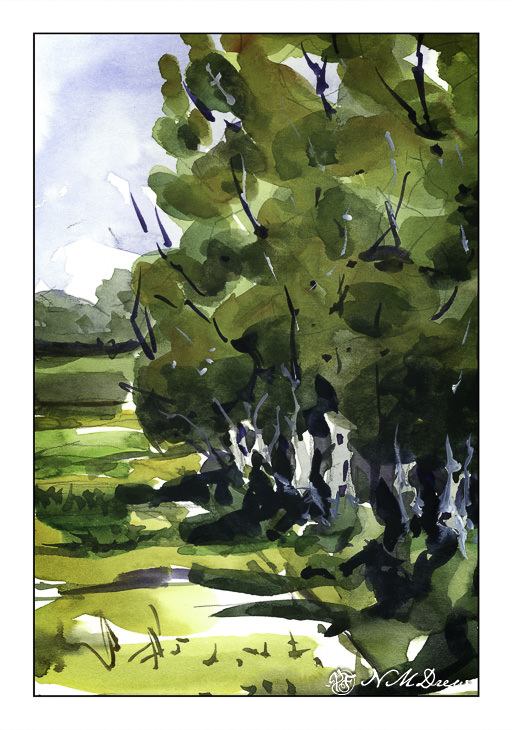
Here, more working with broad swaths of similar colors laid out in a wash. I did this one in a few layers. The first thing I did was the sky and the tree trunks. From there, a pale layer of varying color for the tree foliage, and second and third layers of the same, increasing in darkness. At the end, the field and track and a bit of stuff in the distance. Branches in both dark paint and in gouache.
I have been using Strathmore “Vision” 140# paper for this and other studies, and it is not too bad! Reasonably priced, and it seems to be holding up quite well to wetness and working. I haven’t tried larger sheets, but this may make me interested for practice.
The fountains are dry and the roses over.
Incense of death. Your day approaches.
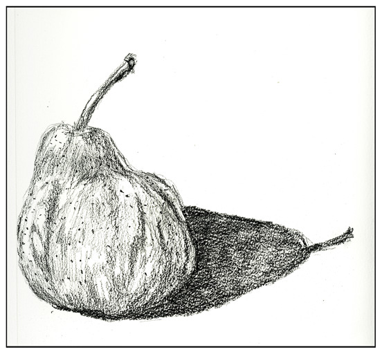
The pears fatten like little buddhas.
A blue mist is dragging the lake.
You move through the era of fishes,
The smug centuries of the pig-
Head, toe and finger
Come clear of the shadow. History
Nourishes these broken flutings,
These crowns of acanthus,
And the crow settles her garments.
You inherit white heather, a bee’s wing,
Two suicides, the family wolves,
Hours of blankness. Some hard stars
Already yellow the heavens.
The spider on its own string
Crosses the lake. The worms
Quit their usual habitations.
The small birds converge, converge
With their gifts to a difficult borning.
These paintings serve two purposes. First is to check out two different 100% cotton papers and decide which has a better feel to it when it comes to handling copious amounts of water. Second is to take a color on a long journey down a sheet of paper, adding similar colors for variety as I go along. I did it in both.
This is done on ArtBeek paper. I consider it to be a student grade paper even though it is 100% cotton. I like it as it has a nice absorbency but it is not up to snuff to my preferences. It is good for studies, though, and a very affordable and nice paper. I prefer it to Strathmore or Canson watercolor papers – they don’t come close as far as I am concerned. This paper has a texture imprinted on the front, but the reverse side is smooth. This actually makes it a good paper for gouache as well as value studies with pencil. No complaints in general.
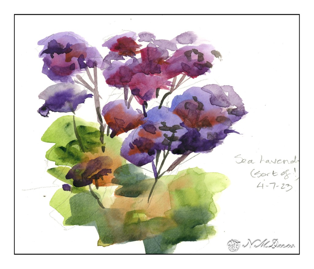
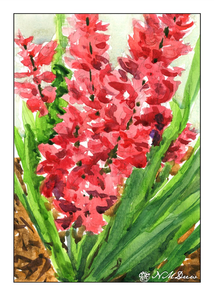
I mixed together alizarin crimson and some other red to try to get a pink – big failure there, so I ordered some Opera, which is a rose pink of a definitely pink leaning. I worked a bead of color down for leaves and flowers, adding different colors to vary the major color. From there, once the flowers were dry, I added darker values with thicker paint.
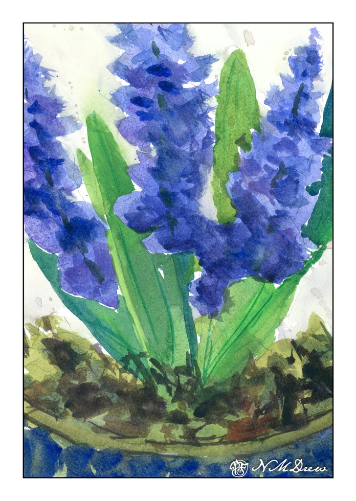
These hyacinths are not as appealing to me as the pink-red ones (which could be gladioli, too!), but the paper is. The paper is extra white Fabriano 100% cotton 140# CP paper. It connects with the paint more readily and there is a sense of contact and control that I don’t feel with the ArtBeek. This same feeling comes with Arches and Kilimanjaro (from Cheap Joe) watercolor papers.
As with the pink flowers and leaves, I worked beads of color down and added various colors as I moved. I started out with a blue that I think is too dark now, but that is part of experience. The same techniques as the pink also applied – dry the painting, add darker colors, creating some sense of depth and detail.
I tried to keep each painting pretty direct as far as colors, not adding too much in the way of glazes. I also worked on negative painting, painting the background around the flowers and leaves.
The past two days’ studies of flowers in sketchbooks were rather precious. Fussy, annoying. That, though, is the purpose of sketchbooks in many ways, as well as memories of places visited or developments of ideas.
Both paintings are 9×12.
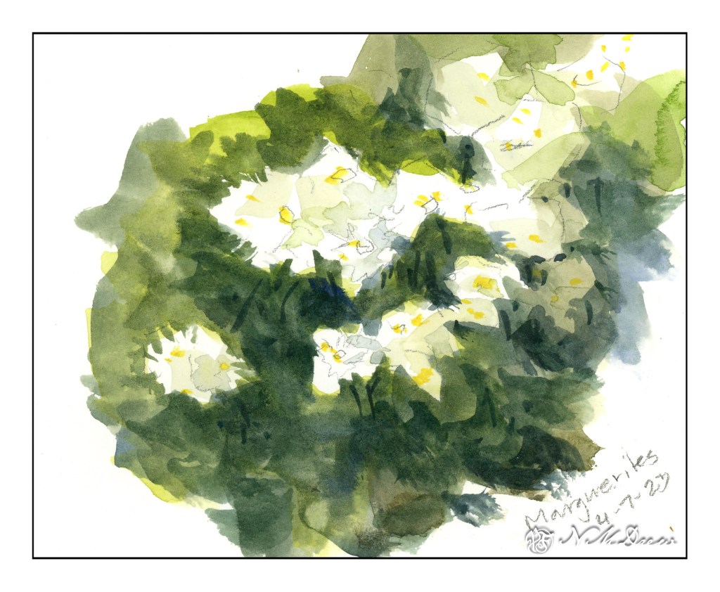
Today’s post is batch of flowers done in a Hahnemuhle Watercolor Book instead of the sketchbook for yesterday’s post. Today I am using a “real” watercolor sketchbook that has watercolor paper in it. I could work with a lot more water without getting blooms or having the paper buckle as in the other book.
I also used tube paints that were on my palette, but found that the paint, having been there for awhile, was very dry. It was difficult to pick up paint in large quantities – just like on the pan paints. To fix this, I put several drops of water on each color and let it sit for awhile – maybe 10 minutes. Misting water on doesn’t suffice – I needed a small flood!
One thing I have done here is to focus on negative painting as well as carrying a plane of color with varying colors along the page. I tried to work light to dark, but other times I worked around the light areas to give them shape. All this is play, experimentation, just doing and then observing, thinking about what I did and what I want to do.
Outcome? Thoughts? A few of my own:
None of these are any good. They show my painting faults to a glaring degree. However, as practice, it will do very well.
Well, gotta run!