Studies: Roadside

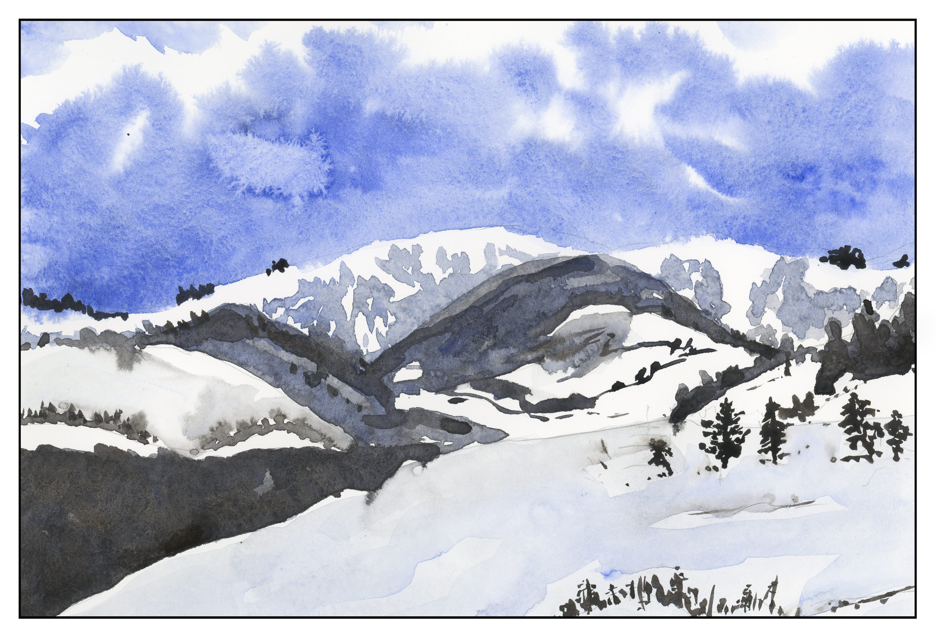
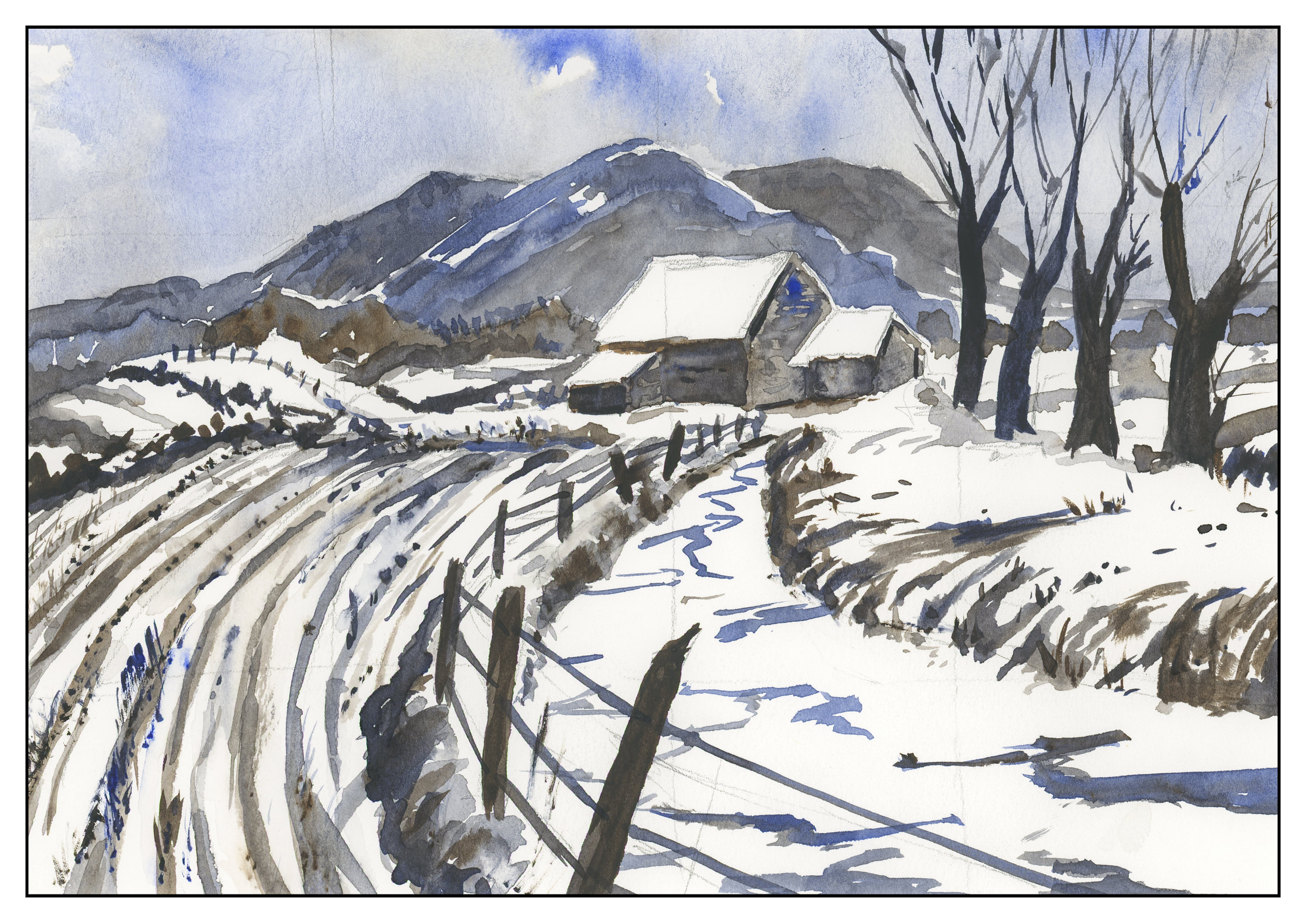
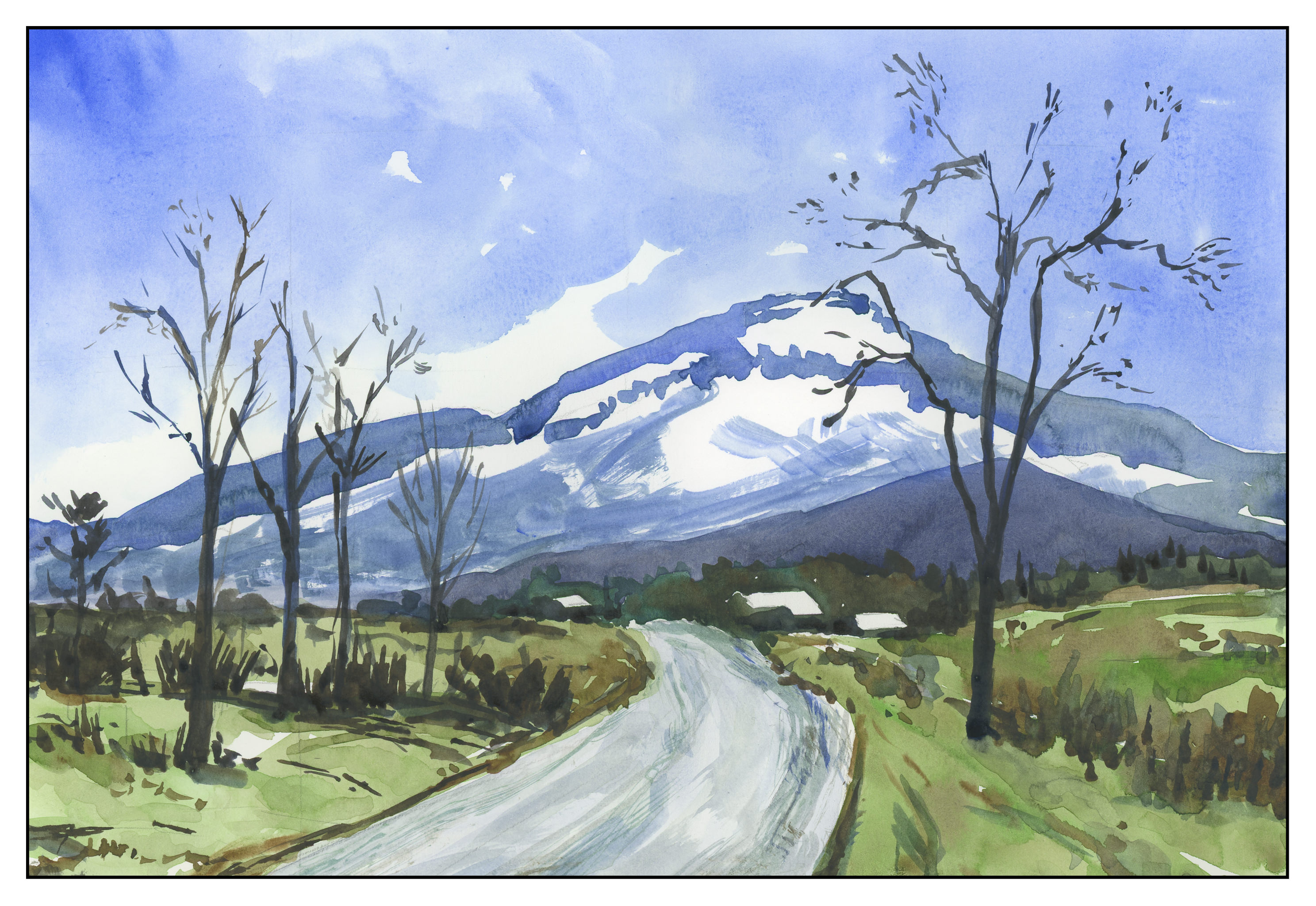
Last summer we drove through a lot of the wild west.  The loneliness of Wyoming always gets me – vistas of open space, few cars, fewer people.  Taking a picture during the summer is much different than what you see in winter, so I looked at some of the photos I took out of the window as we drove from Laramie to the Tetons.  I tried to imagine how barren and cold it could be.  Always the sky, always the distance, always the barbed wire fences.  Again, in Ultramarine Blue and Burnt Sienna.

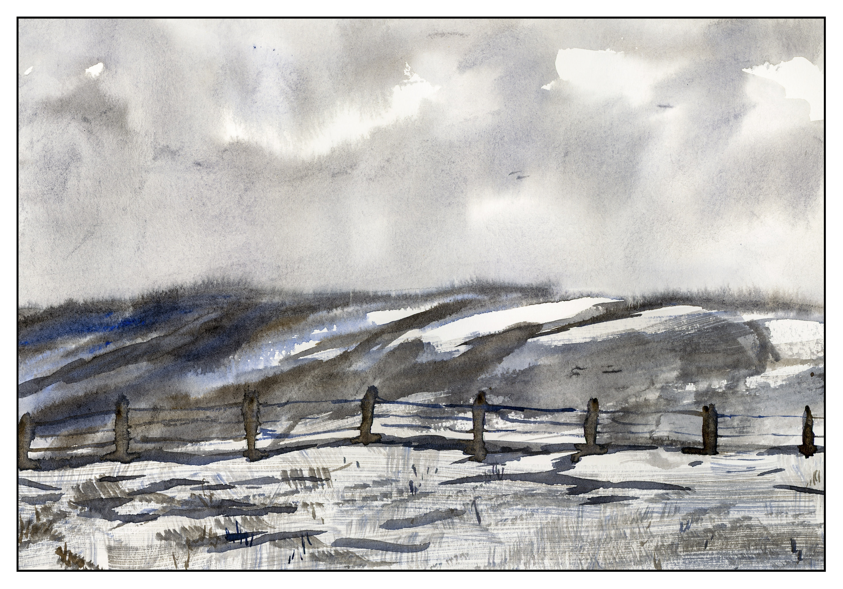
Besides trying to imagine a scene, I also tried out a new brush.  It is a Cosmotop flat, by DaVinci brushes of Germany; it’s about 3/4″ wide.  I wanted to see how it would do on the Canson XL paper I use for practice, in particular to see if I could get a “sparkly” effect with a dry brush.  The paper is too smooth for that to work successfully, which is why there are fine lines in the foreground.  (Sigh.)  It did a pretty good job for wet-in-wet sky, and along the horizon line.

Two Color Studies: Incoming Storm

Another study in Ultramarine Blue and Burnt Umber.  These are really good colors for portraying cold and wintry conditions.  Brr!  Where I live, we have had weather in the 80s for much of January and February, so a break from the heat is much needed.  Today, though, it’s a whopping 52 F.

Two Color Studies: The Mountain

One nice thing about working in only two colors, you don’t get mud.  You get dark colors.  You get light colors.  You get medium colors.  I find that this is actually harder to do, in some ways, and easier, too.  Harder because I have to decide on value (light, dark) and which direction to push the color (blue, brown).  It’s easier as the decisions of color are already made for you (me, the painter!).  Here I have limited my palette to Ultramarine Blue and Burnt Umber, as in the earlier studies from Ted Kautzky I did last week.

After looking at the scan, I realize that some of my darker trees in the foreground sort of float in space!  The lighting at present makes it hard to see, but I will probably go back and correct it later on.


Studies from Kautzky

After the disastrous lilies, I had a good think.  I really am not a decorative painter at heart.  What I love most are landscapes.  The outdoors is to me the most exciting thing . . . mountains, water, trees.  Thus, with this in mind, I pulled out the very first “how to” art book I ever bought, back when I was 16:  Ways with Watercolor by Ted Kautzky.  I still love this book and find his style and words soothing and thoughtful.  To ease my frustration, I did two of his exercises.  The first below is in 2 colors only, ultramarine blue and burnt umber.

The next one is in three colors:  burnt umber, ultramarine blue, and Hooker’s Green.

Kautzky’s palette of colors is one with which I am comfortable and familiar, so it was very reaffirming to feel somewhat skilled after the lilies fiasco.  That really upset my little apple cart!

Lilies

Well – let’s just say that the lilies suck.  The masking fluid tore up the surface of the paper, which is student grade to begin with, and the soap suds from straight dishwashing soap seemed to have remove the sizing – or a lot of it – from the paper.  The paper itself is good for studies with less water, and I enjoy using it for play and experimentation.

The lilies are out of proportion.  Rather a disappointing experience, to say the least.

Still, I am inclined to want to think about this painting.  In reality, this style of painting is better suited, in my opinion, to a graphic presentation.  It’s not “painterly” in the way I want to do watercolors.  If nothing else, that is my take-away from this experience.

Besides being too graphic for my taste in watercolor, the masking fluid was a disaster.  Straight dishwashing soap does not work on the paper, even though my brush didn’t suffer in the least.  I’ve used a diluted soap solution with better results.  I also would prefer to not use masking, simply because I want to keep the process as clean as possible, with few if any extras in the way of the process.

In the end, I think learning what you don’t like is fundamental to many things, whether it’s a job or a way of painting.  This helps to focus your thoughts on your goals because you rid yourself of an unwanted item.  I still plan to focus on negative painting, but want to find a different way to approach it.