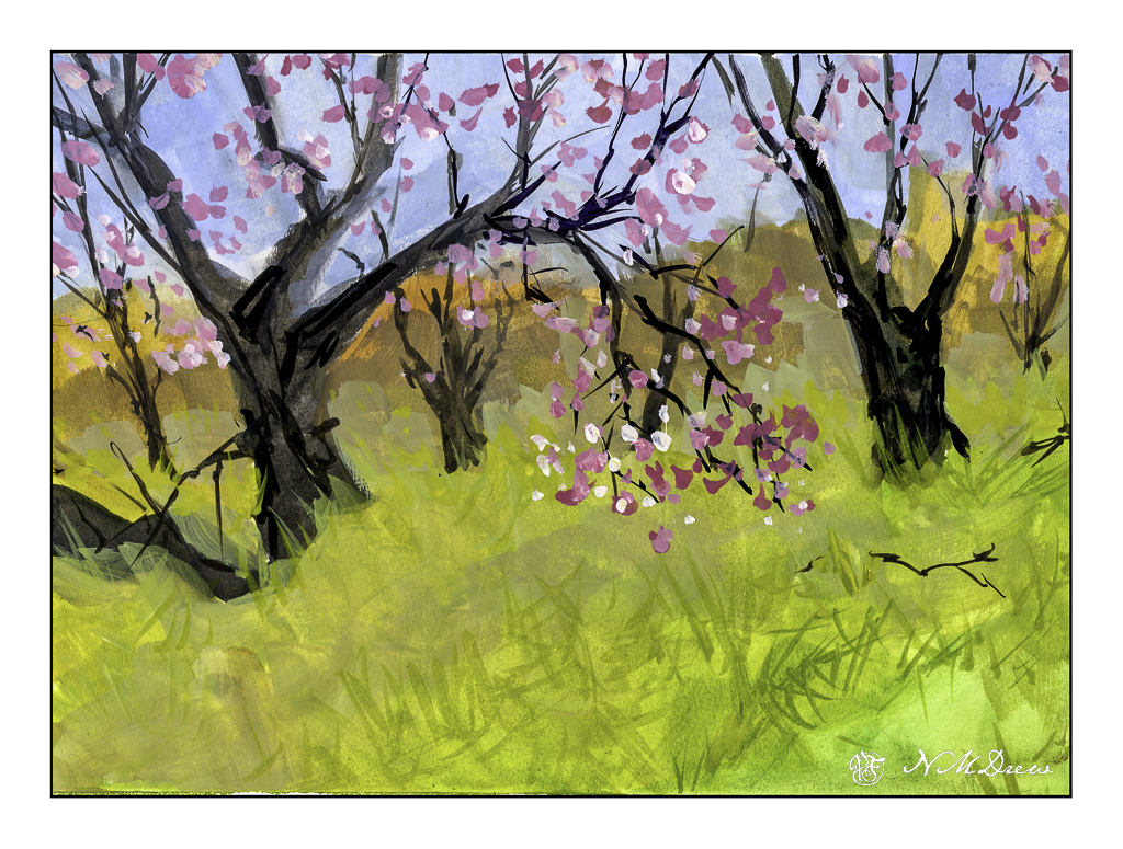
The vernal equinox is upon us, Spring is springing, and a few rains brings greens and oranges and yellows and lavenders to the hills of California. Poppies, more poppies, mustard, lupine. The hills are filled with them – of course, depending on where you are – but when we have really wet winters the hills are alive with color.
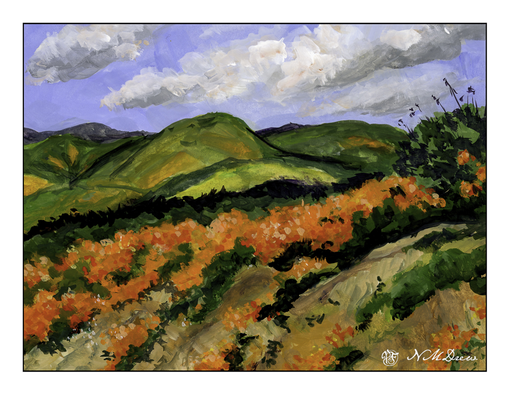
Years ago, and other years of yore, we would drive to the back country or the poppy reserve to just look. Lake Elsinore is well-known for its super blooms (what these massive flowerings are called) to the point where they shut off roads and keep people out. Like parts of the world, over crowding and over-touristed. I’ve taken a lot of photos of this bloom-a-thon, and it is always worth it. And, it is a challenge to paint in a ways as the colors are vivid and almost unreal when you live in a water-starved place and it is beige and brown.
The colors here had to be almost pure pigments with little dilution with zinc white. Gouache, of course. Colors include cadmium red, yellow, and orange along with ultramarine blue, zinc white, yellow ochre, and some umbers. Greens include every single one on my palette!! Once I settled the sky I brought out the titanium white for a bit of emphasis.
I spent a couple of days on this one just because it was really hard to paint. I tend to be a dabber, and that is how I began. Later in the process I just mushed all the colors together, and the next day dabbed in the poppies in the foreground.
Gouache, Strathmore Vision 140# CP paper, 9×12.