I haven’t done any photography in awhile other than a snap or two out of my window. Yesterday, off to the local botanical garden with a new photo buddy. It was really nice to get outdoors again to take pictures, to sit and look and savor all the details the end of summer brings, from the last of the summer flowers to the turning of the leaves.
First stop here was this little brushy bush with red flowers. I don’t recall the name of the plant, but there were bees everywhere (in case you haven’t figured that out!). I had a 24-200 Z mount lens on my Nikon Z6ii, so I had no real macro lens, but at 200mm, I could keep my distance and wait for a bee. I cropped the photo considerably to show the bee and flower. And then this morning I thought up this rather bad title.
A hot, humid day with rain coming or going. Summer is leaving, time soon to bring in the harvest. Late afternoon.
I am totally into lavender fields! The bright colors just make you happy, and when in contrast to the warm yellows and golds of other plants, how can you not but rejoice in nature?
Yeah, it sounds corny, but landscapes and the countryside, no matter where, just make me happy. It can be in gentle countryside like here, in the desert, in the mountains – all just touches me and brings a bit of peace.
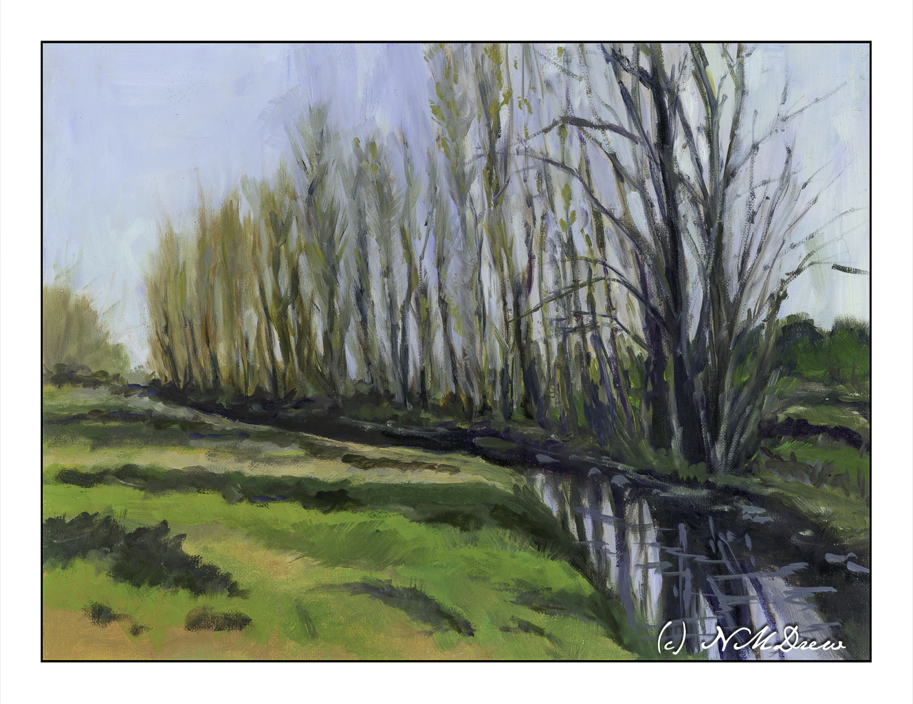
I don’t know why, but I always thought these were called “plane trees,” but it turns out they are poplars. We don’t have them here in SoCal. The ones we do have that look similar – in the sense they are narrow trees that grow tall – can be a type of juniper or eucalyptus. I am really drawn to these trees because of their fine branches and leaves which change in the fall.
If you read my blitherings, you know that I am enrolled in an oil / acrylic painting class which meets weekly, and have been in it for several months. I chose oils as they can be worked on over several days with the paint remaining wet over a period of time. What I like about oils is they blend easily and a softness can be achieved (by me, at least) that I can never get when I use acrylics. In this painting, I worked on both simplification and abstraction of various elements of the painting as well as atmospheric perspective. I only considered this painting “finished” when I added some squiggles in the water to suggest movement.
Overall, I am pleased with my results. I have spent several months gazing at it. It never seemed done until those little squiggles showed up. Crazy, huh?
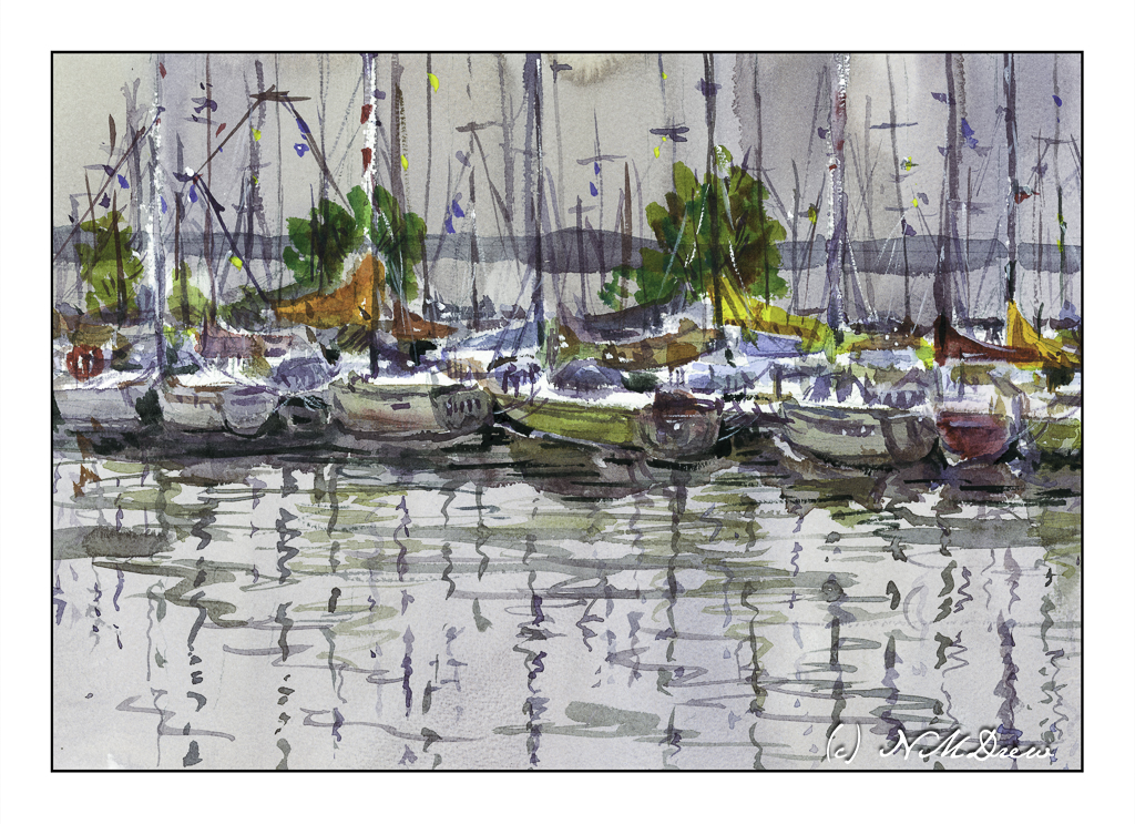
Once more, a class by Shari Blaukopf, “Sketching Boats: Simple Solutions for a Complex Scene,” has changed my approach to subject matter in watercolor and other media. I think this class amazed me the most in how it affected my own painting. As Shari writes:
I love painting boats, but this course is not really about that. It’s about simplifying a complex scene. So, while boats and their reflections are our ostensible subject, I’ll be sharing my tips and techniques for making visual sense from any scene of complexity.
Complex scenes – other than landscapes – overwhelm me when it comes to painting. I just have no idea where to begin. Looking at a bazillion things cluttering up the subject matter and deciding what to do is sometimes so much that it is better to walk away and try something simpler. For me, buildings are often the culprit, and this means city scenes go unpainted. Certainly scenes of harbors and boats and marinas are even more complex as boats sit on the water and are all about the same height – masts being the main difference in a marina full of sailboats. However, this class broke it down quite nicely, and while I am not especially enamored with the results, I am really happy with what I learned from this class and the general success of the painting.
Essentially, the process is very logical and simple. The scene is drawn in pencil. The horizon line is determined, and then the drawing is begun. The boats, as they are the main subject, are drawn on an even level – they all are pulled up against a dock and the water is the surface. There are no hills or valleys. The boats closest to the viewer are drawn in detail, and the rest are suggested with shapes and lines, with their “oh, that’s a boat” qualities indicated when painted.
The sky and the forefront water first were painted along with the land in the distance behind the boats. Areas for larger masts, the white ones, are left unpainted. Then the detailed boats were generally limned in with color. Masts and reflections are indicated in this early period. From there, the painter works back toward the more distant boats and such. Eventually, details are added and final, tiny touches with color and white gouache complete the painting.
In summary: the simplest areas are completed first. The complex areas where detail counts is narrowed down to the first row of boats. Large to small. General to specific.
Writing this does absolutely no justice to Shari’s wonderful short course. I recommend it for watercolorists and any painter intimidated by complex scenes. Her breakdown of a complex scene is very simple – but I personally would never have thought about painting this way!
I was floored by my results – I did not expect to be able to do this painting at all.
Watercolor, short course by Shari Blaukopf, Arches Rough 140# paper, 10×14.
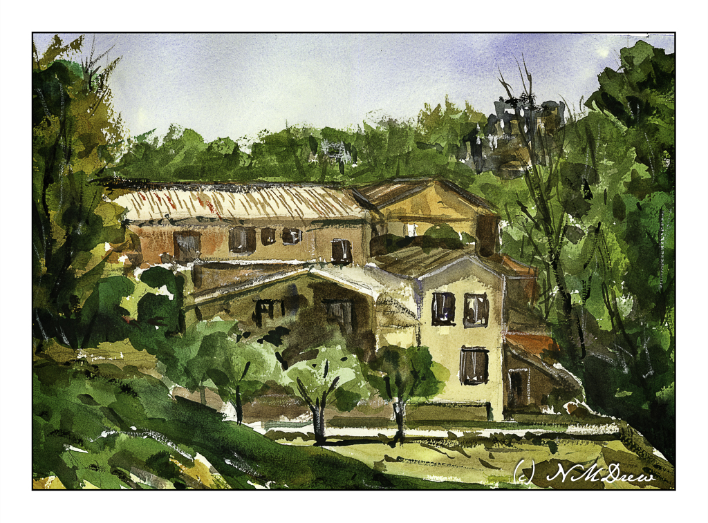
This is sort of an amalgamation of pictures and buildings. It may be part monastery, part hospital, part something. So, “Insititution”.
A few goals here. First, a building of some complexity. Next, contrast on the building with sunny areas and shady areas. Mission accomplished, sort of!
I also used gouache, white and black, for different areas of the painting.