The Palo Verde Tree

The local botanical garden is open at last!  It has been closed since Ventura County closed trails, stores, and such, as well as issued a shelter-in-place order to keep the spread of the coronavirus at a minimum.  Some places are beginning to open up, though the shelter-in-place order is on until the end of May.

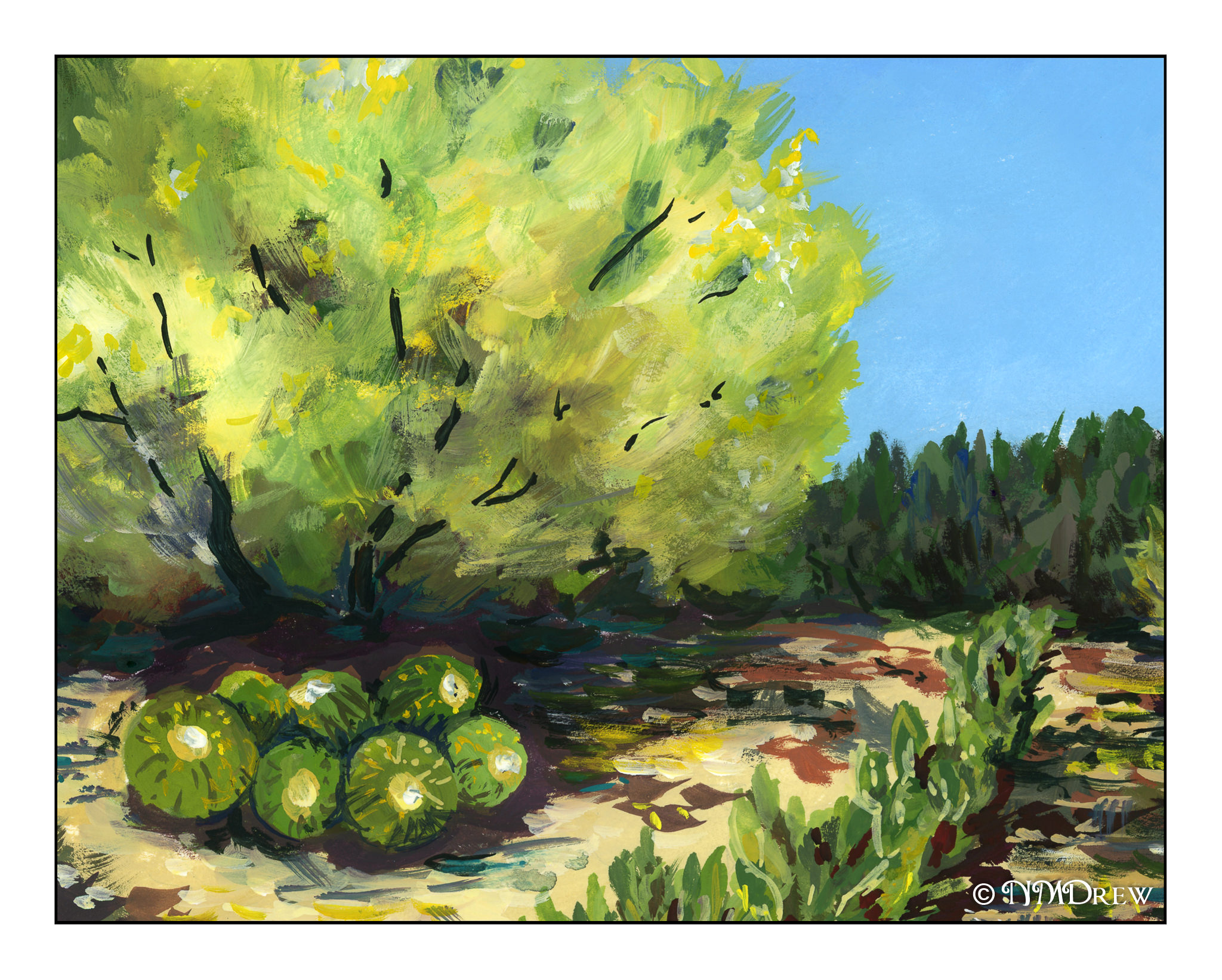
It was such a treat – a real slice of heaven – to be able to walk around the garden again.  Many of the spring flowers have gone, like the poppies, but many of the flowering trees are in bloom.  The palo verde tree at the top of the hill has leafed out in all its delicate bright yellow-green glory.  It is so graceful and lovely in spring that it could not be overlooked – here it is for today’s painting.

Time to Be a Student

I have been painting every day for the past two or three weeks. I enrolled in a couple of online courses, both of which I have totally enjoyed. However, my poor drawing skills keep flying in my face. Yes, I can render things realistically quite often, but all too frequently I tumble when it comes to proportion of multiple objects together, and  a lack of ability to convey perspective.

So, after doing a bit of research, I decided to get myself some help.  Not online course here, but a jan-yoo-wine book.  Ebook, admittedly, but nonetheless, a book. The book is called Keys to Drawing by Bert Dodson. I have other books on the basics of drawing, perspective, pen-and-ink, the right side of the brain. I just wanted something that starts out with basics and straight-forward writing.  I think this will be a good choice to rediscover drawing.

I am not going to get into this book in depth here online, but I am planning to follow it and see how my skills evolve. I need to renew my knowledge, and baby steps and exercises are the key. I plan to continue to paint every day, too, so I will be a little nutso I expect – but who isn’t without people to socialize with in person or being able to go for a hike?  This seems like a perfect time.

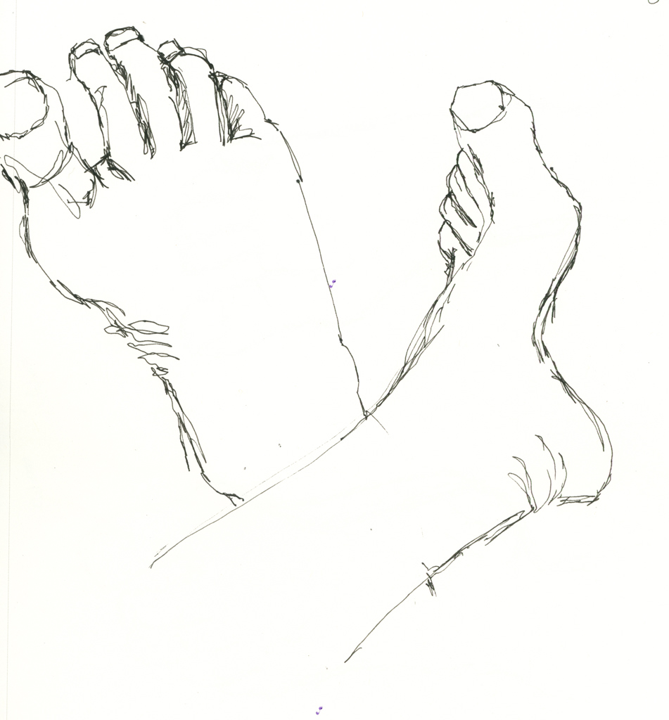
Thus, with no further ado, here are my beginning exercises from Keys to Drawing: Contour drawings of my feet and left hand.
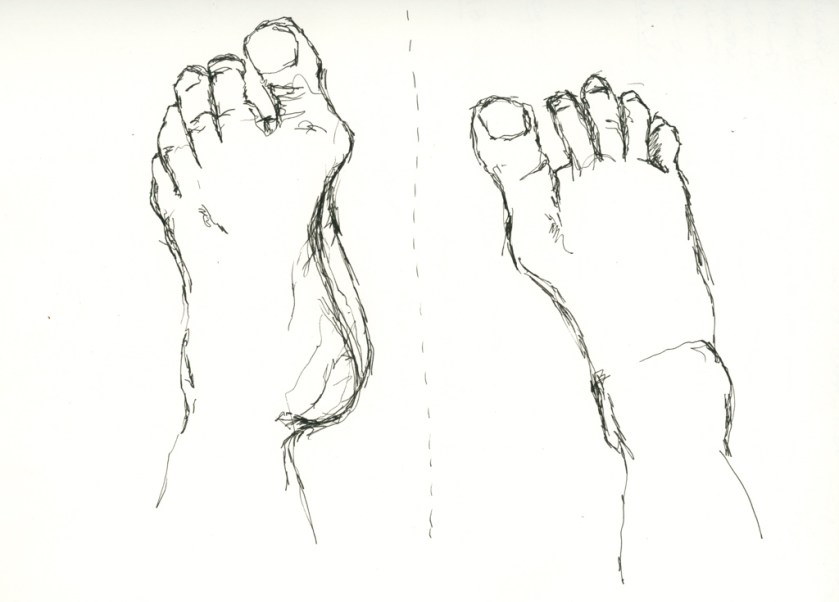
Yeah, I really do have a big gap between my great and second toes!
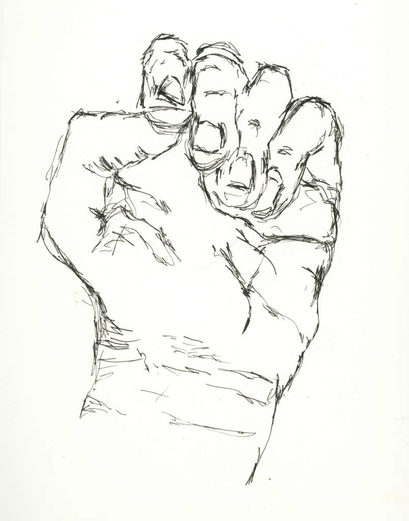
The first exercise was feet – I did three but did not include the first. Dodson says, “Look, hold, draw.”  Look at whatever you are drawing, observe the curves and angles, and put them down.  Spend more time looking at the subject matter to see if you are getting the lines correct, not if you have a good drawing.  (Ah, monkey mind!) As I progressed, things got better and I began to look at relationships of this to that, and things began to improve. 

And that, she said, is what I want to do.

Nowhere Barn

Addendum!

This is the second scan from the final one below.  I changed a bit of the elements after doing a preview scan – don’t know why the one on the bottom of this post is so, er, intense!

Now, let us continue . . . 

More perspective studies!  Today I did a single point study.

This time I created a single vanishing point.  This one is below the building, and above the road.  The idea for this is that the road ends up going over a hill or slope before the horizon, at eye level, is met.  I did a pencil sketch and erased it a billion times.  Finally, when I liked what I did, I erased most of the lines after inking it in.

Sort of a value study combined with a color study to see what I might like for color mixes in watercolor.  This paper is mixed media paper, so it is not the heavy Arches 140# cold press I like for most work.  I think the perspective works pretty well.

Well!  Aren’t these colors intense!  The scan for some reason just came out like this – the original is a bit more subtle – but I rather like it as I think it expresses the intensity of color that sometimes comes with lowering clouds and a storm.  Makes me think of my time as a kid on the plains of the midwest.

So, the final study does have decent architectural perspective, and perhaps even some atmospheric (lots of atmosphere, but more like pressure type!) insofar as I tried to simplify things.

I will continue my focus on perspective, and using it in different media.  Watching videos, referring to books, and just doing it is helping.

Another Tale of 3 Paintings: Tanglewood

Yesterday was Painting Disaster Day. I suppose it had to happen after a couple of good rounds. It was also nearly 100F, and even with the air conditioning on, I was hot and cranky, and that doesn’t make for good focus. Anyway!
I took this photo last month, and rather like its moodiness. The dead leaves and bright new leaves create interesting colors while the trunks create interesting lines. The first attempt to reproduce this painting in some form or another began with pastels, then gouache, and finally watercolor.
This pastel painting is rather clumsy, but I have found in doing these kinds of series that usually the first one, in whatever medium I am using, is always the starting point. I learn more about the picture as I paint it. 9×12 on Mi Teintes paper.This is the second in the series – a small 6×8. What I did differently here than my usual gouache is I used Arches hot pressed paper and worked to keep my gouache paints thin (cream consistency) and moist while I painted. The smooth paper and smoother paints made painting a lot easier. It turned out pretty good!
Finally the watercolor. This is on the reverse side of another painting, on 16×20 Arches cold press watercolor paper. As both pastels and gouache allow for opaque overpainting of other colors, by this time I had a pretty good idea where light and dark were and could plan ahead. I used frisket on the tree trunks and in areas where the leaves are hit by the sun. Keeping these areas masked off let me apply broad washes across the paper without losing the shites.

Altogether, I am pleased with this series. I think I may redo the pastel painting as I have some new pastels to try out! Meanwhile, I am looking for some buildings for my next triad (or “try-at”) of paintings.