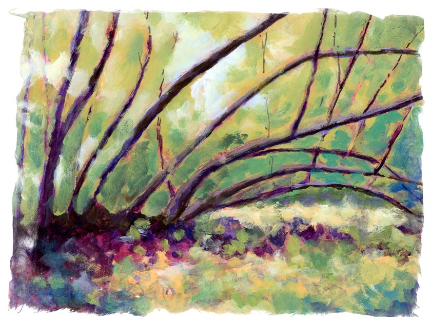
Above is where I currently stand with my acrylic version of Tanglewood. I changed the foreground and began adding colors to the leaves, hoping to indicate dappled light. The foreground was similar in texture and appearance to the leaves, so I applied paint and mushed things around.
In looking at it, I thought this was looking okay, but so boring. Teacher and I both agreed the trees were too symmetrical and their pattern to repetitive. Time to fell some trees!
Home, the painting was scanned, and then sent to LR or some other program to remove the center tree. I didn’t even need to get out my saw! This definitely makes the painting better already.
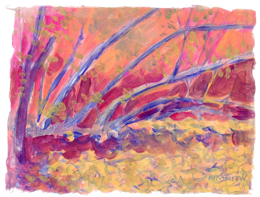
More tree removal, but not as well done as the first one. The hint of the upright remains, but in that glimmer of a tree comes some new ideas.
First, the removal of just one tree is my preferred one of the two. The second one shows that suggestion of an upright, perhaps more subtle (i.e. obscured by foliage) works, too. More upright trees in the background, hidden by foliage, will add to the visual interest of the painting without creating a yawn-worthy one.
So, this is where I am right now. Not finished, but getting close. If you have an opinion, let me know!
A paintings is rather like rocket ship – different stages as it takes off.
I did this in yesterday afternoon’s class, trying to focus on both light and dark, warm and cool. Acrylics seem like a rather unforgiving medium insofar as they dry quickly and can have very hard edges. That makes it a bit of a challenge for someone like me who prefers blending and mushing painting. It took me a bit to figure out how to do it.
The fun thing about an art class is the class members and seeing how they paint. Perceptions and styles are all so individualistic. Naturally you prefer this to that, but admiration for an individual’s work doesn’t mean you have to copy them. Add to this, people are so full of information and stories, and this adds to the value of their art – you get to know them.
So, this may be put off for a few days as I have some other things I need to do – and it never hurts to take a break. I hope I don’t start more than one painting at a time, though, as then I will fall into my habit of UFOs lying around, sobbing for attention.
Back to “Tanglewood” – done already in gouache and watercolor and pastels. Now it is time to do it in acrylic! (If you want to see these, and the photo, click on the tag “Tanglewood”.)
Here I decided to work on setting up values – light and dark, warm and cool. I thought it might be fun to set up areas in complementary colors, but who knows. The whole thing could end up very odd looking, certainly for me and my boring outlook and driveness to reality. I am seeing this as an adventure. The photograph itself is rather dark and murky.
Colors used on Fredrix canvas pad are cobalt blue, Naples yellow, quinacridone magenta, and zinc white. These are applied atop 2 layers of gesso and then a substrate of yellow ochre mixed with Marigold (Holbein’s cadmium orange).
Now that social isolation is lessening and classes can resume in person, albeit with masks and social distancing, I have taken on colored pencils and acrylic painting. To say I have been having a blast is an understatement. Of the two, the painting class is more “me” but the colored pencil class is an adventure into unknown territory.
Colored pencil drawing seems like a logical next step to graphite (pencil) drawing, and in a way it is, and in a way it isn’t. With graphite, shades of grey is what makes the picture. With colored pencil, pencils become almost more important because color, pencil type, and techniques used to create effects in the painting / drawing are considerably more complicated than graphite! So, here are some more colored pencil drawings I have done.
Moving on from colored pencil, my acrylic painting class began last week. I chose “intermediate” as “previous painting experience” was the only requirement. Since I paint with watercolor and gouache with some success, it was a logical choice. And what a wonderful group! Many people have been taking the same class for 4 years – quite a tribute to the teacher. The class is not structured, so subject matter is up to the individual. This doesn’t mean a lack of instruction, but what it provides is direction from the student and help in the process. It works for me.
Years ago, like 40 or so, was the last time I worked with acrylics. I didn’t like them at all. However, today my attitude is a lot different. I have time, motivation, and the opportunity to learn from many resources – teachers online and in person. My sister also paints with acrylics and she has been very helpful with all sorts of information and such.
This was my first acrylic painting. I brought it to class with the underpainting done. I used a Daler-Rowney Acryla 3 set with about 10 colors. My approach was quite trepidatious! I pretended I was painting with gouache, which helped, but my fear was destroying brushes and having paint dry in seconds. Neither catastrophe occurred. I used Canson XL paper as the support, taped to a bit of gator board.
The next one, above, is a rendering of a photo I took while walking along the bluffs in Carpinteria, north of me along the coast. I did this on Fredrix, a canvas pad which is primed. I gessoed it, and like the paper, taped it to gator board. Here I used matte medium only, and the result was a really pleasurable application of paint – it was fun to feel the paint get all squished around with the brush. The canvas surface, too, was a pleasure to work on. Once off the gator board, the Fredrix is really like a canvas off the stretcher bars.
For this image, and the one below, I followed a couple of videos by Will Kemp on YouTube. The one above I only used water to thin the paints; the one below was only matte medium. The supports were canvas panels, 8×10, pre-primed but re-primed by me.
Comments from those who have seen these apples like the apple in the lower painting best, but the background in the upper painting best. I agree.
This is my latest painting. It is from a video I watched by M. Stewart on YouTube. The video is an hour long, filled with information and funny comments. I think I learned the most with this video insofar that there was more time and more detailed instruction. The simplicity of Kemp’s videos of the apple helped me get ready for the complexity of the Stewart’s video – both are excellent teachers.
Tomorrow . . . I think I need a bit of a break from painting, but I do plan to continue working on art as much as possible every day. However, sewing does call, and so does the beauty of the outdoors, and . . . life is too full for only one thing!
Today is my fifth painting with acrylics. I felt confident enough to choose a more complex subject, using (of course) another YouTube video. I am learning a lot by following videos, especially ones that suggest brushes and colors, as well as explain techniques.
This painting is done on Fredrix canvas pad paper, 11×14. The canvas, though already gessoed, was gessoed by me. I like that step and feel it is a good way to begin a painting, much like grinding ink prior to doing sumi-e. There is a meditative element to it.
Murray Stewart, whose video I followed, painted his underlying canvas with burnt sienna. I used red ochre and found that the color is just yummy! I live where red soil is known, so it was like seeing an old friend. That said, from there I pretty much followed through the video. About half way, Stewart mentions that the basic work was done, and details were what were needed to finish the painting. I agreed, but watched through to the end.
I have been using titanium white for mixing colors, but decided to use zinc white, as I do with gouache. For gouache, and mixing colors, it is great, but the titanium is a much better choice for mixing colors in acrylics. I am not quite sure where I will use zinc white in acrylics, but I am sure I can do some research.
This video presented me with a lot of material I enjoyed learning: making sun beams, using a fan brush for foliage, dark against light and light and against light effects. More, too, simply by doing. While painting, I found that dipping my brush in water prior to picking up paint made for better painting. The brush wasn’t sopping, and the water in the brush gave enough moisture to allow pure pigment to be spread around. I also found that this helped with glazes.
So, here is Stewart’s video – he did a good job, and he is pretty darn funny, too!