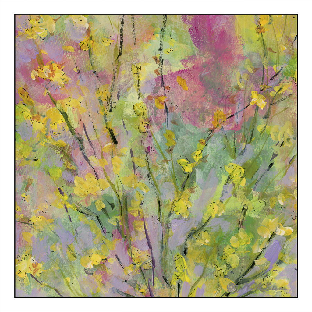
Today I wanted to paint but had no desire to do anything more serious than play. This is the second of 2 paintings I did using big brushes, color, and slapping on paint. Eventually this evolved, and it’s a bit soppy if you ask me.

Today I wanted to paint but had no desire to do anything more serious than play. This is the second of 2 paintings I did using big brushes, color, and slapping on paint. Eventually this evolved, and it’s a bit soppy if you ask me.
I watched a few videos by Jane Slivka, an acrylic painter out of Florida. She tones her canvas with a reddish orange color, paints in the major shapes in Hooker’s green, adds white for highlights, then proceeds to build her painting. Her paints are heavy body while I have been using fluid acrylics. I thought her process was quite interesting as it is seemingly spontaneous, but not without structure. Her steps give it structure, but she is not a slave to her subject – she sort of moves along with a game plan and no game plan, if that makes sense.
What really fascinated me was how she actually creates values by working in the lights and darks before adding colors. Additionally, the red tone beneath the brushwork pops through, and adds a bit of sparkle to her paintings. Negative and positive space and shapes are worked back and forth.
I tried to follow this approach, and found it really quite interesting. In many ways it simplified what I wanted – lights, darks, values, contrast. Carrots are not especially exciting things to paint, but they are quite cheery with their bright colors of orange and green.

Painting the carrots and their tops was really fun. I didn’t take this painting seriously, and sort of slapped around colors, working to see what might be successful, might not be. Never before have I toned a painting surface with cadmium red, but I think it could become a favorite thing to do. Yellow ochre is a wonderful color, but it is not especially dramatic. The little bits of red poking through the greenery is quite pleasing to my eye. I expect I will try more paintings like this.
Golden Fluid Acrylics, Strathmore 300 watercolor paper, 10×14.
Several weeks ago I started an acrylic painting of a building at the end of a road. It was sort of painted in a traditional manner, meaning I was trying to represent reality. Truthfully, it bored the hell out of me, but I kept it as it was fairly decent in my opinion, but it did put me to sleep.
Working with brighter colors of late has really been exciting for me as I feel much more of a connection to the colors I use than I do to subject matter. Subject matter can be anything – but colors express more to me and are more true to who I am (a magpie reincarnated as an old bat) than subject matter in general. So, I took the painting and painted over it. Below is the original.
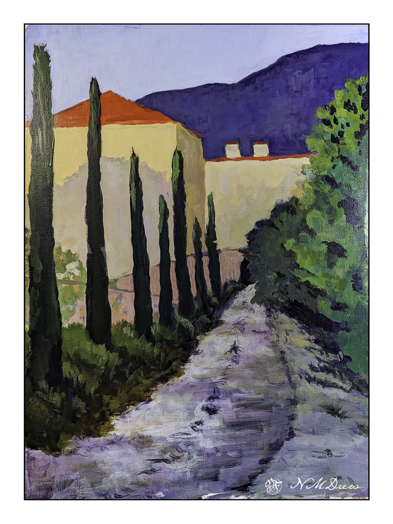
This is a photograph I took and it is pretty crap (above) as there is a lot of weird stuff going on. I didn’t think it scanning it because of its size. This morning I scanned my current iteration of this painting.
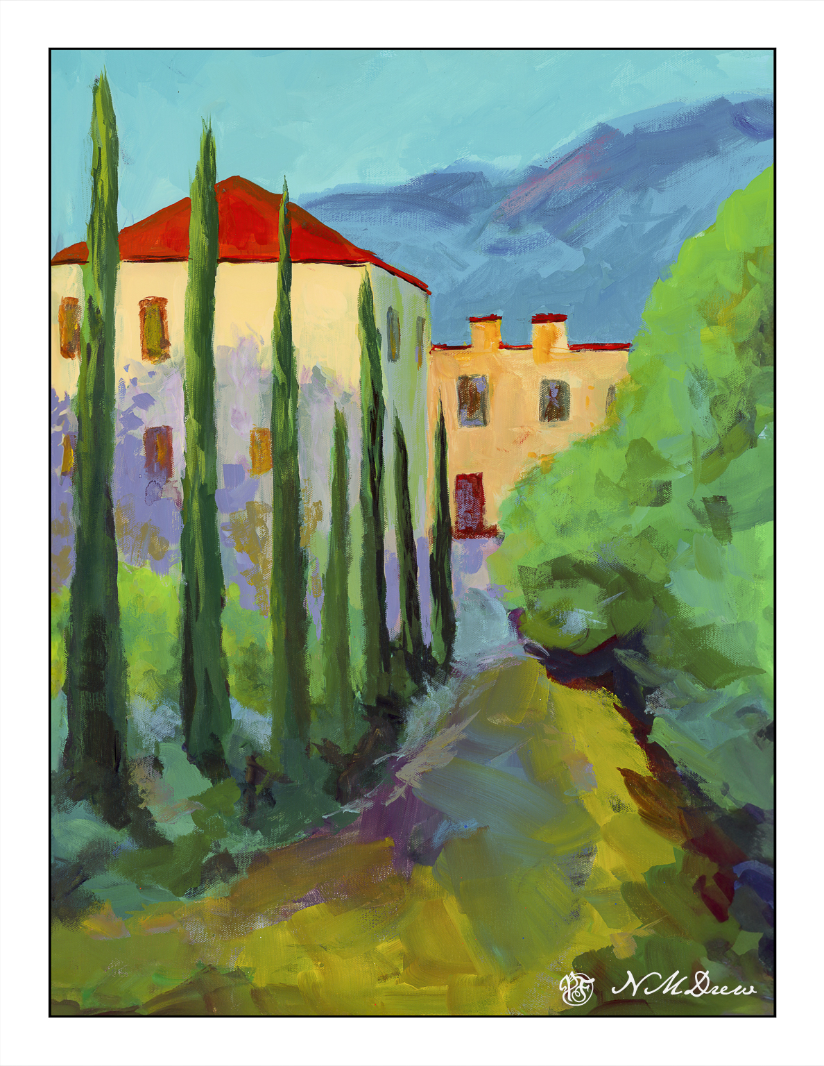
I like this much better, but it is not quite done. I need to work on the road in the foreground as well as details of the building. More windows, fix windows, fewer windows? Create some focus at the end of the road? Fix the road? Cast some shadows – creating light and dark – across the road?
Many things to consider here. I am going to let it sit and ignore it awhile. If you have any ideas, let me know!
Acrylic, canvas, 18×24, scanned on an Epson V600.
Yesterday I posted some of my paintings and a master copy of Khan’s Ground Fog to practice using large, simplified swaths of color to create abstractions of landscapes.
I like abstraction and simplification of things in paintings, but pure abstraction seldom attracts me. Recognition of whatever a painting is trying to depict seems to be essential for me to want to look at a painting, but as I study colorism / colorfield / abstract expressionism more, I find that sometimes pure color by itself can be enticing. I used to detest Rothko’s work, but now I am finding it quite entrancing as I appreciate the subtle qualities of color, and colors adjacent to one another, a lot more.
With this in mind, along with observing the work of Wolf Kahn, Richard Mayhew, Hashim Akib, and Andrew Faulkner, I painted this field of sunflowers.

I started out with big color fields for the sky, trees, and sunflower field using the basic colors of blue (sky), dark green (trees), and yellow and green (sunflower field). From there, I really worked to keep the foreground simple enough as the treeline, mountains, and sky do not beg for detail.
Initially I wanted to paint dots to represent the center of the sunflowers, but in the mindset of color planes, I didn’t. It paid off, but I was still not happy with how the sunflowers and foreground areas looked. Thus, some dabs – but bigger ones, brush strokes instead of dabs to be more accurate. Negative painting, too, and straight lines to represent the sunflower stalks. The buildings and poles were added at the end to add interest to a very horizontally oriented painting.
I am quite pleased with this painting. Goals were accomplished and my own style emerged here. I also did a lot of thinking about colors, how to paint a straight telephone pole (put a card down and run the paint brush along the edge), atmospheric perspective. Simplifying was difficult, but the broad swaths of color with variations within worked. In short, I have a bit of an abstract landscape in which the subject matter is recognizable, but not realistic. If I want a photographic rendition of something, I’ll just take a picture with my camera!
As I mentioned a few days ago, I am experimenting with swaths of color. Not simple planes of one color, but variations of color within that plane is the goal. A number of artists do this beautifully, and the graphic quality is elegant to my way of thinking, with the simplification being the subject and the goal and the voice of the artist. As I am a dabber, this is a big challenge for me.
To begin this, I decided to try my hand at exploring a painting by Wolf Kahn. The one I copied is called Ground Fog, and it is a simple study of grey, white, yellow, green, and variations of each within each area of color. Below is my attempt.

This was a challenge to try as he painted this in oil and I am using Golden fluid acrylics. Blending the colors was hard and required a lot of thought and movement rather rapidly since acrylics dry quickly, and the fluid acrylics even more so than heavy bodied acrylics. I got frustrated, let me tell you! Despite that, I did learn a bit about color – not quite sure what, perhaps just that subtlety is hard to achieve.
From there, once more a foray into fields of lavender and other crops, such as perhaps alfafa or wheat – no idea! I just know I see tawny colors and greens when I look at photos of lavender country.

While not especially low key or subtle, I was pretty pleased with the planes of color with the variations therein. The green and lavender are not too heinous when juxtaposed. I like the mountains and sky in the distance, as well as the trees. Sometimes nature is not subtle, and while bright, I think I did a decent job of catching a sunny day in a Mediterranean clime.

The lavender field with the green foreground was done with both large and smaller brushes. This one was done, for the most part, with a rather scraggly 2.5 inch bristle brush with a lot of scrubbing. In particular, you can see this in the sky. I applied varying layers of blue and white, painting up and down to use the brushwork to express the clouds in the sky. The same with the lavender field below. I used a smaller brush for the dried field area with trees, but worked to keep the brush strokes and colors to convey light and depth. I think it worked fairly well.
The study I did on Kahn’s painting gave me ideas on how to create the color planes, but of course I am not Wolf Kahn, and therefore have my own whatever method in creating such things. Acrylics, too, have qualities which oils do not, and blend differently. I am still learning them, and while I get annoyed and frustrated, each painting helps me gain skill and learn the language of the paints. These are invaluable lessons in technique and composition and methods.
