A Tribute to Janus

I am at an age where looking forward shows little time left – I could be dead in a year for some reason! – and looking back makes me appreciate many of the people I have known and met, things I have done, adventures I have had. Making the best of time left is a major goal, and as Clint Eastwood said, “I wake up every morning and don’t let the old man in.” Let’s change it to “old lady” and take it from there.

I have lived in different parts of the country, mid-west, west coast, east coast, upstate New York. I have taken trips throughout the country, sailed in the British Virgin Islands, been stuck in airports overnight far too many times. Siblings live in Wisconsin and Colorado. Relatives are scattered throughout the country, many I have never met because of my immediate family moving every few months for several years, and we never went back to visit. It makes me sad in some ways, and feel empathy for my mother who was often home alone in a strange community with 4 kids to raise and a husband overseas in some mysterious place for many weeks or months at a time. It wasn’t easy for her, nor us, nor my father – connections that could have been were easily broken.

Sentiment is not something I “do” – broken ties mean just moving on to the next adventure. This is not necessarily a bad thing as being weighed down by the past can be a challenge, but it does bring a sense of disconnect from other people and a lack of willingness to risk a connection that can be severed. Loss is part of it, but there is expectation, too – what lies around the corner? New adventures await!

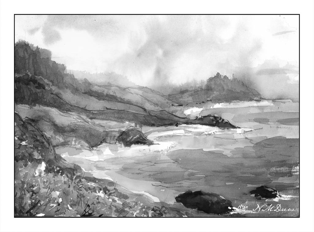
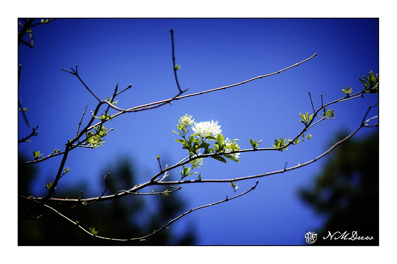
We are used to long road trips, taking several weeks to travel here and there. They are so fun – sometimes tiring – but there is a certain level of Zen that accompanies them. The time passes differently when confined to a car for hours. What is there to do? I often knit on a mindless project, daydream, chat with Josh, look at the landscape, snap crappy pictures out of the window. Country and towns flash by. Then we stop for 2 or 3 days in a town, explore it, and move on. There are a number of places we would like to visit again, and perhaps we shall.

In a couple of months, we will be taking our first trip overseas. We have been to Canada and Mexico, but in the fall we will be flying to Rekyavik and cruising to Barcelona. Stops on the way include Liverpool, Dublin, A Coruna, Lisbon, Porto, Malaga, Valencia, and then Barcelona. From there we travel to Almunecar to visit friends for a week. Then home.

While I look back on travels, I also look forward. New places to see, different cultures, good friends. This could be our first and last trip to the Old World, but one to certainly treasure and enjoy with memories and pictures and experiences.

Sashiko #5 – First Color

I starched and pressed a rectangle of denim from the same stuff I have been using and had washed. It made a major difference as far as an ability to be nicely stitched, I think. It could also be that I am being more conscientious about the rhythm of my running stitches. With this fifth sample, my hands are getting comfortable.

You can see that my stitches are more even and my lines are more straight. This is not counted cross stitch or Victorian handwork where threads are counted. Instead, it is a decorative art with a bit of the human thrown in! As you can see, some areas have more stitches in the same distance and others have less. Is that important?

My beginnings and endings are a bit neater, too. I’ve been using back stitches to begin and end my thread, but in some areas I carried the thread to a new area in need of stitching by running the threads together on the reverse. All the stitching on this sampler is being done on the right side of the fabric, but sashiko #6 will be on the reverse . . . but that is a few days away!

Misty Coast – 2 Versions

Seldom are my watercolors subtle in color. Instead, they tend to be bright and rather garish. Today, I focused on a softer color while painting, meaning more delicate colors, more muted tones. The reason for this is I was driving down to the Valley for an appointment, and I was noticing the soft, hazy qualities of the air. Greens were light and delicate, flowers alongside the roads, while strong, were not a brilliant yellow. In the distance hills and mountains were soft, blurring into the distance – still clear, but very, very soft.

This motivated me to see if I could accomplish something a bit more subtle. I looked at a picture of the northern California coastline, which can be rugged and foggy, with mists rolling in and out, obscuring and revealing at any given time.

Below, is the first painting. I used a lot of water to paint with as well as dilute my colors. This makes them more pale. It seems to have worked fairly well.

To test my theory of a softer, more grey image – longer grey scale – I turned the painting into a black and white image by both desaturating the same image above, as well as removing all vibrancy.

As you can see, there are a few areas which are very dark, but there are a lot of shades of grey, most of which fall into the arena of middle values.

Below is the “revised” version of the first. Here I added some white gouache to the rocks on the lower right, helping define them and to give a sense of breaking water. I cleaned up – removed – the turquoise streak sitting in the middle of the painting. Finally, I mixed some bright yellow and gouache to add dots of color to the lower left of the painting, creating a bit more defined foreground and to break up some of the edges.

I prefer the second version. However, you will note that the values remain the same for the most part below.

To tell the truth, delicate watercolor frighten me! They require a more delicate approach to the paint and water combinations. This was really a good exercise for me and I can see some more follow up paintings along this line. They do not even need to be misty, but just perhaps more pale but still with good contrast.

Where I live, it is quite dry, so those of you who live in more wet and damp climates have more water vapor in your atmosphere than we do. You can see this when you compare watercolorists’ work from other parts of the world, such as Britain or Holland.

Blue

As a kid with blue eyes and blonde hair, everything I wore seemed to be the color blue. So much blue! Too much blue! I really didn’t like it after awhile, but these days it is probably next to greens as a color I enjoy.

Looking through my photo archives this morning, I found a number of pictures I took in the local botanical garden one spring – a brilliantly blue sky with no clouds, but branches blooming and leafing out. This is when I love blue!

A Flower Against the Sky

Meanwhile, blue denim sashiko continues!

Vaduz Castle

We let the butler and staff off for the 4th of July weekend and decided to cruise to Lichtenstein for lunch in the Stratos 714. We needed a break, so we stayed a few days. Beer drinking, fine weather and a bit of plein air sketching with ink and watercolor.

When I draw with ink, I almost never use a pencil. I like the challenge of inking directly onto the paper. I seem to be more successful, too, than drawing in a pencil line and then inking.

Today I used PH Martin’s waterproof India ink. It needs some drying time. Fountain pen ink is almost dry as soon as you write a letter, but because of its nature, India ink needs a bit of time is needed. A hair dryer can help. India ink seems to dry more quickly than iron gall.

The goal here? Play with the ink – an ink I haven’t used since who knows when – see how it performs, and work on perspective, too. That meant buildings. Buildings with right angles are fairly easy to sort out, but I thought a combination of curved walls and right angles might be a bit fun. They were. As well, a bit of distance using varying greens to depict the curve of the grassy hill.

I am pretty pleased with this. Ink first, then color and dry and color and dry and then more color. I had a lot of fun trying to get the slightly uneven rows of stone in the round tower depicted somwhat realistically.