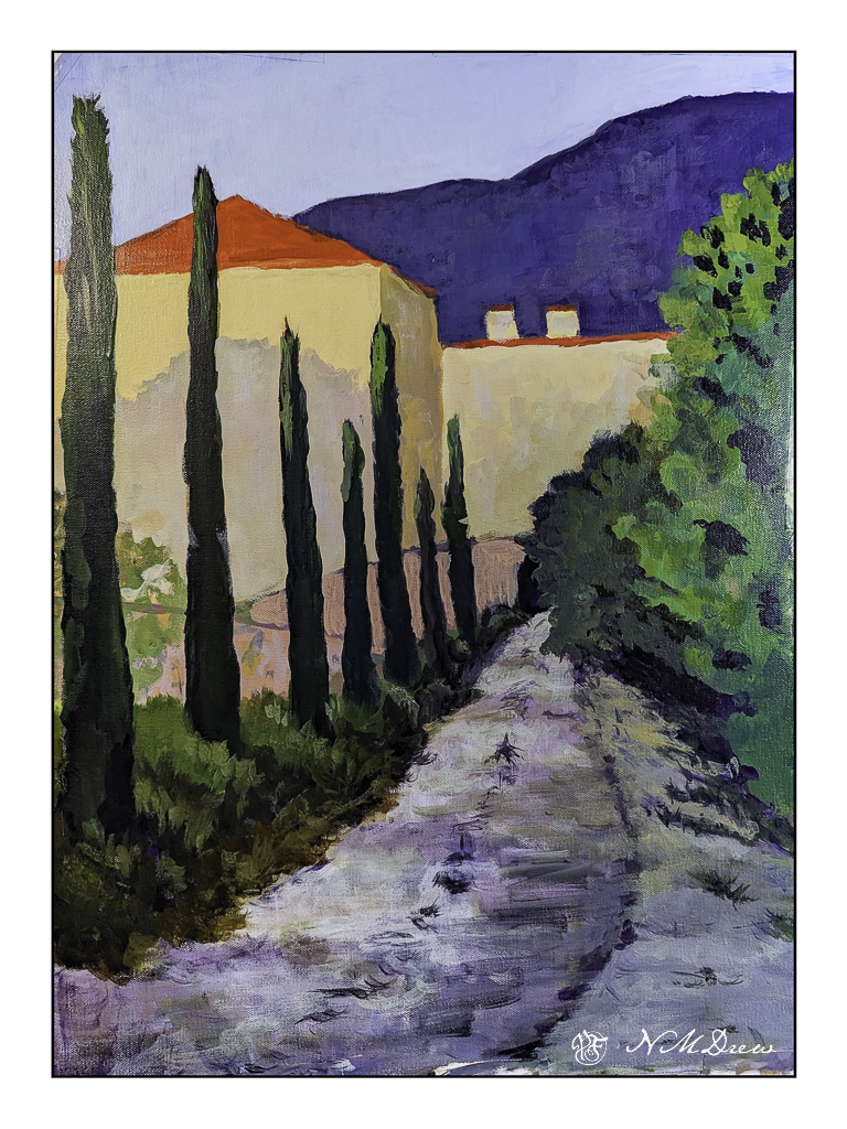
In between everything and all the organizing and deciding and packing and griping and whining and worrying and daily stuff, I did manage to start a painting. It’s on a bit of 14×18 inch Fredrix canvas, taped to coroplast, and on the easel. It has been through multiple iterations since its inception, and still has a way to go. I will finish when we return, and I am sure I will see it all with fresh eyes.
This is not a great picture – a photograph rather than a scan – but it does show where it now stands. I thought a painting of a road and building might be fun to do. I still need to put in windows and work a bit on the middle area where the two pinky curvy bits of architecture are, as well as some of the leafy trees on the left. The photo makes it a bit askew, but the roof lines are actually straighter in the painting.
I usually work in watercolor, and that is usually a more immediate event than returning to a painting daily for a few hours. In fact, it is an altogether new experience for this impatient person, and I am finding I rather like the time I have to come and go with a painting. Having it on an easel to look at all the time is also a new experience. It let’s me look at it and review it from where I sit in the studio, typing away about it or other things. I wonder how this newfound taste and appreciation for time and painting will play out on our trip.
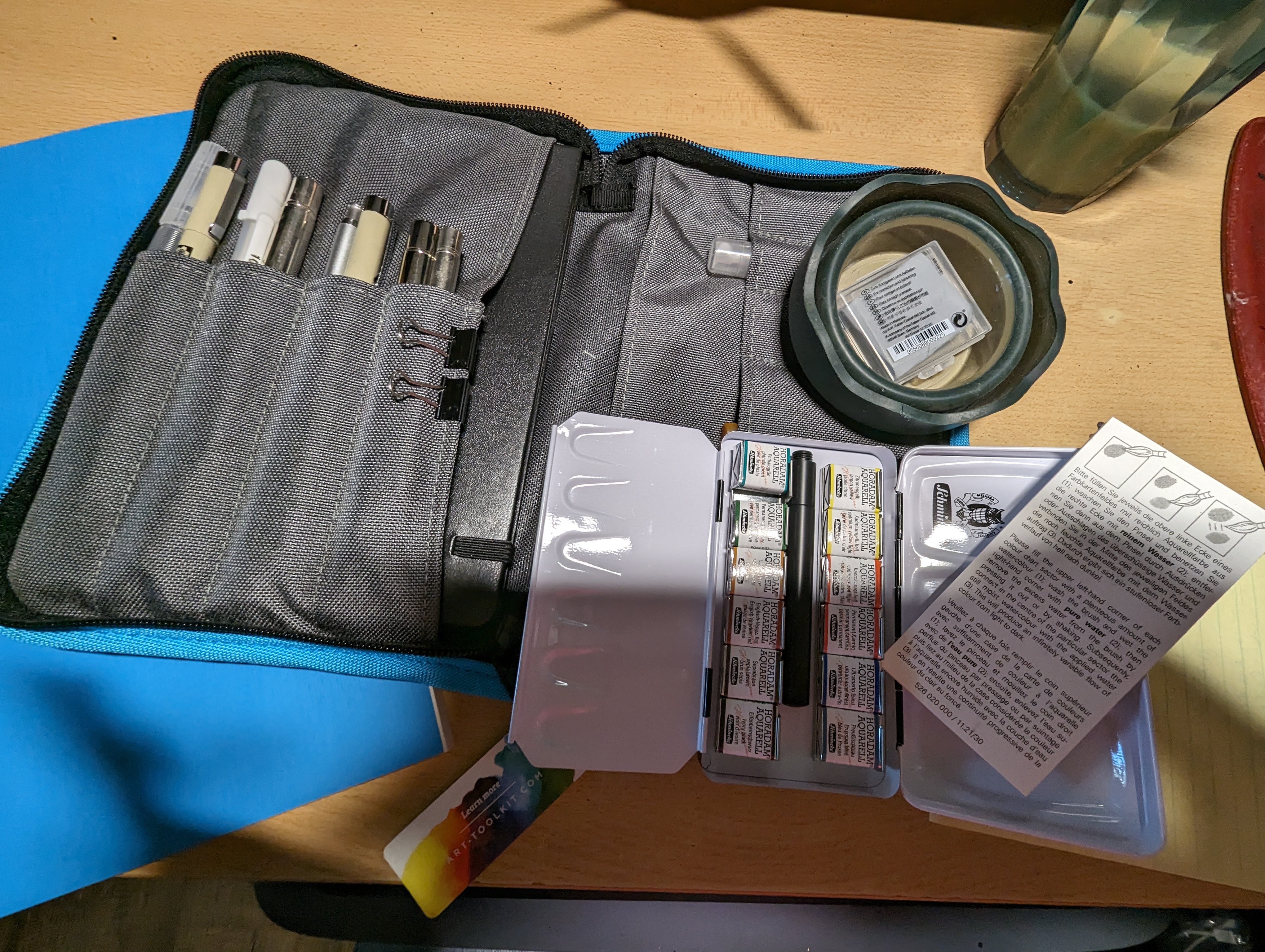
Heading out for an adventure of three weeks with only a carry-on suitcase and a back pack is forcing me to pretend I am an efficient traveler. The fact is, I am not, and it is very challenging to rethink what I want to have around me when traveling. For me, having enough clean underwear is important – but perhaps more so is not getting bored. I need stuff – to read, to paint, to draw, to listen, to make, to take photos. And this means making everything small and efficiently useful.
First on the agenda is my watercolor and drawing set up. In this 7×10 (or so) zip-up case by Art-Tool, I have their included Moleskine watercolor book, 12 half pan set of Schmincke watercolor paints still wrapped up, travel brushes, ink pens, mechanical pencil and lead, kneaded eraser, collapsible water cup, and a few other things. Many of them are original to the kit, but I have modified it a bit to meet my needs. It’s pretty nifty.
Next, books – audio and written. I like to hear things when I am sewing or knitting by hand. This means lightweight, small head phones and something to provide me with books. My phone can supply both! Another need / want conquered.
Camera . . . as someone used to the capabilities of a DSLR and such, a small automatic point and shoot without the option for controlling everything (should I desire such) was not something I wanted to spend money on. I spent weeks on research – I needed to be able to use manual controls all the way as well as my preferred aperture priority – and finally settled on the Canon G7X Mark II. As the Mark III had just come out, I got a good price on it, and have been using it for months. The battery life is good; I can put it a purse or pocket, and the pictures are good but flatter in appearance than either the X100V or the Nikons I like to use. Post production always remedies that.
We will be doing stops in various ports en route to our friends in the south of Spain. Looking ahead to Iceland, Ireland, and England, it appears to be cool but not cold, and with rain. Layers and a lightweight rain jacket that folds into a pouch are to be packed, but also more summery wear for the weather in the warmer areas. Luckily, we will have access to washing machines so a ton of clothing is not necessary.
I am going a bit nuts, but such is life. I have 3 days to finalize what I want to schlep, and then I drop into the abyss of international travel.
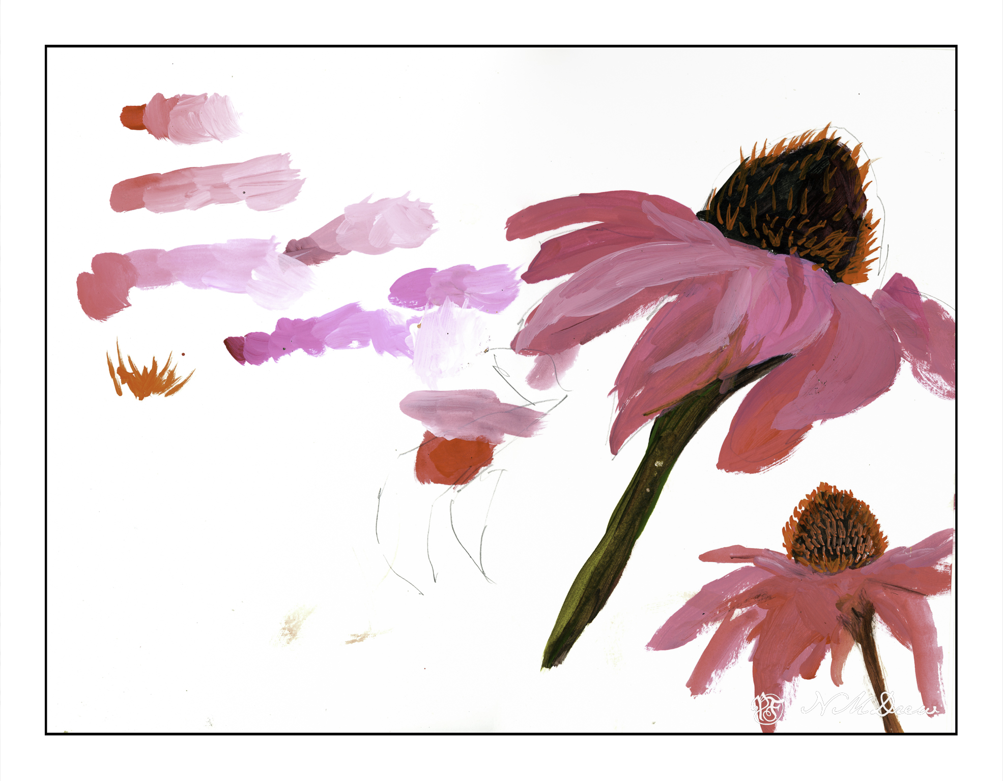
With any art or craft, familiarity with it makes it easy to do. With familiarity and understanding comes the ability to explore using the knowledge you have acquired. I am pretty comfortable with watercolors and oils, but acrylic has always been a point of frustration as it dries so quickly and, to me, doesn’t have the qualities of oil paints. Gouache can be opaque or transparent, depending on how used; acrylics can be used in the same way. The difference between artists gouache (vs acryl gouache) is that the colors underneath the other colors can be re-moistened, and used to dissolve and create other colors. Acrylics, while they can work similarly to artists gouache, once dried, are dried, and there is no going back.
What I am trying to learn is how to use acrylics in ways that make sense to me. This is not coming easily. I like being able to sprawl my colors all over the place without drying, but this doesn’t work quite well with acrylics – unless using the heavy body paints on a sta-wet palette, the fluid acrylics I am using dry very quickly. To use them well I am trying out different ways of painting and mixing paints. Above, on the left, are colors straight out of the bottle and then mixed with white on the palette, increasing the amount of white with each brush dab. From there, I played a bit with painting cone flowers; the one on the lower right is more successful.
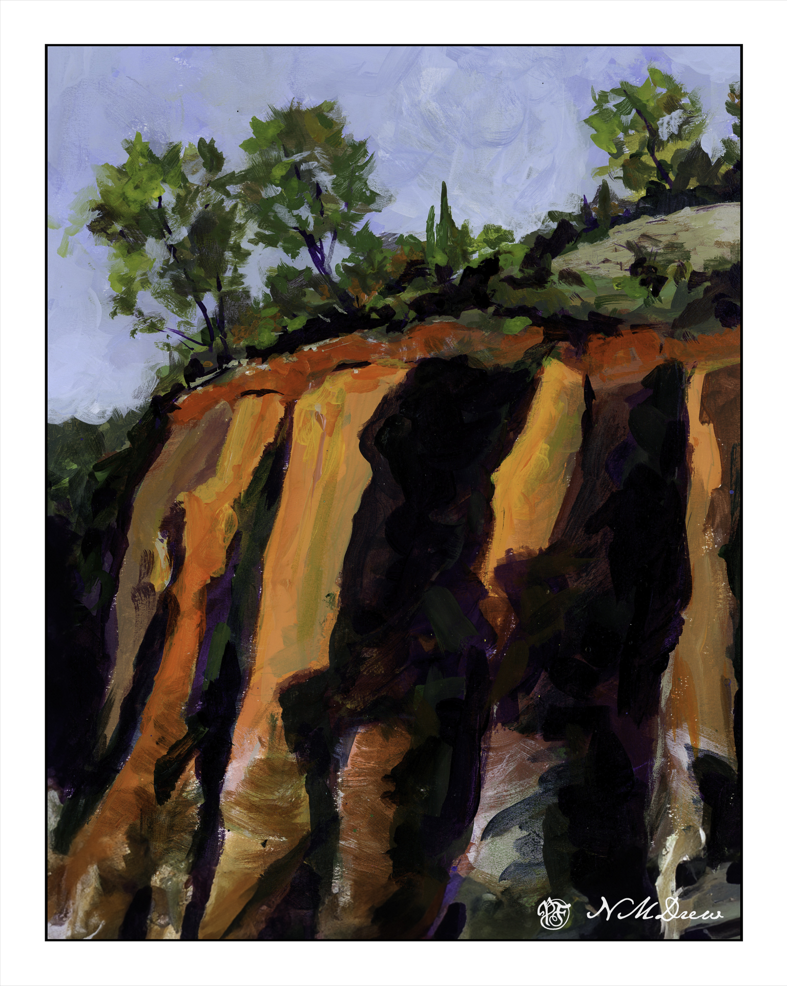
Playing is a way to explore. Above was play. Below is a “more serious” foray into painting with acrylics. I worked hard to make layers, and then return to add more color as I moved along. I just painted directly onto paper in a sketch book and practiced both painting and blending, painting directly on other areas, and bouncing around to work at making a bit of a harmonious or connected picture with similar / same colors used in various parts of the painting.
There used to be 4 trees in a row on the top of the cliffs – but then I looked at it and they were all the same shape and height. I decided to paint out the 3rd from the left. I had to paint the sky in a number of times, building up layers to hide the tree. It worked pretty well. I also played with my brush – I tend to dab, using the point of the brush – but here, especially for the tree foliage, I worked on using the sides of the brush. Additionally, I changed between very soft brushes and more firm brushes. These change how the paint moves and blends over the paper.
Practice can be fun – in any art – and by practicing and playing, new doors and experiences add to the skill set of the artist or craftsman.
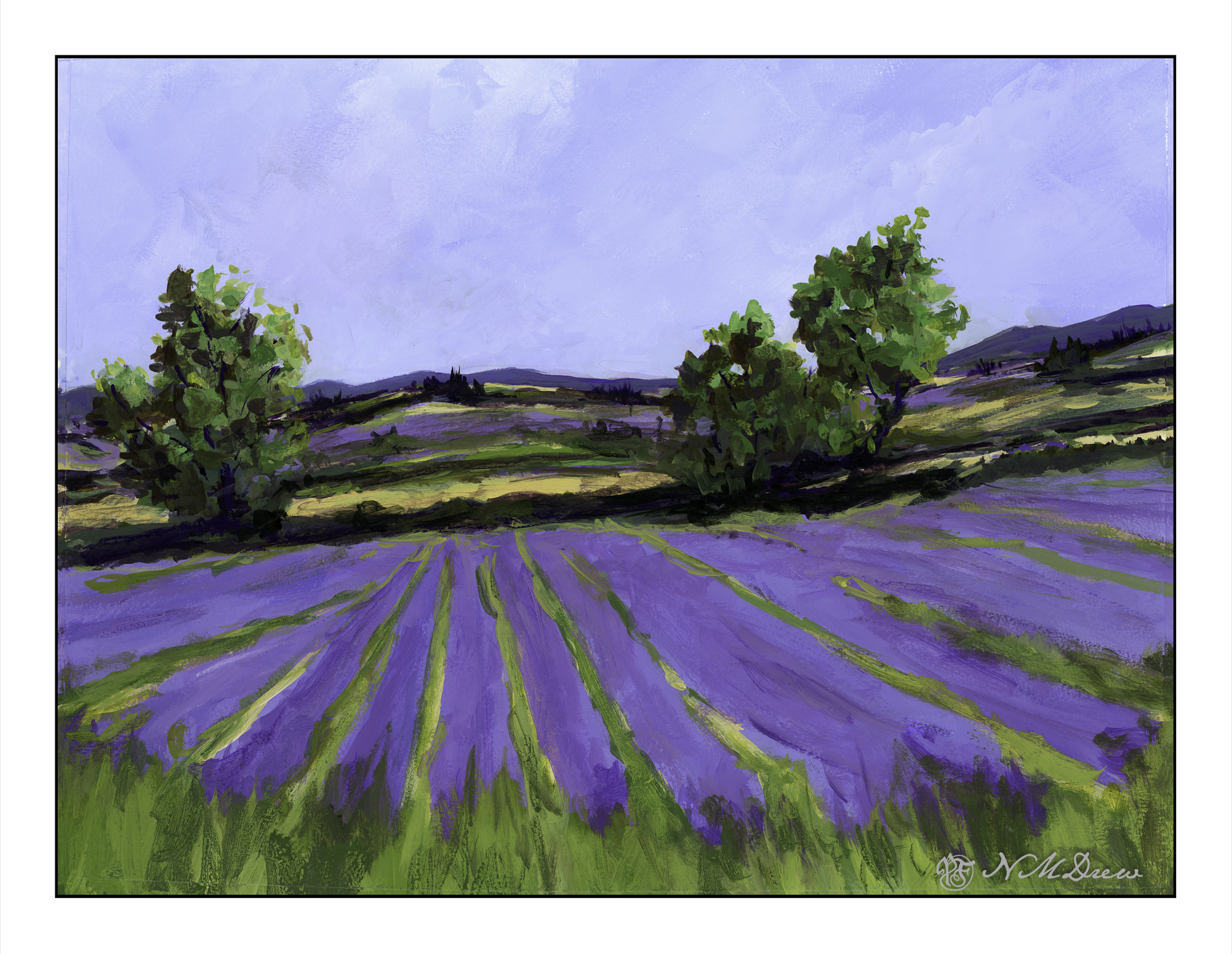
For the last 2 or so weeks it has been appointments and appointments and ordering this or that and consolidating little things and I am so sick of it I could scream!! My lavender painting has been sitting on my easel, I see it every day, and at last I have found time to work on the painting. Finally. Oh, finally! Something fun to do.
I wanted to accomplish a few things with this painting. One was simpler, more blended brushwork throughout. I wanted to grey out the distant colors a bit for a sense of atmospheric perspective. The trees, too, need to be cleaned up a bit. I think the pale field before the second level of lavender could indent a bit more on both sides of the left hand tree. I won’t say this is a masterpiece, but it has a bit more a painterly quality in it, has a decent sense of depth, colors aren’t too overwhelming.
This is painted in Golden Fluid Acrylics. A Sta-Wet palette doesn’t keep the paints wet as they are so fluid – the heavy body acrylics work well with the Sta-Wet because they are thicker. This means working a bit differently and I have found I like them best when they are a bit dryer – great for dry brush. Too much water in the paint – or in the brush – and they can drip down on completed paintwork, or form a rather interesting craquelure.
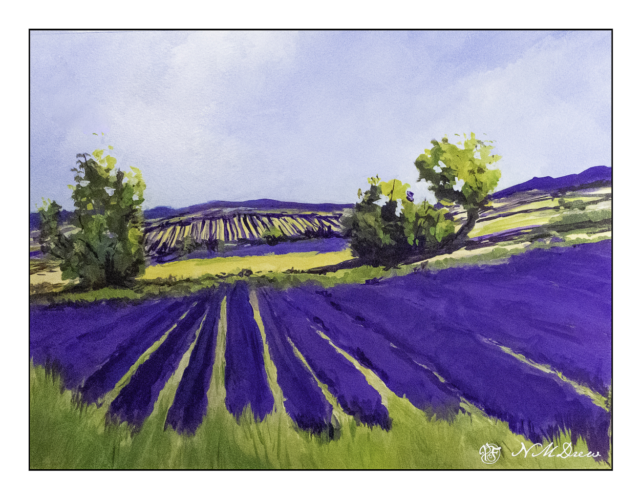
I have been putzing on this painting for quite some time, so here is a series showing its evolution – earliest paint
15×20, Langston watercolor paper, Golden Fluid Acrylics.
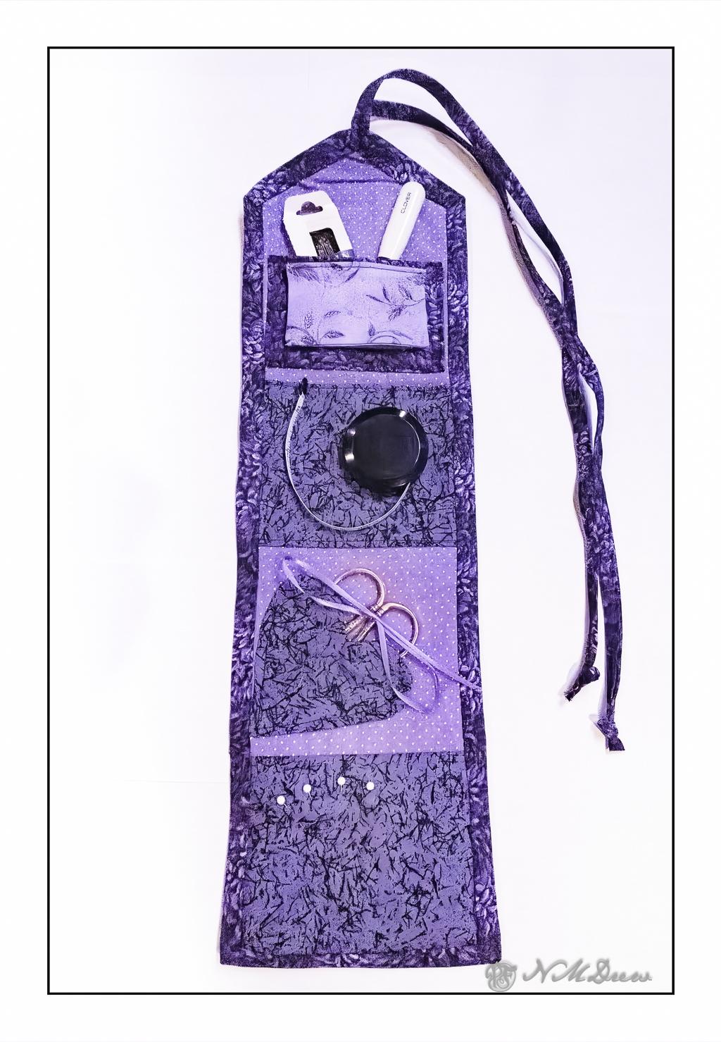
A “hussy” is a rather slutty woman in today’s parlance, but a few centuries back, a “hussy” was a shortened term for a “housewife” or “hussif” – in today’s terms, a sewing kit containing needles, thread, pins, spare buttons, scissors, whatever. They could be practical or fancy, depending on class and income, but the fact is, a sewing kit is a handy thing to have. I admit, I have fixed hems with scotch tape or a stapler, but good sewing helps many a problem! In fact, according to one source, the English troops were routinely issued sewing kits after returning from battle in rags, whereas their Russian counterparts were all supplied with a sewing kit, and could fix their uniforms on the march, or at least around the campfire!
As we make preparations to take a trip, I know I need something to keep me out of trouble – in other words, to keep from being bored. I like to work with my hands, but knitting can be cumbersome (i.e. a sweater), and truthfully, I am tired of socks. I make hats for presents off and on, but those are dull, too, after a while. I am thinking I may try to hand sew a blouse on our trip as we will be on a boat for a couple of weeks – and hand work with a good audio book is not a bad thing to have in quiet moments.
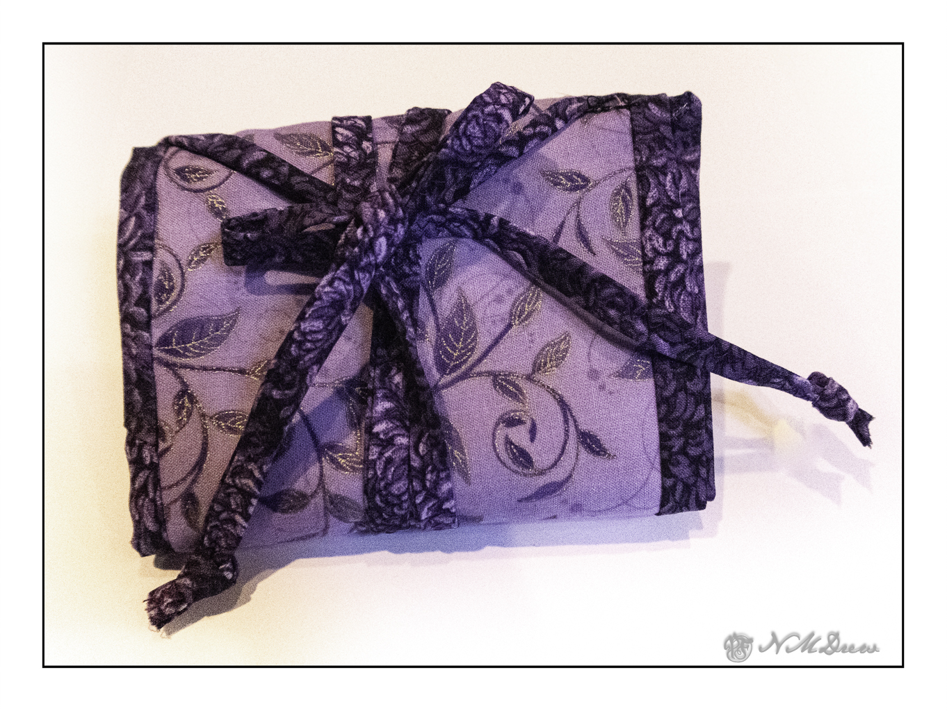
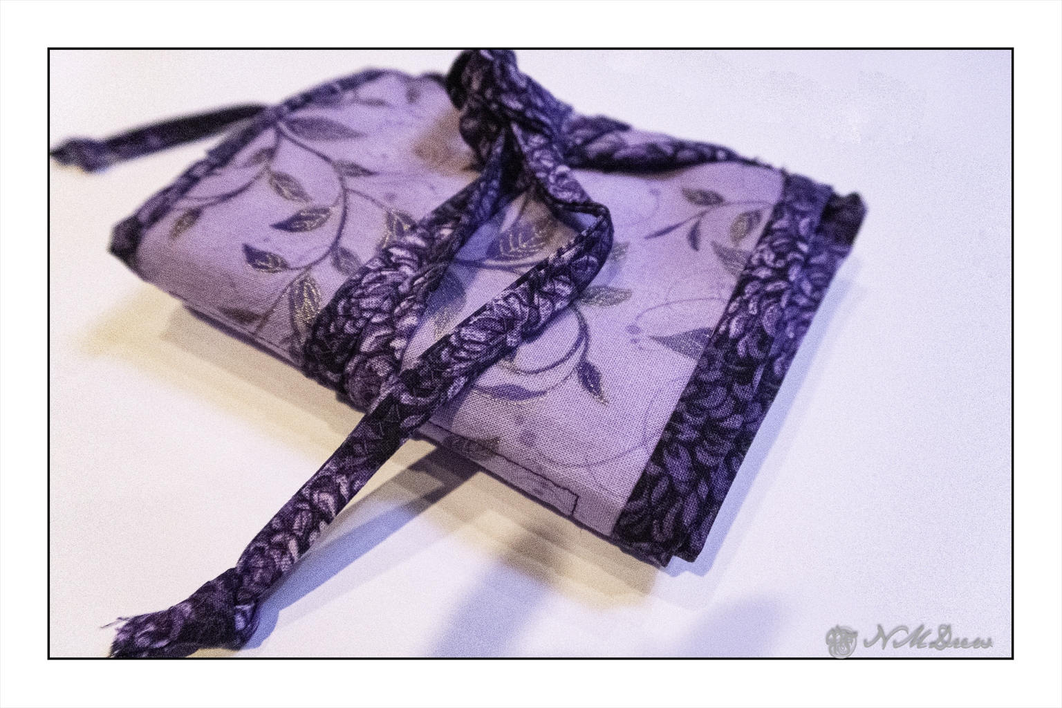
So, with the hopes my scissors and needles will not be confiscated at the airline, I will adhere to the TSA parameters for carry on luggage. If I lose my scissors, I will be surprised as per TSA the blades can be 4″ from the hinge. I am getting some little folding scissors – will that work? Anyway, to bring all this stuff in one convenient spot, I made myself a hussif . . . .
Click on the photos to see them in more detail if you want!
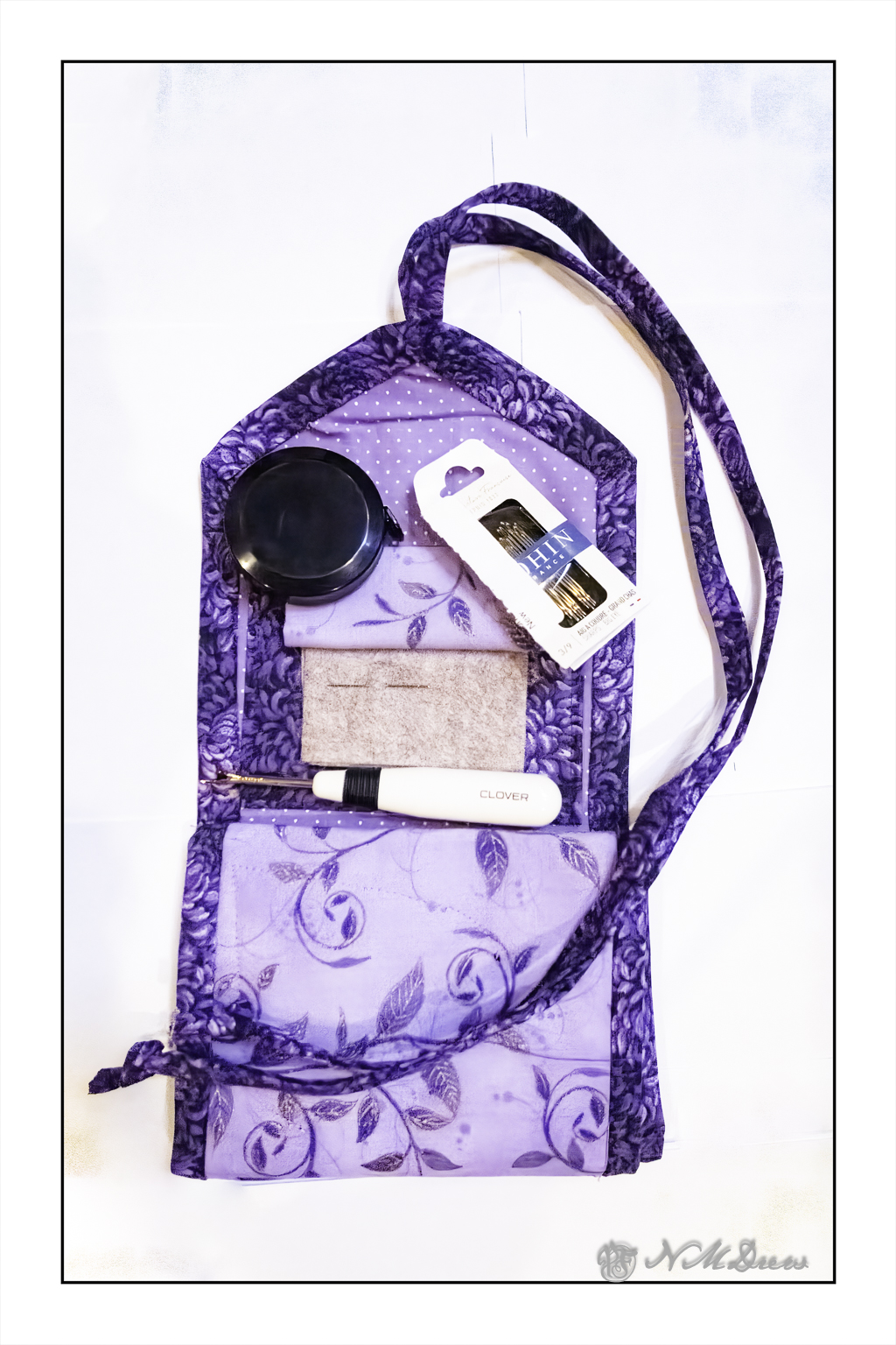
The nice thing about these hussies is that I can customize them! It took a bit of time to come up with a design – and fabric – and so on. To begin with, I had to decide on width and length – in the end, from top to bottom, it is about 16″ long and about 5″ wide. From top to bottom of the above picture you will see the ties to keep the hussif rolled up. Then, a pocket to hold needles and other thingies, but on top of that pocket is a needle book with felt to stick needles into (picture below). The second section, with the tape measure upon it, is simply a pocket to hold supplies. Below that is a pocket for my embroidery scissors with a ribbon to help keep them in place. Finally, the fourth section is a pin cushion of sorts, made with 4 layers of quilting batting to give it some loft.
Above is the hussif with the lower to sections folded up, hiding the pin cushion and scissors pocket, and general pocket. The needle book is opened to show a needle in place. I have 3 pieces of felt here so different needles can be placed in them. I use needles with large eyes or the Clover self-threading ones – I can actually thread them quite easily! I recommend Bohin large eyes if you don’t want the Clover ones – other brands, too, are good. For hand sewing needles, get reputable ones. You will pay more, but trust me, 100 cheap bits of crap metal are not worth it!
And here is the hussif rolled up on itself. It ties quite nicely to keep itself from falling apart. Below is another view of it tied up.
Making the hussif took some doing, and I played around with it for a few days, experimenting and sewing at the same time. I watched a number of YouTube videos on both hussifs and needle books. In the end, to put it simply, I did the following:
Chose 4 colors of cotton quilting calico
Used fusible interfacing
Used cotton quilt batting for the pin cushion
Cut 2 major pieces of fabric for front and back, about 6″ wide and roughly 18″ long. I fused the interfacing to the outer layer of hussif.
I cut out the pocket – about 4×6″ – and doubled it up so that the fabric was 2 layers. I sewed a top and bottom seam, right sides together, and then placed the pocket on the unfinished body of the hussif – the binding would cover the raw edges.
I cut out a heart-shaped pocket for my scissors, using 2 layers of fabric and, as with the pocket, sewed right sides together leaving a hole to reverse it. This was a bit of a challenge, but it came out okay in the end. I sewed it directly to the inner layer of fabric – I should have moved it over a bit, but that is for next time!
The pin cushion is one layer of fabric laid over 4 layers of cotton quilt batting. I sewed the seam at the top and then folded it over the layers of batting, leaving all the raw edges to be covered with binding.
The needle book and pocket at the very top were done after I did the binding. More in a bit here!
I used non-bias binding on the hussif. I cut a very long length of 2″ wide fabric, sewing the pieces together to have plenty of material to go around. I created a double-folded strip from this – first folding the binding in half, ironing the hell out of it, and then opening it up and folding each edge to the midline. Essentially, this is quilt binding.
The binding was sewn from the outside in, meaning I sewed the binding onto the back of the hussif. I used the first fold – at 1/2 inch – as the seam line. I pinned it to the edge of the hussif, and used mitred corners along the way. I then finished it by hand by folding it inward, pressing it again, and steaming it, and using whip stitches to keep the binding in place.
Now, the top pocket and needle book! It drove me crazy. In retrospect, I would make the pocket as I did the one in the second section, beneath the tape measure in the first image. However, before doing that, I had to cut the felt and then place a bit of calico as a cover – this is to keep me from stabbing myself with needles.
First step here – sew the needle book together. Then attach it to pocket. Then sew it onto the hussif. I will make the pocket first, attach the needle book to it, and then make sure the pocket stretches side to side before using the binding to cover the raw edges.
Yeah, this is wordy – but it is what I worked out while doing it. I watched videos on doing quilt binding – perhaps bias would be better next time – and made things up as I went. I spent about 3 days and 7-8 hours designing and sewing it. All told, the fabric and supplies ran about 18.00 USD. Scraps would have worked, too, or stuff from my stash, or even fat quarters, but I was in the mood for purple and lavender, and that is not in my stash!
I am pleased with this – frustrated as I was at times – but the creative experience and learning experience make it even more valuable to me. I have been wanting to make one for some time, and this may keep me from too much trouble in the not too distant future . . .