I was feeling rather depressed by my rather poor watercolors of the other day – so, time for a break. What to do? Well, how about a bit of serious cleaning up of stuff that this gal has accumulated? What I am talking about is my bill and finance drawer. Need I tell you what was in it – nay! But let us say I shredded up about 4-5 fifteen gallon trash bags worth. Now there is a lot of room in the drawer, it is organized, and I have made the resolution to shred unnecessary items about every other month.
Okay, stop laughing. There is a definite pack-rat gene in the family, specifically on the paternal side (sorry, Dad!). De-pack-ratting requires a break, and a break from watercolors means using something else. Enter revisiting pastels. I did an apple.
I was doing pastels a few years ago and really enjoyed the medium. It is a combination of painting and drawing, both of which I like. Apples are rather generic and very recognizable, and cheerful, too, if you like bright red. I do like bright red, and so here we are.
I think I am going to be doing pastels for awhile. I need a bit of a break and a change from watercolor, even though I am really trying to work hard at it. The only drawback to pastels is the dust, but I wear an N95 mask and clean up the dust with a damp cloth afterwards. Here, Nupastels and Rembrandt soft pastels, and a touch here or there with a pastel pencil. I have some fixative arriving tomorrow which supposedly will not darken the pastel painting much. The paper is Mi-Teintes, reverse surface, painted upright.
Well, that is true for me in the world of trying to make my watercolor paintings more simple in painting style though not necessarily in content. Of late, rocks and plants.
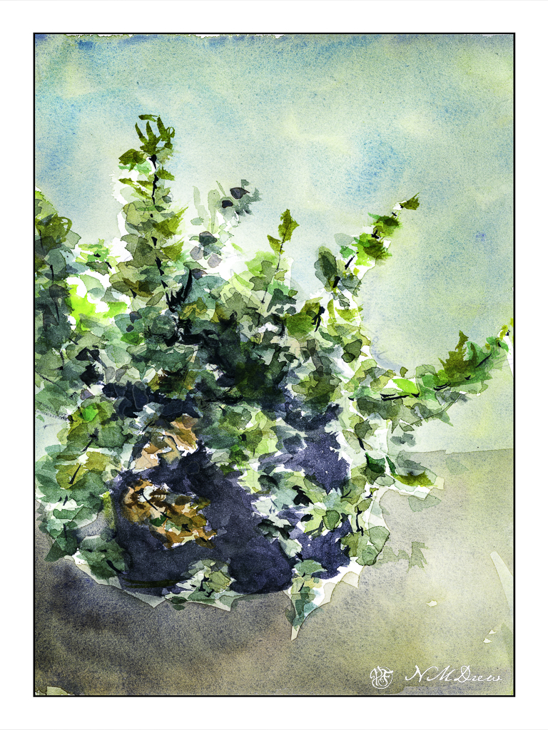
Let’s start with my painting of Greek oregano, growing like a weed in a pot on the patio. The leaves are simple enough, shaped somewhat like an egg (but flatter 🙂 ) on long, straggly stems. The color is sort of that dull, sagey-olive green that plants in the Mediterranean climate often have. In sunlight, a bit of warm yellow shows up. In shade, the greens are darker. Pretty logical, right?
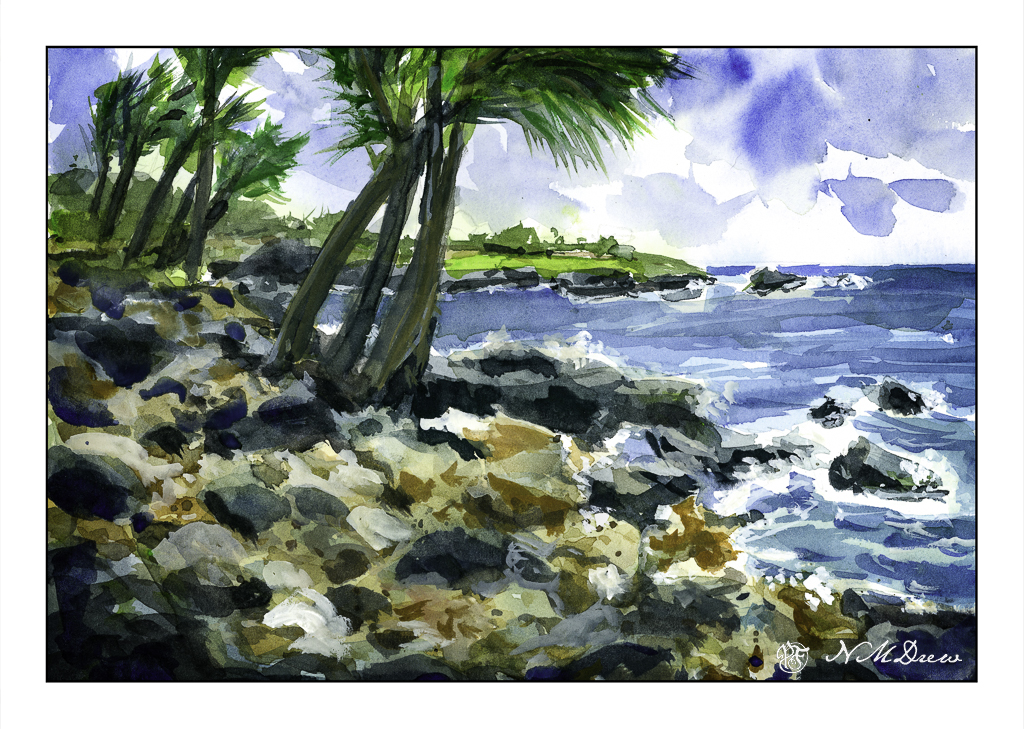
And then there are the rocks I have been thinking about since I did the much more successful cliffs of the other day. The rocks in the fort in the VI was okay as a rock building study, but not so hot as a painting. The beach scene below is of a rocky beach of lava stones – many black ones in particular, but with softer sandy rose colored stones in between. And a few palm trees. And an ocean. And a spit of land sticking out. The rocks were the primary focus as that is the rocky subject I am approaching. Simplification of shape and shadow – some successful, some not.
I sat outside yesterday, using reference photos of lava rock beaches around the world, and then using the oregano plant a few feet away on the concrete. Good to be outside. Good to work on two opposing pages of the sketchbook, waiting for one to dry and working on the other. Back and forth. I was amazed I was out there for at least two hours, with more indoors. I am spending more time on painting a picture than I have before . . .
Success? It comes in steps. A lot of crap with a few successes.
After working on the cliffs, I also want to work on another item found in nature – rocks and boulders. These are also used as building materials, so why not a building of rocks and such cemented together in the 1600s? I always love stone buildings – or fortresses – constructed of nature’s gift. Stone has been used for millennia, so why not? This is a painting of what I believe is Fort Recovery on the island of Tortola, which I visited some time ago.
The purpose of this picture is not a complete picture but a way of figuring out how the stones might be done. The palm trees are really part of the actual fortress, but I put them in as it helps me see if something works.
The stones are simple but I am experimenting with how to express such rock and stone buildings. I could try to do all of the stones, but what a yawn. More, it is the texture of a building made with the irregular shapes and colors of rocks.
What I have chosen to do here is to simplify the structure – not paint rock for rock – but give an impression of it. The stones in many instances are more round than depicted, but it is on the beach – that gorgeous sand is so bright! – with a few plants and palms and newer construction around it. If I recall, the day was glaring and sunny, very hot and humid as is the norm for the V.I. that time of year, and it was also in July.
There is nothing so dramatic as a sea and cliffs, sometimes a sandy shore – but rugged rocks and trees clinging on for dear life always catch my eye. Northern California has its share, as do Oregon and Washington. All over the world such drama is there for our pleasure and to keep us humble.
My approach, thanks to having a sketchbook – my lovely sketchbook! – is becoming more deliberate and more patient. I am working with larger planes of color, going for the grand before homing in on the detail. I also wanted strong contrast of sun and shadow. Simplicity. Clarity. Less is more, etc. As well, warm and cool.
I am honestly very pleased with how this painting turned out. I think I will leave it at that!
Negative painting is when you paint around an object. You can do this in any painting media, and it is really a good way to preserve the white paper for watercolors. As watercolor is transparent, painting over other colors influences the final result – for better or worse!
Today I decided to practice negative painting. Flowers are always a great subject (for anything!) – and a challenge, too.
I decided to start with an umbelliform flower – generic, no specific plant. If you know anything about flowers, think in terms of Queen Anne’s Lace or Cow Parsnip or Fennel. The flowers spread out over long stems branching off in a cone shape from a main stem. The shape is something like that of an umbrella, but the individual plant can be flat, convex, or concave. I chose a convex shape.
The first thing I did was pencil in the flower and stems. From there, a light wash of cobalt teal, diluted, to paint around the flower’s shapes. This took a bit of doing,and a bit of patience – to paint, and to let dry.
And, as you can see, the next step was to paint the flowers. The sun is above the shapes, so I tried to make the upper parts of the flower brighter than those bits directly beneath, and then with a spot of lighter ones further down the stem. By allowing the background to dry around the white areas my flowers were painted, in general, on a clean bit of paper. The colors are more clear. Yes, I did go in here and there later to paint onto the flowers again, and on the background, in an attempt to make sure I didn’t have any overwhelming pattern repeats and to help or improve areas I thought were not quite to my liking.
My next attempt is Spanish Broom. If you know what broom looks like, that is great – you know there are a lot of bright yellow flowers and buds which all clump beautifully together on a bush with dark green foliage. I did this background with the same goal as the umbelliform painting – keep white paper for more clear colors.
I took this painting a lot further than my umbelliform when it came to negative painting! I did 4 to 5 negative painting layers to get the sense of busy-ness of a Spanish Broom plant. I first added cadmium yellow, painting into the white paper and leaving some uncovered. From there, a bit of quinacridone gold or yellow ochre to add dimension to the flowers. Once these colors were dried, I went in with a slightly darker and more yellow green to depict leaves, and from there consecutive layers of darker and darker greens. In the end I diluted some white gouache into a greenish yellow mess on the palette to paint into the leafy areas.
As with the previous two flower paintings, I did a quick, simple outline in pencil. However, instead of painting the entire background and in between plants, I used the big green leaves of the Greater Celadine plant as a frame for its bright yellow flower, and greenish-yellow and dark green buds. Again, leaving white paper was important for the freshness of color.
The next step was to paint the yellow flower itself overall – no shadows or gradations until later. The yellowish-green buds were painted more wet-in-wet for blurring. I also painted some layers of darker greens and warmer greens on the leaves, and a mix of cadmium yellow and ochre for the shadows and stamens (pistils? – can never remember!) within the flower itself. The final touches were the fine hairs on leaves, stem, and buds. I used pure white for painting them on the colors, but added some lavendery green with the white gouache to paint onto the white paper in the background.
These exercises were time intensive, but in the end the focus and willingness to be patient paid off. I like each one for different reasons and I used each to try different ways of painting flowers. All of these are in my big sketchbook, and I am beginning to realize with each painting experience how much both a sketchbook and painting daily as much as possible are paying off. This along with losing a fear of failure a “formal” painting can bring are allowing me to explore and experiment in ways I never foresaw.