Once more, dietary changes are forcing cooking and baking changes. Some results are rather dreadful. Others have proven to be quite good! So it was with this cheesecake. No sugar, no gluten. The biggest problem was finding the dry curd cottage cheese. also known as hoop cheese or farmer’s cheese. I found the cheese at the local Whole Foods, and neither my husband nor I had ever tasted it – but we did, and liked it. It is a rather dry cheese, not sweet or salty, with a bit of a curd, but very fine, like ricotta. The original recipe is from this blog, but I changed it so that I made one 8″ cheesecake, instead of 4 individual ones. The only thing beside pan size that I changed was the baking time.
Honey Cheesecake
Preheat oven to 300 F, and by the time you have your crust ready, you can pop the crust in to bake.
Crust
1 1/2 c. almond flour
1 t cinnamon
3 T melted butter
1 t honey
Mix flour and cinnamon together. Melt butter, mix in honey. Stir together to form a soft dough. I used a fork to really work the ingredients together. Place the crust mixture into an 8″ spring form pan, lined on the bottom with parchment paper, and sides buttered. Working from the center out, press the dough onto the pan. Build a shallow edge along the rim of the pan. Bake for 15 minutes at 300 F. Remove and let cool completely.
When you are ready to make the filling, preheat oven to 350 F.
Filling
1 lb. farmer’s cheese
1/2 c. SCD homemade yogurt
3 eggs
1/3 c. honey
2 t vanilla extract
1 t lemon zest
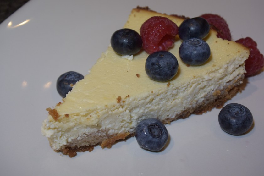
In a blender or with a hand mixer, combine cheese and yogurt. Cream for about 5 minutes – texture will change and become more creamy as you work. Add the rest of the ingredients, and beat until very smooth. Batter will be very thin. Pour carefully into cooled crust. Bake at 350 F for 45-50 minutes. Check to see that the center of the cheese cake is set. When set (the cake no longer jiggles when shaken lightly), turn off oven and open door. Let cheese cake cool about an hour, and then move to refrigerator. Serve with fresh berries.
Comments
I had no idea what to expect from this recipe, but those who tasted it (served at a dinner party) really liked the flavor and lightness of the cheesecake. It wasn’t very sweet, which can happen with many honey-based recipes. The lemon zest complemented the fresh fruit – we used blueberries and raspberries. Without the fruit, the cheesecake might be a bit unremarkable if you are used to big, thick slices of New York cheesecake.
This, for us, is a definite winner!


")
")

")
")


