Palm Tree in Hawaii, with Peter Sheeler

Peter Sheeler does it again – another video to learn from.  This is from Hawaii, and as Peter notes in his video, he has never in his life drawn a palm tree.  I actually think this might be a banana tree – we use them as decorations in my neighborhood.  This doesn’t matter, though; Peter’s mastery is what I wanted to learn from.  My take below.

My contrast is nowhere as attractive as Peter’s.  I am a bit more muddied.  Part of it is because I am not using either Sap or Hooker’s Green, both which I prefer to Viridian, which is part of the palette I pulled out to use.  My own preference is Hooker’s, as it is a wonderful green to add yellow or blue, for brightening or darkening.

Another comment, this is some of the Bee 6×9 paper I bought.  A bit of a sizing issue seemed to be “felt” in a couple of spots on the paper.  Still, for quick studies, I am not faulting the paper at all – I have been enjoying using it.

Once Waitlisted Weekend Watercolor Workshop

How’s that for a few Ws or so?

This past weekend I spent immersed in painting and drawing and sketching, all focused on watercolor.  This lucky girl got in after being waitlisted to a workshop with Brenda Swenson, an excellent watercolorist, and as it turns out, a very good teacher.  Three days of organized to increasingly looser structure was perfect.

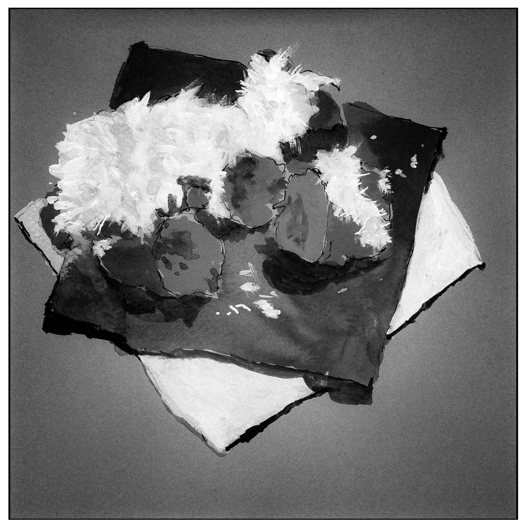
Day 1 began with continuous contour line drawing and lost edges.  At first I got it – and then didn’t – and then did again.  These drawings then led to watercolors using lost edges to blur and bleed color into color – wet working with deliberate movement of color.  This helps with reflected light.  The mind fills in what the brush does not.

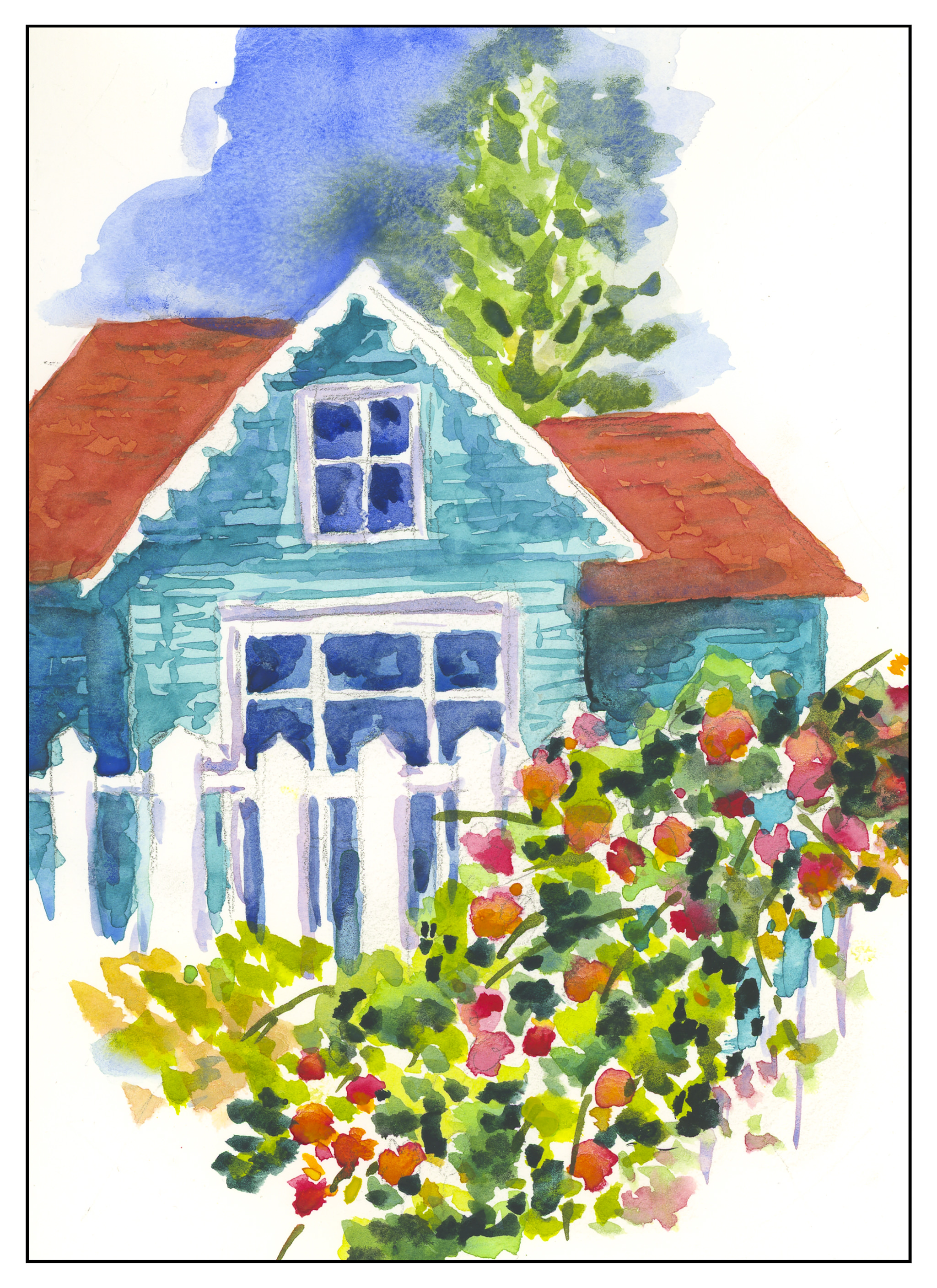
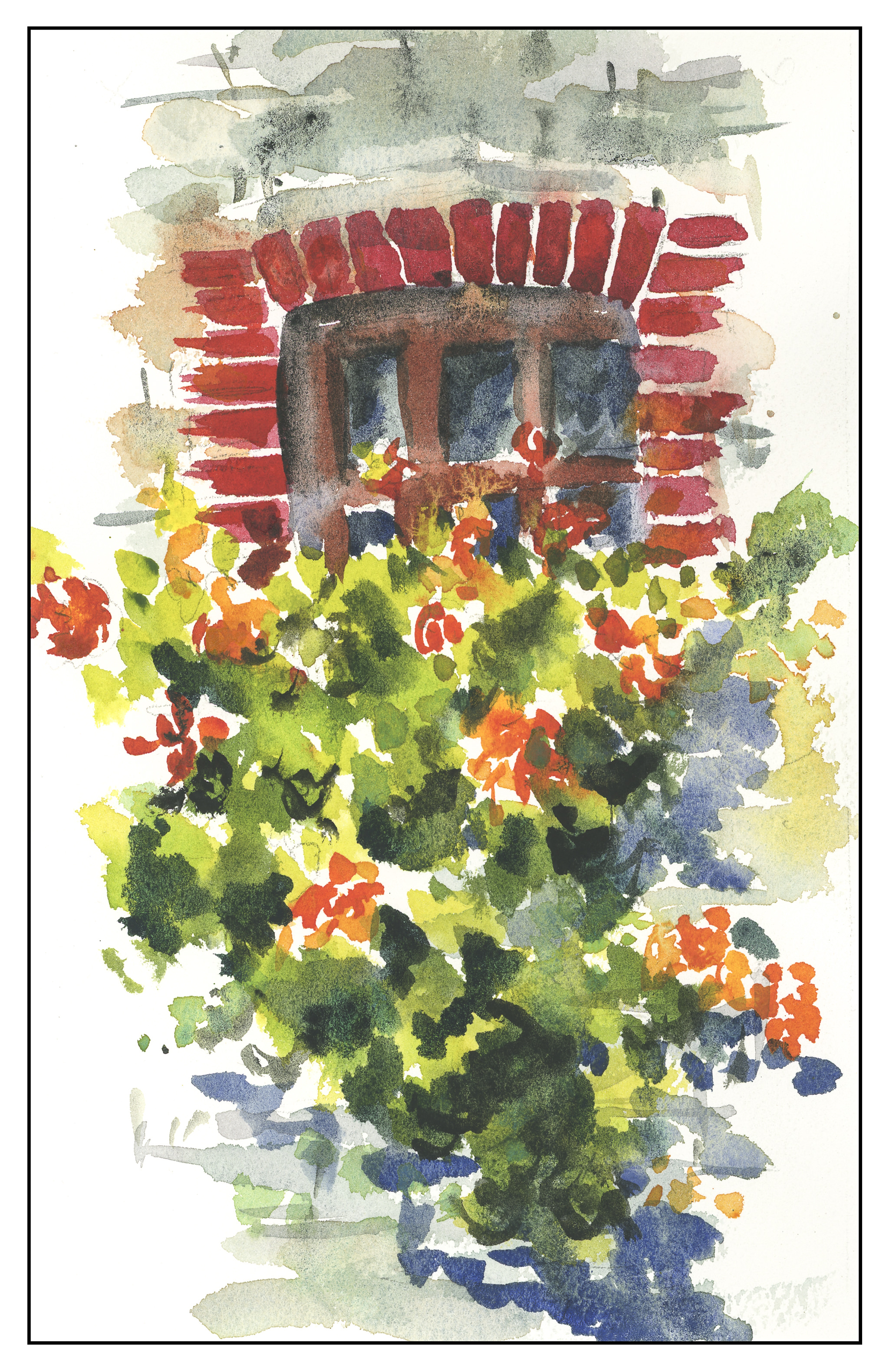
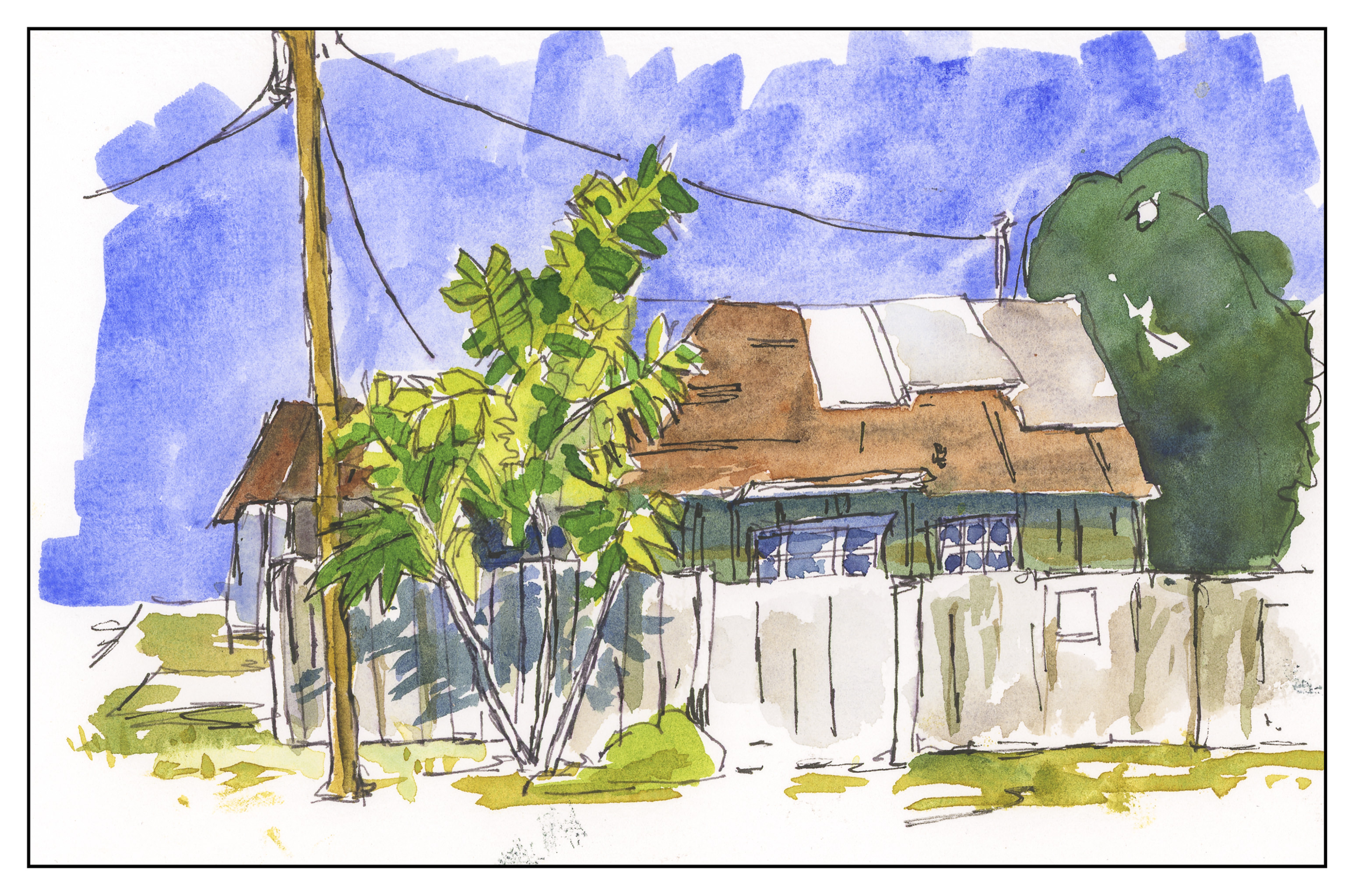
From there, on the second day, we moved into landscapes from photographs, all of which were provided by Brenda, and from which all the landscapes in this post are derived from.  For some reason I couldn’t seem to think straight – I was restless and goofy and my mind was all over the place.  Somehow, I managed to survive and produce a few pictures of value.  The still lives I did sucked.  Structure of the day, if I recall, along with the first was draw, format, paint.  Formatting was finding a border for the image, where edges might break out of the line, and give an interesting look to the painting.  Good graphics!

And on the third day, structure loosened.  The focus was on painting vignettes.  A vignette, I knew, had white around the borders of a painting – a piece of a painting.  Brenda put it into a different perspective, on which I never had heard of – cruciform.  Don’t touch the corners with paint, touch one or all of the 4 edges of the picture’s ostensible borders, and focus on how the shape – the negative space of the corners – looks in relationship to all the other.

Lessons each day, thoughts for each day.  If I get another chance to attend here workshop, I will – if you get a chance, do it!

Now, a few things done during the workshop . . . click on a picture to see them bigger!

Watercolor Workshop, Day 3

Today was the last day of the workshop with Brenda Swenson.  She is a fabulous teacher who takes time with her students, with a personal quality that is positive and constructive.  I learned a lot from three days immersed in watercolor, and I think I turned a corner in how I handle color.  Besides being a good teacher – meaning her critiques and advice are sound – she also opened my eyes to a number of different things.

One lesson:  paint the same item 6 different ways.

Another lesson:  Use Canson pastel paper for painting!  The colors are good, the paper is 70% cottong, and those two things work well together.  Brenda brought in donuts for our first project.  Mine is below.

For the remainder of the day, we worked on vignettes.  I knew that vignettes were little images with white surrounding them.  So?  Well, it turns out that there is a real art to vignettes.  Making the image cruciform – in the shape of a cross – with portions of the painting touching the top, bottom, and sides (1 or all 4), but not flowing into the corners, makes for a vignette.  Key to an interesting picture is that each shape is in each corner is different than the others; additionally, work some of the white of the corners into the painting itself.  I was surprised to find myself rather calm today, rather than flighty and unfocused like yesterday.

Mine worked out fairly well.  A valid criticism was to make the lower windows somewhat greenish and warm, rather than a cold blue, to reflect the light of the unseen grass in the yard.  A glaze was suggested.

My second painting was supposed to be a vignette, but failed on the middle side portions.  I may go back in to fix it later.

Brenda provided all of us with incredible photos from her travels to use in the workshop, which in addition to unique items like plastic frogs and pecks of fake fruit, made for a really good experience.  My weekend was only too short!