Author: -N-
Through the Window

I’ve been doing a bit of reading . . . the gist of which is work light to dark, then general to detailed, and the last is more important than the first. It is from Tom Hoffman’s excellent book on watercolor, should you wish to know.
Anyhoooo, following this advice, I made a foray into a rather abstract painting. The corner of my house has two windows, set perpendicular to one another, and are furnished with plantation shutters – wooden shutters with wide slats. This is from a photo I took. I tried to catch the graphic lines of the shutters in contrast to the curves of the fig tree and its autumnal leaves outside, next to the sidewalk and street.
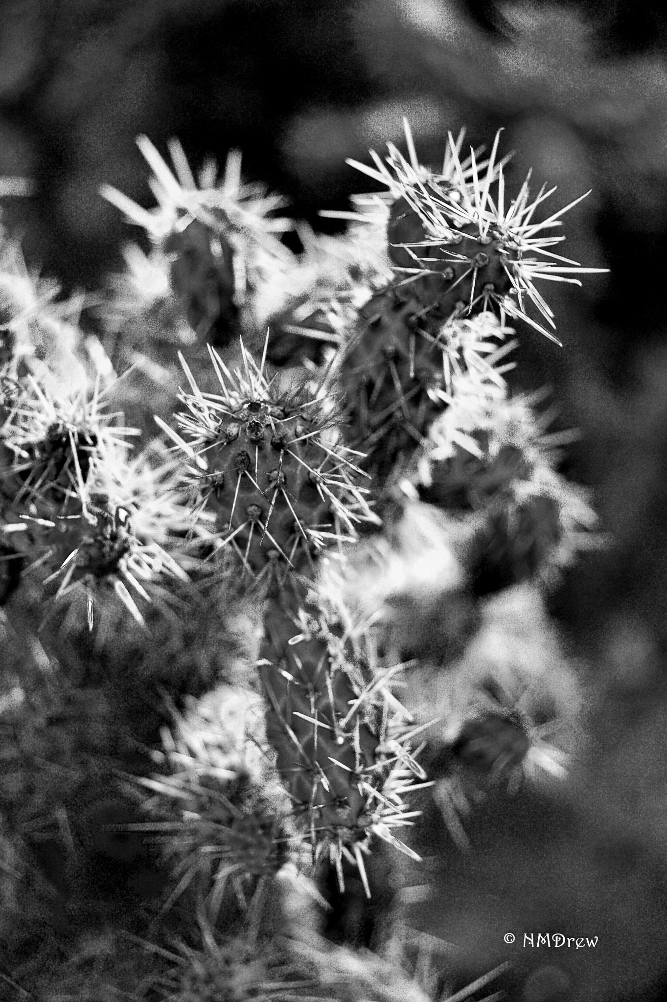
Pointy
Mists and Blurs
Wetness in watercolor varies. There are times when a very dry brush on dry paper is necessary to give sharp, clear edges to an object. Then there is wet-on-dry wherein washes are applied to dry paper with a lot of water. And finally, wet-in-wet, where wet color is applied to wet paper. As the paper dries, the color behaves differently. There is so much to learn in watercolor!
Of late, I have been painting with a lot of water and a lot of color. It’s a challenge, but daily painting is yielding better results overall. Not every day, but overall! Yesterday, I watched a number of videos, and did two studies based on videos by Rick Surowicz and Edo Hannema.

This one is from an early video by Surowicz. He used some frisket, but my bottle was not working, so I painted without it. I really needed it as his style is not just wet, but sopping wet! He uses a fine mist sprayer to scoot paint around. The result can be quite nice as you build layers of colors on layers of color. I did this painting on Strathmore 400 paper, a paper I don’t especially like, so I was quite pleased with how it handled all the water. The palette consisted of three colors – sap green, indanthrene blue, and a bit of Indian red.

Edo Hannema is a master of the wash. I enjoy using his videos as study guides. The above painting is my favorite of the two I did yesterday. The palette was limited to raw sienna, burnt sienna, cobalt blue, ultramarine blue. The green was a mixture of cobalt and raw sienna. One thing I really like about Hannema’s videos is he tells you when he thinks he makes a mistake, or needs to fix something in his painting, as well as tips on using colors. It’s rather like eavesdropping on the artist.
I decided to look at mists and soft edges because the other day Rick Surowicz posted a video about mist rising below a mountain ridge – Overlook:
This was a good video to watch on how to create a mist or fog. He also has another one called Misty Lake which was the one I used in my above studies:
Edo Hannema is a master at wet-in-wet techniques, which are great for fogs and soft effects. The horizon of this painting video demonstrates this quite well. The thing that is especially fun about the video below is the fact he took a painting he did of this scene in the summer and converted it to winter:
I find using practice videos helpful in learning techniques. They are also helpful in thinking about how I paint versus how I want to paint. Like many beginners, I put in far too much detail, and my own impatience impairs final results far too often. Letting the paper dry is important, and I am learning to do that – my hair dryer is hanging within easy reach! Leaving white paper is getting more “natural” in feeling, so I am thinking ahead as well.
Nowadays, I find I am plotting out paintings in my head. Daily painting is another big step forward as I now have the time to spend on it without a million other things demanding my time weighing me down with guilt – chores and duties or the pleasures of a hobby.
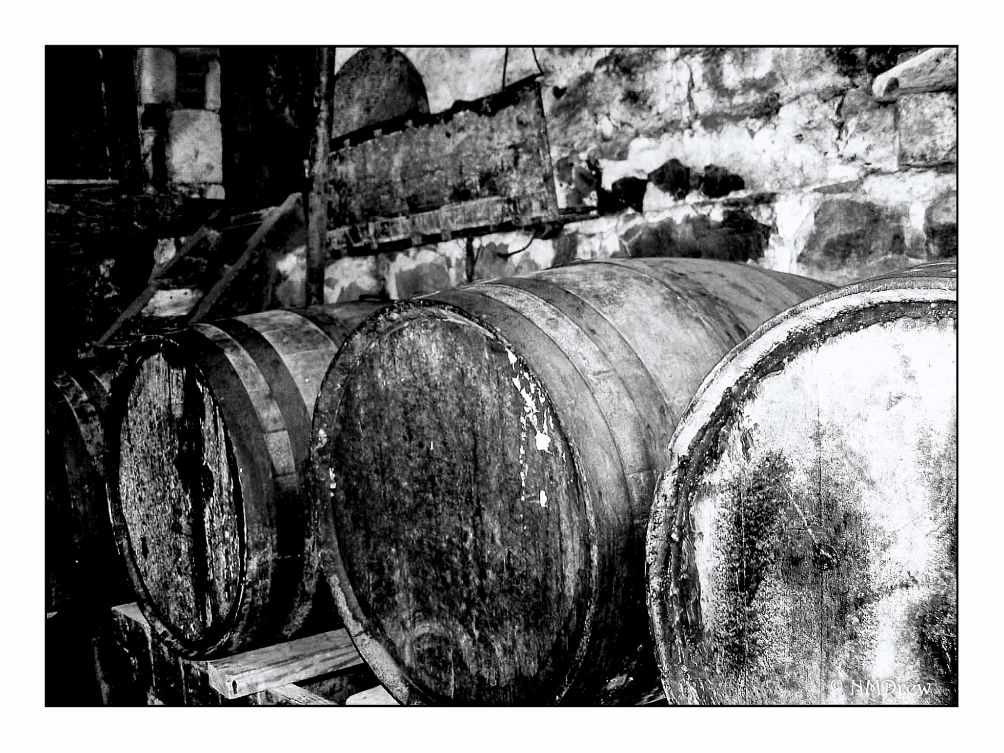
Rum Barrels