Spring Orchard

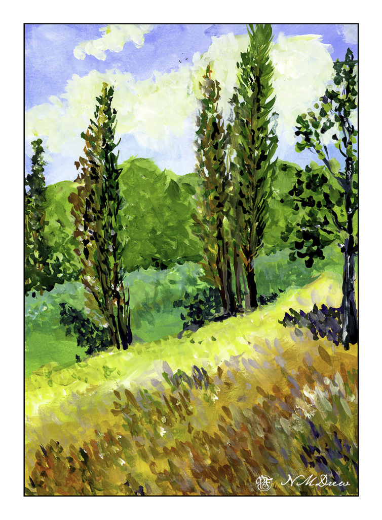
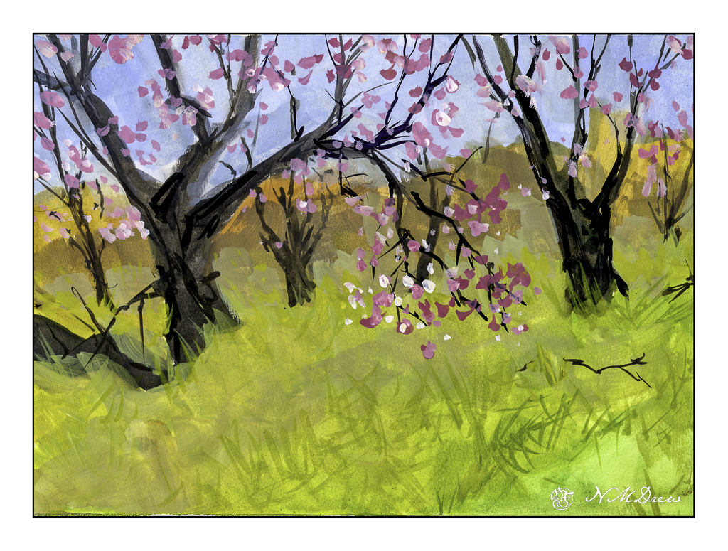
I had to miss my oil painting class yesterday as I had some things to do and some workmen to work. I had planned to use gouache while I waited. The workmen came, but I didn’t get around to painting at all. This afternoon I made up for my missed paint time. Spring is nearly here, so Spring it is!

As with any medium, if I have not used it for awhile, I need to get used to it again. As I was playing and it was lying around, I picked up my pad of Strathmore Vision watercolor paper. This is not a great paper for watercolor, but I love it for pen and ink. Why not gouache?

What I like about gouache is that it is opaque, yet diluted it becomes transparent – or certainly thin enough to show the colors beneath it. I painted with an angle brush and thin paint, laying in colors. Details were done with a small, pointed round. Additionally, as this is artists’ gouache and non-acrylic, the colors can be re-wet, and thus some fun blending can happen. I used all my little tricks to refresh my gouache memory, and here we are.

Gouache, Strathmore Vision paper, 9×12.

Out for a Walk

I enjoy walking through the local botanical garden. I decided to head out the other day as it has been awhile, and with the coming of spring, new growth and leaf buds await to be seen. Additionally, the annual – or ongoing? – garden clean up appears to be over, so little things normally hidden are beginning to emerge. All the photos below may be seen on Flickr – just click on one and it will take you there where you can also see other photos I have done over the years.

Green Thingies

“Green Thingies” – pretty cheerful and abstract and strange. Succulent? I don’t recall.

Boogie Woogie

“Boogie Woogie” – called thus because they just looked like they were dancing! I used AI in PS to get rid of some unsightly signs in the distance that were a bit distracting.

Remember the Fallen

“Remember the Fallen” – fallen leaves, fallen soldiers, fallen countries, fallen women, fallen in Fall, even though it is close to Spring!

Do Not Climb

“Do Not Climb” – or shinny or otherwise skedaddle around this tree! There are two in the botanical garden and I can never remember what species they belong to, but think they are fascinating.

I used a macro 50mm lens, which I find to be one of the most diverse lenses to use – close up and personal, to clarity as needed.

Nikon Z6ii, Nikon Z 50mm f2.8 Macro. Post in LR and On1 Photo Raw.

Between the Mountains

One thing I love about California is the fact that the geography varies so much! Oceans with flat beaches, oceans with cliffs, mountains with snow and mountains with pine trees, and deserts stretching flat and hot, surrounded by mountains and creating a secret world fascinating and forbidding. Worldwide, deserts host animals and plants and insects which survive on little water, are stark and seemingly dead – but of such beauty. Deserts are not for everyone – familiar and comfortable landscapes full of trees and greenery are very different. It took me a long time to appreciate a more stark landscape than the rolling green hills and woods of the midwest and eastern seaboard.

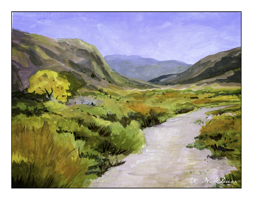
This is a painting I have been working on in my weekly class, inspired by multiple memories and photos taken. I had a limited palette of white, ultramarine blue, Indian yellow, and light green. I tried to catch a golden glow as well as give a yellow-orange cast to the desert floor and hillsides – and create a softly blended painting.

Oil, 12 x 16 canvas panel.

Flat

I normally tend to use pointed round brushes for watercolors, but every now and then I pick up a flat brush and use it throughout a painting. The other day I noticed some inexpensive flats on sale in a variety of sizes, so I picked up a couple to add to my collection. Now I have .25, .5, .75, and 1.0 inch flats, some firm, some soft. And tested them out.

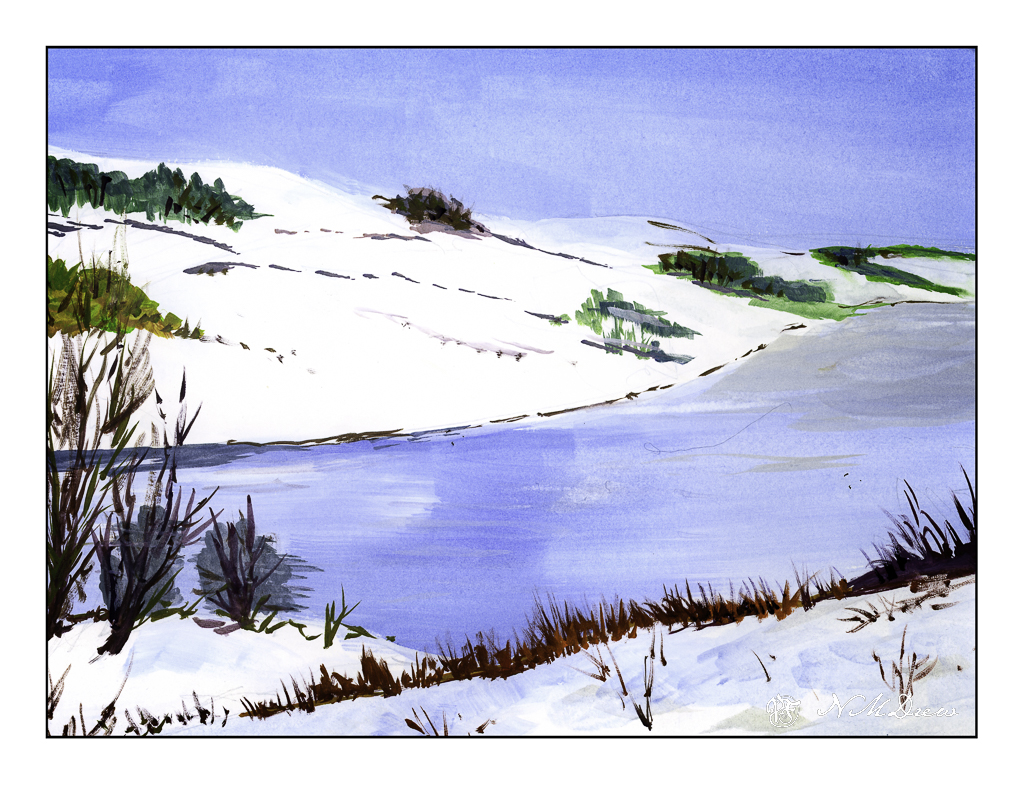
Epson Scan used here – too lazy to putz around. The blue in the sky is granulated and light in color, but the blue in the water is too blue. The rest of the colors seem to be okay.

A flat brush is rather versatile. The longer edge makes for wider strokes, obviously. You can also load your brush with one color on one side and another color on the other side, and when you paint on wet paper, the results can be interesting. I didn’t do that here, but am writing this to remind myself I need to do it a bit more! The narrow side of the brush can give very nice straight lines, as you can see in the hay canopy in the mid-ground. Sharp edges, like in rocks can be easily expressed. Squiggly lines can also be achieved as seen in the too-blue-to-be-true water.

Watercolors, flat brushes, limited palette.