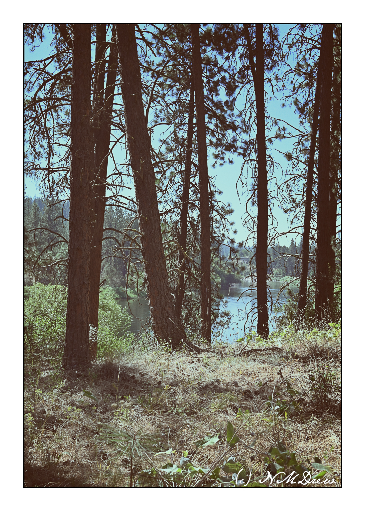
We are staying at the edge of the Riverside National Forest, just outside of Spokane, WA. The Spokane River runs through it. Tall pine trees and other plants – flowers, bushes – line the banks of the river. Some people have houses along the shoreline. In high summer, the dusty, dry smell of pine needles fills the air. So do a few bugs – I got a nasty bite from some kind of fly and it hurt! Despite the bugs, it is always a pleasure to walk through a forest and be in the countryside.
As we wend our way to Wisconsin by car, we are seeing a lot of the West – the non-burning part so far – and this is a grain elevator (I think) taken as we drove by it. To one side we had barren hills, an occasional tree, the freeway in front of us, and to the other side, the broad expanses of the Columbia River in Oregon. A building was rare in this barren, beautiful land.
Modern conveniences . . . like hot pots, like microwaves, like prepackaged and prepared food. like TV dinners and Jiffy Pop, washing machines and dryers, frostless freezers, and electric cars. Dear me! What is the world coming to?
Well, here is a hint for the busy housewife who uses a manual can opener and milks her own cows . . .
I do enjoy these old movies – makes me think of my childhood! But, wow, this is in color! I don’t think I ever saw a color movie until I was in high school (that is, in school).
Since February or March of this year I have been taking a series of online classes, complete with live Zoom meetings, with Ian Roberts. He has been the best online teacher because he is so diverse in his interests and he brings them into the world of creativity. I admire his artwork, too, and think his book on composition is an excellent resource. For me, art is more than a pretty picture – it is an expression of a person, a skill, a view point. All of this, in a painting, is more akin to me than any other form of art, such as photography or music. While I enjoy them, I just am not as I entranced by them as I am by color, paint, and the process of painting.
That said, the first of the three courses was about drawing and values, not as an art in and of itself, but as a means to move forward into preparing for a painting. Next came brushwork, using black and white to render shades of grey and to learn about value. By adding yellow ochre, the next step was discerning warm and cool variants of color – or monochrome. Finally, we have come to the third and final class in this series – colorwork.
What is color? As the title says, color varies with hue, value and intensity. This week our job is to mix greys from complementary colors. Easy enough – or is it? Part of it will depend on medium used, and then, it also depends on warmth and coolness of colors. Our preliminary palette begins with a warm and cool color of each of the primaries, along with white if necessary. Cool colors are Cerulean Blue, Alizarin Crimson, and Cadmium Yellow Lemon. Warm colors are Ultramarine Blue, Cadmium Red Light, and Cadmium Yellow Deep. I have stuck with these three colors and a bit of titanium white gouache where I couldn’t keep the highlights, or lost them in my painting, or forgot about them altogether!
Pretty dull painting! It makes me think of the Upside Down. The point of this study was to take the clashing and garish still life Ian Roberts provided and tone it down – dull down the colors. I am using watercolors here, and I used complementary colors to tone things down but still leave the original color recognizable. The foreground cloth was bright lavender-violet; back behind squash a dark blue, wall on the left a sea green. Bowl is pinkish rose, apples green, and squash an orange with ridges casting shadows. Some shadows were hard edges, others blurred together. It was a hard exercise because I had to test my colors over and over again on a piece of scrap watercolor. This was on Arches 140# CP.
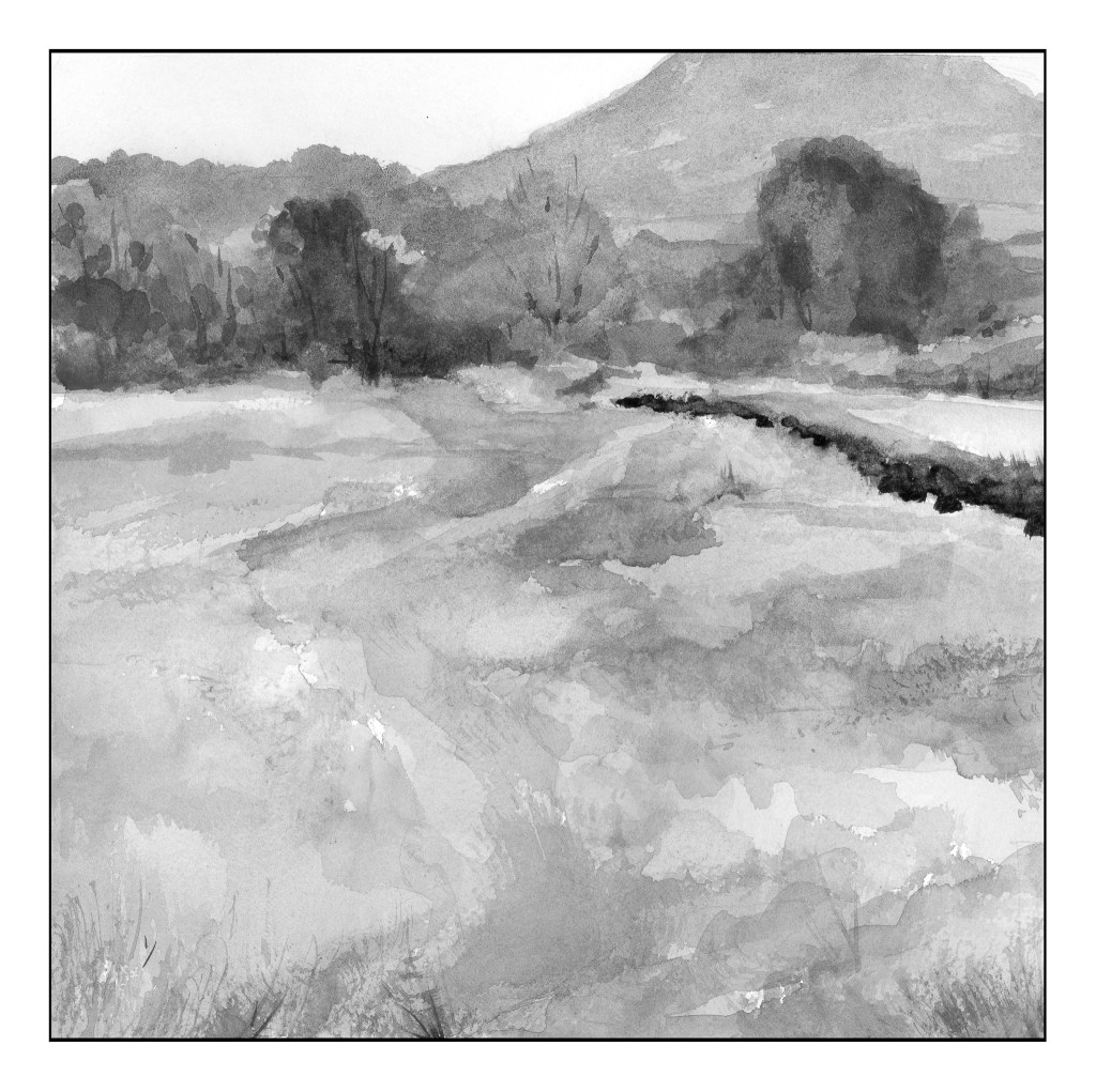
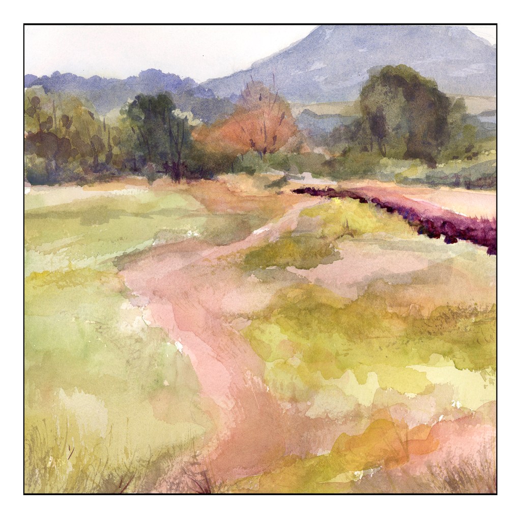
Our next study was a very low key (low key in color intensity) landscape. Evidence of a hazy day dulled all the colors so that while they were warm and cool, they all were similar in tonality. The above scan of my painting in black and white showed me I did accomplish by and large, especially in the field that makes up the lower 2/3 of the painting. The colors were very soft without a lot of bright or intense colors; rather, they all sort of blended into each other when I squinted my eyes. Only a few areas of dark contrast stood out – on the right of the field in the curve, and the bottoms of the trees at the edge of the field.
As you can see, there are no colors of high intensity. They are soft and subtle, even when dark. Hue means variations of color – and there are several, and as this is watercolor the colors are transparent and can be laid over one another or blended, depending on the wetness of the paper. The values are all in the middle of the spectrum. I used Kilimanjaro 300# Bright White paper, and this is a 10×10 inch square. My palette here are only the 6 colors I mentioned above, without any white at all.
In many ways, the still life is more “my style” insofar as the colors are laid in rather heavily. The landscape involves a more delicate and patient approach to the colors. Both were very challenging in their own way, but each taught me a lot. I liked the limited palette as I was forced to stay within its parameters, but could still achieve a lot of lovely colors, as well as darks and lights.