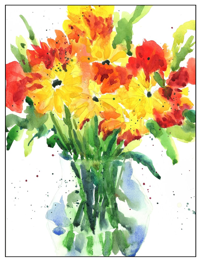
Yesterday’s tulips were accompanied by red and yellow flowers, some negative painting, and color combining. I used reds and yellows (which ones, I forget) and some Pyrrol Orange to make the flowers. Thinking of black-eyed Susans, I used black for the flowers’ centers on the daisy-like ones. What are the red ones? Good question!
What I did here was try to work from large masses of color to details, top to bottom, and having things dry to a certain point before adding more color unless I wanted them to bleed. White space, too, was thought about. Near and far, even with a rather shallow depth of field, was pondered, and the idea was to use cold colors – such a cold yellow or green – to make something recede – and warm colors to bring things forward. Light and dark were also used in an attempt to achieve this effect.


 On a rainy day . . .