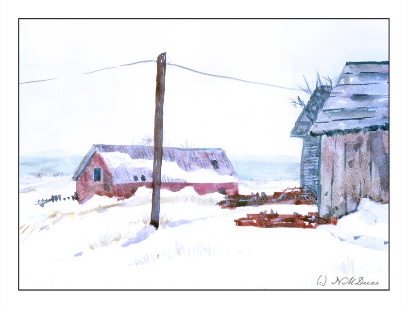
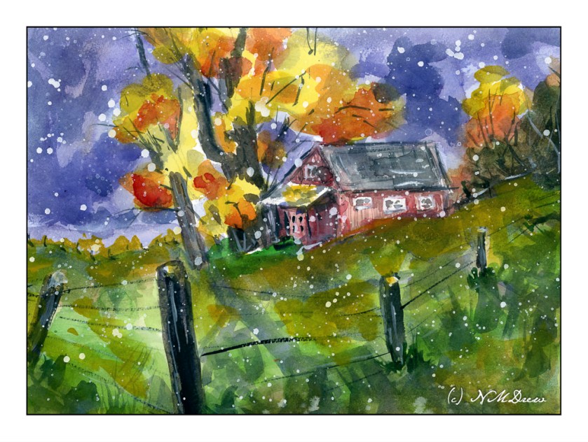
This one got totally out of hand, but I sure had a lot of fun – and I am getting better acquainted with the Millford paper, which does hold up quite well to a lot of abuse.
Tag: winter
Working with Watercolor Paper Defects
I have been very pleased with the Bockingford paper from St. Cuthberts Mill. It is a good quality, non-cotton paper which gives quite good results and closely mimics the 100% cotton paper most watercolorists prefer. With this in mind, I bought a 9×12 block of their Millford cold press paper. This paper is supposed to closely resemble Whatman’s watercolor paper, long out of production, and highly recommended by painters such as Ted Kautzky.
Choosing to reconsider the composition of my previous painting “North Coast” and the island’s placement, I figured a good, wet wash would give me a good idea how the paper handles. I wet the sky first and then added blue.
Immediately I could see there was a serious problem with the paper’s sizing. You can see it as a dark blue streak with a straight edge about an inch into the paper. After that, the wash blends well. We have all seen skies with an odd straightness between sky and cloud, but this is not what I want to have in a painting. Given the price of paper, this is not good.
However, what can I do since this is a fact of this particular block of paper? I know I could take it into Photoshop to fix should I wish to print it out, but that is not the point here.
On to another painting, one with a sky that is varied. Again, I wet the sky area first. I laid in the yellowish color at the horizon – hard experience shows this to be a really good way to do such a sky. From there, I applied the bluish mix, dark at the top, drawing a very wet brush across the top of the paper and then into different parts of the sky, letting it blend a bit with the still-wet yellows. Here, I worked with the defect. But then! I saw on the left side of the paper, the same sizing issue appeared.
Sigh.
Well, working with thin washes, I painted on. Trees on the left help to hide the defect.
Despite these issues, I really do like the Millford paper. It has a nice texture. Water rests a bit longer on the surface than other papers, allowing bleeds and such to work well together. In the first painting, I lifted a bit of color out of the island, just to see what happened, and it held up well. Additionally, the glue around the edge of the block was light enough to allow for easy removal of the sheet without tearing the paper – I have had this issue with Arches blocks decades ago, and that has been a big turn off. The glue around the edges of the Arches paper was tough. Perhaps I shall revisit it . . .
Problems exist. Things are not perfect. Working with a problem successfully is satisfying. Knowing the problems with this particular block, I can find ways to make my paintings successful. One thing is to allow the composition of the painting to discard that area if necessary. There are other ways, too, but those can be worked on as a painting proceeds. What will be interesting is to see how far down the pad this problem exists.
And there we are – a Saturday afternoon’s painting, exploration, and play!
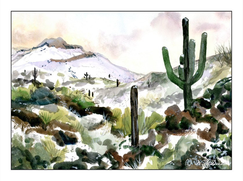
Snow in the Sonoran Desert
It seems appropriate to do a version of a western snow scene, and what better place than the Sonoran Desert? It is a bit closer to home than New York. I always find snow in the desert or places I don’t think of getting snow to be absolutely fascinating.
Once more, I am using a limited palette. Here, umber, ultramarine, Payne’s grey, and Hooker’s green for the landscape. The sky is ochre with some Indian yellow, quinacridone rose, and cerulean. Some of the Indian yellow is also present in the landscape, partly to lighten things up and to make some variations. Titanium white gouache is used here and there as well.
I am beginning to find limited palettes of color a lot of fun! When I am painting with them, I have not set out to use a triad of colors (such as a red, yellow, and blue), but picked the colors based on my need to succeed, at least in my head, in creating the painting I want. At some point, I will try primary triads, but that may be for warmer weather. Right now it is winter, and winter I shall paint!
In addition to a limited palette, I am also using larger brushes overall and abstracting details into shapes. Pale, pale washes, as for the sky, are also some of my goals. The scan, once more, is not as good as it could be, but in general the stronger colors are well portrayed.
My paintings are getting better, I think. At least I like them better than many others I have done. Yesterday’s painting was meh, but if I consider that 3 out of 4 have pleased me so far, I must be winning. 🙂
Watercolor, limited palette, St. Cuthberts Mill, Bockingford 140# CP, 12×16.
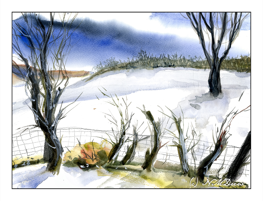
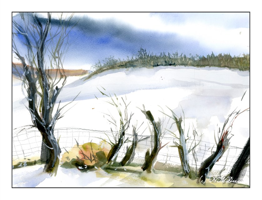
Winter Hill
I am working really hard to simplify my paintings. Winter scenes are perfect for this as I have to keep large swaths of paper white and untouched. Contours of the land are suggested by some blues and such for shadows. Additionally, I am trying to keep my brushwork fairly direct and using the brush’s qualities to dictate the result. A bit of a challenge!
This scan seems to be decent, too, as far as matching the painting’s colors.
I added some new colors to my palette for this painting. In addition to ultramarine blue, burnt sienna and Payne’s grey, I added some Winsor Newton brown madder and olive green, and McCracken black by Daniel Smith. I also used some white gouache for the snow on the right hand tree and in the viney-like things in the foreground along the fence. Altogether I am working toward getting comfortable with a limited palette. Winter lends itself well to this.
The wire fence was drawn in with colored pencil – a warm and cool grey.
St. Cuthberts Mill, Bockingford paper, 140# CP, watercolor.
A Bit Later
Now, a bit later, I wondered if that tree on the right was okay. I wondered if it was needed. I don’t think so. Here is the painting without the tree!
Thoughts?
Trees in Snow
This was an exceedingly hard painting to scan simply because of the very soft usage of blue in the foreground snow. While this scan does not represent the painting very well, the overall image is good enough unless I decided to really play with my scanner’s software. I am not so sure I want to do that.
There are a few “points” to this painting. Using a very limited palette was one point – colors here are ultramarine blue, burnt umber, burnt sienna. There is a touch of a few other colors here but nothing of any significance.
Another point is to keep as much of the paper as white as possible. I managed to do this, but the scan does not do justice to the pale blue of the foreground snow; to compensate for this I used a very light blue graduated filter overlay in my post production software.
And the final point was to work in layers – light to dark – for the trees. Yes, I used titanium white artist’s gouache for the snow on the branches.
St. Cuthberts Mill, Bockingford archival watercolor paper, 12×16, CP 140#.