By the Water

I am taking an online watercolor class, and I am sort of this way, that way about it. There is feedback and some great videos, but I find that I like to have a more personal contact than such. Another online class I am taking has weekly Zoom meetings and even though we aren’t all yacking with the instructor, it is more personal.

Anyway, despite what I would like to see different, there is a lot of value in pursuing online learning. To a degree, you have to motivate yourself. You have to have the discipline to do it. One thing that I do find especially hard in all my classes is the making of value studies – oh, how I hate them! I don’t have them as part of my routine when it comes to painting, and the discipline of doing them is what I hate. I expect that doing them will pay off in the future – but it may be a bit down the road as I force myself to do them without appreciating what I know they are supposed to provide.

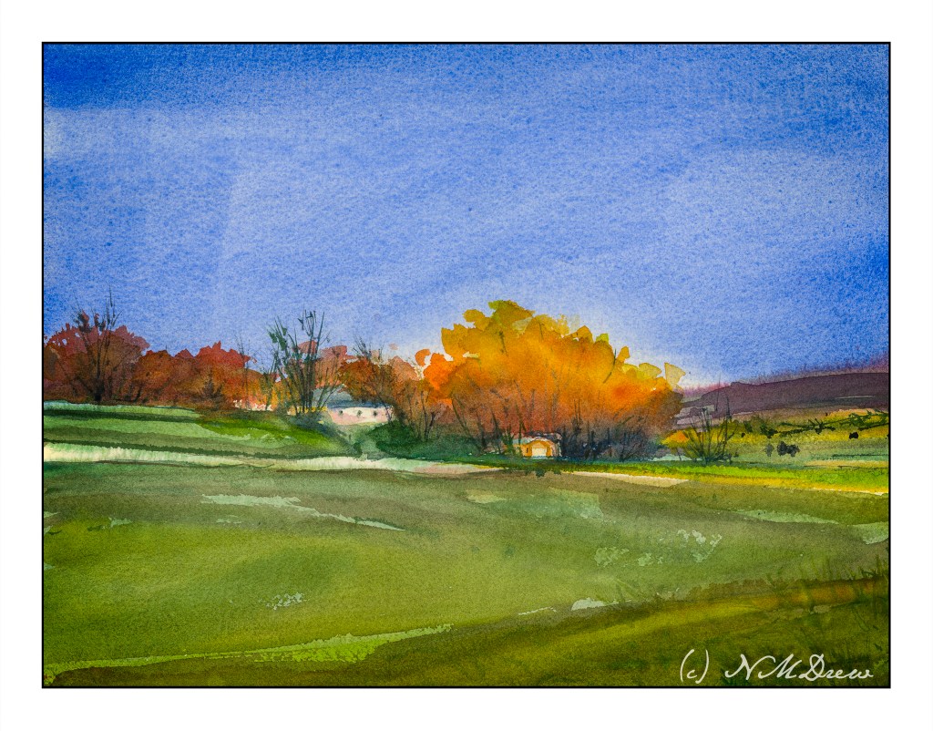
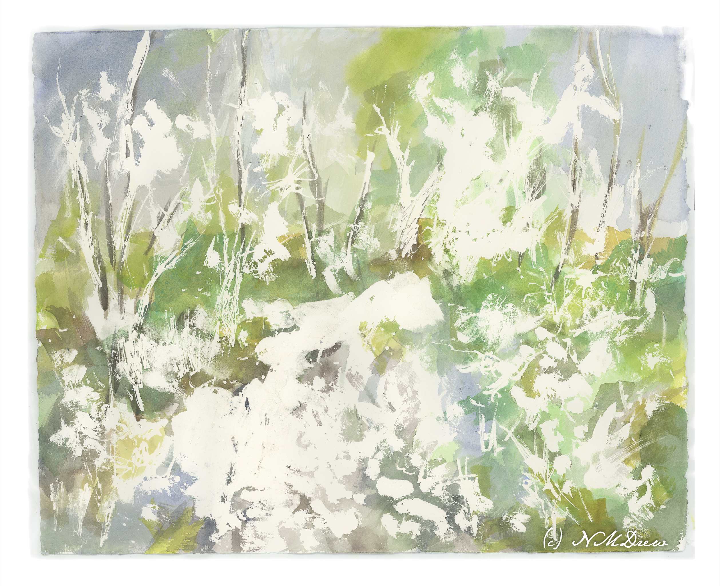
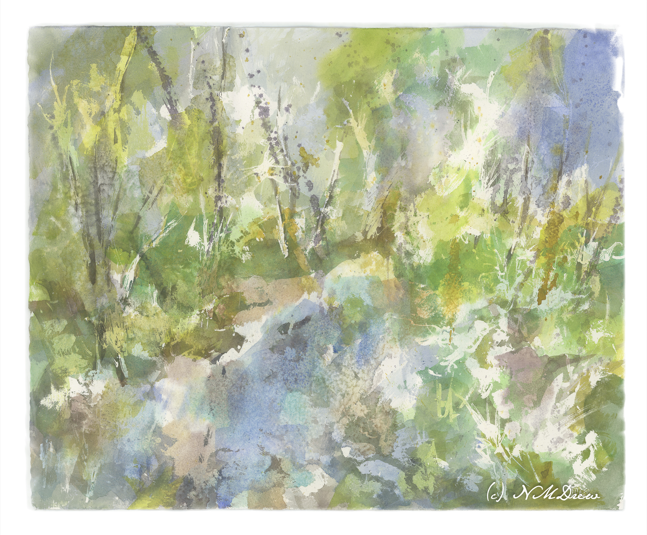
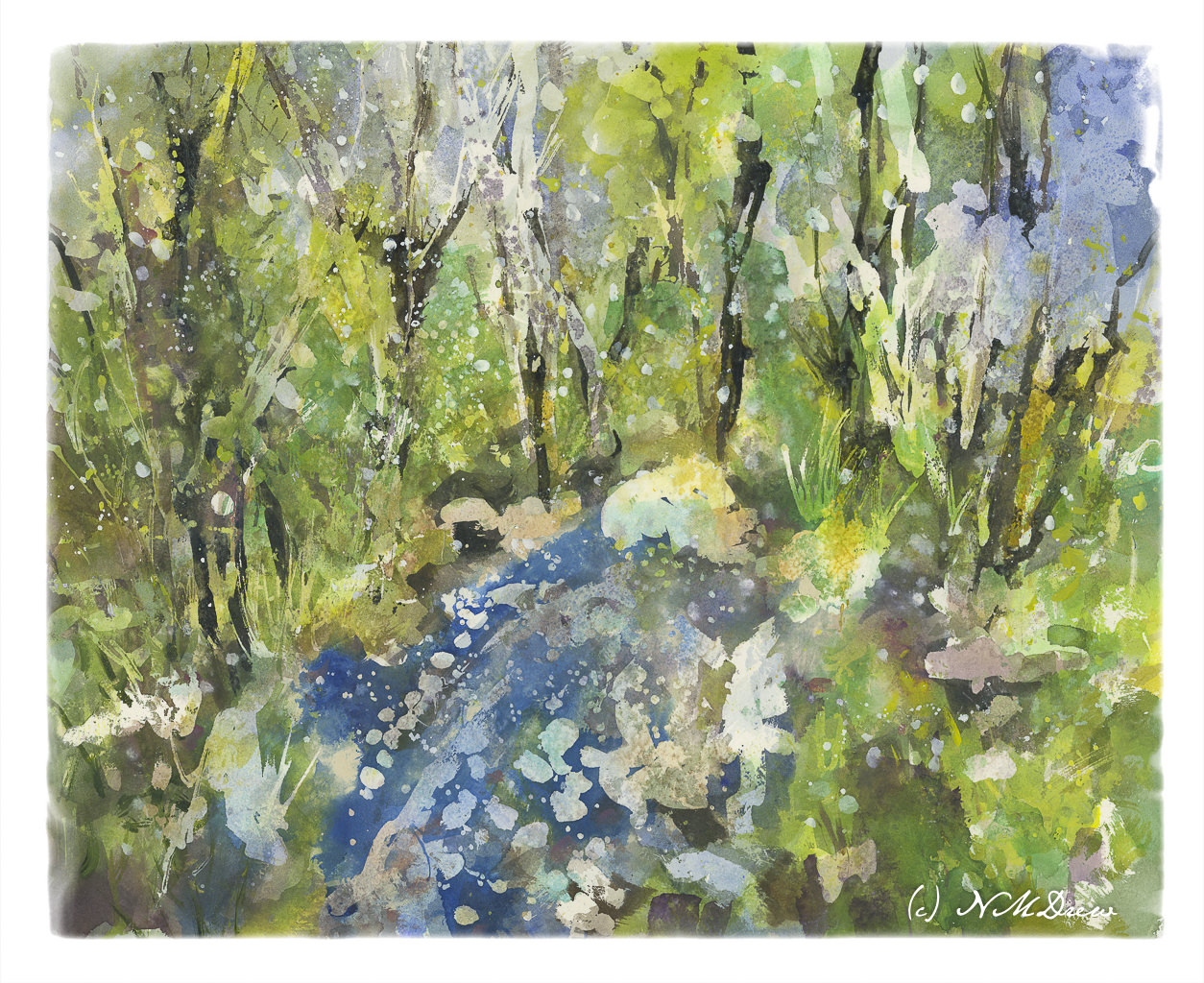
Above, a study from a photo in my watercolor class. Below is the first value study showing the midtones

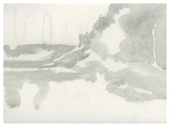
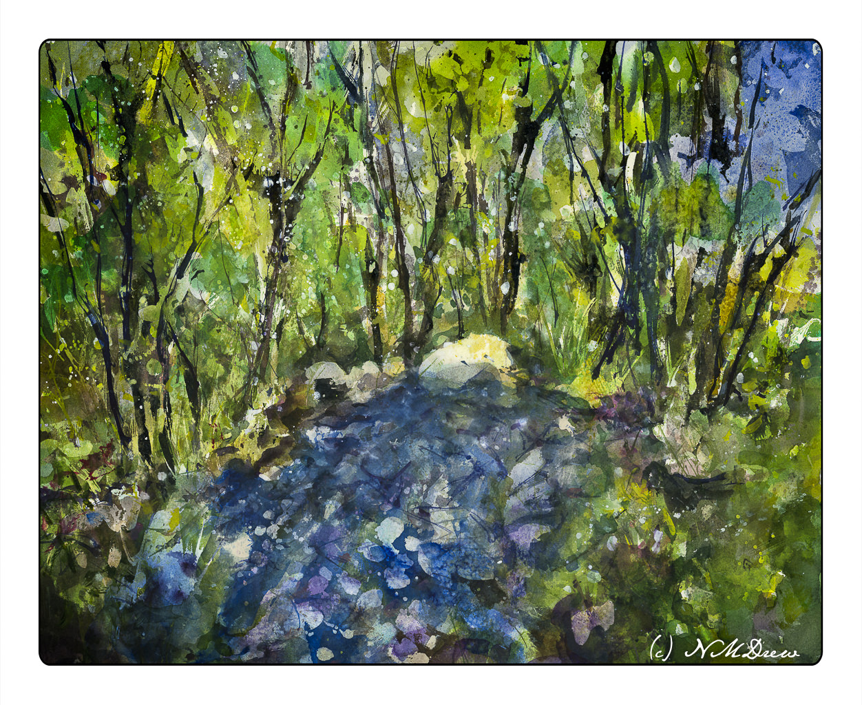
All the white area is supposed to be sky and the lightest areas of the picture. The grey is the middle value. These are used to help shape the painting before refinement with darks and details. Below is my dark-added value study.

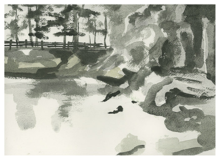
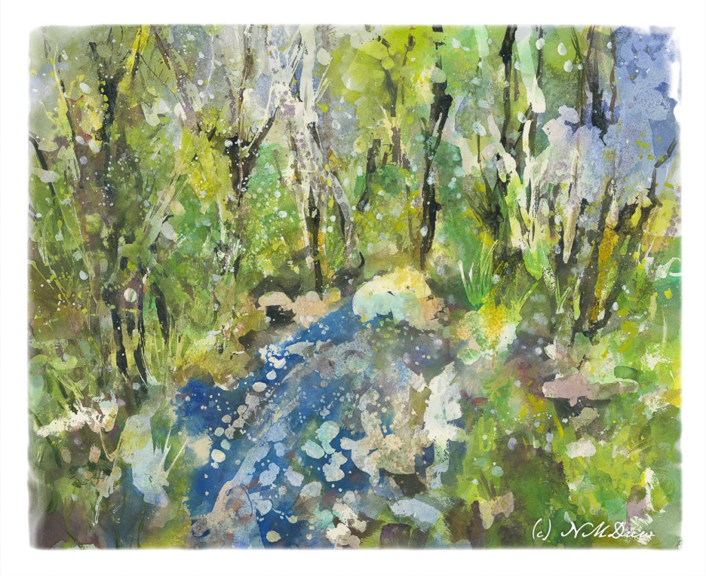
I actually really think this idea of doing middle values for the first step of a value study is a good idea. Do these values first, paint your lights and mid values in color, and then move on to the darker ones in the value study and the final painting. Doing this is very nice, really, because the dark values and details get distracting.

Like I said, this is a thing I am not enjoying doing but know it is probably going to reap bigger rewards than I can imagine at present. Values and edges are what I am trying to see in anything I do.

Out in the Midwest

Module 2 – Study 2 – Andy Evansen’s “Watercolor for All Seasons” Class

This is my second foray into the series of photos Andy Evansen has posted for studies in the second module of his watercolor class. Here the focus is on value studies.

One of the things I am attempting to do, from both my classes with Evansen and with Ian Roberts, is to work on value. Evansen is a watercolorist and Roberts is an oil painter. Evansen demonstrates the use of a value study on his YouTube channel by creating the middle value(s) as large shapes. Roberts emphasizes shapes rather than things as well. Unlike Roberts, though, Evansen begins his value study with simply the middle value, leaving lights as white. After he has painted the middle values in his painting, he returns to the value study to put in darks and perhaps details.

I managed to do the middle value study, and then painted in what I considered to be the middle values, working left to right as I am right handed. But, before that, I laid in the sky with paper turned upside down as I wanted to have a darker value at the horizon.

I am not sure if the paper is improperly sized, but the paint and paper did not interact well. This is a 300# CP Kilimanjaro paper, natural white, and the first time I have used it. I also wet both sides of the paper, which is a habit I have for watercoloring with 140# paper. I need to see what happens in the future with other paintings.

I don’t really think this painting has a focal point, but that is not the purpose of this study. This module is to paint left to right, working in midvalues and sky first and leaving areas of white or light colors intact. From there, darks.

Evansen has provided a number of photos as references for the basis of a painting, and for values, I think I will work on that and try to apply what I am learning from Roberts and Evansen to create some things worth the time I spend. The reference photos range from landscaapes to cityscapes – animals and people. I will begin with the landscapes and then try the harder subjects for me. Here, there are cow shapes – blobby things. I have also done geese – more blobby things. All thesse blobs have characteristic shapes for the critters.

So! I am dipping my toe into new territories . . . let’s see where it takes me!

Water Thaw – 4 (Final Version?)

Water Thaw 4 – Final Version??

The end! Or is it?

Anyway, as I mentioned yesterday, more blue in the lower front, some other touches, and then let it sit overnight.

This morning I took another look at it, and the only way I can describe what I did was to refine it. I increased contrast in some areas to create harder edges. Other things were designed to lead the eye toward the center of the painting, toward the whitish rock at the top of the water. I also looked for areas that just didn’t look right, somehow too symmetrical or distracting. In the end, little bits here and there made it better to my eye. But – that was during morning coffee when I was trying to wake up!

I have never worked on a painting – a watercolor – for this long a time period. Total time is probably 8-10 hours. Time was spent laying down frisket, colors, letting things dry. Then frisket was rubbed off. Water was sprayed at different times and salt sprinkled. Rubbing alcohol was also sprayed on. I think the last round of frisket took about 30 minutes to rub off, along with salt. The result, though, are transparent layers of color which I could not have accomplished otherwise.

While the perspective seems a bit off – or maybe we are looking down into the water from above? – I like this painting. It’s a new adventure for me in watercolor, and while bright, I don’t think it is overly so. I deliberately did not use any orange!! New ideas are coming to mind for painting in a transparent medium. Mood and impression work here for me – not realism, but suggestion. So, spring thaw, melting ice, new leaves.

In this final version, I cropped it and changed the perspective a bit in Lightroom. Post-processing artwork is much like post-processing a photo, an din the printing industry it is done all the time. You can see the uncropped version in the gallery below.

Arches 16×20 140# CP, acrylic, gouache, watercolor.

Water Thaw – 3

Water Thaw – 3

Getting there, but not quite.

I added more frisket, colors, salt. I also began adding acrylic paint thinned down quite a bit. Now, another night of letting it stew, but I already think I know what I want to do with it. For instance, I want to add more blue in the lower left foreground in that rather large white blob. Perhaps some sense of geometric texturing by adding tape and then painting over it. White streaks for snow on trees? It’s hard to tell.

Waiting is a good thing to do.