WIP: Trees in a Drought #3

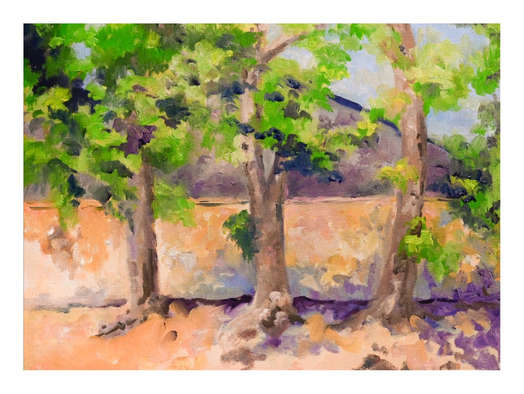
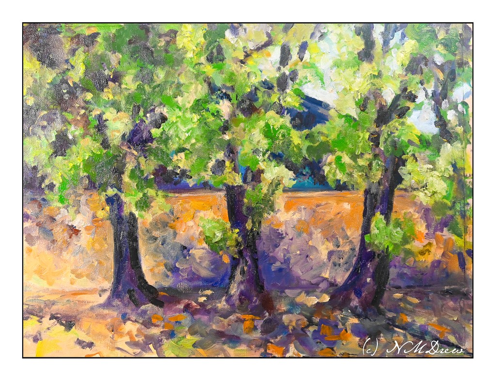
I am not sure whether this is done, overdone, or not yet done! Certainly it is more finished than before – and I am not sure I even like it – so it is in the garage to dry and to be ignored for awhile.

Oil paints are proving to be a pleasure to use. Their malleability makes them easy in comparison to acrylic paint. Add to that, they don’t end up looking plasticky.

Compositionally this painting has little to offer. It’s just a study of trees and color and playing with paints. A learning experience by doing. For instance, I finally “got it” when using brushes – and why painters use multiple brushes in oils. You know how you always see the artist holding 2 or 3 or more brushes in one hand, painting with the other? It is – for me at least – a way to keep colors more pure without creating mud. That was an eye-opener. In water based paints it is really quick and easy to clean a brush, but not with oils. Okay, new thing learned.

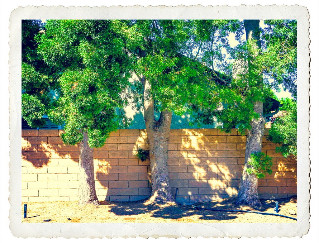
Below is the photograph I used as the basis for this painting along with all stages of the painting itself so far.

Splotchness

Another floral study following a YouTube video. This one is by Lois Davidson, whose technique is much different than the “Bowl of Roses” video.

I rather liked this one. There were some little things in doing it that I hadn’t done before. I’ve sprinkled colors onto wet paint, but never dropped in sprinklings of water. That was fun. Also, the sheer joy in painting splotchy flowers is always a delight but I did have to think a lot more than it looks – working light to dark requires forethought and patience. To me, watercolor painting is like haiku – it takes a lot more work than it appears to need!

This is on Arches CP 140# – as always! – 9×12.

Two Watercolorists Who Inspire

I’ve long been a fan of Charles Reid and his wonderful, loose watercolor style. In particular, I enjoy his paintings of the Bahamas and other Caribbean scenes. The light, the sky, the land all work together to create something most of us dream about.

A Watercolor by Charles Reid

The above painting is by Charles Reid, but when you look at it, you can also see he is influenced by the watercolors by Winslow Homer a century earlier.

Florida by Winslow Homer

Winslow Homer painted not only the Bahamas in the Caribbean, but other tropical areas, such as Florida. Palm trees and ocean and sky and wind show us another world.

Palms by Winslow Homer

Several years ago I spent a week crewing in the British Virgin Islands, and the colors I saw were are so seductive. Around every corner, I thought of Winslow Homer. Charles Reid, while I knew of his work, I did not know he had painted the same areas as Homer, nor where I had been hanging out. It was a real delight to discover he painted the Bahamas and similar areas.

A study based on a watercolor by Charles Reid (see above).

Here, a quick study – about 15 minutes – of the watercolor above by Mr. Reid. It’s rough. The goal was to capture a purity of color and gesture to express movement, the shape of people on the beach, the colors of the sky.

Island, Island View

Sky, beach, water, clouds – the Caribbean has it all. The British Virgin Islands are just a few of the many islands in the area, many of which have tourist-driven economies. Despite this, the islands have their flavors, based on who originally colonized them – English, French, Dutch and American.

I don’t know if I could live on a small island because I am so spoiled by the ease with which I can buy a book (hard to do on an island, especially before e-books!) and a wide variety of food. What you cannot buy, though, is the atmosphere and the beauty. That you take home with photographs, paintings, and memories.

Monet & Etretat, I

For some reason the works of Claude Monet have been rolling around my head, in particular his studies of the cliffs at Etretat. I found that he has done many studies of this place – it must have been a favorite of his. The above gouache was inspired by his version from 1885, Study from Etretat, the Manneporte, Reflections on Water.

By Claude Monet – Own work, CC BY-SA 3.0, https://commons.wikimedia.org/w/index.php?curid=21407533

It was really interesting to use Monet’s study as a study of my own. His painting is in oil, mine in gouache. The beauty of gouache is that it can respond in ways similar to oils, such as brushwork and color mushing. Initially, I just blobbed the colors in, but as I came closer to completion, I saw the little things which make this study more than just a simple study. Little things such as the dry brush on the cliffs, the dabs of color making up reflections and waves, the scumbling to create a sense of a sunny fog, became more apparent as I moved closer to completion of my own painting.

I’ve always loved the way Monet handled light; perhaps my studies of his works will help me with my own depth issues and contrast problems. I think this painting worked out fairly well. Even better, it was a lot of fun!

Rush Creek in 15 Minutes

Seemed appropriate that a 15-minute study should be of a place called Rush Creek up in the Eastern Sierras!

Aspens, calm water, reflections, and done. I also used this as an opportunity to check out a new spray fixative (for me). This is an acrylic semi-gloss.

The problem with pastels is they smear if touched, so storing them and framing them can be a bit tricky. Smearing was attenuated well here, but it did take about 8 applications, some of which were a single coat, and the last about 4 or 5, back and forth, out of impatience.

Fixatives often dull colors or darken them, and whites can be especially vulnerable. This one seems to have done okay, perhaps turning the white of the aspen trunks to a creamy color, but the white trunks on the middle right seem to be doing okay.

Interesting thoughts arise . . .