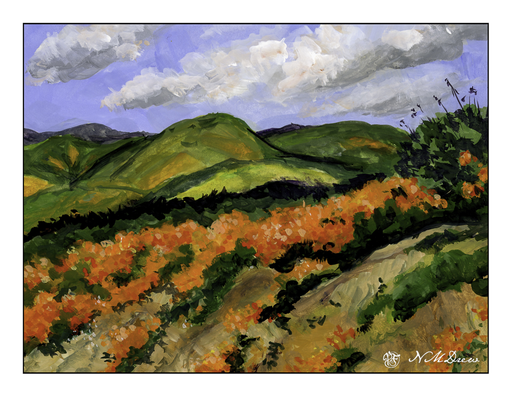
The vernal equinox is upon us, Spring is springing, and a few rains brings greens and oranges and yellows and lavenders to the hills of California. Poppies, more poppies, mustard, lupine. The hills are filled with them – of course, depending on where you are – but when we have really wet winters the hills are alive with color.
Years ago, and other years of yore, we would drive to the back country or the poppy reserve to just look. Lake Elsinore is well-known for its super blooms (what these massive flowerings are called) to the point where they shut off roads and keep people out. Like parts of the world, over crowding and over-touristed. I’ve taken a lot of photos of this bloom-a-thon, and it is always worth it. And, it is a challenge to paint in a ways as the colors are vivid and almost unreal when you live in a water-starved place and it is beige and brown.
The colors here had to be almost pure pigments with little dilution with zinc white. Gouache, of course. Colors include cadmium red, yellow, and orange along with ultramarine blue, zinc white, yellow ochre, and some umbers. Greens include every single one on my palette!! Once I settled the sky I brought out the titanium white for a bit of emphasis.
I spent a couple of days on this one just because it was really hard to paint. I tend to be a dabber, and that is how I began. Later in the process I just mushed all the colors together, and the next day dabbed in the poppies in the foreground.
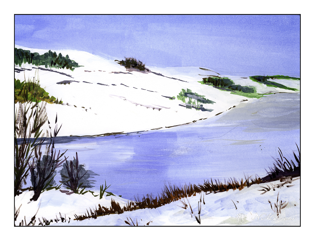
Having used a lot of gouache colors in my palette, this is a deliberate effort to see how I can make a primarily white painting. Snow, of course, is the best subject.
The two whites available for gouache are zinc white and titanium white. Zinc white is more transparent and works very well with colors to lighten them. It is not as bright as titanium white. Titanium white is more dense and opaque, and works very well for areas you want to be very white – such as white caps on waves and here very bright areas of snow.
Besides the two whites, I kept my palette limited to most ultramarine blue, burnt sienna, yellow ochre. A touch here and there included some orange, yellow, and umber to mix colors I needed.
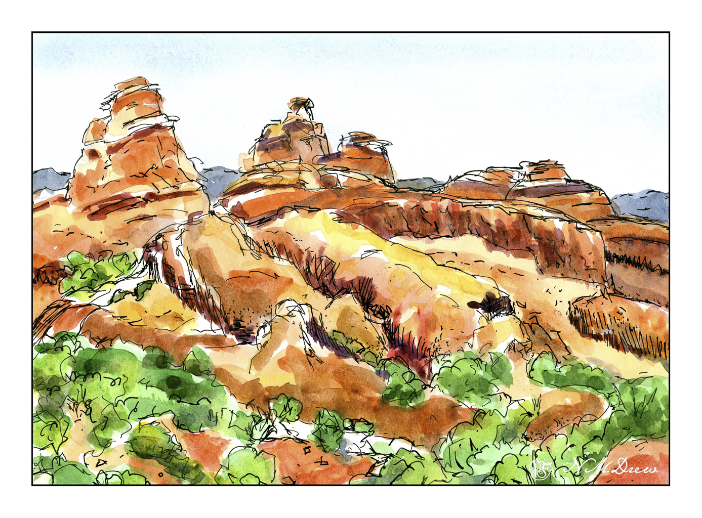
The American Southwest is amazing. Austere, rugged, rich colors of red barren stone showing sedimentary rock layers in many different colors. Plant life is tough and diverse and needs to be able to withstand extreme heat and cold, as well as arid conditions. Portraying these colors is really a challenge and a lot of fun as well! Here is the Devil’s Garden Trail area in Arches National Park. I thought doing it in pen and color might be the easiest route . . .
I have had a tablet of Strathmore’s Vision watercolor paper, 140# CP, lying around for some time but did not try it out until today. There are some things I liked about and some I didn’t like. Strathmore watercolor papers and I do not get along at all for watercolor painting, yet I really like them for acrylic and gouache. The papers’ textures never agree with me and with the Vision sizing seemed questionable. Canson XL is another watercolor paper I don’t like for watercolor painting but really enjoy for a lot of other things.
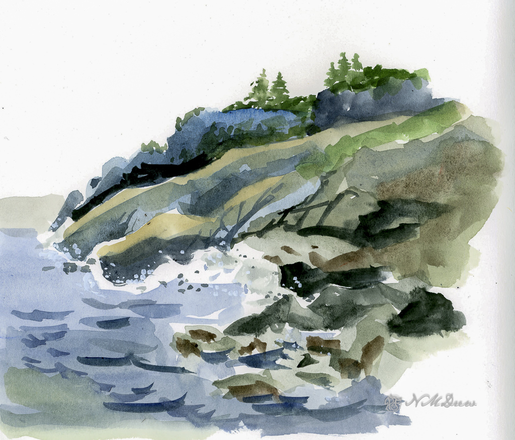
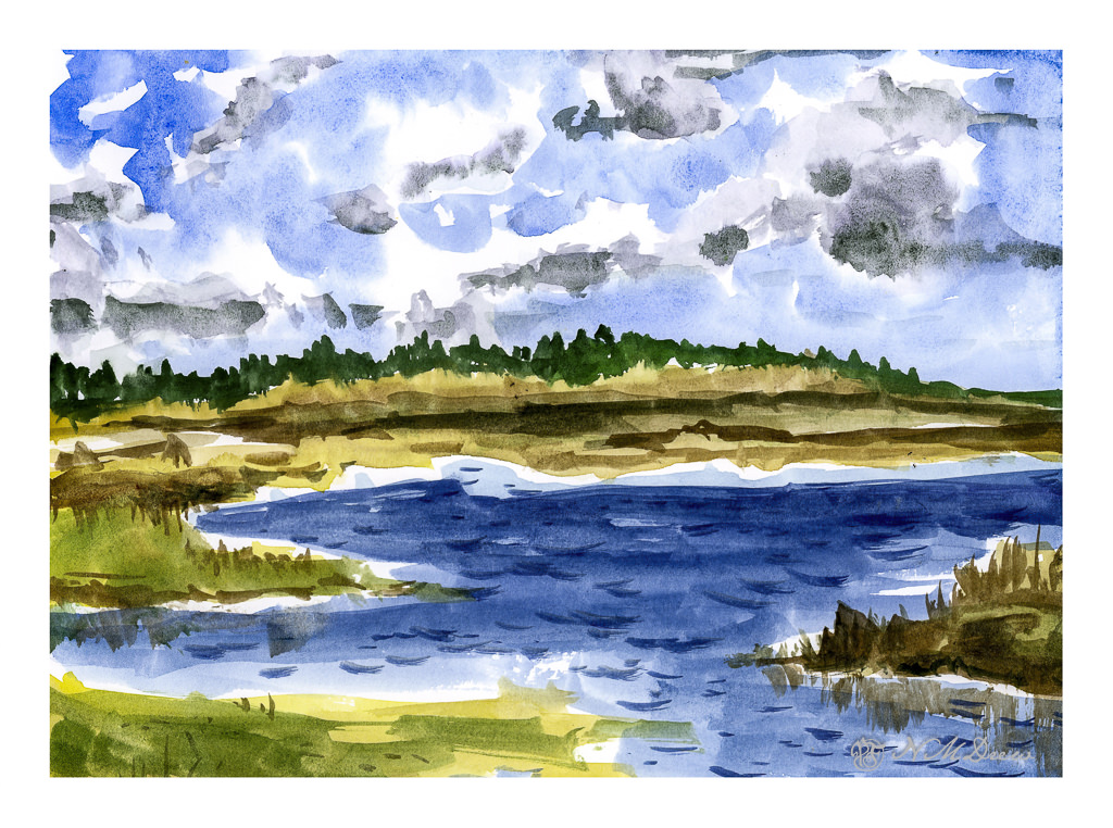
This is the first study I did – simple, free-flowing watercolor. The purpose was to lay down color with a bit of density, not overworking either paper or painting. I found it handled direct painting without any lifting or scrubbing quite well. I could paint over dried paint easily – such as where the darker blue wave shapes are – and add gouache to create a bit of sea spray or foam. Blending colors into each other as I moved the brush along in a wash worked well, too. Off to a good start!
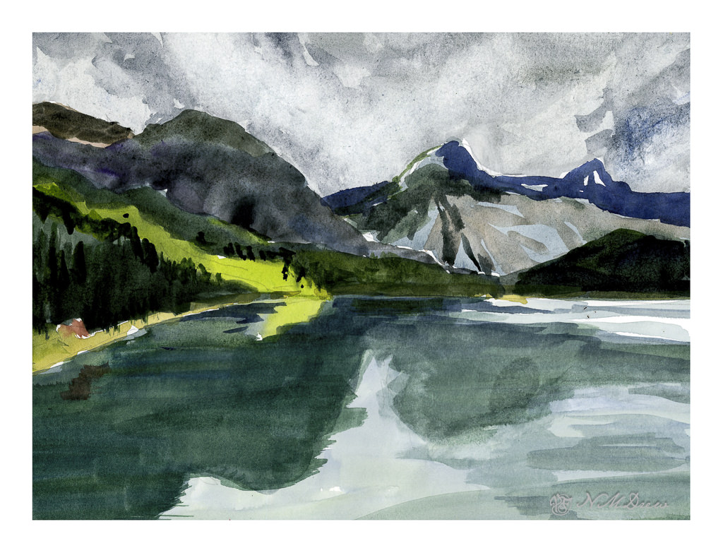
This was the second painting. As with the first one, I did direct painting for the most part – specifically the middle and foreground – and used many of the same techniques I used in the first one. However, on this one, I did the sky differently to see how a specific technique could work with this paper.
Clouds are white, right? Well, yes and no. Upper clouds can be quite bright and the paper is usually left untouched in watercolor to show it. To paint a sky with clouds you can use a lot of techniques, but here I chose to wet the paper around the cloud shapes and drop in the blues for the sky and then move the paint around a bit. Once dried, I dropped fresh water into the cloud shapes, at the lower ends, and then added greyish blues to represent the shadow on the underside of the cloud. I have not really worked with this technique, but I have been meaning to check it out, so this seemed to be the perfect opportunity.
I think Vision paper might be able to handle this technique for painting clouds, and I want to practice this technique more before deciding it will or won’t work with this paper. I know that scrubbing the paper will mess it up and as a result I have to be prepared to work very directly. This keeps a watercolor fresh and clean rather than overworked and ugly.
Here, I tormented the paper! I laid down a wash on the upper portion of the painting and then scrubbed out the paint for clouds. Then I came in a few more times and did the same. Some of the paper peeled a bit with the harsh treatment. This is good to know – how much damage can I do??
From there, I did the middle and foreground. The middle ground was pretty directly painted in one go, meaning one layer of color for the most part. I like the way this paper allows heavy paint to merge and blend as it makes for more interesting color areas. The foreground water and reflections is a series of washes, one laid atop the other once the underlying one is dry. I think in some areas I did up to 5 layers of glazing. Other areas I did a bit of wet-in-wet without a lot of scrubbing – just a gentle swipe of the brush.
Now here comes a complaint. In the lower right area of the painting you can see what looks like a thumb print. This is not – it is an area where the paper sizing is not good. You can also see problems with sizing around the upper and right edges of the paper. Poor sizing can ruin many a painting, and this is why professional watercolorists and amateurs alike go toward 100% cotton rag papers from reputable manufacturers.
Overall, I like this paper. I think it is really good for direct painting. Pleasingly, the paper does not buckle and ripple with fairly wet paint, but I have yet to lay down a traditional wash that covers a large area of the paper. That will be another experiment for a future posting. The sizing issue bugs me, but that is okay as this tablet of paper was not expensive. I prefer Vision to the Canson student watercolor paper for a lot of reasons, but in particular the way it handles pigment on its surface. I can see using this paper for practice, for studies, for preliminary work on a “serious” painting. Would I recommend it? Yes – but with some caveats.
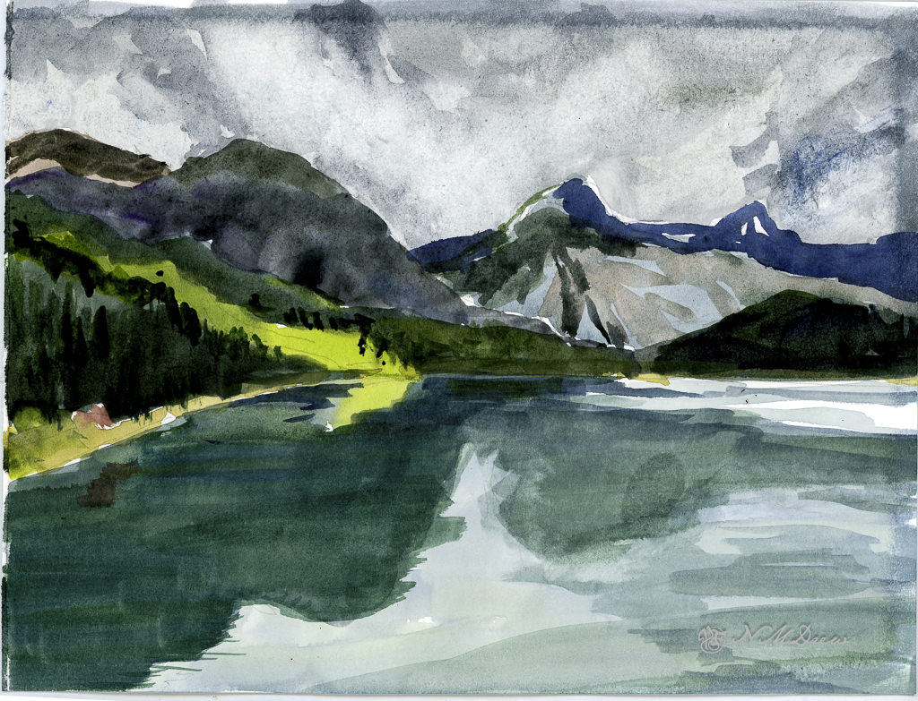
Today has been a lot of fun. Being immobile is making me quite dull and uninterested in doing anything, but at least the boot is making life a lot less painful. Yesterday morning I met up with a friend, hobbling a short distance and then basking in the beautiful outdoors for several hours with a good bit of chit chat, croissants, and delicious coffee. Socializing and watercolors always make my day . . .