There are some days where chaos is the daily menu and you just have to flow with it. I had an appointment in the morning so I could go to my painting class in the afternoon. Well, that appointment turned into a hurry-up-and-wait-for-a-phone-call situation. Solution? Watercolor!
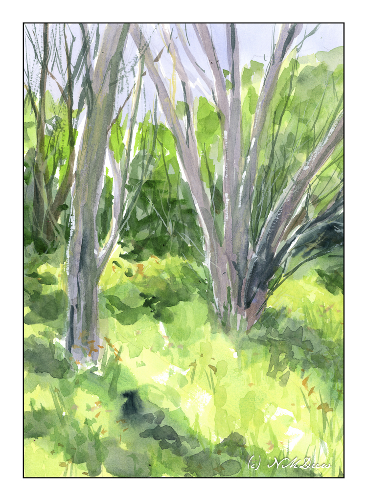
This painting is loosely based on a photograph I took while out at the settling ponds in Ventura. In California, “Spring” happens after any rainstorm. The brown grasses green, trees bud, flowers bloom. It’s the nature of the beast. We had rain yesterday and have another big storm coming in next week. In the days before my visit to the settling ponds, we had a lot of rain, and the result is this lovely little bit of trees and grass. Hard to believe this is within walking distance to the beach!
I did a bit of post in LR on the photo, but it does catch the sense of Spring, I think.
While I am busy with lots of other things – sewing, painting, learning 3-deck Canasta – I am also trying to move back into photography and just getting out. As well, editing photos I have taken, and adding mood to them which matches my mood but perhaps not what the original photo looked like! I guess that is cheating per some, but for me it is artistic license.
Before the day begins and I have read my snippets of depressing news, coffee in hand, I am reviewing past photos and editing them. This photo is one I took while at the Settling Ponds earlier this month.
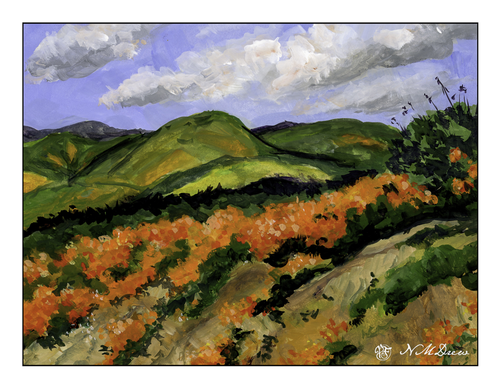
The vernal equinox is upon us, Spring is springing, and a few rains brings greens and oranges and yellows and lavenders to the hills of California. Poppies, more poppies, mustard, lupine. The hills are filled with them – of course, depending on where you are – but when we have really wet winters the hills are alive with color.
Years ago, and other years of yore, we would drive to the back country or the poppy reserve to just look. Lake Elsinore is well-known for its super blooms (what these massive flowerings are called) to the point where they shut off roads and keep people out. Like parts of the world, over crowding and over-touristed. I’ve taken a lot of photos of this bloom-a-thon, and it is always worth it. And, it is a challenge to paint in a ways as the colors are vivid and almost unreal when you live in a water-starved place and it is beige and brown.
The colors here had to be almost pure pigments with little dilution with zinc white. Gouache, of course. Colors include cadmium red, yellow, and orange along with ultramarine blue, zinc white, yellow ochre, and some umbers. Greens include every single one on my palette!! Once I settled the sky I brought out the titanium white for a bit of emphasis.
I spent a couple of days on this one just because it was really hard to paint. I tend to be a dabber, and that is how I began. Later in the process I just mushed all the colors together, and the next day dabbed in the poppies in the foreground.
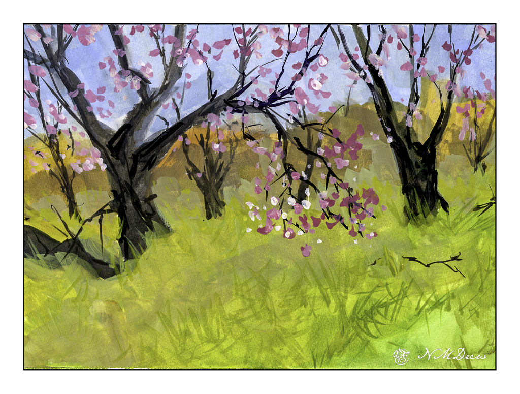
I had to miss my oil painting class yesterday as I had some things to do and some workmen to work. I had planned to use gouache while I waited. The workmen came, but I didn’t get around to painting at all. This afternoon I made up for my missed paint time. Spring is nearly here, so Spring it is!
As with any medium, if I have not used it for awhile, I need to get used to it again. As I was playing and it was lying around, I picked up my pad of Strathmore Vision watercolor paper. This is not a great paper for watercolor, but I love it for pen and ink. Why not gouache?
What I like about gouache is that it is opaque, yet diluted it becomes transparent – or certainly thin enough to show the colors beneath it. I painted with an angle brush and thin paint, laying in colors. Details were done with a small, pointed round. Additionally, as this is artists’ gouache and non-acrylic, the colors can be re-wet, and thus some fun blending can happen. I used all my little tricks to refresh my gouache memory, and here we are.
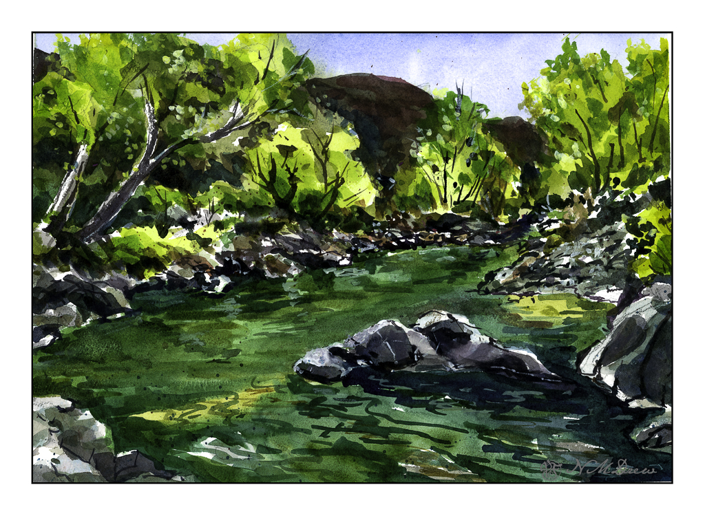
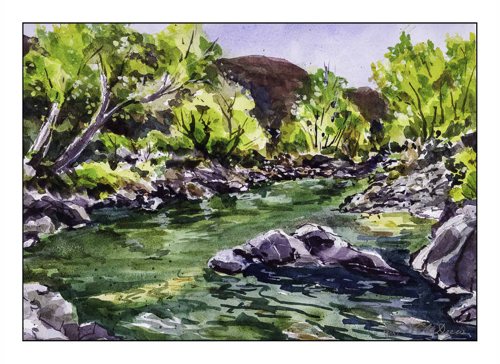
The way the light shimmers through leaves on a bright day is something so difficult to capture in a photograph or a painting. The contrasts between light and dark shift and change to be almost blinding.
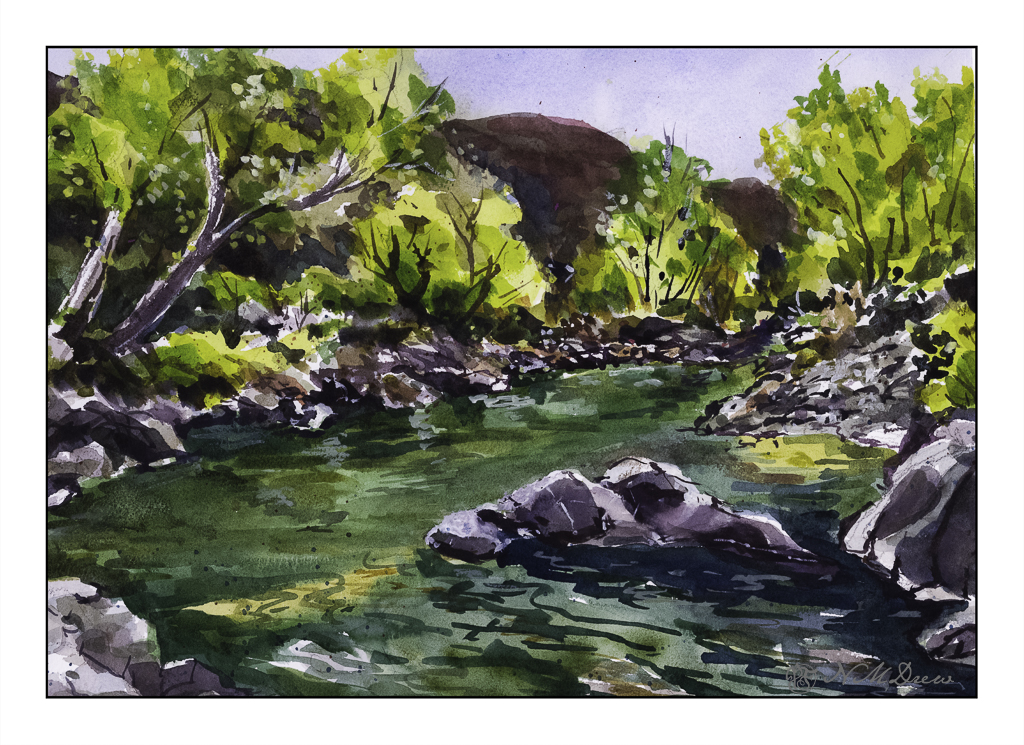
This is a creek running through the Coconino National Forest in Arizona. It is near Flagstaff and Sedona, and the terrain varies from alpine to the red rocks of Sedona and creeks and forests of Ponderosa pines. The above scan is a VueScan image with some corrections. Below is one using Epson Scan.
Neither scan really does justice to the colors, but the sparkle is caught. I think like a camera a scanner and software has difficulty with subtle variations from light to dark.
Sigh.
So, what did I try to do today? First, a bit of a limited palette. I didn’t do a triad, as with yesterday’s painting. I used (off the top of my head) mostly ultramarine blue, cadmium yellow, and burnt sienna, but into that mix I added Hooker’s green, cobalt teal, phthalo blue. The greys of the rocks came mostly from ultramarine and burnt sienna. Hooker’s provided a basis for some of the more obvious greens, but the cobalt teal mixed with yellow were used for the lighter, brighter greens you seen in springtime. Some titanium white gouache was applied here and there.
Additionally, besides limiting my colors, I tried some of the techniques for the water. Here, there were swaths of shallow water with an ochre coloring, reflections of rocks and trees in the water, and shadows beneath the rocks in the foreground and lower right. I didn’t use enough color and water to create a bead to allow blending – I have been told I would make a stingy bartender! – but still managed to get some of the colors to blend with one another. I also did glazes to show direction of water and movement. It turned out better than I thought it would – if nothing else, I need to be more generous and allow more paint and water than I think I will need. This something we all need to learn – how much is too little, how much is too much. Of course, the Goldilocks effect is best!