I feel I somehow turned a bit of a corner when it comes to painting. Shari Blaukopf’s online classes are helping a lot. She applies color directly and doesn’t follow “the rules” – by this I mean applying all the light colors first and ending with darks. Instead, she applies color to areas and moves on, making sure in many cases to let the paint dry. (Gotta love those hair dryers!) The corner also started to turn when I decided it was time to add some of the rest of the world to my painting, meaning buildings and so on. Thus far, buildings, but I am gaining confidence with them, so why not with people and urban scenes?
The fact is, I was getting pretty tired of my limited subjects, so this is a good thing. Now, even my boring suburban neighborhood is taking on a totally different perspective – there are a lot of things to paint, even here.
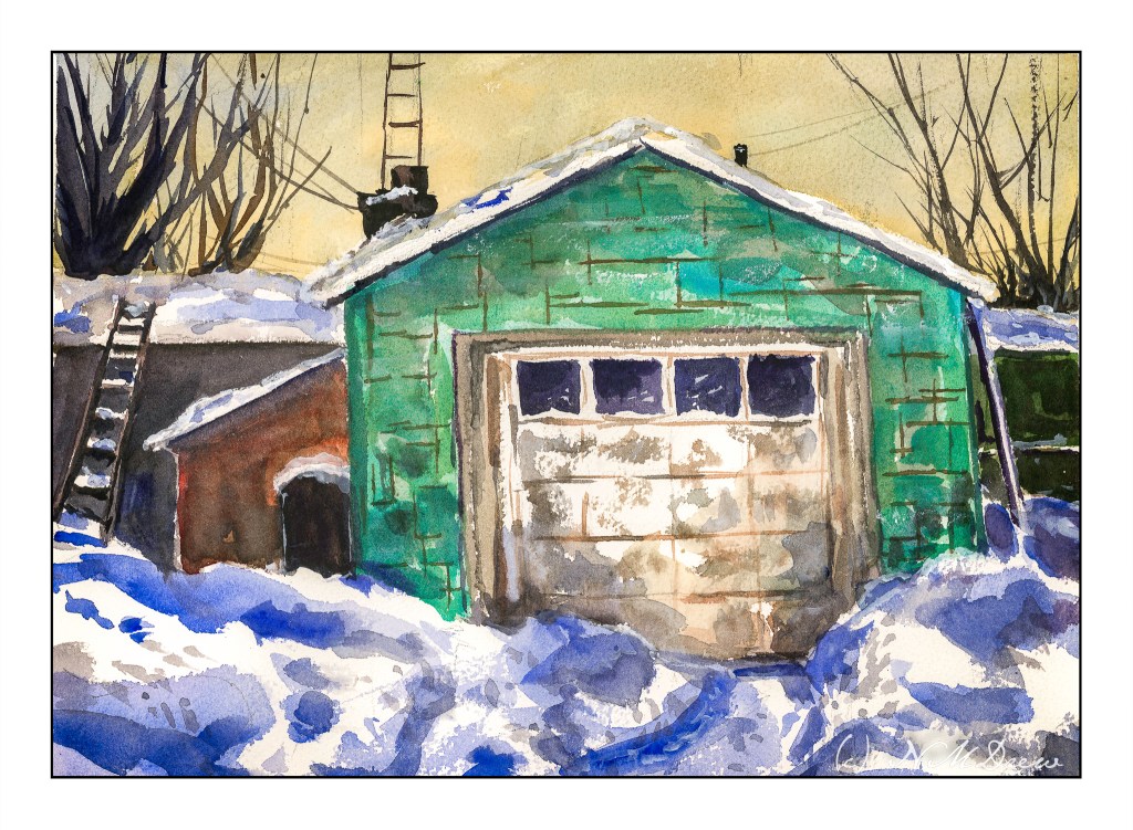
Nothing like a slushy pile of dirty snow alongside the road to make you really appreciate bright, white clean snow!
I thought I would do this for more practice painting snow, using some of the things that stuck in my mind from the Shari Blaukopf’s class on painting snow. Add to that, I tried to recall and implement some of the things I have learned over the past several months from my courses with Ian Roberts. Something seems to be shifting!
Somehow I think Cathy and Heathcliff might have enjoyed wandering around here – it certainly is bleak enough, more so in winter. Such barren, stark hills always appeal to me.
More issues with depth. Sigh.
Watercolor, 9×12 CP 140#, Kilimanjaro natural white paper.
For the past several weeks I have been immersed in painting classes – 2 or 3 a week, and too many hours to count. I finally decided I was doing more than was good for the rest of my life, and decided to cap it to a few hours a day. That balanced things out as I was getting rather nutso.
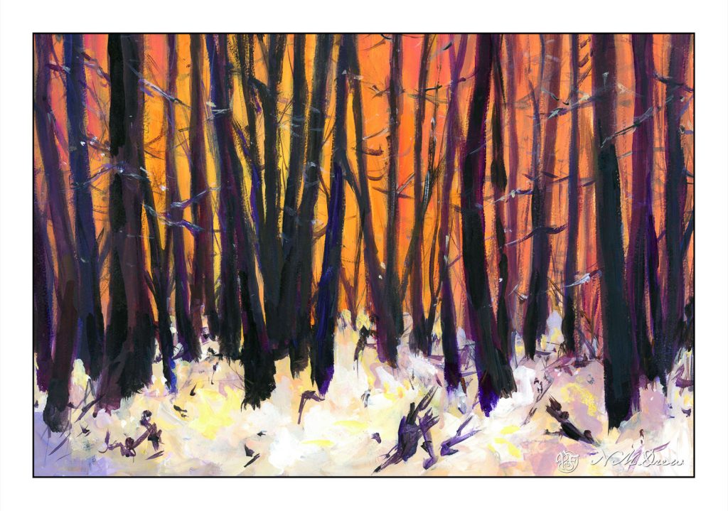
This is based off a Pixabay photo of trees and snow, at sunset or dawn. I am not sure if this one is “finished” yet, but think it is done enough to scan and put online. It is acrylic paint on a piece of 11×15 watercolor paper. I decided to use it as the paper is 100% cotton but the sizing is not good. As I bought the paper a long time ago, I cannot return it.
One thing about painting in acrylic, you can paint on a lot of different surfaces. I like the feel of paper beneath my brush more than a canvas panel that I have gessoed. Maybe it is because I am used to its surface texture, but there is more of a connection there with its surface – smoother than a cotton canvas panel, but with some tooth. I do plan to learn more about oils later this summer but need to play with it a lot more and figure out where to paint as oil solvents, while now often odorless, are still volatile and not exactly something to be breathing in a closed space.
As I work on learning how to paint I also explore different artists. Right now I have been looking at a lot of the Russian artists of the Impressionist variety along with ones from the 1930s, such as Nikolai Timkov and his fellow painters. Impressionists and more modern painters appeal to me because their sense of color and brushwork, as well as subject matter, are more to my liking than any other era. I like abstraction, too, so a bit of all of these appeal to me. Strong graphics, elegant composition, good colors get my eye. Art is really a personal thing anyway. What I want to hang on my walls may be nothing you would even consider . . .
All this painting is also making me think about brushwork. It expresses so much. Smoothly blended or broken? I think the next exploration will be broken brush strokes and trying to choose a color and put it down – paint it and leave it, as Ian Roberts is telling us!