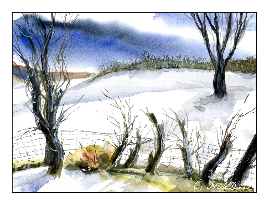
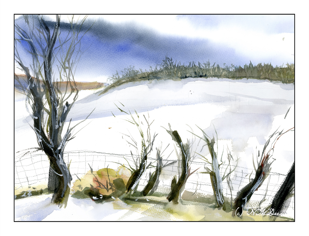
The Great Plains stretch from Canada south to the tip of Texas and into Mexico. It is essentially a high plateau of prairies and grasslands, a vast flat country swept by winds. The Rocky Mountains form the western border and the woodlands of the midwest form the eastern edge. Tornados are not uncommon, and unpredictable weather is the norm. Rain is sparse, increasing as the plains roll eastward.
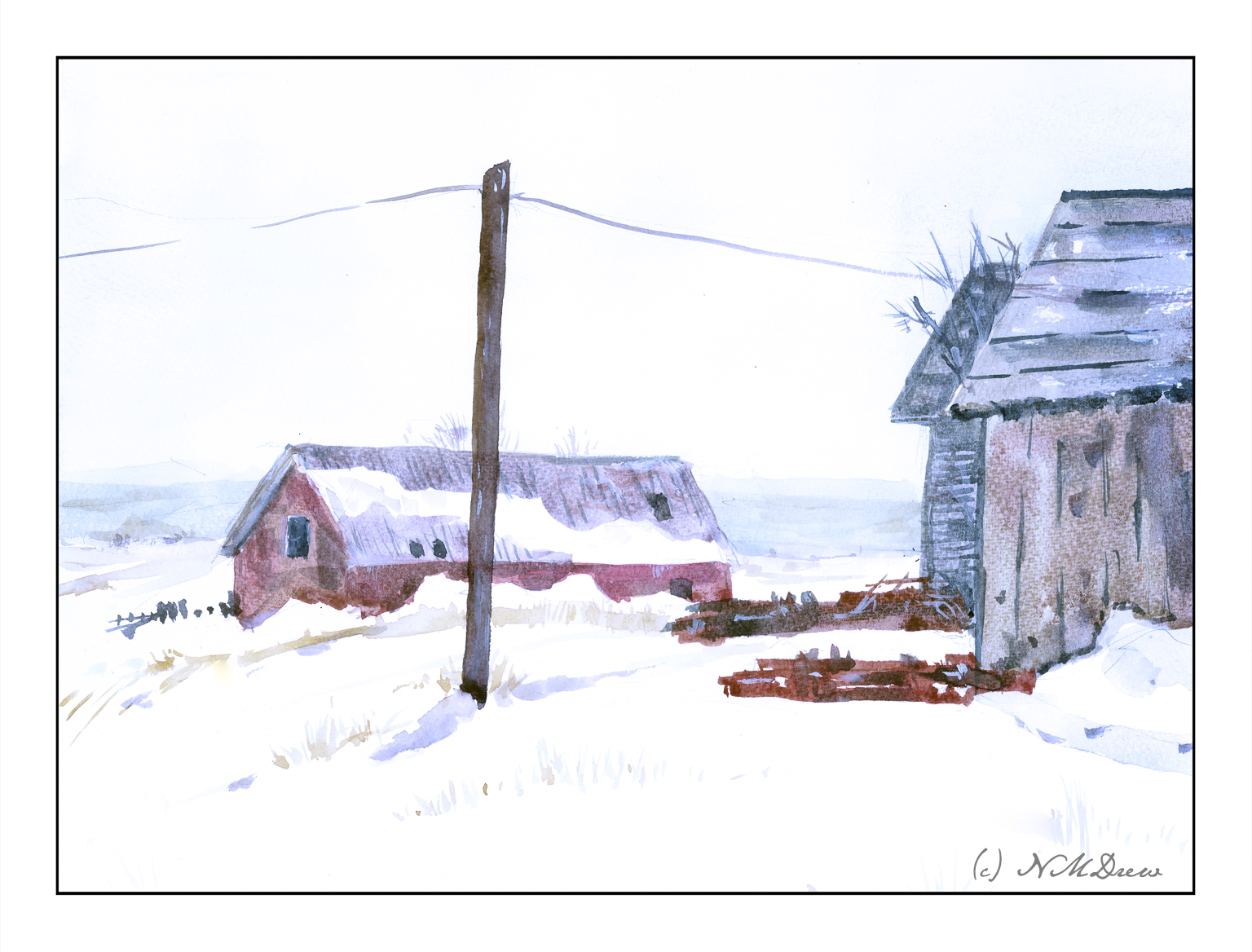
When we moved to California from New York, we drove across the plains in the dead of winter. Often the weather was windy and the air was frosty and misty. Stubble fields were seen, with remnants of corn or wheat pushing through the snow. It can be very desolate and lonely, but indescribably beautiful in a rather terrifying way.
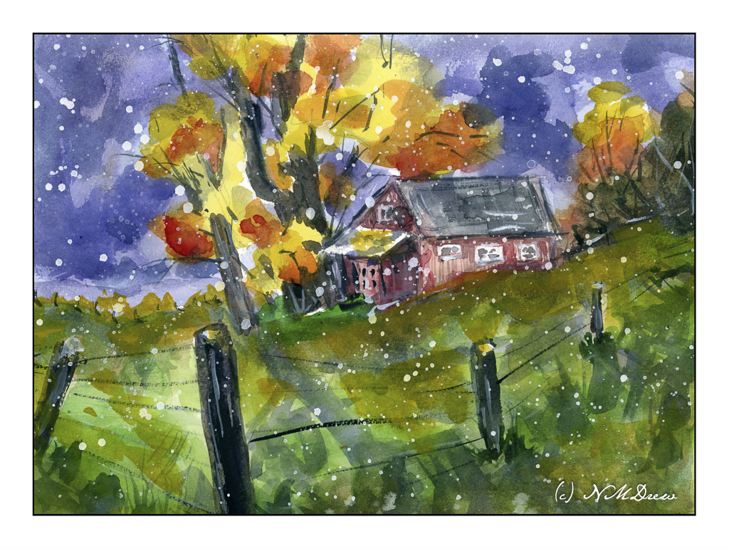
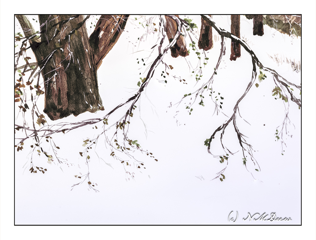
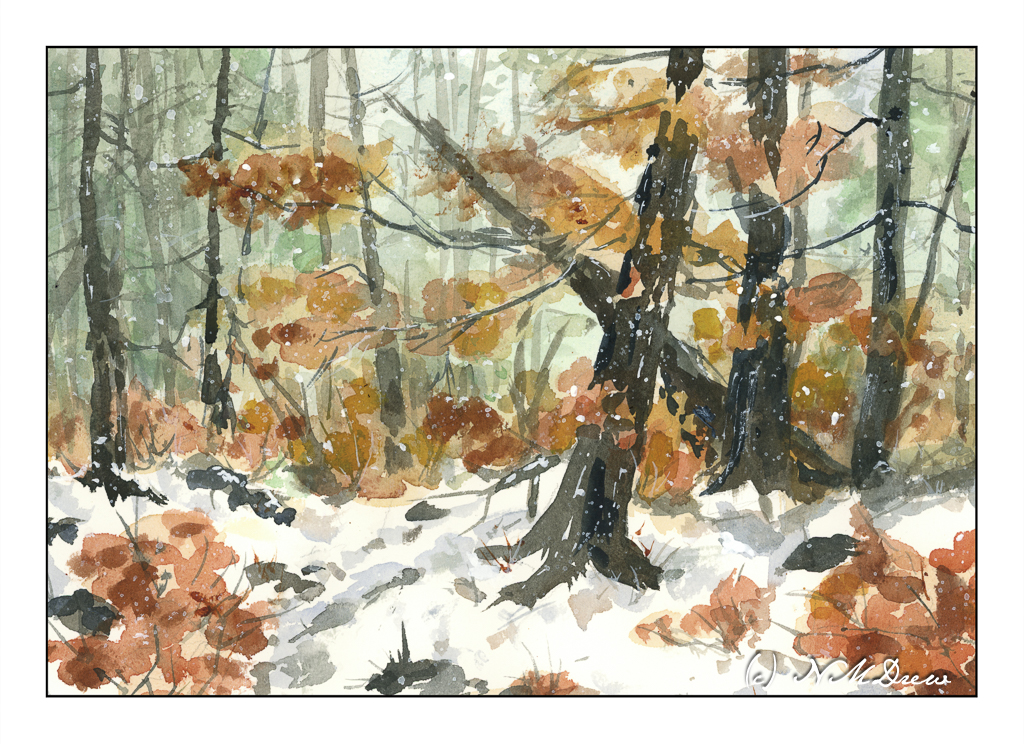
Here I have tried to catch that loneliness. I used a limited palette for the most part consisting of cerulean, lemon yellow, and alizarin. Payne’s grey and burnt sienna helped with the darker areas. Patience was needed here, from applying the very thin washes and letting them dry, to carefully considering how paint the wooden buildings. I painted on it throughout this morning and early afternoon, in between exciting stuff like dishes and laundry!
Bockingford 140# CP paper, 16×20, watercolors.