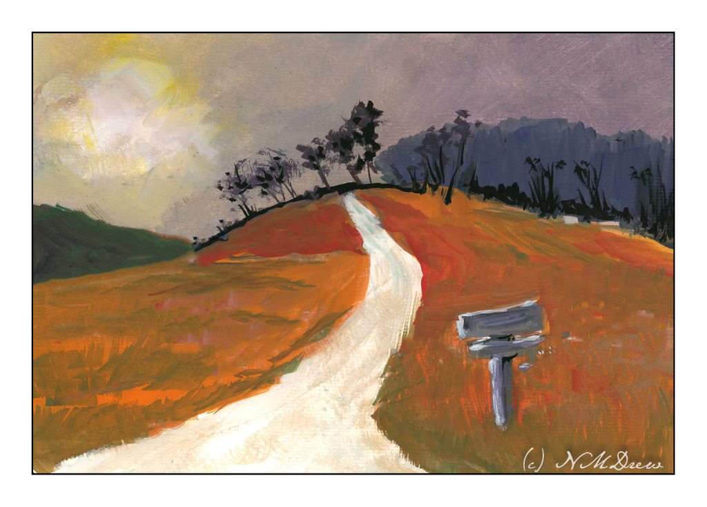
I’ve spent the last two afternoons following along with an online class in gouache. It’s been fun. The main focus has been skies and their moods as shown by clouds and color and time of day and weather. For some reason the dark and stormy sky stayed in my mind’s eye, and visual memories of days of yore came back.
I don’t know about where you live, but here in California where I am, the clouds are seldom domineering and frightening like they can be in the tropics or midwest. I remember one day when I was about 9 coming home from school and the sky was nearly black with clouds. It was still daylight, but it was in the fall of the year and cold. It was eerie and scary and beautiful. All the colors in the surrounding fields and meadows and trees were brighter than usual, almost to the point of being unreal.
That is what I have tried to catch here – intense light, strange light and colors, a wildness waiting to happen.
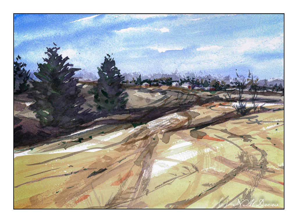
I do love the bleak look of winter. With watercolor, a limited palette of 3 or 4 colors can express so much. Admittedly I used more, but I usually like alizarin, ultramarine, burnt sienna, and Hooker’s green for the colder time of the year.
Following through on points for some of the classes I have been taking, I am working to simplify subject matter, colors, and lead the eye. I think I managed to do this here, leading through the fields to the houses on the hilly horizon. I tried to contrast warm and cool colors, with a bit of warm on the buildings with the hope it will draw the viewer in. I also used wet in wet and dry brush, working from general shapes to more specifics; light to dark in general.
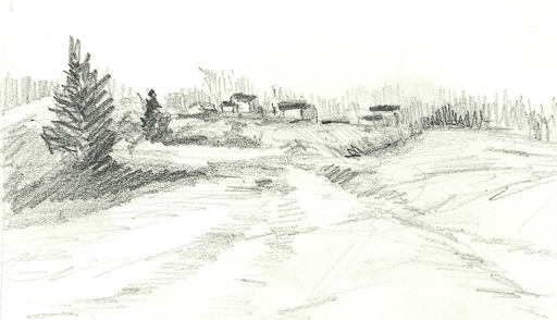
In addition to the painting, I am trying to make myself do a preliminary drawing before I touch brush to paint to paper. I did this one today. Lesson – it is actually worth the time, and I have been a silly bunt not to take on this fine habit sooner!
Watercolor, 9×12 CP Extra White Fabriano Artistico 100% cotton paper.
I cannot believe it has been over 3 weeks since I last posted here! Suffice it to say I have been busy with learning how to handle oil paints and some drawing, and really not in the mood to look at the computer much.
That said, today a trip down to Pasadena’s Blick store was a fun morning’s journey and got my mojo going again. I didn’t spend too much, but did pick up some colors in oil and watercolor from brands not available locally (and that is not to say we don’t have a fantastic store nearby), and just had fun wandering around a well-stocked art store. The esposo did the driving as I am not a big fan of driving in L.A., even on a Sunday morning.
Anyhoo! I am trying a more subtle approach to my watercolors – perhaps less bright, more delicate? As well, trying to convey depth better along with leading the eye of the viewer where I want to go. Not too sure if it is working, but the process is fun.
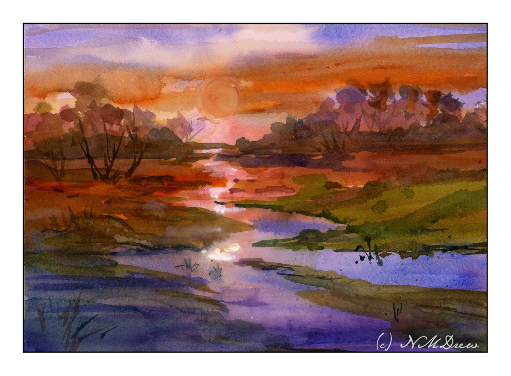
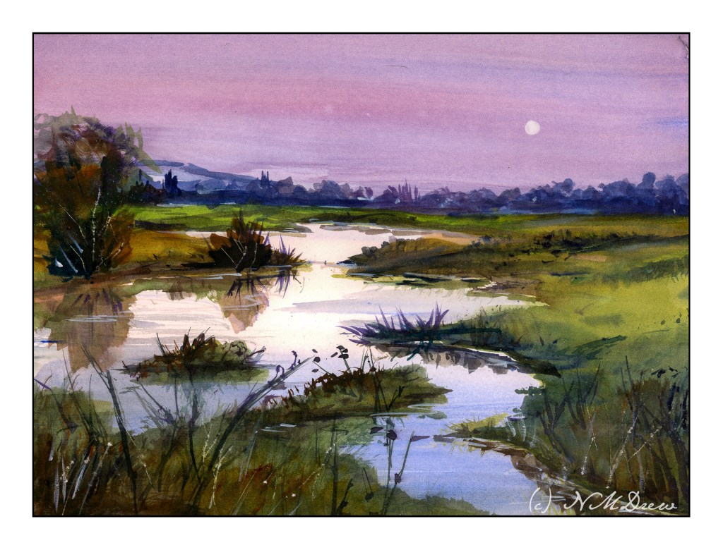
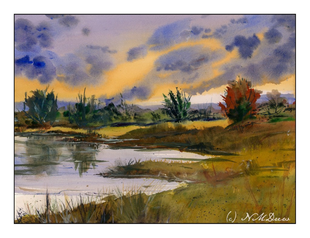
More practice paintings. Negative painting will return in the not-too-distant future. Before all those negative painting exercises came in, I ran across the watercolors of Javid Tabatabaei. He has a wonderful way of painting skies reflected in water. His YouTube channel shows his tricks – definitely watch him if you want to see what magic he creates with a very simple method.
Normally, I paint the sky first, and then I do the distant hills. Water on the ground is left to last. Tabatabaei strokes in the sky and the water where the colors of the sky are reflected, but he leaves areas of bright water white or with a light tint of gold or yellow or blue, depending on his needs. For the sun, he paints around the circular shape of the sun; he does the same for the moon. Other times he will lift the paint. This technique creates a lot of drama.
Below are a couple of studies I followed on YouTube as well as a copy of a painting from Tabatabaei’s Instagram account, to see if I had learned from his demonstrations. I did. And to tell you the truth, this is one of the most fabulous ways I have ever seen for painting water and sky in watercolor – a big thanks to Mr. Tabatabaei for sure! Very simple, very elegant.
The above is my first attempt to follow Tabatabaei’s technique; this is from a YouTube study I seem to be unable to find at present. This is also on HP paper by Fabriano, and I was not really in a comfort zone as far as using it. Still, it worked out quite nicely. Here, I tried to lift out the image of the sun, but it really didn’t work. White gouache failed too. So, a painting lacking in success in a lot of ways but that water and reflections are yummy!
The one above is also from a YouTube video by Tabatabaei. He has a couple of YouTube channels, come to think of it. That may be why I am having problems finding them! This one and the one below are on Arches CP paper.
Finally, my version of one of Tabatabaei’s paintings using his water / sky technique. It worked out pretty good, I think, and I can see I am going to have a lot of fun painting water! Expect a monsoon or flood . . . of watery watercolor paintings.
I am trying to lighten up my handling of watercolor. Very often my colors are far more intense than I really want. I think part of this is the result of impatience and perhaps pre-cataract surgery days. Watercolor itself lends itself to a delicacy other media lack, I think, and to not play into the wetness and what it can do perhaps defeats watercolor’s beauty.
There is something about fog and early morning that always fascinates me. The idea that a cloud is on the ground (my father’s description of fog when I was about 5) still intrigues me. After all, clouds are UP!
So, a morning along the coast. Wet, soft, blurry, and giving way to a sunny, summer day.