I think I have purchased every single course that Shari Blaukopf has online! She is such a good teacher, puts together short and affordable courses, and I always learn a few things – or oodles of things – from her! Her latest one is “Sketching Techniques with Pens and Inks” which you can check out here. I do a lot of pen and ink, but figured I would dip into this one just to see what I could learn. And, I did – such as a more clear way to view things from eye level. Ellipses become more round below and above eye level (duh!), and she explained it in a way that made me review my own way of drawing a bit, and perhaps will help me solve some perspective problems.
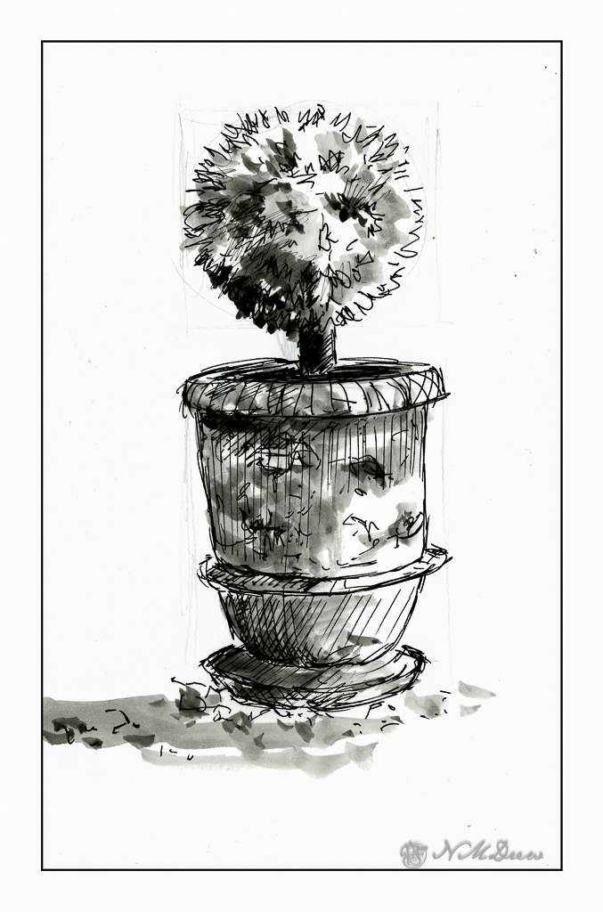
So, this first one is a potted plant in a planter somewhere in France. It’s a cool planter, too. Shari pointed out that it is good to begin with the big shapes and determine ratios. Top is a circle for the pruned tree or bush. Make a square, insert your circle. Below is the trunk, and beneath that is a large rectangular shape which you can divide into upper pot and lower pot, as well as the stand. Texture a bit for the gravel and stones upon which this planter stands. Shari put in light pencil lines, which she later erased in her video, but I left these in. You can see them very lightly in the painting. Contrast and shape coupled with expressive lines and here we are.
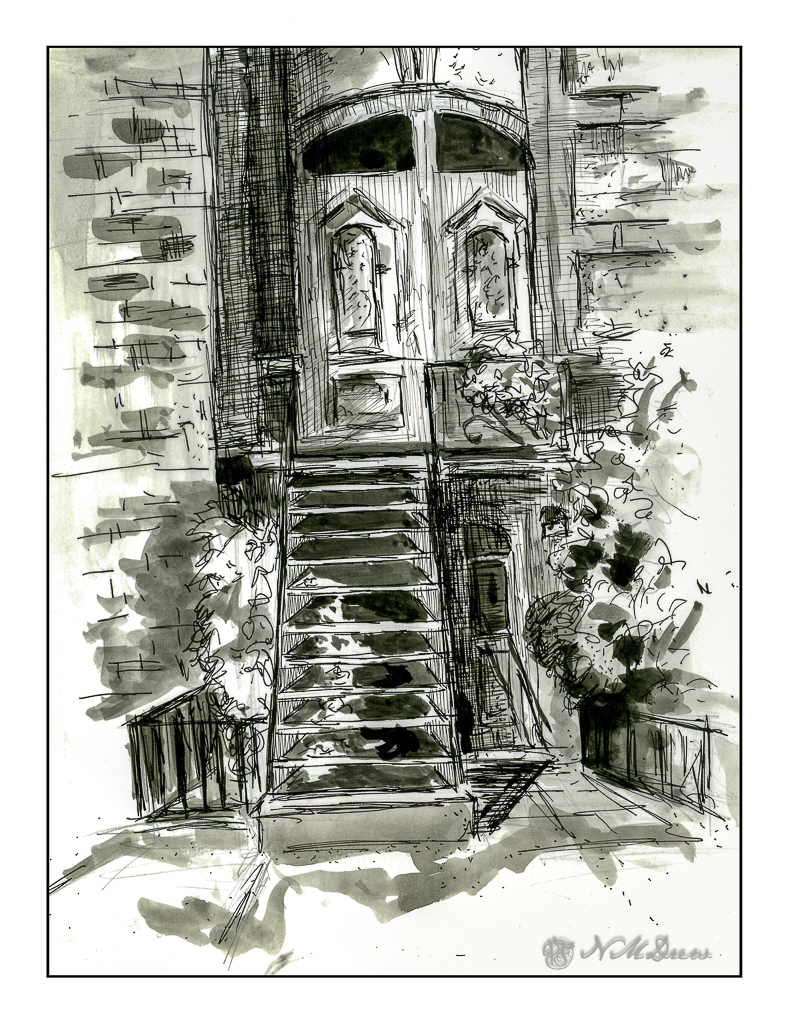
The Victorian door is considerably more complex than the planter, but once more Shari’s clear instructions helped me set up the proportions to make things work. Both the planter and this door came with reference photos, which is very helpful because things can become a bit confusing. This subject was definitely a challenge.
The detail in this subject matter makes for a desire to put it in – one of the good things about pen and ink – but I also needed to make sure I did not lose a sense of light and dark. I used waterproof ink, but to get the greys I put a bit on a plate and used it straight or diluted it as needed. I check the values to the side of the drawing before inking. Lines and dots also add to the texture and contrast of the drawing.
I like my potted plant as it works well with contrast, value, and textures. The Victorian door is more complex. Under the stairs is a second door, and I may go back in and fictionalize it a bit or darken it a bit to the right of the stairs. Something to look at and rethink.
Sailor black ink; fountain pen with Sailor ink; water and brush. Strathmore Bristol paper.