The Demonstration
Chinese and Japanese paints must be waterproof once they dry, because of traditional mounting processes. In class, we use Marie’s, which come in packages of 12 or 18 colors. The picture of Marie’s shows you the ones we use; if you are new to Chinese painting, be sure to get the ones shown, as Marie’s also makes western watercolors, which are not waterproof.

Teacher has set his table up to work. If you look at the picture, you will see that the other tables are covered in green paper. On his working table is a large, felt pad. This is used to absorb any paint or ink which bleeds through, as well as support, the thin paper used in painting. You can see ink stains all over it. To the left, the paints are placed, and the ink. Above this, water. The book or subject matter is above the paper, and below that, to the right of the paint, is the paper itself, which a soft, unsized paper. Finally, note the paper towel that Teacher is using. Make sure you have soft, absorbent rags on hand, or paper towels when you paint. You will certainly need them, to blot your paper to prevent bleeding, as well as to pull excess moisture from your brush – if you don’t, you could end up with a sea on your paper because it is so absorbent!
As with western watercolors, it is important to have a palette which will allow pigments to remain pure and uncontaminated by others, as well as large areas where colors can be mixed together. This palette is a tray for a desk drawer, bought at a dollar store. You can see how it is being used.

Teacher has chosen the painting to copy, and has begun to paint.


The peony color is alizarin crimson. The brush is loaded with water, dipped into a wash of alizarin crimson, blotted, and then dipped into a more concentrated or pure mix of alizarin. When you dip your brush into water, just dip the tip, and allow the absorbency of the brush fibers pull up water. Then, in the dilute paint, use only the tip, and allow the fibers to absorb the color. When you blot your brush, lay it on its side, and you will see how the colors are stronger toward the brush tip. Again, dip your brush into the alizarin. Blot your brush again, or not at all. If you want to, you can also hold your brush with the tip upward to move pigment up the bristles; this is really effective you are using more than one color on your brush.


Before I continue, I suggest you take a look at how Teacher is holding his brush, even though it is a western one! (The sumi painter Susan Frame describes how to load the brush, and hold it.) To paint the petals, he is using the length of the brush, at an angle, not just the tip, and creating the petals in one or two strokes. This way the gradated paint in the brush, in combination with the absorbency of the paper, create the subtle variations in color which characterize the flower petals, as you can see below. Note that as Teacher paints, the colors become weaker. He uses the paint in the brush to make many petals before reloading his pigments.

If you look in the above pictures, you will see that the colors range in intensity from light to medium. I think most of the petals have been done with the first loading of the brush. Now, Teacher has reloaded his brush, and is using pure pigment to create the a sense of depth in the petals, as would be seen toward the center of the flower. As the pigment is used up, lighter petals may be painted toward the edge of the flower. Notice the aura around the petals – this is the water spreading into the paper around the paint.

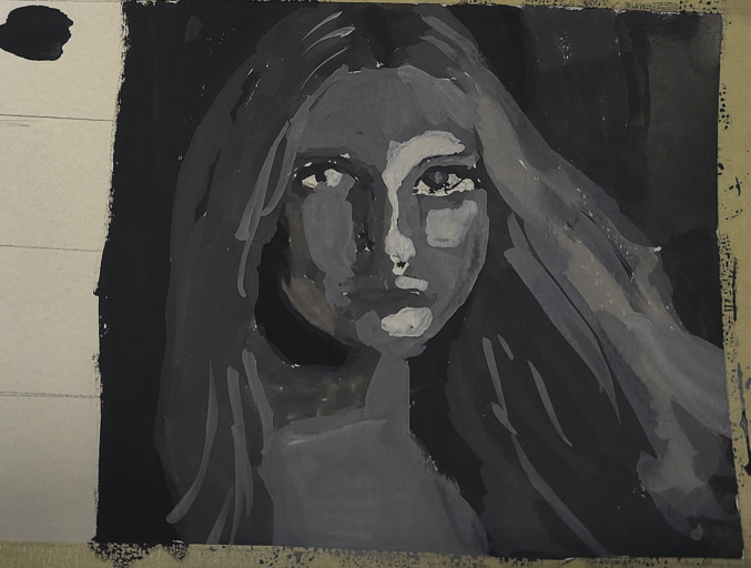
Tonality is an important element in any painting. It gives a sense of dimension and depth. Without it, a painting is weak. For many artists, this is difficult to see. For myself, I see color before I see tones, and if the color is more intense, or I have a preference for it, I can miss it altogether. To combat this tendency, use your digital camera and software to compare a color image next to one which is rendered solely in greys. This is a great tool to understand tone. You can see below that Teacher has done a great job!


At this point, Teacher lets the painting dry. This is necessary for the fine brush strokes which will be used to emulate the stamens and pistils of the flower’s center. Sometimes, to hurry things along, you can use a hair dryer! The paper’s absorbency will work against you for detail, so a very dry brush, and pure pigment (fresh out of the tube is best!) are your best options. If you don’t do this, the paint might bleed into the petals, and ruin everything you have just done.


A closer look will show that the blue is quite opaque, probably straight out of the tube, but the yellow is diluted. Because the paper is dry, the thinned yellow does not bleed into the paper and make a mess, but remains settled on top of the alizarin petals.
Now, it is time to add the stems and leaves to the peony. Teacher has chosen a large brush with dark bristles. This is a “hard” brush, with a resilience that can give crisp lines which vary as pressure is applied – very effective for painting twigs, branches, and stems. Notice how Teacher holds the brush for the leaves – at an angle. I expect the lighter leaves were a combination of yellow and green loaded into the brush – water, yellow, green. The darker ones were most likely water, green, and ink. Also, notice how fine a point is possible. This is a large brush, which is perfect for laying down large leaves, but the fine point allows for more delicate strokes as well. The brush is considerably dryer for the stems and leaves than it was for the petals.


The painting is nearly done. However, to complete the composition, Teacher added some peony buds, and veins to the leaves, which were worked in while the leaves were somewhat damp. Often, as he paints, Teacher presses the paper, checking for its moisture content before adding to an area.

And finally, the peony is finished. Calligraphy is added – sorry, but I don’t remember what it means! – and the painting is completed. You can see it below, including my shadow in the lower left corner! The finished size of this painting is probably about 20 inches (50 cm) square.
Before you move on to the rest of this rather long entry, I also want you to observe what Teacher has done in this very simple painting. From top to bottom, he has moved from light and medium into dark. The peony is light, and so are some of the leaves, toward the top of the painting, but increasing in darkness toward the bottom. From left to right, or in different areas, the shades of the leaves vary from warm to cold. This is a subtle element in the finished painting, but without it, the painting could be dull and uninteresting, yet you would never understand why. Try this out – painting only a “cold” or “warm” painting, and you will see what I mean. Unfortunately, my camera does not do justice to the painting at all.

Whenever I look at a painting, I enjoy looking at the details of different areas. Consequently, below you will see details of different areas, each of which has its own beauty. Try to analyze the details as you look at them – consider how it was painted, the sequence of color on the brush, the movement of the brush and number of strokes. Was the brush hard or soft? Was pressure applied and then lifted as the line was created? Was the tip of the brush used, or the side, or both? Was the paint very dilute, or pure? Was the brush loaded with water as the area was painted, damp, or dry? When you think about these, you analyze the painting. When you apply them, you learn skills. When you do them, and master them, you then are capable of creating a painting which combines all the elements with which you have struggled. And, in mastering your brush, you will also be mastering the paper!