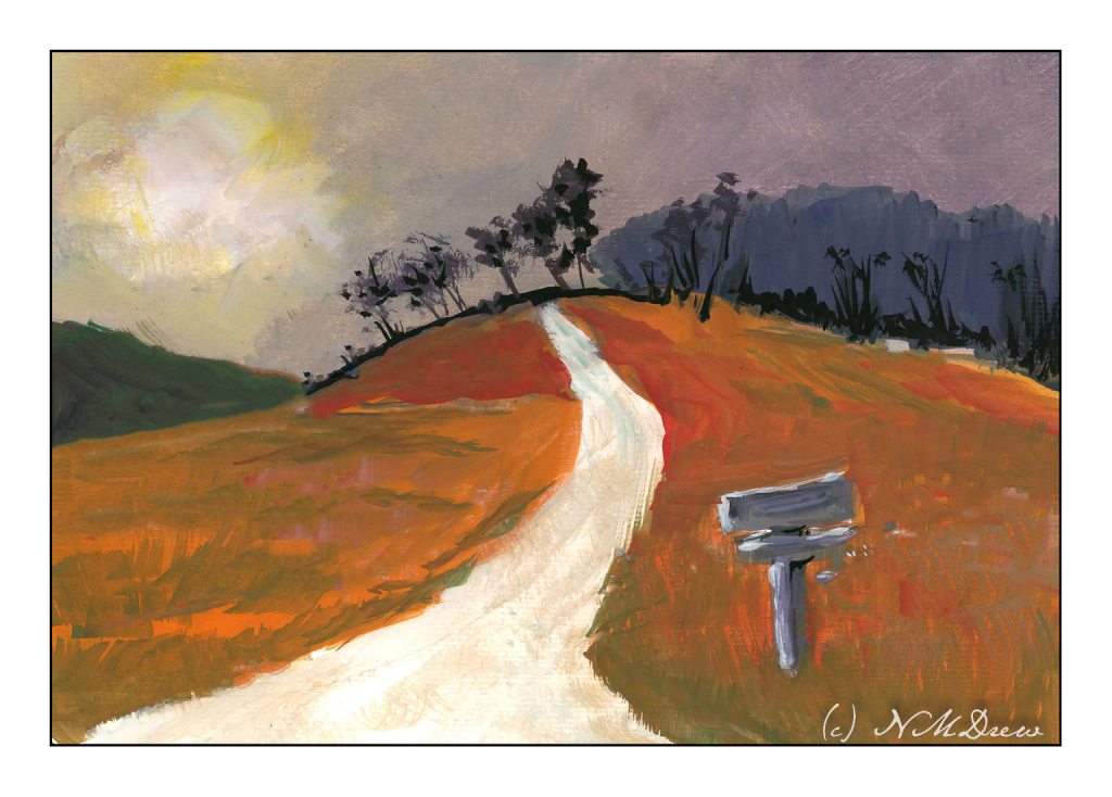
I’ve spent the last two afternoons following along with an online class in gouache. It’s been fun. The main focus has been skies and their moods as shown by clouds and color and time of day and weather. For some reason the dark and stormy sky stayed in my mind’s eye, and visual memories of days of yore came back.
I don’t know about where you live, but here in California where I am, the clouds are seldom domineering and frightening like they can be in the tropics or midwest. I remember one day when I was about 9 coming home from school and the sky was nearly black with clouds. It was still daylight, but it was in the fall of the year and cold. It was eerie and scary and beautiful. All the colors in the surrounding fields and meadows and trees were brighter than usual, almost to the point of being unreal.
That is what I have tried to catch here – intense light, strange light and colors, a wildness waiting to happen.
Nothing like a slushy pile of dirty snow alongside the road to make you really appreciate bright, white clean snow!
I thought I would do this for more practice painting snow, using some of the things that stuck in my mind from the Shari Blaukopf’s class on painting snow. Add to that, I tried to recall and implement some of the things I have learned over the past several months from my courses with Ian Roberts. Something seems to be shifting!
For the past few months I have been taking a number of classes in watercolor and painting. Throw in an occasional Pencil Portraits in the Park classes, and you can see I get a bit busy.
Magpies like bright things, and I am convinced I am a magpie reincarnated. Hawaiian shirts are a particular delight. Color in any form, the brighter is usually the better, even if it borders on poor taste. Oddly, I do enjoy black and white photography – it can be quite beautiful and dramatic – but painting value studies, monochrome, has eluded me as something to enjoy – until now!
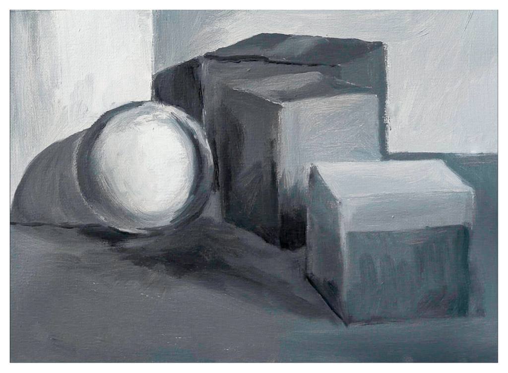
I have been taking an online class from Ian Roberts for the past few months. It began with value studies in pencils. Now we are doing value studies in paint. Some people are painting in watercolor, others in acrylic or pastels; I decided to try out oil paints for the first time in years – nay, decades – and am pleased with the results. It is a hell of a lot of fun to moosh around paint and be able to moosh it around the next day, unlike acrylics. (You can also use gouache to pretty much the same effect.) With our weekly Zoom meetings on Saturday mornings, Roberts is providing great feedback and a personal, technical, and esoteric touch to what are foundational elements in art.
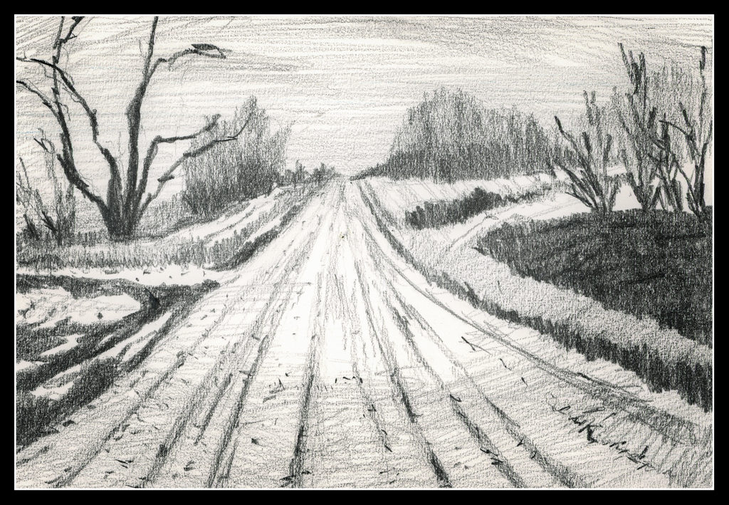
Above is my first oil monochrome. I didn’t do a great job of replicating the picture, but I did get reacquainted with how to use a brush with oils. I am using hog bristle filberts if you want to know. While we are working on values, we are also working on leading the eye. Here, not a lot of success as the road or white area in the mid left is too bright – the eye is to be led to the right.
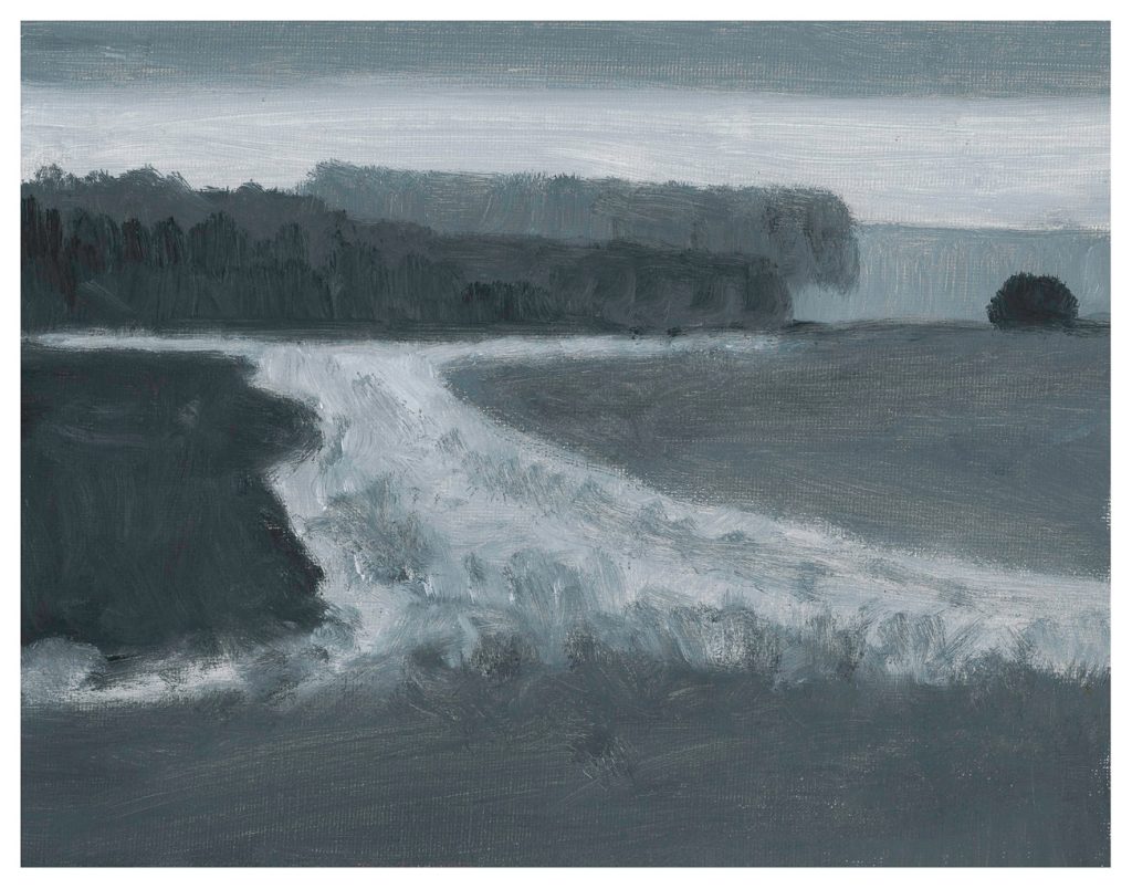
This is from the second week. Focus is on values and edges, the latter being hard or soft or vanishing. I enjoyed this a lot, even though my sphere needs a bit of anchoring! It really helped me to see a bit more sharply.
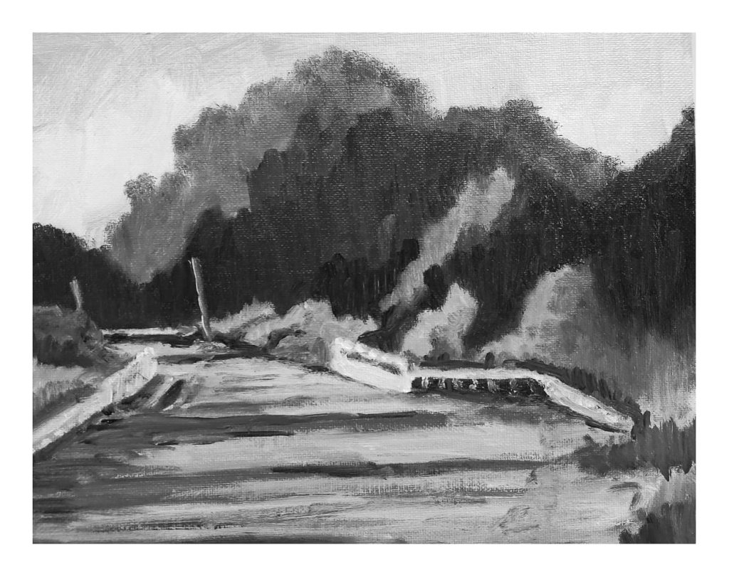
Roberts did a demo version of the still life, and then left us to find our own way with the landscape. Oils are a bit of a challenge to use because of their long drying time if you want to paint over something. As a result, I cannot scan them, but have to take a photo while they dry. Wet surfaces are a bit shiny, and the texture of the paint and canvas are more challenges to creating a digital image. This study made me see things differently, and one element I had to do was to edit the photo – simplifying it – to work a bit on the painting to make it work. Not great, but values are getting easier to produce.
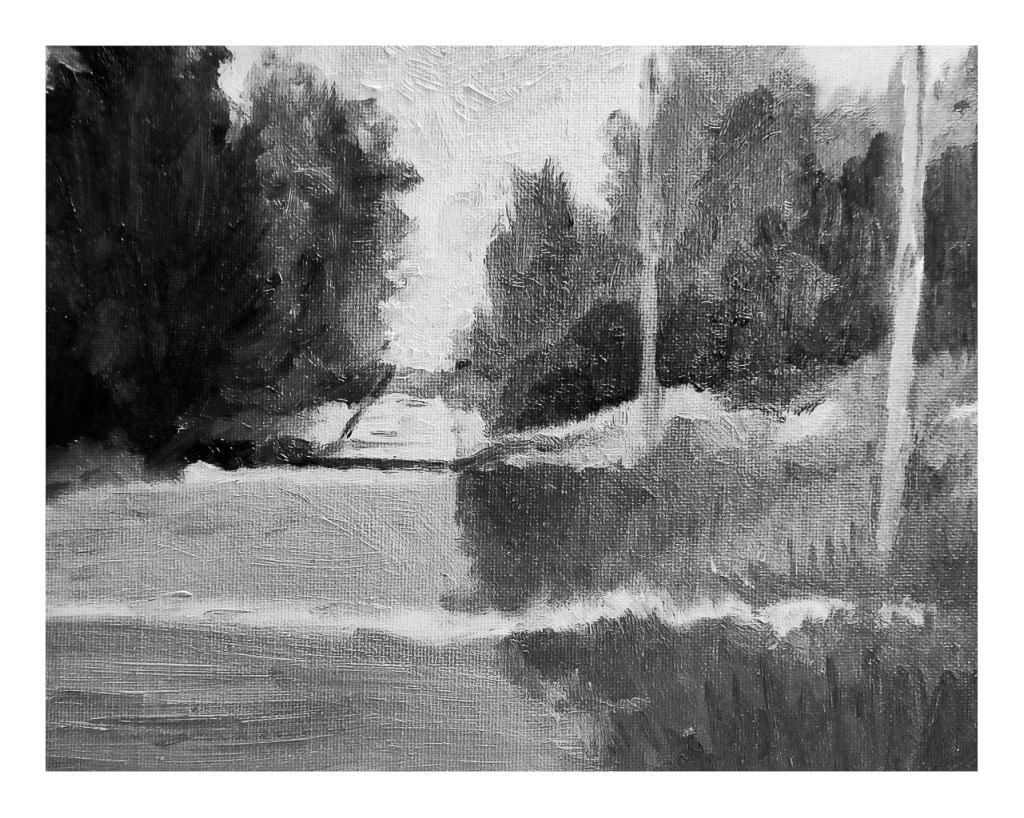
Here is one of the two studies for the third week. I did this yesterday, outdoors on the patio. I lugged out this and that, found I forgot something, ran back to get it, and it was a Big Production. But a fun one! I still need to work on this one a bit – the 2nd pole on the right needs some sharpening and the road in the distance needs a bit of work. Once more, the photo is lacking, but what can you do?
So, my painting world is suddenly black and white, and I am enjoying it. I’ve decided to do “daily painting” when possible, on other subjects as well. It will be interesting to see where all these monochrome studies take me, and when Roberts lets us to add yellow ochre to our titanium white and ivory black to learn more about warm and cool values, I think the world will change even more . . .
Today we will hit 77F and it is a joyous combination of spring fever, gardening, and just pleasure the weather is so fine! Colors, too, speak of seasons coming and to come.