Today the rains are pouring down. The backyard is flooded and the pump is working to keep the water levels acceptable by shunting it out to the the street and into the storm drains. This is the second of the two Pineapple Express atmospheric rivers causing concern and evacuations throughout the county and elsewhere in California. There is charm to living up a canyon until the rains erode it all – I live on a small hill in a tract with a creek in a park a ways down the hill. I’ll settle for that! Our clay soil and poor landscaping creates a boggy lake in the backyard, held in place with our clay soil, but we are lucky overall.
And on a rainy day, oil painting is not something I want to smell throughout the house even though I did think about it. Watercolors called – because of all the water around me? Who knows – but rain brings green growth and soggy ground, and that is a delight in our dry, dry land.
Several weeks ago I started an acrylic painting of a building at the end of a road. It was sort of painted in a traditional manner, meaning I was trying to represent reality. Truthfully, it bored the hell out of me, but I kept it as it was fairly decent in my opinion, but it did put me to sleep.
Working with brighter colors of late has really been exciting for me as I feel much more of a connection to the colors I use than I do to subject matter. Subject matter can be anything – but colors express more to me and are more true to who I am (a magpie reincarnated as an old bat) than subject matter in general. So, I took the painting and painted over it. Below is the original.
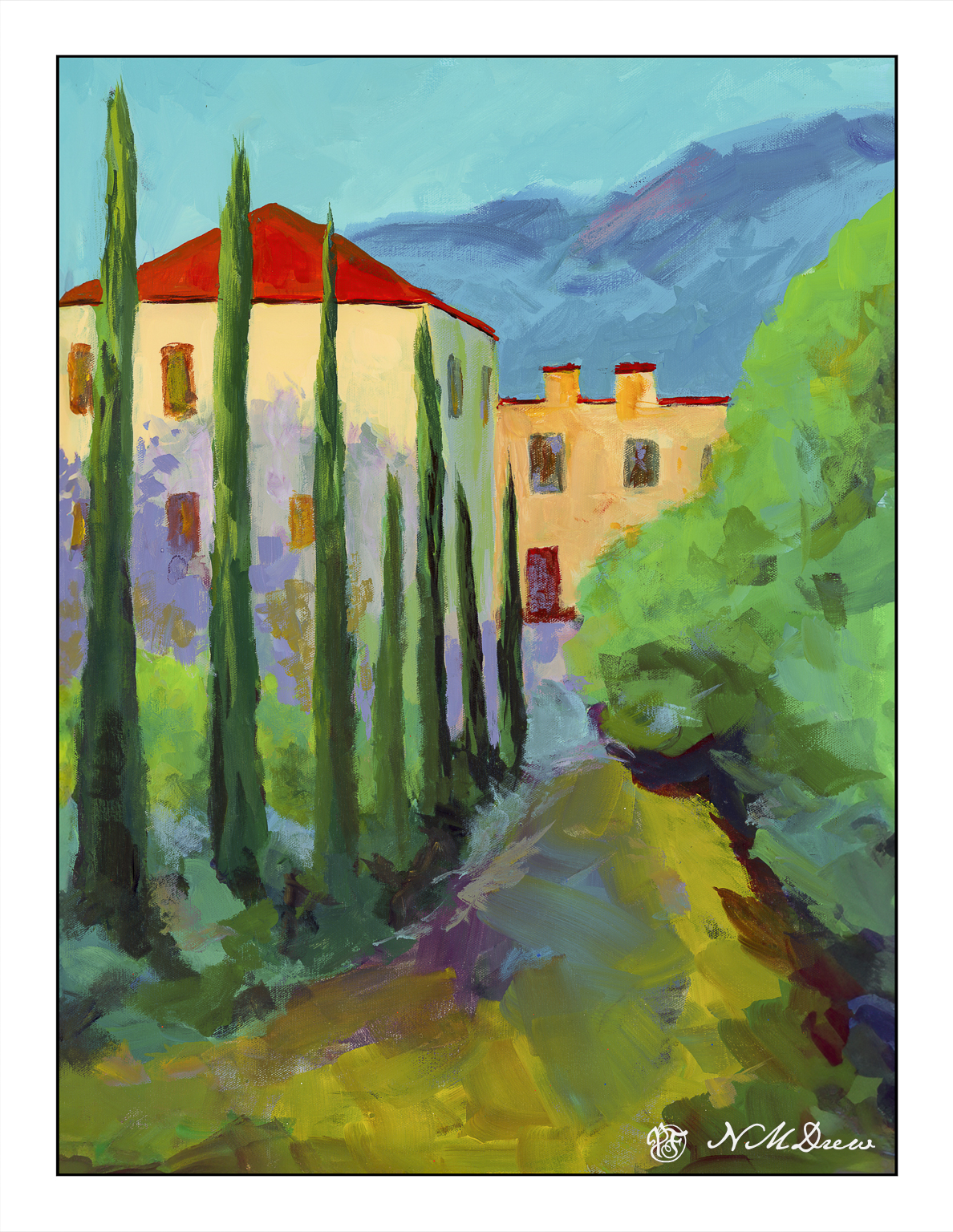
This is a photograph I took and it is pretty crap (above) as there is a lot of weird stuff going on. I didn’t think it scanning it because of its size. This morning I scanned my current iteration of this painting.
I like this much better, but it is not quite done. I need to work on the road in the foreground as well as details of the building. More windows, fix windows, fewer windows? Create some focus at the end of the road? Fix the road? Cast some shadows – creating light and dark – across the road?
Many things to consider here. I am going to let it sit and ignore it awhile. If you have any ideas, let me know!
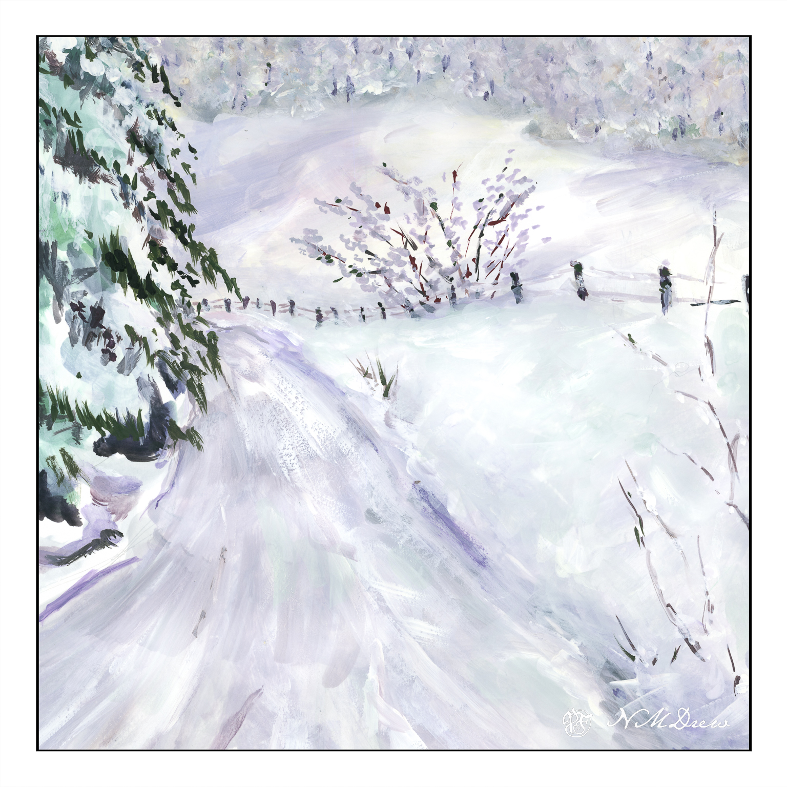
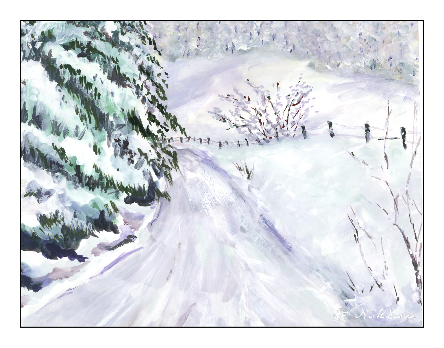
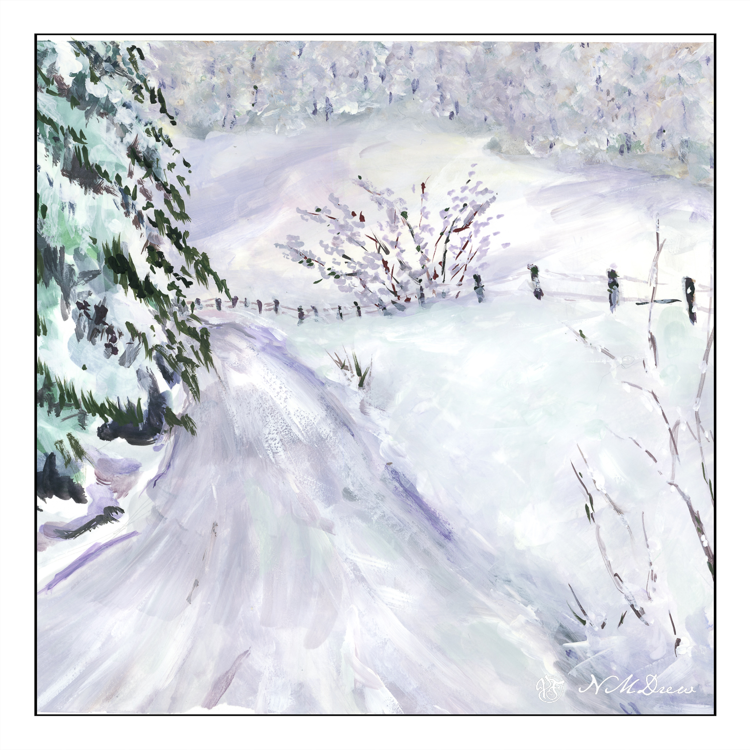
Another afternoon, another bit of time, another gouache. Today, since we are in December, it is time to visit mythological scenes of snow and cold as today we had 70+ F, and tomorrow more of the same with the possibility of fires because of the winds.
I am also in a bit of a dilemma – are the trees too heavy on the left hand side of the painting, or should they be reduced a bit in volume? The only way to do this is to crop the picture, so I did it in Lightroom.
Or is the square one a better painting?
I am rather torn. So, a slide show to compare them side by side. Drag the <> as far as you can left to right if you want to see them . . .
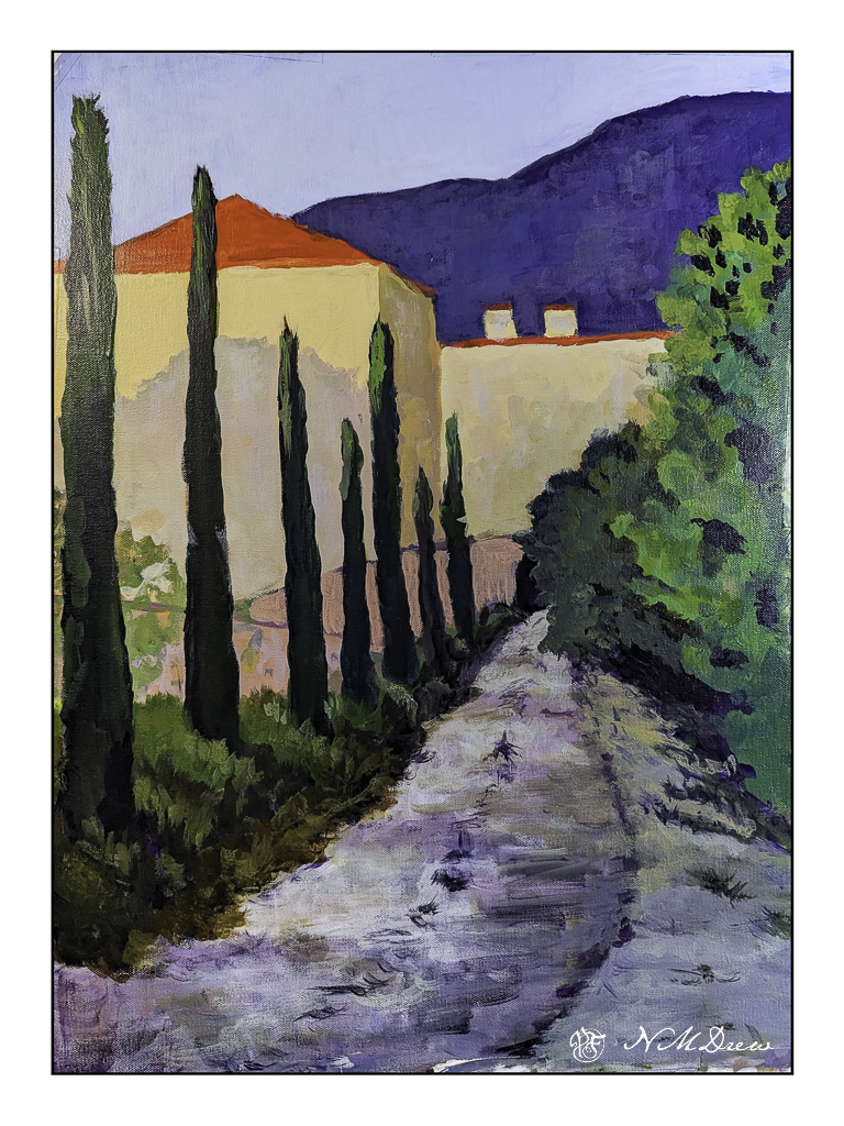
In between everything and all the organizing and deciding and packing and griping and whining and worrying and daily stuff, I did manage to start a painting. It’s on a bit of 14×18 inch Fredrix canvas, taped to coroplast, and on the easel. It has been through multiple iterations since its inception, and still has a way to go. I will finish when we return, and I am sure I will see it all with fresh eyes.
This is not a great picture – a photograph rather than a scan – but it does show where it now stands. I thought a painting of a road and building might be fun to do. I still need to put in windows and work a bit on the middle area where the two pinky curvy bits of architecture are, as well as some of the leafy trees on the left. The photo makes it a bit askew, but the roof lines are actually straighter in the painting.
I usually work in watercolor, and that is usually a more immediate event than returning to a painting daily for a few hours. In fact, it is an altogether new experience for this impatient person, and I am finding I rather like the time I have to come and go with a painting. Having it on an easel to look at all the time is also a new experience. It let’s me look at it and review it from where I sit in the studio, typing away about it or other things. I wonder how this newfound taste and appreciation for time and painting will play out on our trip.
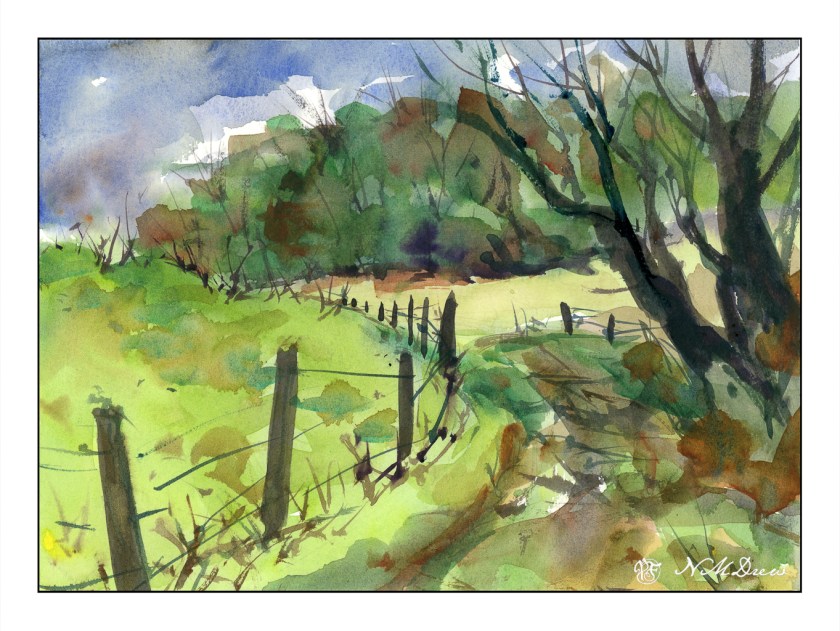
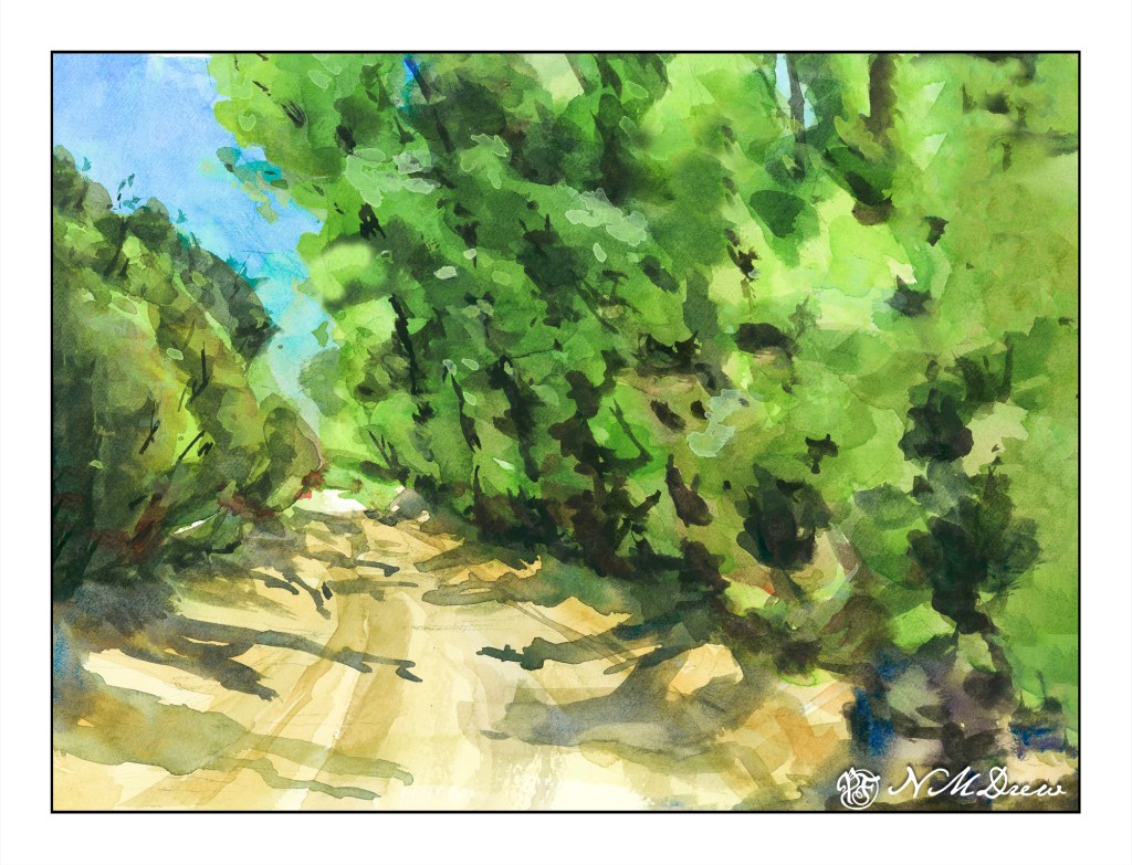
Yesterday I posted a hill that was a color study. Today I am posting trees and a road as large planes of colors. Green is green, but there are variations. The trees on the left are different greens than on the right, and so is the brushwork. The center is a rather yellowish grey road. The shadows, too, are a bit different, with the ones on the left are more blue than on the right, which have more green.
The painting started out with my using my the Schmincke half-pans on a large painting for the pans. I struggled to get enough color to begin a wash and resulted in blooms and cauliflowers everywhere. The whole beginning was a major disaster and I was not happy. Then I pulled out my usual large palette with tube paints. Start the painting over on a new sheet, or try to rescue it? I decided to apply some life saving . . . .
The sky was a big cauliflower. The trees on both sides of the road were big cauliflowers. I began with using clear water to wash away as much of the cauliflower lines, blending the paint into the surrounding color. This ended up with some lifting of color and some stripey areas, but that was not a bad start.
The next step was repainting the sky. It started out a nice light color but with another layer of color it got darker. Then the trees. Each layer became darker although I did manage to save some lighter areas. This was annoying, but then I decided to re-watch Shari Blaukopf’s “Trees Across the Seasons” to see her tree painting technique. It really helped.
My crime in watercolor is a lack of patience. That is what happened with this painting – my frustration using the pan paints made me impatient. I just want to get in and paint – I don’t want to pre-plan, do value studies, etc. There is a place for spontaneity and a place for patience. Outdoors is for spontaneous painting with drawing and thought; in the studio I want to be more deliberate. I made the choice to use tube paints, and be more patient.
The end result is not too bad. The original is darker than this one, but that is the beauty of digitalization – I can fix things. I use it in my photos, and I use it when I post my paintings online. Is this wrong? I don’t really know, but as far as I am concerned there is nothing unethical about such manipulation. If I were selling prints, I would be working to make sure the prints were good – just as in a photo – removing spots, augmenting colors, etc. Having worked awhile in the printing industry, this is the norm to produce modified images. Digitalizing a painting lets me crop and frame and sign it, too.
Besides helping me make a painting look better, it also allows me to see it differently. A monitor makes everything more clear, and that includes mistakes like weird shapes and splatters that I don’t notice in the original. Seeing such things is a learning experience in and of itself.
So, color planes and shapes, getting rid of cauliflowers, learning that half-pans are not best for my way of painting large, and fixing a painting that could have just gone into the scrap paper pile. Altogether, a good experience.