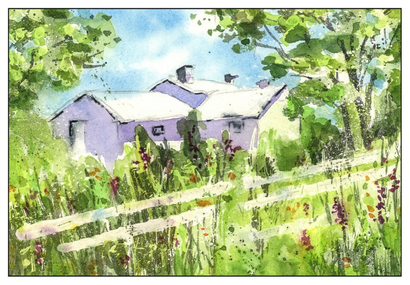
After “getting” negative space yesterday, I decided to make a complicated drawing and “work” at negative space. I have orange lilies blooming in pots on the patio every year, and they are brilliantly orange with piles of leaves in all directions. What better source of light and dark, overlaps, medium shades? And in the afternoon sun. So, here you go.
Tag: practice
Covered in Paint
A workshop all day Saturday, playing with Yupo (a plastic paper) and masking fluid. What did I accomplish? A familiarity with two unknown – unfamiliar – items. I produced not a thing worth talking about, and truth to tell, if a friend at the workshop hadn’t shown up, I would have been down in the dumps – I FORGOT TO BRING MY PALETTE OF PAINTS!
Oh, well. But, it did get me rolling, and this has been a weekend spent immersed in watercolors and studying techniques by watching videos on YouTube, specifically, those by Rick Surowicz. I followed two of his, one called “Creek’s Edge” and the other called “The Inn at Brandywine.” His stuff is great. The question is, will I carry his lessons into my own paintings, not copies?
So, here is what I did this weekend – the first is the “Creek’s Edge” and the second is my rendition of the “Inn at Brandywine.”
Pen, Ink, and Watercolor with Claudia Nice
I have always liked pen and ink combined with watercolor. The contrast between the two can be art in itself, or the two can work together, each enhancing the other. I came across this book by Claudia Nice, Creating Textures in Pen & Ink with Watercolor, quite some time ago. It’s detailed and it has some exercises with suggestions as to what to do and notes as to what she did to create the effects. Some are just ink and colors, others involve traditional “helpers” such as alcohol or salt to achieve results.
Yesterday afternoon I was in an antsy mood, but didn’t want to paint in my usual splashy style, but wanted some “containment” if that makes sense. I wanted something requiring a degree of precision. Ink is always the answer there. Realism, too, is not where I wander naturally, so Nice’s work and exercises always have a magic to them.
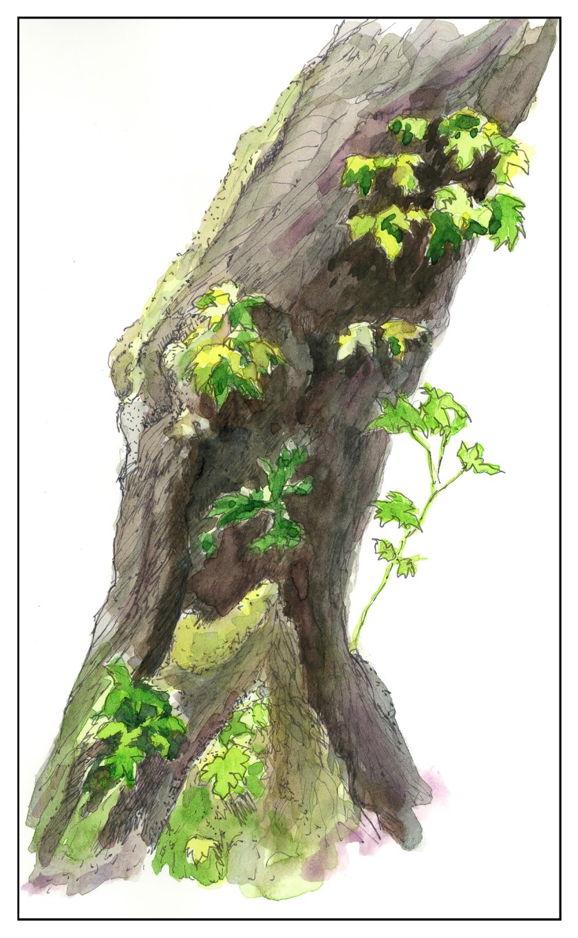
The first I chose was her “Old Broadleaf Maple” – detailed, subtle. And a tree. I love trees! This is my rendering of her example.
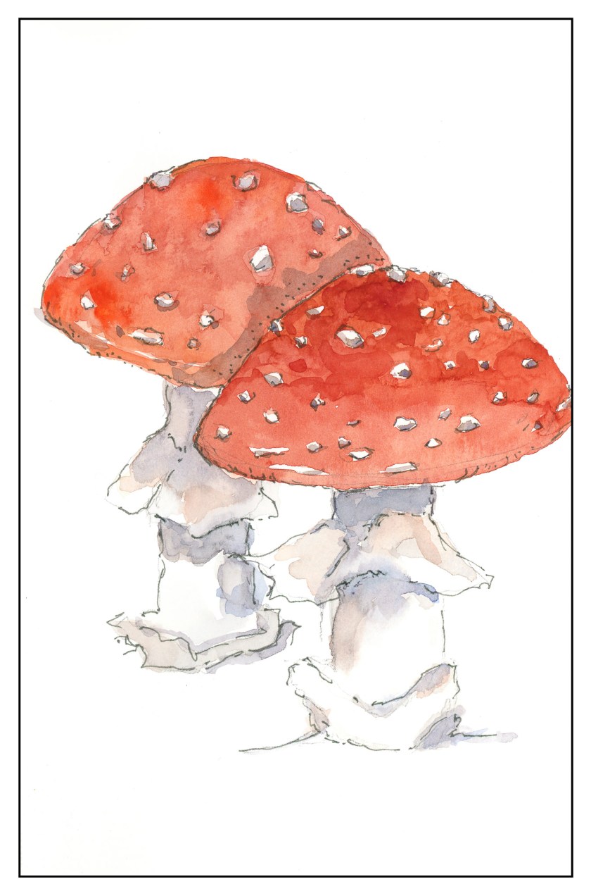
The second one I chose was a fly agaric mushroom. I have seen only one like it in my entire life – and even then I am not sure it was the same mushroom. I was hiking up in the Rockies in Colorado, up high, and came across some huge, red mushrooms, the kind you see in fairy tales. Wanting more colors than the tree, the red hues of the mushroom were perfect.
The beauty of Nice’s work is that while it appears easy, if you are doing the study, you focus on the small things as well as the overarching picture. By nature, I am not detailed oriented, and for me, it is a different way of seeing and doing something. I am always pleased with the results when I take my time. The biggest challenge is to take these studies to my own world, outside the pages of the book, and look for the details on a plant or whatever, decide what to keep, what to discard, and so on. It is hard work worth every minute!
Light Industry, with Nil Rocha
I did another study, using a video produced by Nil Rocha. As you can see, he has a style similar to Peter Sheeler – and a lot of other urban sketchers: ink and watercolor. Although it looks easy, it is deceptive. It is far more difficult to achieve a good contrast study, meaning, a good light-dark balance. I found that out with yesterday’s study with Peter Sheeler, and especially with this one. I think I need to work out the values before I begin inking in lines. Blah is far too easy to achieve!
Above, in color. Below, converted to black and white in Lightroom to check out contrast. Sadly lacking!
I’ve had a cold for the past week and it’s really hard to get creative with sniffles and a fever! Following videos is a good way to learn, but more importantly they have helped me realize that I must push, push, push to show good contrast. Middle tones are easy to create, as are lighter ones, but getting the truly dark ones is far more challenging for me than seems logical. Something to think about . . .
Mesa, Sunrise: Practice!
Every artist practices. Pianists do scales. Painters paint. I, on the other hand, have never been fond of practicing anything because I always want to do. However, I am finding myself rather stumped at the moment, and have decided I do need to practice. I need to practice brush strokes and colors. I realized this after I lay down this wash for the mesa and lower portions of the painting, which for now are at a standstill.
Looking at everything, I am thinking about two things. What colors should I use? What brush should I use?
Colors don’t require a brush choice, so I have dabbled with reds for the mesa, as you can see below. There are combinations of Burnt Sienna, Quin Gold, Yellow Ochre, Raw Umber, Organic Vermilion, and Pyrrol Orange. Doing these early in the morning, I didn’t label them. That’s okay, because I know the colors I used, and I will check them out during daylight.
Next, I need to decide on a brush. I am inclined to go with a flat, so I can draw straight across to show the sedimentary layers of rock. Those I will get to sometime tomorrow and then choose colors and – yes! – practice making some strokes and mixing the colors strong enough to make some good contrasts, too.


