Round Brush – Doing Lines

Before I get into the morning’s routine, I feel like writing up what I did yesterday afternoon on my first “me only” day in a long time.  After my nap and afternoon coffee, I pulled out a novel, watercolors, paper, iPad, and a few other things, and moved out to the back patio.  The goal was to work on using a round brush and practicing how to use it.

I did – and still do occasionally – sumi-e – which is really focused on brushwork on absorbent paper.  Watercolor is not ink only, but colors, and the colors are alluring and distracting.  So distracting are they that I forget the value of brushwork and am completely seduced by colors!  As a result, I did some web searching and found a nice article on different brushstrokes to do with a round brush, as well as with a flat brush.  I chose the round to begin with as that is my go-to brush type.  Below are the exercises.

I made notes as I moved along.  I used pale colors, too, just to see how my scanner would pick them up (BTW, it did a pretty good job – the ink is a bit pale, though).

From this point – which was about an hour’s practice – I moved on to deciding what to do next.  Read my novel?  Have more coffee?  Paint a picture and focus on brushwork using a round brush!  I alternated between a larger squirrel mop and a synthetic sable round.

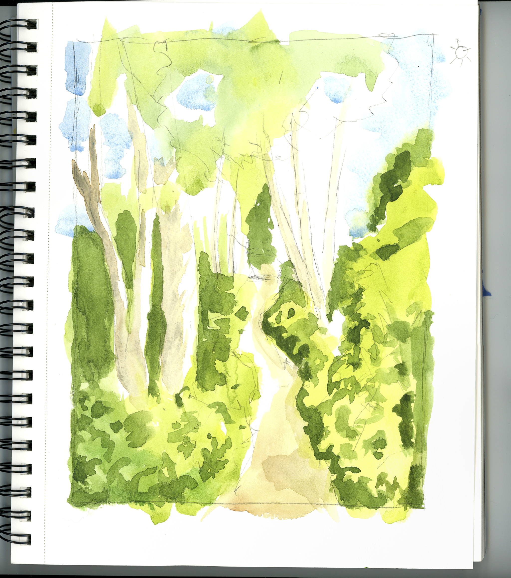
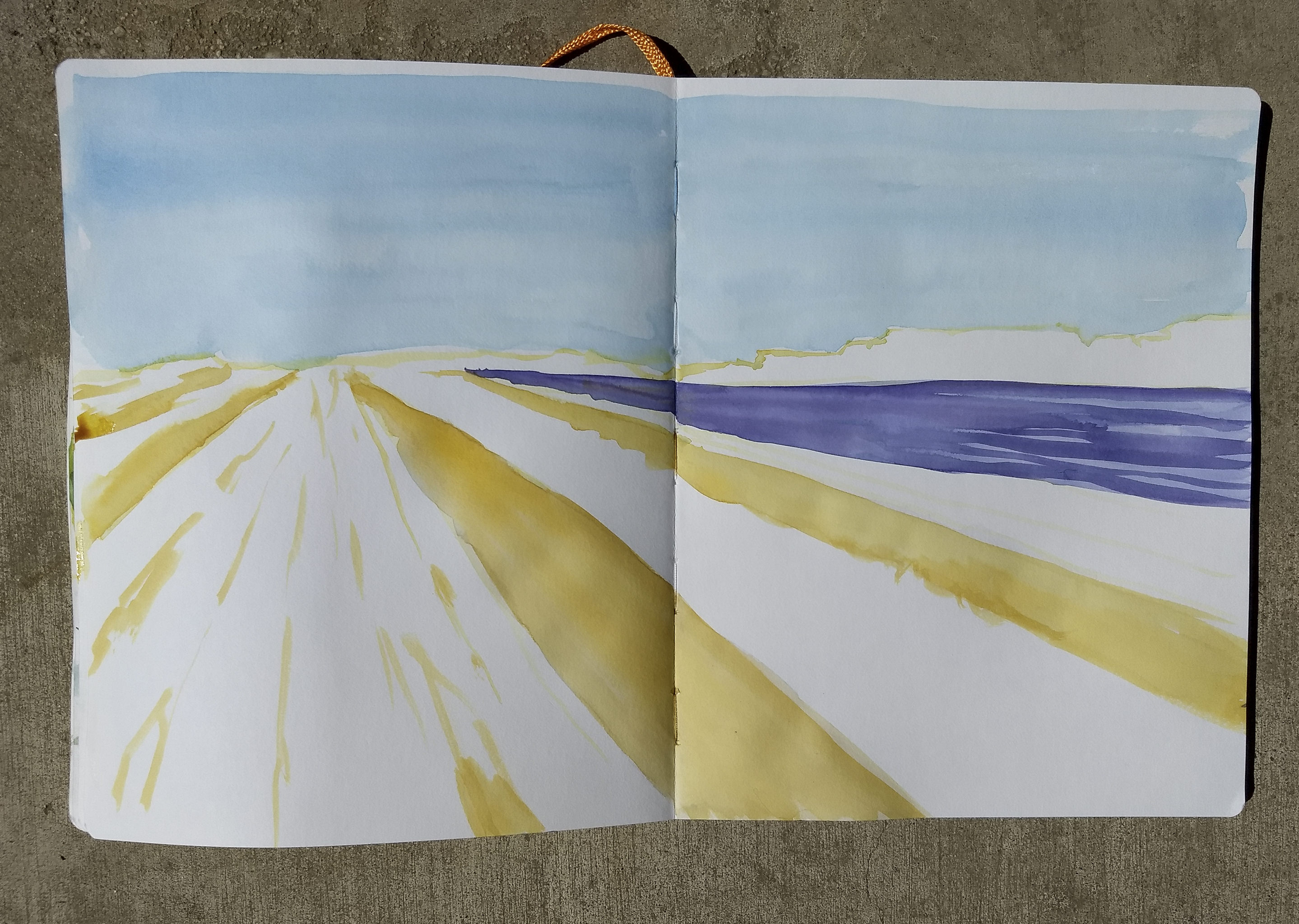
The first step was to choose the paper.  In the end, I chose a Handbook across two pages.  I had read somewhere about using a light color to create the outlines one might make with a pencil, so I used Quinacridone Gold and laid down the foundational lines.


At this point I worked out the building structure, horizon, and vanishing point, more by eye than using anything scientific like a ruler.

The next step was to add vast washes of color for the sky and field debris between the flowers.  The brushwork was done wet-on-wet for the sky.  A clear wash was followed by a sky of cerulean.  The same was done with the purple flower field on the right, which was then overlaid with a wet-into-kinda-wet mix of Alizarin Crimson and Carbazole Violet.  The gold between the long white was also wet-into-wet using Quinacridone Gold in varying strengths.  Then I let it all dry.

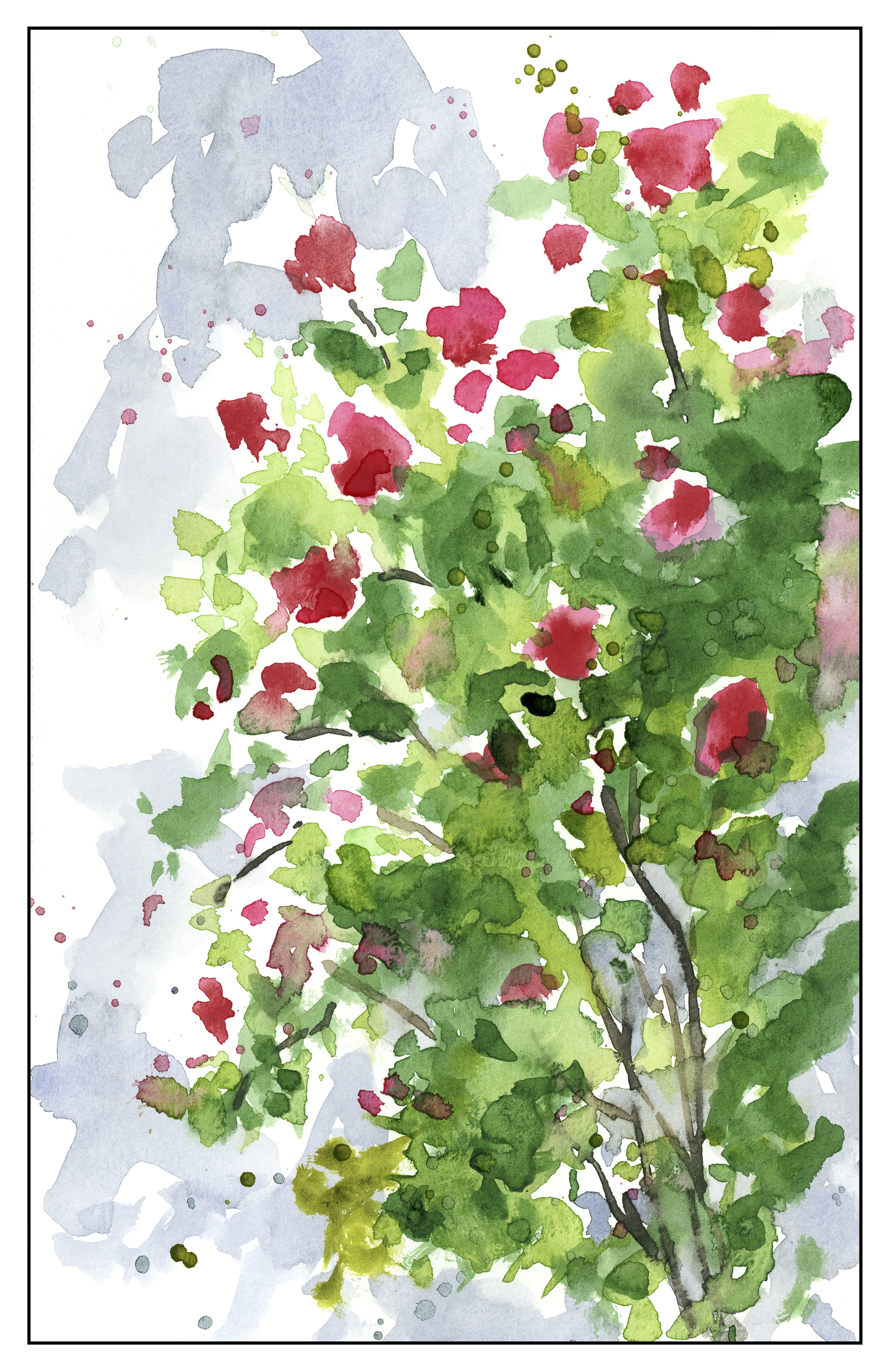
The next step was to create the pink flowerbeds. I used a mixture of Quinacridone Gold, Quinacridone Rose, and Alizarin Crimson. I really pushed the colors here, laying down values far darker than I would if I was working toward what I wanted – I really need to remember than watercolors dry about 30% lighter than the wet paint!

As you can see, I worked to create white space in the pink flower beds, and tried to add depth as they move toward the horizon.  From this point, the painting continued, and I didn’t stop to take pictures.  I read my novel as different layers dried.

As each step of proceeded – from initial lines of the sketch to the flower field – I thought about brush strokes.  The lines of the initial sketch were simple lines with the tip of the brush.  The washes for the sky used the side of the brush.  The fields of gold and violet were done as washes and as brush tip lines.  The pink flowers were a combination of lines and curves and dots.

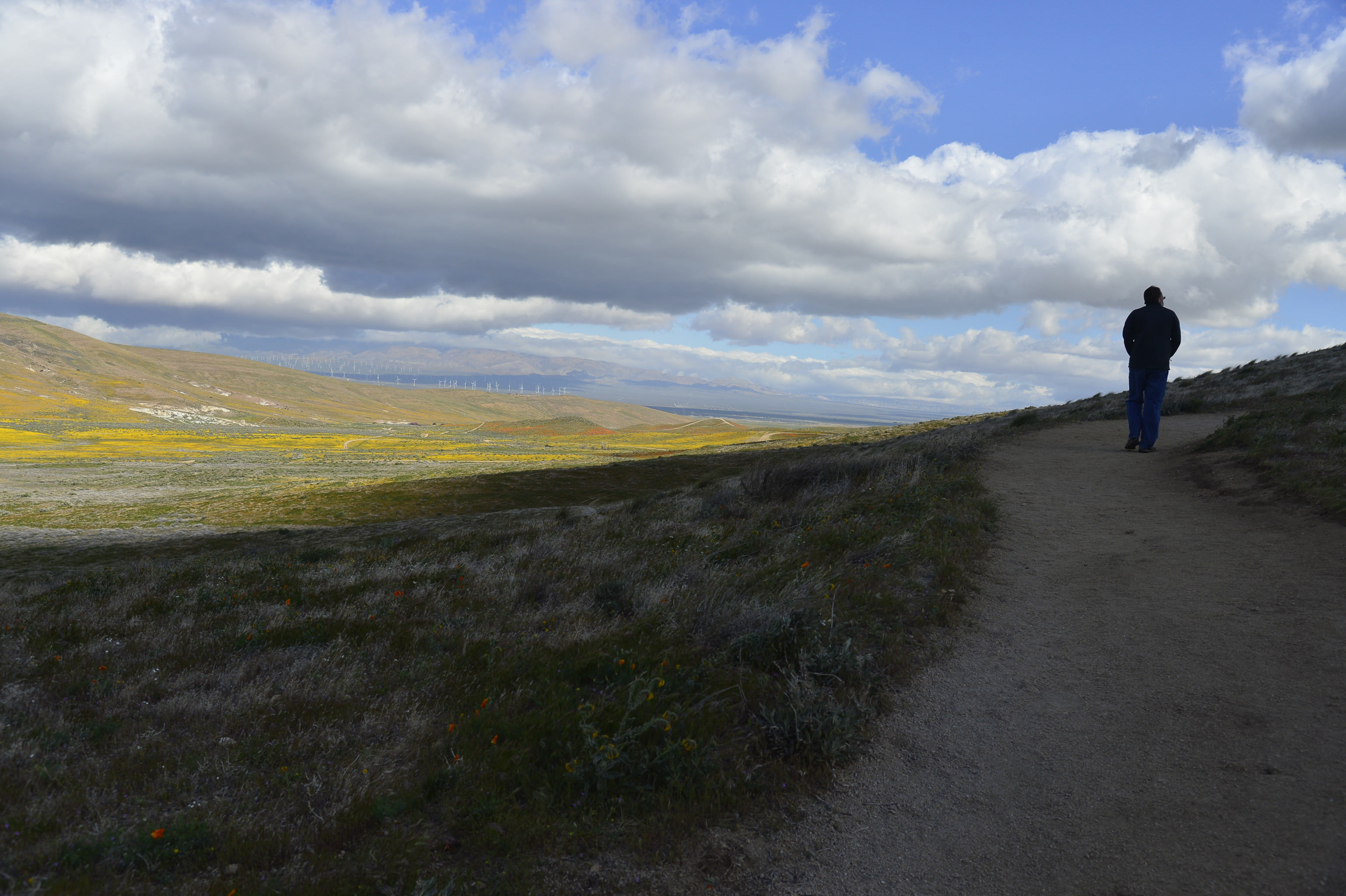
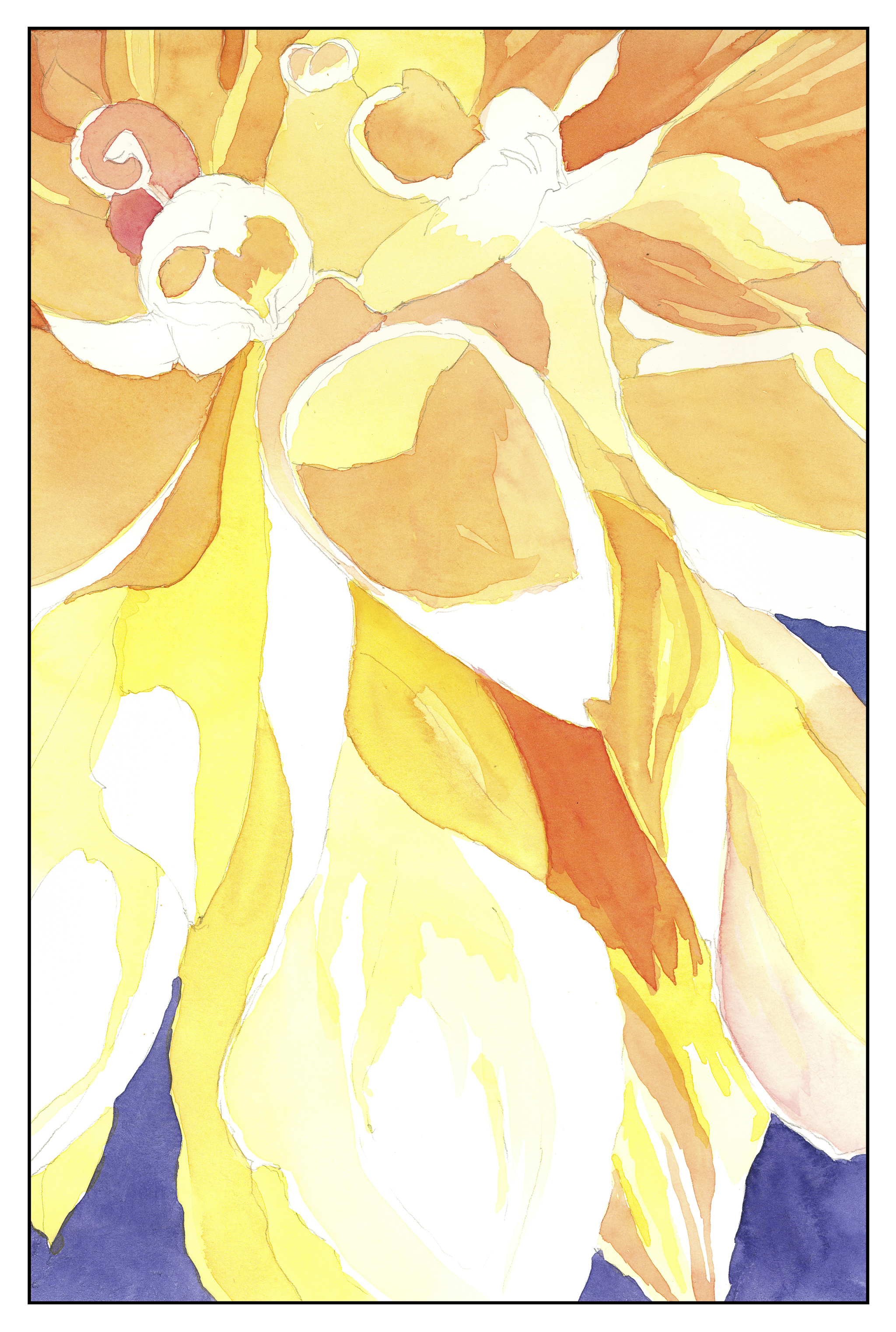
Below is the final image.  The sky is vastly different than the flat wash, which I initially had planned on retaining, but as the outlines on the building were not strong, and the whites too pale and lacking in contrast, I turned the painting upside down and used a mix of Cerulean and Ultramarine to make edges pop.  This led to just doing the sky all over.  Imagine my surprise when I saw not only lines in my brushwork, but the lines in the composition!  The way the fields of flowers create a diagonal motion matches the opposite movement of the sky and clouds.

Altogether, I am really pleased with this study.  It took about 2 hours, with layers drying and my thinking and reading my novel.  Certainly an afternoon well spent, I think.

Field of Flowers

Up the coast a way is a town known for its flower farms – a big industry locally.  The climate is varied, so a lot of different flowers may be grown, both for florists as well as seed.  Agriculture isn’t all cows and Brussel sprouts!

This was a fun study – I did a lot of lines as a practice exercise (I forget about lines because I have color to use – in ink painting it is so much about lines) and decided to focus on lines as the raison d’être for the painting.  Wet lines, dry-brush lines, wash and lines, wet on dry, dry on wet, etc.  Dots, too.


Freedom!

Sounds grand, doesn’t it?  It’s a heady feeling.  Instead of ending my work day at 6:30, it now ends at 4:30 for the next 2 days, then next week at 3:30, and then after that, 5 weeks off (maybe 4, I haven’t really counted) until I return to work for 2 mornings a week to do a short summer school session of ESL (English as a Second Language) before another 2 off  and then begin my last year of work.  Retirement looms closer and closer, and what is a girl to do?

Practice!

Yeah, I mean that.  Practicing for retirement means finding a meaning and a purpose and a general “raison d’etre” so that life is not a series of TV and aimlessness.  It doesn’t mean finding a second job or a new vocation, it means simply doing things which have value and meaning to me.  Volunteer work?  Maybe.  What kind?  Where?  Why?

I have all sorts of ideas about what I want to do, and this summer, with my free time, I really want to explore things.  LIke a lot of old folks free from the traces of work, travel sounds really good.  Of course, photography and painting and reading.  Exercise – going to the gym – long walks – hiking – socializing – thinking – making – sewing – painting – egads!  My head is exploding!

Lines, Shapes, Shadows

I had to take a day off from painting as my head was swirling.  This seems to happen whenever I do a lot of any one thing.  My brain feels overloaded and I need to do something to break out of it.  Then it settles down with sometimes clarity or a nagging little sense of something different, good but not completed, if that makes any sense.

Today’s focus – this morning in poor light – I decided to look at white space and dark space.  Neither results are spectacular but what I do see is shapes in this pictures.  Corners outlines, curves, straight edges.  I also like the merging and blending and granulations I see.  Other than that?

It Gets Overwhelming

Returning to watercolor is becoming an obsession, and the more I look at the work of various watercolorists, the more I become mentally deluged with images and colors and styles and painters.  It is a seriously crazy-making experience!  Like photography, most of what I do is really not good at all – from downright awful to meh – but it also becomes rather distressing.  That’s when a break is necessary, like making chocolate gelato or going out for a hike or looking for a new pair of shoes.  Just do something different to break out of the ruts of daily life.Focusing on “direct watercolor” – painting without any preliminary drawings or value studies – is sort of what I am trying to do on a daily basis.  This is from a photo, and the study was windows and reds and buildings.  The proportions are off, and that feels like failure big time.  The colors were all the dregs on the palette, so most were muddy and not interesting, but determined not to waste paint, why not?  I also used a water brush, and that can make colors even murkier if you don’t squeeze out excess water.

Another direct watercolor painting, this time limited to a 1/2 inch flat brush for everything.  The colors are cleaner, for sure, but the contrast of light and shadow are off.  The fun part was learning that yes, you can paint with only a flat brush.

I admit, I rather like this one, because I like its brightness.  However, after I finished it, I got a good laugh over my totally unrealistic chimney (or whatever that thing is) on the top of the building in the upper right.  What dimension is that in?!

I think I am going to return to this one again, as it is from a photo I took a couple of years ago along the coast.  The bluffs are really intense.  The problem lies in rendering the ocean and beach below them – lack of depth and overworking.

This is a WIP – from a black and white photo to consider light and dark.  I am going to try to work on this one today, or the one below, which is from a macro photo of a dahlia or similar flower.   I started this one in my Friday afternoon watercolor class.

Lastly, sometimes just a quick interpretation can give a lot of satisfaction.  There is something about light-colored walls on a brilliant day, colorful flowers – here, a rambler rose – and dancing shadows.  I would like to do this one again, too, on a bigger piece of paper and a more formal and finished work.