Le Port au Soleil Couchant, St. Tropez – Paul Signac Study

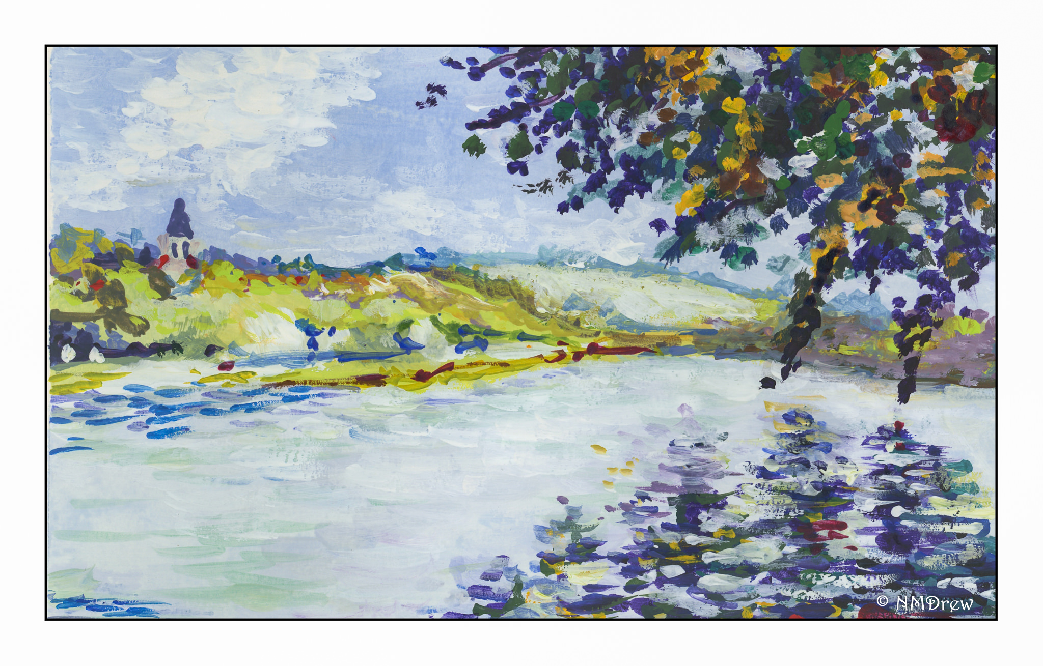
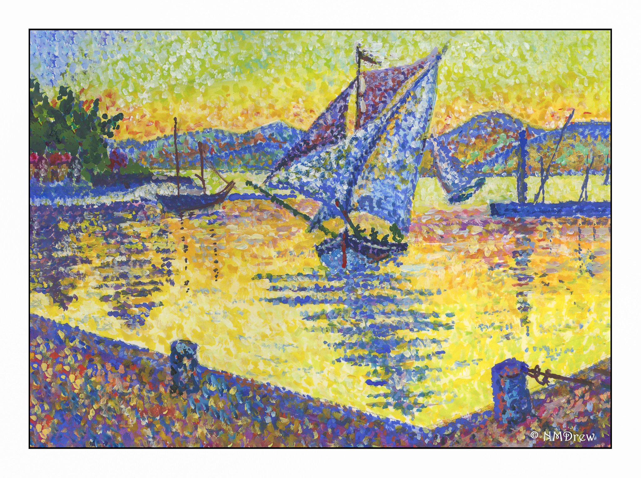
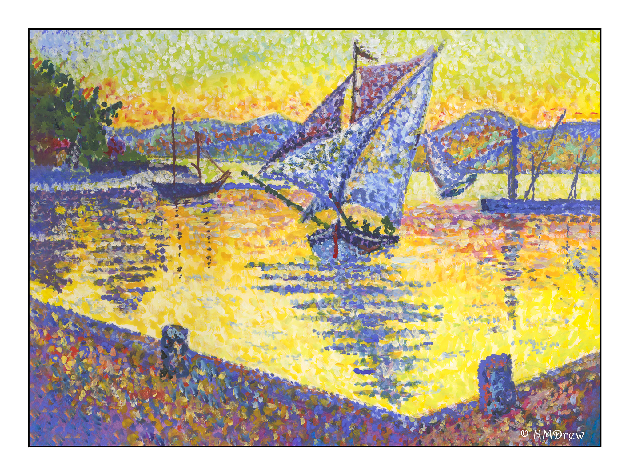
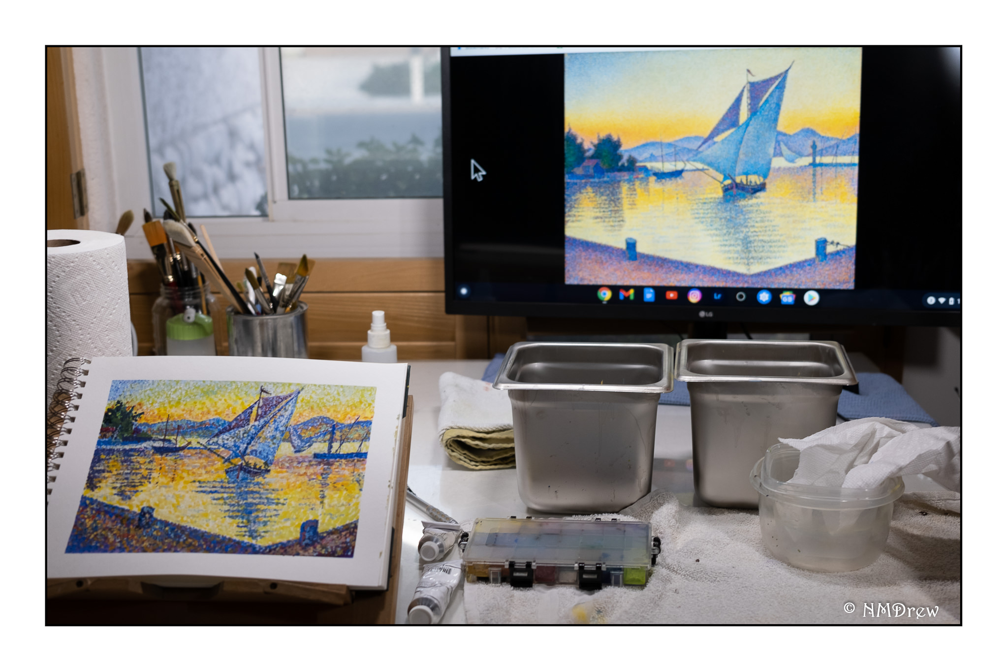
I really love this particular painting by Paul Signac, Le Port au Soleil Couchant, St. Tropez.  The colors and composition draw my eye in so many ways.  My study is above, and the illustration I used is below.   Unfortunately, its color is rather flat and muted compared to other versions I saw.  This image was the best I could find to download and share here.

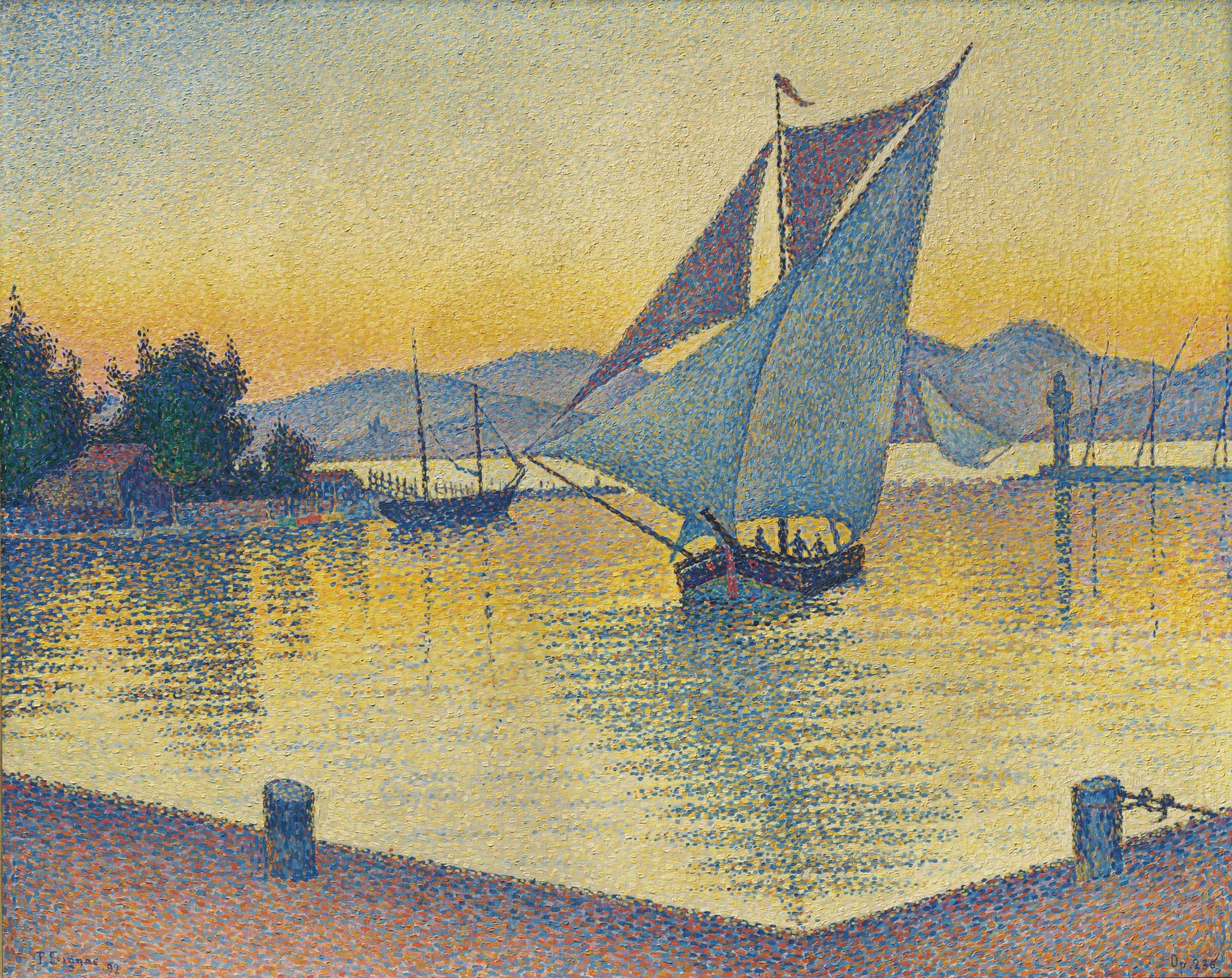
There are a number of things I like about this painting. The graduation of colors in the sky, from the blue in the upper left corner and its movement through the spectrum to green, yellow, and orange. The sailboats provide a visual dance, from the one in the center of the painting, and the especially delightful one further back on the right. That one, for some reason, just expresses joy to me. I used to sail a bit, and that one catches me in particular – the keeling over in a good wind is a grand experience! Finally, the reflections from the center sailboat along with the ones to either side, moving in to the dock. There is a sparkle and liveliness throughout the painting, and the usage of Pointillism really brings home that brilliance of the Mediterranean clime.

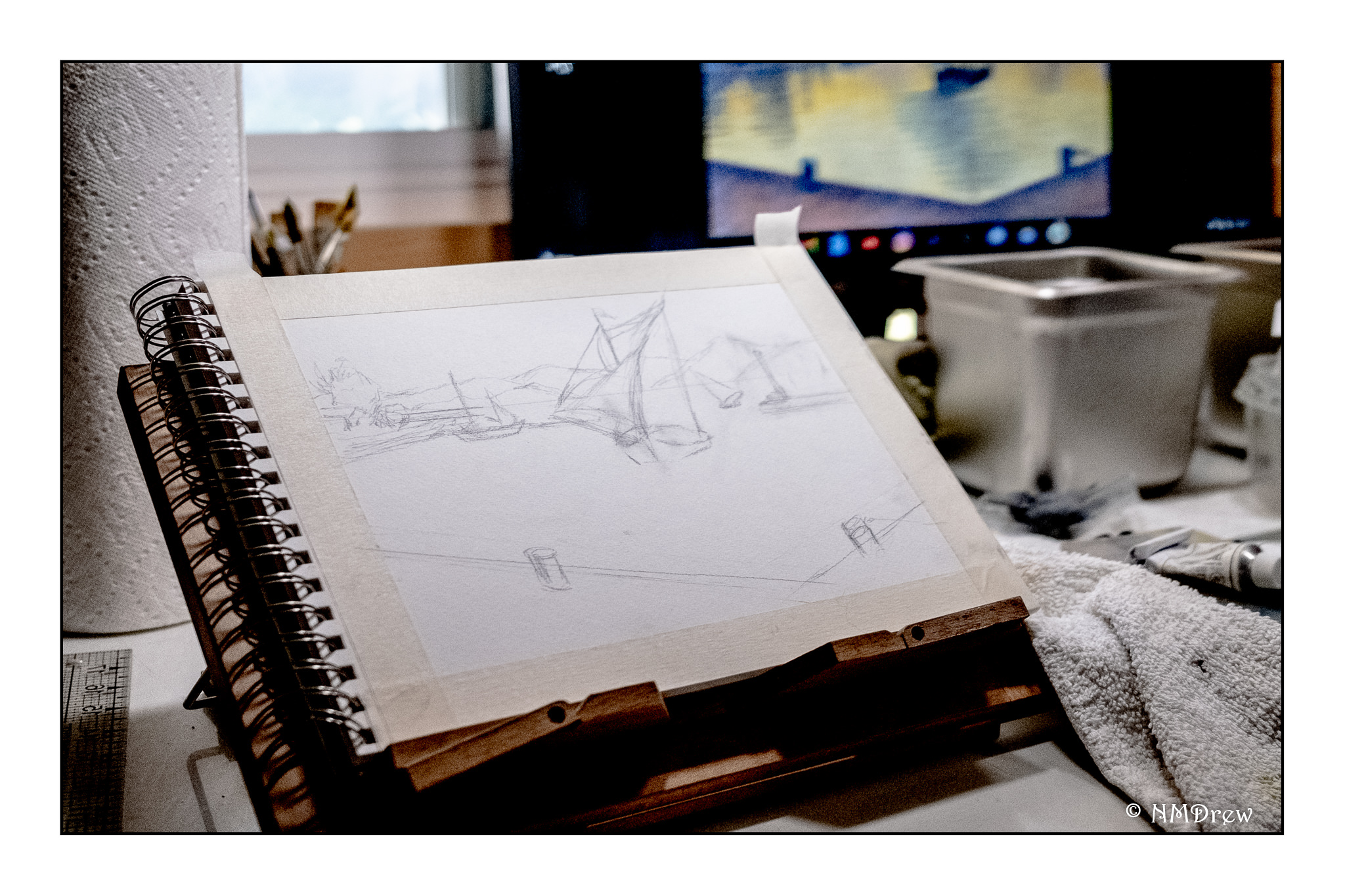
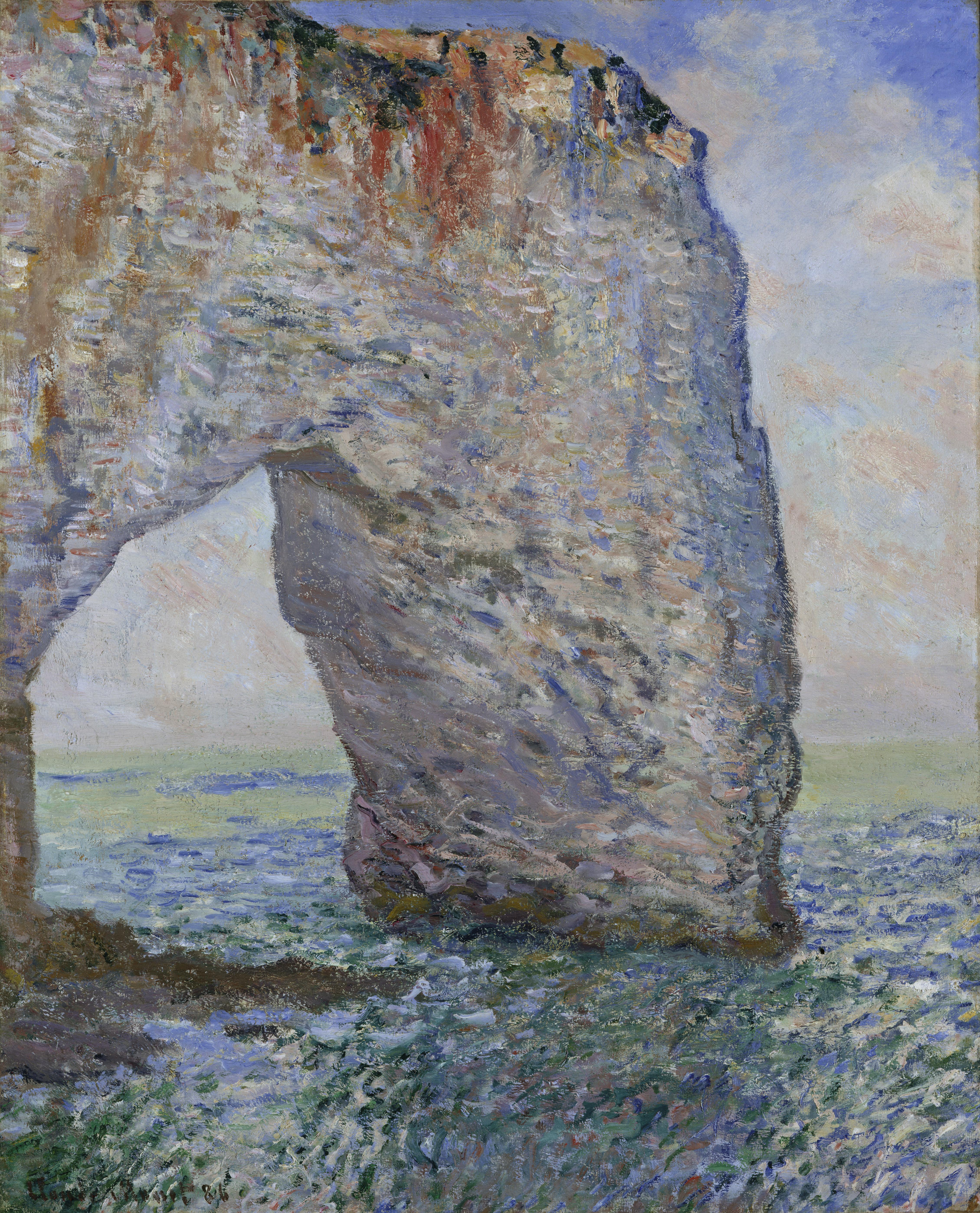
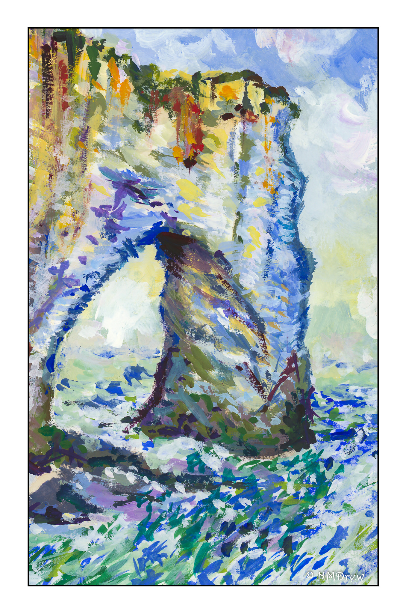
My own progress through this painting took a bit of time and tactical consideration. From earlier paintings I learned that an under painting of the primary colors for the section to be painted produced good results, as well as provided a structural basis for the painting. This requires a good drawing to get perspective correct.

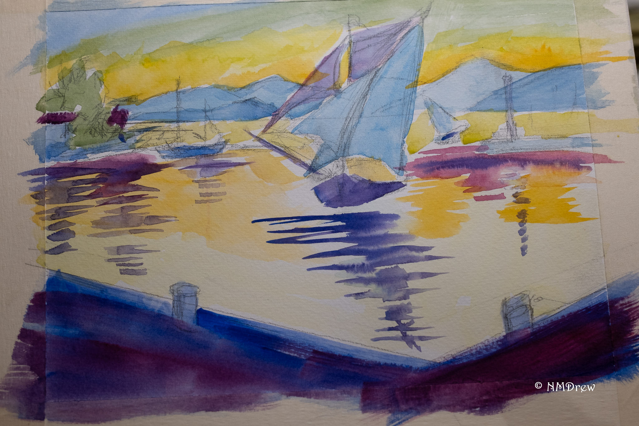
Above, you can see the basic under painting, using colors close to the final one.

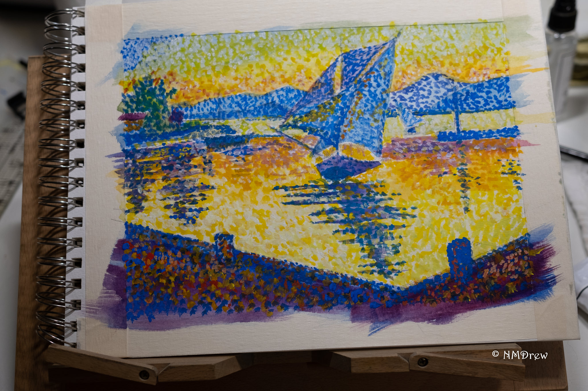
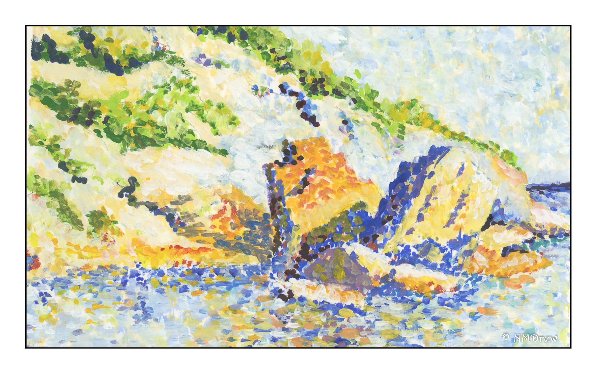
The first layer of dots goes down, and in many instances I simply used what I had on my palette, straight out of the tube. As this is gouache, even when the paints are dry, I can mush colors together on the paper if I want.

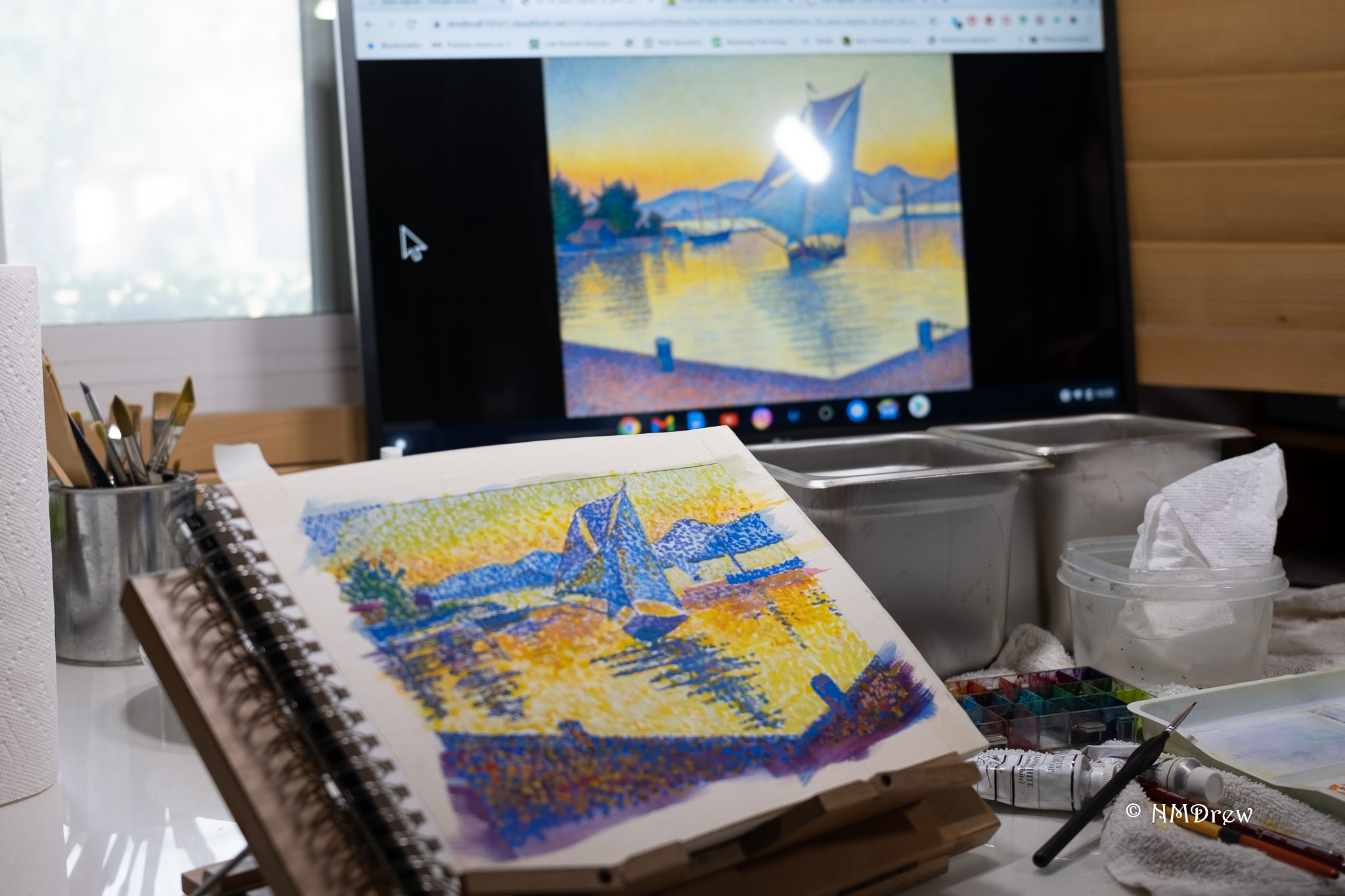
I work on my drafting table and use a large monitor to see what I am looking at. Out of range of this photo, to my right, is my Chrome Book set up.

My second layer of color was done by using a smaller brush than I used to lay in the first layer of dots. And what color did I use? White! Tap, tap, tap. I felt like a woodpecker.

Finally, the painting is close to finished. More layers of dots and various colors.  Little details were added at the end, such as the flag on the mast, the gaps in the top sail which show the sky beyond, the people in the boat, the rigging on the boat moored to the left, the upright lines on the dock in the right mid ground (more moored vessels?), and after the photo was taken, the lines on the right mooring bitt.

The takeaway here?  More understanding on using color, and the strength of a good composition.  Signac provided both, but copying brought home some lessons.  It is hard to say what I am learning here, but I do know that my hardest lesson continues to be not making mud.  Separating colors out from others – specifically, not blending them (too much) – is easily done in Pointillism.  I wonder how this will impact my future work and practice.

On to finding another Signac to study!

Under a Summer Sky

More Pointillism!

This painting was done on a larger sheet of paper than my earlier ones as my sketch book was filled and finished with the painting of the other day. I began with a thin wash of gouache, putting in the basic colors of the sky, fields, house and trees. From there, I began the dots. And more dots. And even more dots. Paint went from thin to thick, and thin again. Dots were bigger and smaller. The closer I came to the completion of the painting, the more I began to use the paint to shape the different areas of the subject. I tried to use some complementary colors in shadows, such as red in the shadows of the trees, and bright yellow to enliven the lavender. Altogether, this painting took about 3-4 hours to complete (I lost track of time), but in the end, the dots were worth the effort.

I think I could live here.

The View of the Seine at Herblay – Another Signac Study

As mentioned the other day, Paul Signac was known primarily for his Pointillism – the application of colored dots in painting to convey depth and light. Signac’s work is very graphic and structured, but he also used the same approach of color to produce paintings more of an Impressionistic flavor. The one below, The View of the Seine at Herblay, is the study for my practice piece above.

The first painting I did using Pointillism as the “style” I started by just laying on dots!  With a bit of paper to cover, only using dots became time consuming and tedious.  Thus, with this piece, I laid down broad swaths of the primary colors, essentially blues and beiges before applying dark colors for the leaves and reflections, and from there began the dot process.  As gouache is never permanently dry, I could go back in and lay in colors on top of others, as well as mush them together a bit.  Squishy good fun!  A firmly pointed round brush did the trick, using both the tip as well as the side of the brush.

Close looks at Signac’s painting show he did merge and blend his colors, as I did. I expect this was a quick sketch or a practice piece, or just a casual plein air painting for the joy of being outside. His other works that are more Pointillisticky have a very different quality. I think I will attempt to copy one of those in the not too distant future.

Color in Impressionism & Pointillism

For me, color is an excessively important part of my visual world.  I see colors before I see people or things.  I think in colors.  From there, reality intrudes and I can identify what is around me.  Because colors are my primary draw, when I paint, mud has often been the result.  Learning to separate colors and learn how one color works with another in painting has been, and continues to be, a difficult lesson for me.  My emotions want the color, but reality is that all colors do not create better ones.  Thus, “patience, grasshopper”!

According to Wikipedia:

Impressionism is a 19th-century art movement characterized by relatively small, thin, yet visible brush strokes, open composition, emphasis on accurate depiction of light in its changing qualities (often accentuating the effects of the passage of time), ordinary subject matter, inclusion of movement as a crucial element of human perception and experience, and unusual visual angles. Impressionism originated with a group of Paris-based artists whose independent exhibitions brought them to prominence during the 1870s and 1880s.

If you know your art history, Impressionism was ground-breaking and revolutionary.  Smooth blending and invisible brush strokes gave way to a different sense of light and its workings on the world seen by the artist.  As with all things, evolution occurred, and from this first rebellion against the “acceptable” art of Europe came other schools.  A direct off-shoot is Pointillism.  Color still is extraordinarily important, but instead of “impressions” being important, the usage of pure color became more distilled.  According to Wikipedia:

Pointillism (/ˈpɔɪntɪlɪzəm/) is a technique of painting in which small, distinct dots of color are applied in patterns to form an image.

Below is a short, clear video about Pointillism, its derivation and its influence.

What does this have to do with me? My need to work with color successfully requires a certain amount of intellectualization and rational thought about color – how color works, how colors interact, how Cobalt Teal reacts with Quinacridone Gold, and so on. I find breaking down colors into individuals before combining them helps. So, I decided to turn to the works of Monet and his studies of the ciffs at Etretat. I looked at several Monet studies, but I will use this one in particular:

And here is my interpretation of it:

Obviously, my colors are more intense, but the impact of light on surfaces was the focus. After a few “Monet studies” I realized that this was not quite was what I was looking for. I knew of Georges Seurat but do not care much for the start graphic quality of his work. Exploring other Pointillists, I remembered Paul Signac, and it is here that I found my current muse.

Signac’s works vary from graphic and sharp to blurred and “painterly” (for want of a better term). His more purely Pointilistic works have an energy and vitality I prefer to Seurat’s – more modern, more attractive, and more elegant in composition. He also works with the precepts of Pointillism, but still in a more Impressionistic way. I did my first Pointillistic painting by painting a detail of this painting by Signac, Cassis, Cap Lombard:

I took a small section, enlarged it, and painted a detail of it without following the exact structure of Signac’s painting.  If you click on Signac’s painting above a couple of times, you can enlarge it, and find the blues and oranges together in the shadows, which I studied and used in my sample below.  Additionally, I studied both warm and cold blues and oranges to get a sense of the temperature of the painting, but I will admit at this point I am rather befuddled and cannot describe my observations

My goal was to look at the usage of color, in particular, the juxtapositioning of colors. In the stones along the shore, and in the reflections in the sea, you find blues and oranges, complements of each other, in play to create light, shadow, reflected light, and reflections seen in the lap of the waves.

Did I succeed? As far as color usage, yes, to a degree. In doing this study I also learned about making a Pointillistic painting. I began with just dots and soon learned it took forever! So, in further studies, I laid in the primary background colors in given areas and then applied the dots. I am working in gouache, and so I can blend colors into each other on the paper to create new ones since artists gouache is never permanently “dry” unless sealed. Gouache is the perfect medium for this, but I can also see the value of acrylics as each layer can dry and then be painted over without dissolving the layer beneath. The other beauty of gouache is that it is an opaque medium and so painting over other colors can be done, unlike watercolors.

More studies will follow using the principles of Pointillism, and I know that I will evolve into my own methods. Copying from the works of a master is a time-honored tradition and an important part of any student’s learning, no matter the field.  Such practice causes one to think, analyze, and apply; it is from this one learns.


Cassis, Cap Lombard – Detail Study from a Painting by Paul Signac

After putzing around with attempts to emulate some of Monet’s Impressionistic paintings of Etretat, I muddled around and found the works of Paul Signac, a Neo-Impressionist and Pointillist. These two schools espoused dabbing, using complimentary colors and such to create a sense of light and movement. They are rather delightful to my eye – I am a magpie at heart – and the vibrant colors and energy of these painters fascinates me.

Here, I decided to see what I could do with a detail of Paul Signac’s painting, which you can see below. His rocks, or whatever they are, and their reflections in the sea caught my attention. My reflections are not very good. As a first attempt to try pointillism, I just started with making dots on the unpainted paper. In reality, the best way to start would have been to laid down solid areas of underlying color, and then build upon that with the dots.

If you look at Signac’s painting, you will see the use of orange and blue in the shadows – reflected light in the shadows. What I also found fascinating is his use of different shades of blue – ultramarine, cobalt, and cerulean in particular. Together with varying shades of orange, yellow, and ochre, he created the stone reflections. I found this very hard to do, but think I get the idea!

More to come. The purpose of copying or interpreting Signac’s work (and Monet’s) is to get a better sense of color. With pointillism, the colors are applied individually. Doing this myself, I begin to appreciate the purity of color when juxtaposed with another.